✨ NodeLink Documentation
NodeLink is a Qt/QML node editor library for building node-based and dataflow-oriented applications. It provides a ready-made scene engine with customizable nodes, ports, and connections, while staying flexible enough to be integrated into complex systems and domain-specific tools.
This documentation gives you a high-level overview, a guided setup, and reference material for working with NodeLink from both QML and C++.
Who is this for?
NodeLink targets Qt developers who want to build:
- Visual scripting tools
- Dataflow editors (e.g., effects chains, ETL, processing graphs)
- Node-based UIs (logic, shader graphs, workflows, automation, etc.)
What is NodeLink?
NodeLink is a Qt/QML-based framework for building node-based applications. It follows a Model-View-Controller (MVC) design, separating rendering and interaction (View) from the logical graph structure (Model).
- Model: Represents the graph structure, application data, and evaluation logic.
- View: QML scene that renders nodes, ports, and connections and handles user input.
- Controller: Glue between UI actions and model changes (selection, create/delete, connect/disconnect, undo/redo, etc.).
The same model can be used in a headless mode (no visible node editor) or attached to one or more NodeLink views.
Key Features
NodeLink ships with a rich set of features for building production-grade node editors:
- MVC design with clear separation between data model and QML UI.
- Custom node visuals and logic (QML or C++).
- Custom connection rendering (Bezier, straight, orthogonal, etc.).
- Scene overview (minimap-style view), zoom, panning and selection tools.
- Dynamic links and ports: create/remove ports at runtime.
- Undo / redo stack for most scene operations.
- Built-in save / load capabilities for graphs.
- Snapping and grid-based positioning for precise layouts.
Production-ready architecture
NodeLink is designed for integration into real applications: it is modular, tested with Qt 6, and built to work with CMake-based projects across platforms (Linux, Windows, macOS).
📋 Requirements
Supported Platforms
- Linux (x64, gcc ≥ 7.0, clang ≥ 7.0)
- Windows (Win32/x64, MSVC 2019 or compatible, MinGW if supported)
- macOS (Apple Clang / Xcode toolchain)
C++ / Build Toolchain
- C++ standard: C++17
- CMake: ≥ 3.8 (recommended: 3.20+)
- Git (with submodule support)
Qt / QML
- Qt: ≥ 6.2.4
- Required modules:
QtQuickQtQuick.ControlsQtQmlQtQuick.Layouts
📦 Installation
Clone the repository (including submodules) and add it to your CMake project.
Clone
# Recommended (single step)
git clone --recursive https://github.com/Roniasoft/NodeLink.git
cd NodeLink

# If you cloned without --recursive
git submodule update --init --recursive
Integrate with CMake
In your existing CMake project, add NodeLink as a subdirectory and link it to your target.
# CMakeLists.txt (top-level or within your app)
add_subdirectory(NodeLink)

target_link_libraries(MyApp
    PRIVATE
        NodeLinkQml    # or the library target exported by NodeLink
)
Install vs. Subdirectory
You can either:
- Install NodeLink system-wide (
make install) and then find it viafind_package, or - Include it as a subdirectory in your project for tighter version control.
🛠️ Building & Running
Command-line build (Linux / macOS)
mkdir build
cd build
cmake .. -DCMAKE_BUILD_TYPE=Release
make -j$(nproc)
sudo make install   # optional, if you want to install
Build with Qt Creator
- Open
CMakeLists.txtas a project. - Run CMake configuration.
- Build all targets.
- Run one of the example applications or your own.
Submodules
If you see missing headers or empty submodule folders, ensure you have run:
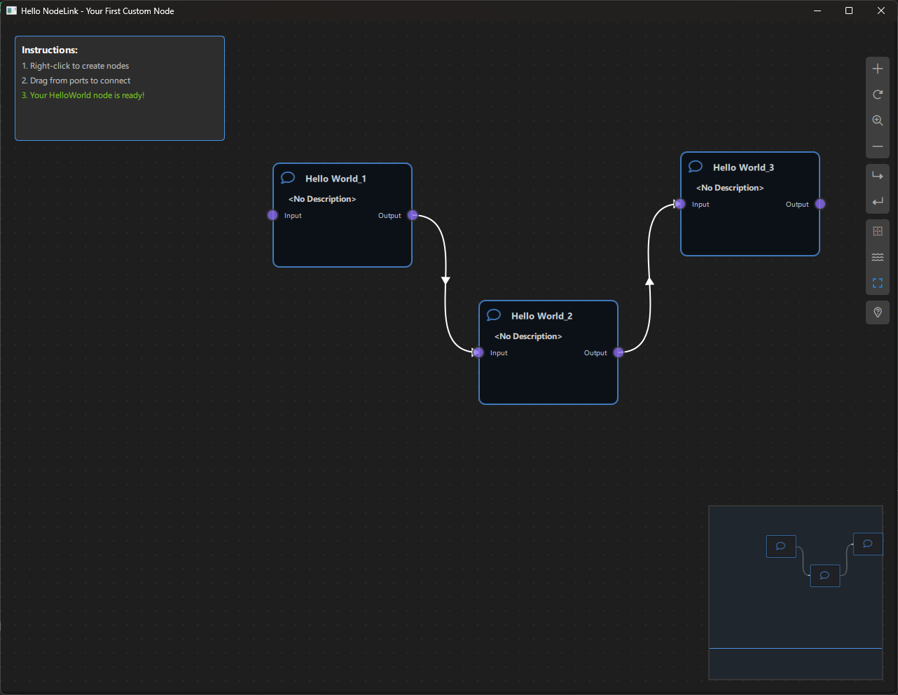
git submodule update --init --recursive🚀 Quick Start: Your First Custom Node
In this section, we'll create a simple "HelloWorld" node that displays a message. This will take approximately 10 minutes.
Step 1: Create Project Directory (1 minute)
Create a new directory for your project:
mkdir HelloNodeLink
cd HelloNodeLink
Step 2: Create main.cpp (1 minute)
Create main.cpp:
#include <QGuiApplication>
#include <QQmlApplicationEngine>
#include <QtQuickControls2/QQuickStyle>

int main(int argc, char *argv[])
{
    QGuiApplication app(argc, argv);

    // Set Material style
    QQuickStyle::setStyle("Material");

    QQmlApplicationEngine engine;
    const QUrl url(QStringLiteral("qrc:/HelloNodeLink/main.qml"));

    QObject::connect(&engine, &QQmlApplicationEngine::objectCreated,
                     &app, [url](QObject *obj, const QUrl &objUrl) {
        if (!obj && url == objUrl)
            QCoreApplication::exit(-1);
    }, Qt::QueuedConnection);

    engine.load(url);

    return app.exec();
}
Step 3: Create HelloWorldNode.qml (2 minutes)
Create HelloWorldNode.qml:
import QtQuick
import NodeLink

Node {
    // Set unique type identifier
    type: 0

    // Configure node data
    nodeData: I_NodeData {}

    // Configure GUI
    guiConfig.width: 200
    guiConfig.height: 120
    guiConfig.color: "#4A90E2"

    // Custom property for input text
    property string inputText: ""

    // Add ports when node is created
    Component.onCompleted: addPorts();

    // Update output when input changes
    onInputTextChanged: {
        if (inputText.length > 0) {
            nodeData.data = "Hello, " + inputText;
        } else {
            nodeData.data = "";
        }
    }

    // Function to add ports
    function addPorts() {
        // Input port (left side)
        let inputPort = NLCore.createPort();
        inputPort.portType = NLSpec.PortType.Input;
        inputPort.portSide = NLSpec.PortPositionSide.Left;
        inputPort.title = "Input";
        inputPort.color = "#4A90E2";
        addPort(inputPort);

        // Output port (right side)
        let outputPort = NLCore.createPort();
        outputPort.portType = NLSpec.PortType.Output;
        outputPort.portSide = NLSpec.PortPositionSide.Right;
        outputPort.title = "Output";
        outputPort.color = "#7ED321";
        addPort(outputPort);
    }

    // Handle data from connected nodes
    function processInput() {
        // This will be called by the scene when data flows
        var inputPort = findPortByPortSide(NLSpec.PortPositionSide.Left);
        if (inputPort) {
            // Get data from connected node (simplified - actual implementation depends on your scene)
            // For now, we'll use the inputText property
            if (nodeData.input !== undefined && nodeData.input !== null) {
                inputText = String(nodeData.input);
            }
        }
    }
}
Step 4: Create main.qml (3 minutes)
Create main.qml:
import QtQuick
import QtQuickStream
import QtQuick.Controls
import NodeLink

Window {
    id: window

    // Scene property (will be overridden by load)
    property Scene scene: Scene { }

    // Node registry setup
    property NLNodeRegistry nodeRegistry: NLNodeRegistry {
        _qsRepo: NLCore.defaultRepo
        imports: ["HelloNodeLink", "NodeLink"]
        defaultNode: 0
    }

    width: 1280
    height: 960
    visible: true
    title: qsTr("Hello NodeLink - Your First Custom Node")
    color: "#1e1e1e"

    Material.theme: Material.Dark
    Material.accent: "#4890e2"

    Component.onCompleted: {
        // Register HelloWorldNode
        var nodeType = 0;
        nodeRegistry.nodeTypes[nodeType] = "HelloWorldNode";
        nodeRegistry.nodeNames[nodeType] = "Hello World";
        nodeRegistry.nodeIcons[nodeType] = "\uf075";  // Font Awesome comment icon
        nodeRegistry.nodeColors[nodeType] = "#4A90E2";

        // Initialize QtQuickStream repository
        NLCore.defaultRepo = NLCore.createDefaultRepo(["QtQuickStream", "NodeLink", "HelloNodeLink"])
        NLCore.defaultRepo.initRootObject("Scene");

        // Set registry to scene
        window.scene = Qt.binding(function() {
            return NLCore.defaultRepo.qsRootObject;
        });
        window.scene.nodeRegistry = Qt.binding(function() {
            return window.nodeRegistry;
        });
    }

    // Main view
    NLView {
        id: view
        scene: window.scene
        anchors.fill: parent
    }

    // Instructions label
    Rectangle {
        anchors.top: parent.top
        anchors.left: parent.left
        anchors.margins: 20
        width: 300
        height: 150
        color: "#2d2d2d"
        radius: 5
        border.color: "#4890e2"
        border.width: 1

        Column {
            anchors.fill: parent
            anchors.margins: 10
            spacing: 5

            Text {
                text: "Instructions:"
                color: "#ffffff"
                font.bold: true
                font.pixelSize: 14
            }

            Text {
                text: "1. Right-click to create nodes"
                color: "#cccccc"
                font.pixelSize: 12
            }

            Text {
                text: "2. Drag from ports to connect"
                color: "#cccccc"
                font.pixelSize: 12
            }

            Text {
                text: "3. Your HelloWorld node is ready!"
                color: "#7ED321"
                font.pixelSize: 12
            }
        }
    }
}
Step 5: Create CMakeLists.txt (2 minutes)
Create CMakeLists.txt:
cmake_minimum_required(VERSION 3.16)

# Require C++17
set(CMAKE_CXX_STANDARD 17)
set(CMAKE_CXX_STANDARD_REQUIRED ON)
set(CMAKE_AUTOMOC ON)

# Configure Qt
find_package(QT NAMES Qt6 Qt5 COMPONENTS Core Gui QuickControls2 REQUIRED)
find_package(Qt${QT_VERSION_MAJOR} COMPONENTS Core Gui QuickControls2 REQUIRED)

# Set QML import path
set(QML_IMPORT_PATH ${CMAKE_BINARY_DIR}/qml/NodeLink/resources/View)
set(QT_QML_OUTPUT_DIRECTORY ${CMAKE_BINARY_DIR}/qml)

# Add NodeLink as subdirectory (adjust path to your NodeLink installation)
# Option 1: If NodeLink is in parent directory
add_subdirectory(../NodeLink NodeLink)

# Option 2: If NodeLink is installed system-wide, use find_package instead
# find_package(NodeLink REQUIRED)

# Create executable
qt_add_executable(HelloNodeLink main.cpp)

# Define QML module
qt_add_qml_module(HelloNodeLink
    URI "HelloNodeLink"
    VERSION 1.0

    QML_FILES
        main.qml
        HelloWorldNode.qml

    SOURCES
)

# Include directories
target_include_directories(HelloNodeLink PUBLIC
    Qt${QT_VERSION_MAJOR}::QuickControls2)

# Link libraries
target_link_libraries(HelloNodeLink PRIVATE
    Qt${QT_VERSION_MAJOR}::Core
    Qt${QT_VERSION_MAJOR}::Gui
    Qt${QT_VERSION_MAJOR}::QuickControls2
    NodeLinkplugin
    QtQuickStreamplugin
)

# Debug definitions
target_compile_definitions(HelloNodeLink
    PRIVATE $<$,$>:QT_QML_DEBUG>)
Important: Adjust the add_subdirectory path to point to your NodeLink installation
directory.
Step 6: Build and Run (1 minute)
Using Command Line:
# Create build directory
mkdir build
cd build

# Configure
cmake ..

# Build
cmake --build . --config Release

# Run
./HelloNodeLink  # Linux/macOS
# or
HelloNodeLink.exe  # Windows
Using Qt Creator:
- CMakeLists.txt in Qt Creator
- Configure the project
- Build (Ctrl+B / Cmd+B)
- Run (Ctrl+R / Cmd+R)
Expected Result:
Calculator Example
Overview
The Calculator Example is a visual node-based calculator application built with NodeLink and Qt Quick. It demonstrates how to create a functional node graph system where users can connect different types of nodes to perform mathematical calculations. This example serves as an excellent introduction to building custom node-based applications using the NodeLink framework.
a. Purpose and Use Cases
Purpose
The Calculator Example demonstrates:
-
Node-Based Data Flow: Shows how data flows through a network of connected nodes, where each node performs a specific operation or holds a value.
-
Custom Node Types: Illustrates how to define and implement custom node types with specific behaviors, ports, and data handling.
-
Real-Time Updates: Demonstrates automatic data propagation through the node graph when connections are made, modified, or removed.
-
Visual Programming: Provides a visual interface for building mathematical expressions without writing code.
-
Scene Management: Shows how to manage a scene with multiple nodes, links, and their relationships.
Use Cases
- Educational Tool: Learn how to build node-based applications with NodeLink
- Prototyping: Quickly prototype mathematical workflows or data processing pipelines
- Visual Expression Builder: Create complex mathematical expressions visually
- Framework Demonstration: Showcase NodeLink capabilities to potential users or developers
- Custom Application Foundation: Use as a starting point for building more complex node-based applications
Example Scenarios
- Simple Calculations: Connect Source nodes to operation nodes to perform basic arithmetic
- Complex Expressions: Build multi-step calculations like
(a + b) * (c - d) / e - Data Flow Visualization: Understand how data propagates through a node network
- Interactive Learning: Experiment with different node connections and observe results in real-time
b. Node Types Explained
The Calculator Example implements six distinct node types, each serving a specific role in the calculation pipeline.
1. Source Node (SourceNode)
Purpose: Provides input values for calculations.
Type ID: CSpecs.NodeType.Source (0)
Properties:
- Contains a single output port named "value"
- Users can directly edit the numeric value in the node
- Acts as the starting point for data flow
Ports:
- Output Port: "value" (Right side) - Emits the numeric value entered by the user
Usage:
- Place Source nodes to input numbers into your calculation
- Connect the output port to operation nodes or Result nodes
- Edit the value by clicking on the node and typing a number
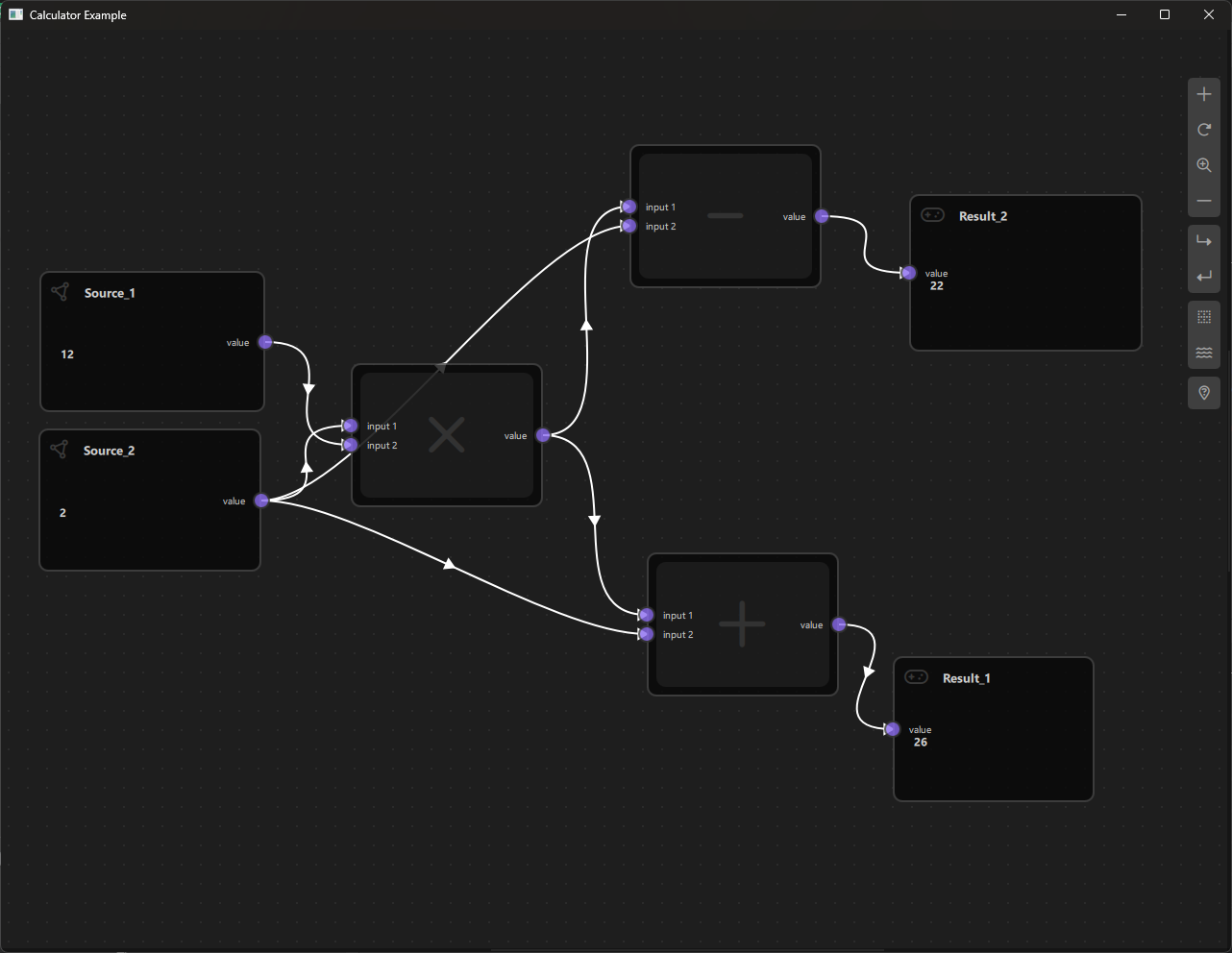
Example: A Source node with value 5 outputs 5 through its output port.
2. Additive Node (AdditiveNode)
Purpose: Performs addition of two input values.
Type ID: CSpecs.NodeType.Additive (1)
Properties:
- Inherits from OperationNode
- Has two input ports and one output port
- Performs: output = input1 + input2
Ports:
- Input Port 1: "input 1" (Left side)
- Input Port 2: "input 2" (Left side)
- Output Port: "value" (Right side) - Emits the sum of the two inputs
Behavior:
- Waits for both inputs to be connected and have valid data
- Automatically calculates the result when both inputs are available
- Outputs null if either input is missing
Example:
- Input 1: 3, Input 2: 7 → Output: 10
3. Multiplier Node (MultiplierNode)
Purpose: Performs multiplication of two input values.
Type ID: CSpecs.NodeType.Multiplier (2)
Properties:
- Inherits from OperationNode
- Has two input ports and one output port
- Performs: output = input1 * input2
Ports:
- Input Port 1: "input 1" (Left side)
- Input Port 2: "input 2" (Left side)
- Output Port: "value" (Right side) - Emits the product of the two inputs
Behavior:
- Requires both inputs to be connected and have valid data
- Calculates result automatically when both inputs are available
Example:
- Input 1: 4, Input 2: 6 → Output: 24
4. Subtraction Node (SubtractionNode)
Purpose: Performs subtraction of two input values.
Type ID: CSpecs.NodeType.Subtraction (3)
Properties:
- Inherits from OperationNode
- Has two input ports and one output port
- Performs: output = input1 - input2
Ports:
- Input Port 1: "input 1" (Left side)
- Input Port 2: "input 2" (Left side)
- Output Port: "value" (Right side) - Emits the difference of the two inputs
Behavior:
- Subtracts the second input from the first input
- Requires both inputs to be connected
Example:
- Input 1: 10, Input 2: 3 → Output: 7
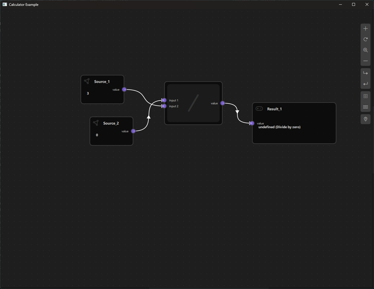
5. Division Node (DivisionNode)
Purpose: Performs division of two input values.
Type ID: CSpecs.NodeType.Division (4)
Properties:
- Inherits from OperationNode
- Has two input ports and one output port
- Performs: output = input1 / input2
Ports:
- Input Port 1: "input 1" (Left side)
- Input Port 2: "input 2" (Left side)
- Output Port: "value" (Right side) - Emits the quotient of the two inputs
Behavior:
- Divides the first input by the second input
- Handles division by zero: outputs "undefined (Divide by zero)" if the second input is 0
- Requires both inputs to be connected
Example:
- Input 1: 20, Input 2: 4 → Output: 5
- Input 1: 10, Input 2: 0 → Output: "undefined (Divide by zero)"
6. Result Node (ResultNode)
Purpose: Displays the final result of a calculation.
Type ID: CSpecs.NodeType.Result (5)
Properties:
- Contains a single input port
- Displays the value received from connected nodes
- Read-only (cannot be edited directly)
Ports:
- Input Port: "value" (Left side) - Receives the calculated result
Behavior:
- Displays whatever value is connected to its input port
- Updates automatically when the input value changes
- Resets to null when cloned or when the input connection is removed
Usage:
- Connect the output of any node (Source or Operation) to a Result node to view the final value
- Useful for displaying intermediate or final results in complex calculations
Example:
- Connect a Source node with value 42 → Result displays 42
- Connect an Additive node output → Result displays the sum
Node Type Summary Table
| Node Type | Type ID | Input Ports | Output Ports | Operation |
|---|---|---|---|---|
| Source | 0 | 0 | 1 | Provides input value |
| Additive | 1 | 2 | 1 | Addition (+) |
| Multiplier | 2 | 2 | 1 | Multiplication (×) |
| Subtraction | 3 | 2 | 1 | Subtraction (-) |
| Division | 4 | 2 | 1 | Division (/) |
| Result | 5 | 1 | 0 | Displays result |
c. Step-by-Step Building Guide
This guide will walk you through building the Calculator Example from scratch, explaining each component and how they work together.
Prerequisites
- Qt 6.2.4 or later (Qt 6.10.0 recommended)
- CMake 3.1.0 or later
- C++ compiler with C++14 support (MSVC 2019/2022 on Windows)
- NodeLink framework built and installed
- QtQuickStream module built and installed
Step 1: Project Setup
1.1 Create Project Structure
Create the following directory structure:
calculator/
├── CMakeLists.txt
├── main.cpp
├── main.qml
└── resources/
    ├── Core/
    └── View/
    └── fonts/
1.2 Configure CMakeLists.txt
Create CMakeLists.txt with the following configuration:
cmake_minimum_required(VERSION 3.1.0)

set(CMAKE_AUTOMOC ON)
set(CMAKE_CXX_STANDARD_REQUIRED ON)

# Configure Qt
find_package(QT NAMES Qt6 Qt5 COMPONENTS Core Gui QuickControls2 REQUIRED)
find_package(Qt${QT_VERSION_MAJOR} COMPONENTS Core Gui QuickControls2 REQUIRED)

list(APPEND QML_IMPORT_PATH ${CMAKE_BINARY_DIR}/qml)

# Create executable
qt_add_executable(Calculator main.cpp)

# Set CSpecs as singleton
set_source_files_properties(
    resources/Core/CSpecs.qml
    PROPERTIES
        QT_QML_SINGLETON_TYPE True
)

# Define QML module
qt_add_qml_module(Calculator
    URI "Calculator"
    VERSION 1.0
    QML_FILES
        main.qml
        resources/Core/CSpecs.qml
        resources/Core/SourceNode.qml
        resources/Core/OperationNode.qml
        resources/Core/ResultNode.qml
        resources/Core/AdditiveNode.qml
        resources/Core/MultiplierNode.qml
        resources/Core/SubtractionNode.qml
        resources/Core/DivisionNode.qml
        resources/Core/CalculatorScene.qml
        resources/Core/OperationNodeData.qml
        resources/View/CalculatorView.qml
        resources/View/CalculatorNodeView.qml
    RESOURCES
        resources/fonts/Font\ Awesome\ 6\ Pro-Thin-100.otf
        resources/fonts/Font\ Awesome\ 6\ Pro-Solid-900.otf
        resources/fonts/Font\ Awesome\ 6\ Pro-Regular-400.otf
        resources/fonts/Font\ Awesome\ 6\ Pro-Light-300.otf
)

target_include_directories(Calculator PUBLIC
    Qt${QT_VERSION_MAJOR}::QuickControls2)

target_link_libraries(Calculator PRIVATE
    Qt${QT_VERSION_MAJOR}::Core
    Qt${QT_VERSION_MAJOR}::Gui
    Qt${QT_VERSION_MAJOR}::QuickControls2
    NodeLinkplugin
    QtQuickStreamplugin
)
Key Points:
- Links to NodeLinkplugin and QtQuickStreamplugin
- Sets CSpecs.qml as a singleton for global access
- Includes Font Awesome fonts for icons
Step 2: Create Specifications (CSpecs.qml)
Create resources/Core/CSpecs.qml - a singleton that defines node type constants:
pragma Singleton

import QtQuick

QtObject {
    enum NodeType {
        Source      = 0,
        Additive    = 1,
        Multiplier  = 2,
        Subtraction = 3,
        Division    = 4,
        Result      = 5,
        Operation   = 6,
        Unknown     = 99
    }

    enum OperationType {
        Additive     = 0,
        Multiplier   = 1,
        Subtraction  = 2,
        Division     = 3,
        Unknown = 99
    }
}Purpose: Provides type-safe constants for node types used throughout the application.
Step 3: Create Node Data Models
3.1 OperationNodeData.qml
Create resources/Core/OperationNodeData.qml - data model for operation nodes:
import QtQuick
import NodeLink

I_NodeData {
    property var inputFirst:  null
    property var inputSecond: null
}Purpose: Extends I_NodeData to store two input values for binary operations.
Step 4: Create Base Node Types
4.1 SourceNode.qml
Create resources/Core/SourceNode.qml:
import QtQuick
import NodeLink

Node {
    type: CSpecs.NodeType.Source
    nodeData: I_NodeData {}

    guiConfig.autoSize: true
    guiConfig.width: 150
    guiConfig.height: 100

    Component.onCompleted: addPorts();

    function addPorts() {
        let _port1 = NLCore.createPort();
        _port1.portType = NLSpec.PortType.Output
        _port1.portSide = NLSpec.PortPositionSide.Right
        _port1.title    = "value";
        addPort(_port1);
    }
}
Key Features:
- Single output port on the right side
- Auto-sized node with fixed dimensions
- Users can edit the value directly in the node view
4.2 OperationNode.qml (Base Class)
Create resources/Core/OperationNode.qml - base class for all operation nodes:
import QtQuick
import NodeLink

Node {
    property int operationType: CSpecs.OperationType.Additive

    type: CSpecs.NodeType.Operation
    nodeData: OperationNodeData {}

    guiConfig.autoSize: false
    guiConfig.minWidth: 150
    guiConfig.minHeight: 80
    guiConfig.baseContentWidth: 120

    Component.onCompleted: addPorts();

    function addPorts() {
        let _port1 = NLCore.createPort();
        let _port2 = NLCore.createPort();
        let _port3 = NLCore.createPort();

        _port1.portType = NLSpec.PortType.Input
        _port1.portSide = NLSpec.PortPositionSide.Left
        _port1.enable   = false;
        _port1.title    = "input 1";

        _port2.portType = NLSpec.PortType.Input
        _port2.portSide = NLSpec.PortPositionSide.Left
        _port2.enable   = false;
        _port2.title    = "input 2";

        _port3.portType = NLSpec.PortType.Output
        _port3.portSide = NLSpec.PortPositionSide.Right
        _port3.title    = "value";

        addPort(_port1);
        addPort(_port2);
        addPort(_port3);
    }
}
Key Features:
- Two input ports (left side) and one output port (right side)
- Uses OperationNodeData to store input values
- Base class for all arithmetic operations
4.3 ResultNode.qml
Create resources/Core/ResultNode.qml:
import QtQuick
import NodeLink

Node {
    type: CSpecs.NodeType.Result
    nodeData: I_NodeData {}

    guiConfig.autoSize: true
    guiConfig.width: 150
    guiConfig.height: 100

    Component.onCompleted: addPorts();

    onCloneFrom: function (baseNode) {
        nodeData.data = null;
    }

    function addPorts() {
        let _port1 = NLCore.createPort();
        _port1.portType = NLSpec.PortType.Input
        _port1.portSide = NLSpec.PortPositionSide.Left
        _port1.enable   = false;
        _port1.title    = "value";
        addPort(_port1);
    }
}
Key Features:
- Single input port (left side)
- Resets data when cloned
- Read-only display of results
Step 5: Create Specific Operation Nodes
5.1 AdditiveNode.qml
Create resources/Core/AdditiveNode.qml:
import QtQuick
import Calculator

OperationNode {
    operationType: CSpecs.OperationType.Additive

    function updataData() {
        if (!nodeData.inputFirst || !nodeData.inputSecond) {
            nodeData.data = null;
            return;
        }
        var input1 = parseFloat(nodeData.inputFirst);
        var input2 = parseFloat(nodeData.inputSecond)
        nodeData.data = input1 + input2;
    }
}
Key Features:
- Inherits from OperationNode
- Implements updataData() to perform addition
- Validates inputs before calculation
5.2 MultiplierNode.qml
Create resources/Core/MultiplierNode.qml:
import QtQuick
import Calculator

OperationNode {
    operationType: CSpecs.OperationType.Multiplier

    function updataData() {
        if (!nodeData.inputFirst || !nodeData.inputSecond) {
            nodeData.data = null;
            return;
        }
        var input1 = parseFloat(nodeData.inputFirst);
        var input2 = parseFloat(nodeData.inputSecond)
        nodeData.data = input1 * input2;
    }
}
5.3 SubtractionNode.qml
Create resources/Core/SubtractionNode.qml:
import QtQuick
import Calculator

OperationNode {
    operationType: CSpecs.OperationType.Subtraction

    function updataData() {
        if (!nodeData.inputFirst || !nodeData.inputSecond) {
            nodeData.data = null;
            return;
        }
        var input1 = parseFloat(nodeData.inputFirst);
        var input2 = parseFloat(nodeData.inputSecond)
        nodeData.data = input1 - input2;
    }
}
5.4 DivisionNode.qml
Create resources/Core/DivisionNode.qml:
import QtQuick
import Calculator

OperationNode {
    operationType: CSpecs.OperationType.Division

    function updataData() {
        if (!nodeData.inputFirst || !nodeData.inputSecond) {
            nodeData.data = null;
            return;
        }
        var input1 = parseFloat(nodeData.inputFirst);
        var input2 = parseFloat(nodeData.inputSecond)
        if (input2 !== 0)
            nodeData.data = input1 / input2;
        else
            nodeData.data = "undefined (Divide by zero)"
    }
}
Key Features:
- Includes division-by-zero handling
- Returns error message for invalid operations
Step 6: Create the Scene
6.1 CalculatorScene.qml
Create resources/Core/CalculatorScene.qml - the main scene that manages nodes and links:
import QtQuick
import QtQuick.Controls
import NodeLink
import Calculator

I_Scene {
    id: scene

    nodeRegistry: NLNodeRegistry {
        _qsRepo: scene._qsRepo
        imports: ["Calculator"]
        defaultNode: CSpecs.NodeType.Source

        nodeTypes: [
            CSpecs.NodeType.Source      = "SourceNode",
            CSpecs.NodeType.Additive    = "AdditiveNode",
            CSpecs.NodeType.Multiplier  = "MultiplierNode",
            CSpecs.NodeType.Subtraction = "SubtractionNode",
            CSpecs.NodeType.Division    = "DivisionNode",
            CSpecs.NodeType.Result      = "ResultNode"
        ];

        nodeNames: [
            CSpecs.NodeType.Source      = "Source",
            CSpecs.NodeType.Additive    = "Additive",
            CSpecs.NodeType.Multiplier  = "Multiplier",
            CSpecs.NodeType.Subtraction = "Subtraction",
            CSpecs.NodeType.Division    = "Division",
            CSpecs.NodeType.Result      = "Result"
        ];

        nodeIcons: [
            CSpecs.NodeType.Source      = "\ue4e2",
            CSpecs.NodeType.Additive    = "+",
            CSpecs.NodeType.Multiplier  = "\uf00d",
            CSpecs.NodeType.Subtraction = "-",
            CSpecs.NodeType.Division    = "/",
            CSpecs.NodeType.Result      = "\uf11b",
        ];

        nodeColors: [
            CSpecs.NodeType.Source     = "#444",
            CSpecs.NodeType.Additive    = "#444",
            CSpecs.NodeType.Multiplier  = "#444",
            CSpecs.NodeType.Subtraction = "#444",
            CSpecs.NodeType.Division    = "#444",
            CSpecs.NodeType.Result      = "#444",
        ];
    }

    selectionModel: SelectionModel {
        existObjects: [...Object.keys(nodes), ...Object.keys(links)]
    }

    property UndoCore _undoCore: UndoCore {
        scene: scene
    }

    // Update node data when links/nodes change
    onLinkRemoved: _upateDataTimer.start();
    onNodeRemoved: _upateDataTimer.start();
    onLinkAdded:   updateData();

    property Timer _upateDataTimer: Timer {
        repeat: false
        running: false
        interval: 1
        onTriggered: scene.updateData();
    }

    // Create a node with specific type and position
    function createCustomizeNode(nodeType: int, xPos: real, yPos: real): string {
        var title = nodeRegistry.nodeNames[nodeType] + "_" +
                   (Object.values(scene.nodes).filter(node => node.type === nodeType).length + 1);
        return createSpecificNode(nodeRegistry.imports, nodeType,
                                 nodeRegistry.nodeTypes[nodeType],
                                 nodeRegistry.nodeColors[nodeType],
                                 title, xPos, yPos);
    }

    // Link validation and creation
    function linkNodes(portA: string, portB: string) {
        if (!canLinkNodes(portA, portB)) {
            console.error("[Scene] Cannot link Nodes");
            return;
        }
        let link = Object.values(links).find(conObj =>
            conObj.inputPort._qsUuid === portA &&
            conObj.outputPort._qsUuid === portB);
        if (link === undefined)
            createLink(portA, portB);
    }

    // Validation rules for linking
    function canLinkNodes(portA: string, portB: string): bool {
        // ... (validation logic - see source file)
        return true;
    }

    // Update all node data based on connections
    function updateData() {
        var notReadyLinks = [];

        // Initialize node data
        Object.values(nodes).forEach(node => {
            switch (node.type) {
                case CSpecs.NodeType.Additive:
                case CSpecs.NodeType.Multiplier:
                case CSpecs.NodeType.Subtraction:
                case CSpecs.NodeType.Division: {
                    node.nodeData.data = null;
                    node.nodeData.inputFirst = null;
                    node.nodeData.inputSecond = null
                } break;
                case CSpecs.NodeType.Result: {
                    node.nodeData.data = null;
                } break;
            }
        });

        // Process links and update data
        Object.values(links).forEach(link => {
            // ... (data propagation logic)
        });

        // Handle nodes waiting for multiple inputs
        while (notReadyLinks.length > 0) {
            // ... (process remaining links)
        }
    }

    // Update specific node data
    function upadateNodeData(upstreamNode: Node, downStreamNode: Node) {
        switch (downStreamNode.type) {
            case CSpecs.NodeType.Additive:
            case CSpecs.NodeType.Multiplier:
            case CSpecs.NodeType.Subtraction:
            case CSpecs.NodeType.Division: {
                if (!downStreamNode.nodeData.inputFirst)
                    downStreamNode.nodeData.inputFirst = upstreamNode.nodeData.data;
                else if (!downStreamNode.nodeData.inputSecond)
                    downStreamNode.nodeData.inputSecond = upstreamNode.nodeData.data;
                downStreamNode.updataData();
            } break;
            case CSpecs.NodeType.Result: {
                downStreamNode.nodeData.data = upstreamNode.nodeData.data;
            } break;
        }
    }
}
Key Features:
- Node Registry: Defines all available node types, names, icons, and colors
- Link Validation: Ensures valid connections (no cycles, single input per port, etc.)
- Data Propagation: Automatically updates node values when connections change
- Undo Support: Integrated undo/redo functionality
Data Flow Logic:
1. When a link is added/removed, updateData() is called
2. All operation nodes are reset
3. Data flows from Source nodes through operation nodes
4. Operation nodes wait for both inputs before calculating
5. Results propagate to connected nodes
Step 7: Create Views
7.1 CalculatorNodeView.qml
Create resources/View/CalculatorNodeView.qml - custom view for displaying nodes:
import QtQuick
import QtQuick.Controls
import NodeLink
import Calculator

NodeView {
    id: nodeView

    contentItem: Item {
        id: mainContentItem
        property bool iconOnly: ((node?.operationType ?? -1) > -1) ||
                                nodeView.isNodeMinimal

        // Header with icon and title
        Item {
            id: titleItem
            anchors.left: parent.left
            anchors.right: parent.right
            anchors.top: parent.top
            anchors.margins: 12
            visible: !mainContentItem.iconOnly
            height: 20

            Text {
                id: iconText
                font.family: NLStyle.fontType.font6Pro
                font.pixelSize: 20
                anchors.left: parent.left
                anchors.verticalCenter: parent.verticalCenter
                text: scene.nodeRegistry.nodeIcons[node.type]
                color: node.guiConfig.color
            }

            NLTextArea {
                id: titleTextArea
                anchors.right: parent.right
                anchors.left: iconText.right
                anchors.verticalCenter: parent.verticalCenter
                anchors.leftMargin: 5
                height: 40
                readOnly: !nodeView.edit
                placeholderText: qsTr("Enter title")
                color: NLStyle.primaryTextColor
                text: node.title
                onTextChanged: {
                    if (node && node.title !== text)
                        node.title = text;
                }
            }
        }

        // Value display/input field
        NLTextField {
            id: textArea
            anchors.top: titleItem.bottom
            anchors.right: parent.right
            anchors.bottom: parent.bottom
            anchors.left: parent.left
            anchors.margins: 12
            anchors.topMargin: 5
            visible: !mainContentItem.iconOnly
            placeholderText: qsTr("Number")
            color: NLStyle.primaryTextColor
            text: node?.nodeData?.data
            readOnly: !nodeView.edit || (node.type === CSpecs.NodeType.Result)
            validator: DoubleValidator {}
            onTextChanged: {
                if (node && (node.nodeData?.data ?? "") !== text) {
                    if (node.type === CSpecs.NodeType.Source) {
                        node.nodeData.data = text;
                        scene.updateData();
                    }
                }
            }
        }

        // Minimal view (icon only at low zoom)
        Rectangle {
            id: minimalRectangle
            anchors.fill: parent
            anchors.margins: 10
            color: mainContentItem.iconOnly ? "#282828" : "transparent"
            radius: NLStyle.radiusAmount.nodeView

            Text {
                font.family: NLStyle.fontType.font6Pro
                font.pixelSize: 60
                anchors.centerIn: parent
                text: scene.nodeRegistry.nodeIcons[node.type]
                color: node.guiConfig.color
                visible: mainContentItem.iconOnly
            }
        }
    }
}
Key Features:
- Editable Title: Users can rename nodes
- Value Display: Shows node data (read-only for Result, editable for Source)
- Minimal Mode: Shows icon only when zoomed out
- Validation: Uses DoubleValidator for numeric input
7.2 CalculatorView.qml
Create resources/View/CalculatorView.qml - main view container:
import QtQuick
import QtQuick.Controls
import NodeLink
import QtQuickStream
import Calculator

Item {
    id: view
    property CalculatorScene scene

    property SceneSession sceneSession: SceneSession {
        enabledOverview: false;
        doNodesNeedImage: false
    }

    // Nodes Scene (flickable canvas)
    NodesScene {
        id: nodesScene
        anchors.fill: parent
        scene: view.scene
        sceneSession: view.sceneSession
        sceneContent: NodesRect {
            scene: view.scene
            sceneSession: view.sceneSession
            nodeViewComponent: Qt.createComponent("CalculatorNodeView.qml")
        }
    }

    // Side menu for adding nodes
    SideMenu {
        scene: view.scene
        sceneSession: view.sceneSession
        anchors.right: parent.right
        anchors.rightMargin: 45
        anchors.top: parent.top
        anchors.topMargin: 50
    }
}
Key Features:
- NodesScene: Provides the scrollable canvas for nodes
- SideMenu: Allows users to add new nodes to the scene
- SceneSession: Manages view state and interactions
Step 8: Create Main Application
8.1 main.cpp
Create main.cpp:
#include <QtGui/QGuiApplication>
#include <QQmlApplicationEngine>
#include <QQuickStyle>

int main(int argc, char* argv[])
{
    QGuiApplication app(argc, argv);
    QQmlApplicationEngine engine;

    // Set Material style
    QQuickStyle::setStyle("Material");

    // Import all items into QML engine
    engine.addImportPath(":/");

    const QUrl url(u"qrc:/Calculator/main.qml"_qs);
    QObject::connect(&engine, &QQmlApplicationEngine::objectCreated,
                     &app, [url](QObject *obj, const QUrl &objUrl) {
        if (!obj && url == objUrl)
            QCoreApplication::exit(-1);
    }, Qt::QueuedConnection);
    engine.load(url);

    return app.exec();
}
Key Features:
- Uses Material design style
- Loads QML resources from the Calculator module
- Standard Qt Quick application setup
8.2 main.qml
Create main.qml:
import QtQuick
import QtQuick.Dialogs
import QtQuick.Controls

import QtQuickStream
import NodeLink
import Calculator

Window {
    id: window
    property CalculatorScene scene: null

    width: 1280
    height: 960
    visible: true
    title: qsTr("Calculator Example")
    color: "#1e1e1e"

    Material.theme: Material.Dark
    Material.accent: "#4890e2"

    Component.onCompleted: {
        // Create root object
        NLCore.defaultRepo = NLCore.createDefaultRepo(["QtQuickStream", "Calculator"])
        NLCore.defaultRepo.initRootObject("CalculatorScene");
        window.scene = Qt.binding(function() {
            return NLCore.defaultRepo.qsRootObject;
        });
    }

    // Load Font Awesome fonts
    FontLoader { source: "qrc:/Calculator/resources/fonts/Font Awesome 6 Pro-Thin-100.otf" }
    FontLoader { source: "qrc:/Calculator/resources/fonts/Font Awesome 6 Pro-Solid-900.otf" }
    FontLoader { source: "qrc:/Calculator/resources/fonts/Font Awesome 6 Pro-Regular-400.otf" }
    FontLoader { source: "qrc:/Calculator/resources/fonts/Font Awesome 6 Pro-Light-300.otf" }

    // Main view
    CalculatorView {
        id: view
        scene: window.scene
        anchors.fill: parent
    }
}
Key Features:
- Dark Theme: Material Dark theme with custom accent color
- Scene Initialization: Creates the CalculatorScene using QtQuickStream
- Font Loading: Loads Font Awesome icons
- Full-Screen View: CalculatorView fills the window
Step 9: Build and Run
9.1 Configure Build
-
Create a build directory:
bash mkdir build cd build -
Configure with CMake:
bash cmake .. -DCMAKE_PREFIX_PATH=<Qt_Install_Path> -
Build the project:
bash
                        cmake --build .
9.2 Run the Application
Run the executable:
./Calculator  # Linux/Mac
Calculator.exe  # Windows
Step 10: Using the Calculator
Basic Usage
-
Add Nodes: Click the side menu to add nodes (Source, Additive, Multiplier, etc.)
-
Set Values:
- Click on a Source node
- Type a number in the value field
- Press Enter or click outside
-
Connect Nodes:
- Click and drag from an output port (right side)
- Release on an input port (left side)
- A link will be created if the connection is valid
-
View Results:
- Connect operation nodes to a Result node
- The Result node displays the calculated value
- Values update automatically when inputs change
Example Calculation: (5 + 3) × 2
- Add two Source nodes, set values to
5and3 - Add an Additive node
- Connect Source (5) → Additive input 1
- Connect Source (3) → Additive input 2
- Add a Source node with value
2 - Add a Multiplier node
- Connect Additive output → Multiplier input 1
- Connect Source (2) → Multiplier input 2
- Add a Result node
- Connect Multiplier output → Result input
- Result displays
16
Architecture Overview
Data Flow
Source Node → Operation Node → Result Node
     ↓                              ↓                       ↓
  (value)              (input1, input2)      (result)
Component Hierarchy
CalculatorScene (I_Scene)
├── NodeRegistry (defines node types)
├── SelectionModel (manages selection)
├── UndoCore (undo/redo support)
└── Nodes & Links
    ├── SourceNode
    ├── OperationNodes (Additive, Multiplier, etc.)
    └── ResultNode

CalculatorView
├── NodesScene (canvas)
    └── NodesRect (renders nodes)
        └── CalculatorNodeView (custom node UI)
└── SideMenu (add nodes)
Key Concepts
Ports
- Input Ports: Receive data from other nodes (left side)
- Output Ports: Send data to other nodes (right side)
- Port Rules:
- Each input port can only have one connection
- Output ports can connect to multiple inputs
- Cannot create cycles in the graph
Data Propagation
- Source nodes provide initial values
- Operation nodes wait for both inputs before calculating
- Results propagate downstream automatically
- Updates trigger when:
- Links are added/removed
- Source node values change
- Nodes are deleted
Node Lifecycle
- Creation: Node created via
createCustomizeNode() - Initialization: Ports added in
Component.onCompleted - Connection: Links established via
linkNodes() - Update: Data calculated in
updataData() - Deletion: Cleanup handled by scene
Extending the Calculator
Adding New Operations
To add a new operation (e.g., Power/Exponentiation):
-
Add to CSpecs.qml:
qml enum NodeType { // ... existing types Power = 6 } -
Create PowerNode.qml:
```qml
import QtQuick
import CalculatorOperationNode {
operationType: CSpecs.OperationType.Power
function updataData() {
if (!nodeData.inputFirst || !nodeData.inputSecond) {
nodeData.data = null;
return;
}
var base = parseFloat(nodeData.inputFirst);
var exponent = parseFloat(nodeData.inputSecond);
nodeData.data = Math.pow(base, exponent);
}
}
``` -
Register in CalculatorScene.qml:
qml
                        nodeTypes: [
                        // ... existing
                        CSpecs.NodeType.Power = "PowerNode"
                        ]
Customizing Appearance
- Node Colors: Modify
nodeColorsinCalculatorScene.qml - Node Icons: Change
nodeIcons(Font Awesome codes) - Node Sizes: Adjust
guiConfigproperties in node definitions - View Styling: Modify
CalculatorNodeView.qmlfor custom UI
Troubleshooting
Common Issues
- Nodes not updating: Check that
updateData()is called after link changes - Invalid connections: Verify
canLinkNodes()validation logic - Division by zero: Handled in
DivisionNode.qml- displays error message - Missing fonts: Ensure Font Awesome fonts are in
resources/fonts/
Debug Tips
- Enable console logging in
CalculatorScene.qml - Check node data with:
console.log(node.nodeData.data) - Verify port connections:
console.log(link.inputPort, link.outputPort)
Conclusion
The Calculator Example demonstrates the core concepts of building node-based applications with NodeLink:
- Custom Node Types: Define specialized nodes for your domain
- Data Flow: Implement automatic data propagation
- Visual Interface: Create intuitive node views
- Scene Management: Handle nodes, links, and their relationships
Use this example as a foundation for building more complex node-based applications such as:
- Visual programming languages
- Data processing pipelines
- Workflow builders
- Shader editors
- Logic circuit simulators
For more examples, see the other examples in the NodeLink repository.
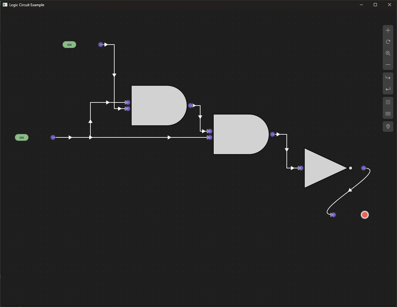
Logic Circuit
Overview
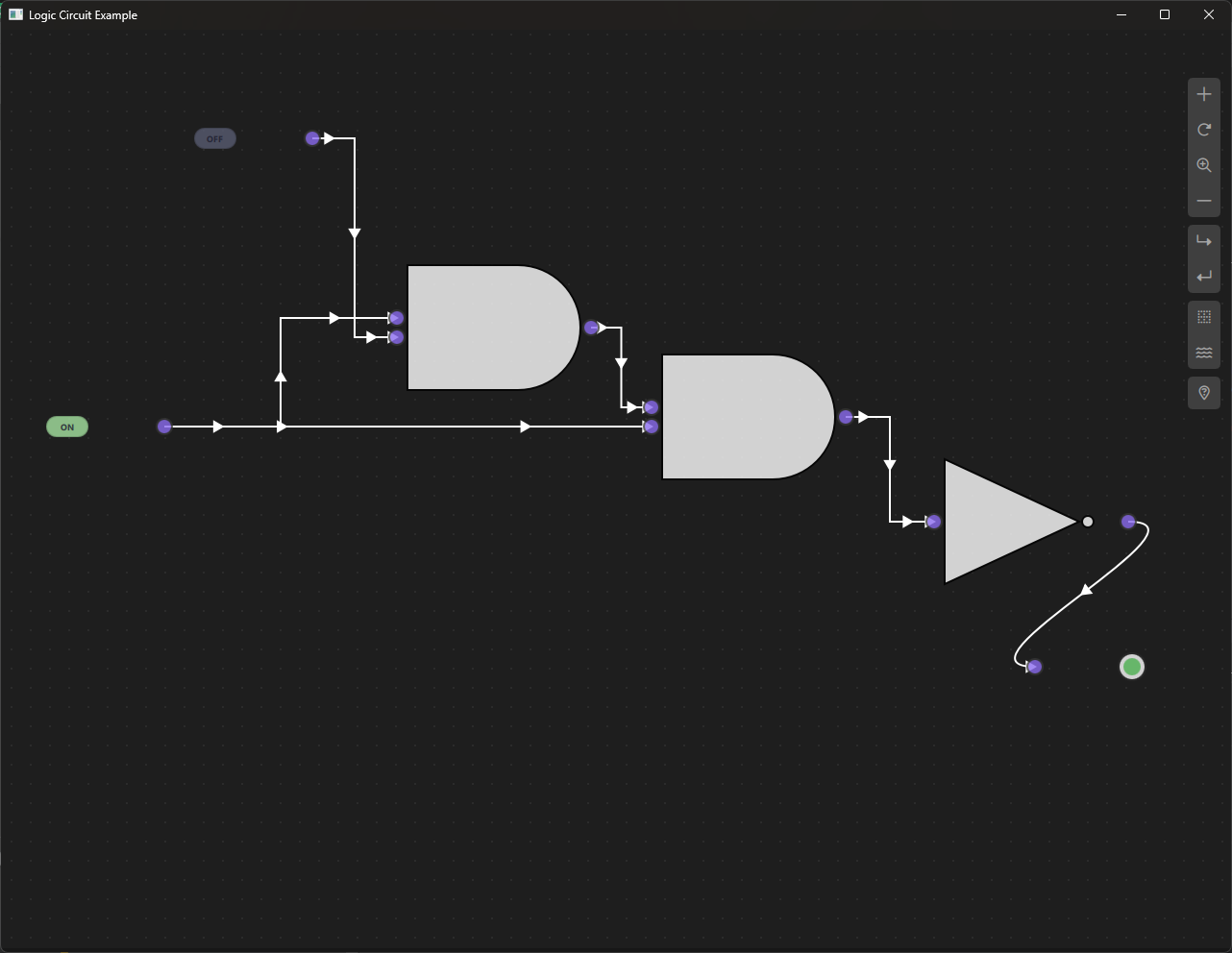
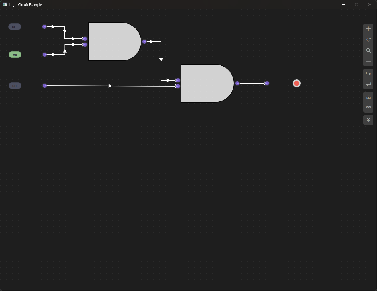
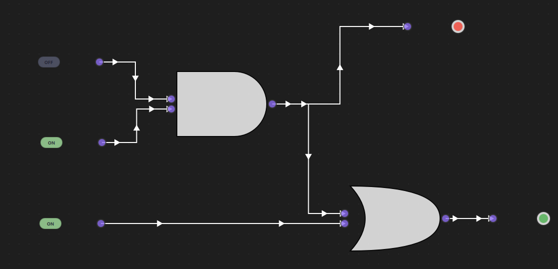
The Logic Circuit Example demonstrates how to build a visual digital logic circuit simulator using NodeLink. This example allows users to create, connect, and test digital logic gates (AND, OR, NOT) in a visual node-based interface. Users can toggle input switches and observe how signals propagate through the circuit in real-time, making it an excellent tool for learning digital logic, designing circuits, and understanding boolean algebra.
a. Purpose and Use Cases
Purpose
The Logic Circuit Example demonstrates:
-
Visual Circuit Design: Create digital logic circuits using a visual node-based interface without writing code.
-
Real-Time Signal Propagation: Observe how boolean signals (true/false) flow through gates and update outputs instantly.
-
Standard Logic Gates: Implement fundamental logic gates (AND, OR, NOT) with their standard symbols and truth tables.
-
Interactive Input/Output: Toggle input switches and see immediate results on output indicators.
-
Educational Tool: Learn digital logic concepts, boolean algebra, and circuit design principles visually.
-
Gate Symbol Rendering: Display logic gates using standard digital circuit symbols drawn with Canvas.
Use Cases
- Educational Tool: Teach digital logic, boolean algebra, and circuit design to students
- Circuit Prototyping: Quickly prototype and test logic circuits before implementation
- Learning Tool: Understand how logic gates work and how signals propagate
- Truth Table Verification: Test and verify truth tables for various gate combinations
- Circuit Design: Design and test combinational logic circuits
- Framework Demonstration: Showcase NodeLink's capabilities for building interactive simulators
Example Scenarios
- Basic Gate Testing: Test individual gates (AND, OR, NOT) with different input combinations
- Combinational Circuits: Build circuits like half-adders, full-adders, or multiplexers
- Boolean Expression Implementation: Convert boolean expressions into visual circuits
- Signal Propagation: Observe how signals flow through complex circuits
- Interactive Learning: Experiment with different circuit configurations and see results immediately
Real-World Applications
- Digital Electronics Education: Teach students about digital circuits and logic gates
- Circuit Design Tools: Prototype logic circuits before hardware implementation
- Boolean Logic Visualization: Visualize boolean expressions and their evaluation
- Hardware Design: Design and test logic for FPGAs, microcontrollers, or custom chips
- Troubleshooting: Debug logic circuits by visualizing signal flow
b. Node Types Explained
The Logic Circuit Example implements five distinct node types, each representing a fundamental component of digital logic circuits.
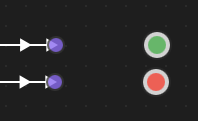
1. Input Node (InputNode)
Purpose: Provides boolean input values (ON/OFF) to the circuit through an interactive toggle switch.
Type ID: LSpecs.NodeType.Input (0)
Properties:
- Contains a single output port
- Has an interactive toggle switch that can be clicked
- Outputs true (ON) or false (OFF) boolean values
- Acts as the starting point for all signals in the circuit
Ports:
- Output Port: (Right side) - Emits the current state (true/false)
Properties:
- nodeData.currentState: Boolean value representing ON (true) or OFF (false)
- nodeData.output: Output value (same as currentState)
- nodeData.displayValue: String representation ("ON" or "OFF")
Behavior:
- Initializes to OFF (false) state
- Clicking the switch toggles between ON and OFF
- When toggled, updates the circuit by calling scene.updateLogic()
- Visual indicator shows green for ON, gray for OFF
Visual Appearance:
- Icon: Lightning bolt (⚡)
- Toggle Switch: Rounded rectangle with ON/OFF text
- Color: Green (#A6E3A1) when ON, Gray (#585B70) when OFF
- Interactive: Clickable to toggle state
Usage Example:
- Click Input node → Toggles from OFF to ON
- Output port emits true
- Connected gates receive the signal
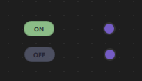
Truth Table:
| Input State | Output |
|-------------|--------|
| OFF | false |
| ON | true |
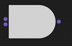
2. AND Gate (AndNode)
Purpose: Performs logical AND operation - output is true only when both inputs are true.
Type ID: LSpecs.NodeType.AND (1)
Properties:
- Has two input ports and one output port
- Implements boolean AND logic: output = inputA && inputB
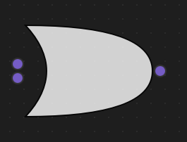
- Uses standard AND gate symbol (flat left side, curved right side)
Ports:
- Input Port A: (Left side, top)
- Input Port B: (Left side, bottom)
- Output Port: (Right side)
Properties:
- nodeData.inputA: First input value (boolean or null)
- nodeData.inputB: Second input value (boolean or null)
- nodeData.output: Result of AND operation (boolean or null)
Behavior:
- Waits for both inputs to be connected and have valid values
- Calculates: output = inputA && inputB
- Output is null if either input is missing
- Updates automatically when inputs change
Visual Appearance:
- Icon: AND symbol (∧)
- Gate Symbol: Standard AND gate shape (flat left, curved right)
- Drawn using Canvas with white fill and black border
- Color: Black border (#000000)
Usage Example:
- Input A: true, Input B: true → Output: true
- Input A: true, Input B: false → Output: false
- Input A: false, Input B: true → Output: false
- Input A: false, Input B: false → Output: false
Truth Table:
| Input A | Input B | Output |
|---------|---------|--------|
| false | false | false |
| false | true | false |
| true | false | false |
| true | true | true |
Code Implementation:
function updateData() {
    if (nodeData.inputA !== null && nodeData.inputB !== null) {
        nodeData.output = nodeData.inputA && nodeData.inputB;
    } else {
        nodeData.output = null;
    }
}
3. OR Gate (OrNode)
Purpose: Performs logical OR operation - output is true when at least one input is true.
Type ID: LSpecs.NodeType.OR (2)
Properties:
- Has two input ports and one output port
- Implements boolean OR logic: output = inputA || inputB
- Uses standard OR gate symbol (curved shape on both sides)
Ports:
- Input Port A: (Left side, top)
- Input Port B: (Left side, bottom)
- Output Port: (Right side)
Properties:
- nodeData.inputA: First input value (boolean or null)
- nodeData.inputB: Second input value (boolean or null)
- nodeData.output: Result of OR operation (boolean or null)
Behavior:
- Waits for both inputs to be connected and have valid values
- Calculates: output = inputA || inputB
- Output is null if either input is missing
- Updates automatically when inputs change
Visual Appearance:
- Icon: OR symbol (∨)
- Gate Symbol: Standard OR gate shape (curved on both sides)
- Drawn using Canvas with white fill and black border
- Color: Black border (#000000)
Usage Example:
- Input A: true, Input B: true → Output: true
- Input A: true, Input B: false → Output: true
- Input A: false, Input B: true → Output: true
- Input A: false, Input B: false → Output: false
Truth Table:
| Input A | Input B | Output |
|---------|---------|--------|
| false | false | false |
| false | true | true |
| true | false | true |
| true | true | true |
Code Implementation:
function updateData() {
if (nodeData.inputA !== null && nodeData.inputB !== null) {
nodeData.output = nodeData.inputA || nodeData.inputB;
} else {
nodeData.output = null;
}
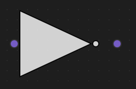
}4. NOT Gate (NotNode)
Purpose: Performs logical NOT operation (inversion) - output is the opposite of the input.
Type ID: LSpecs.NodeType.NOT (3)
Properties:
- Has one input port and one output port
- Implements boolean NOT logic: output = !inputA
- Uses standard NOT gate symbol (triangle with bubble)
Ports:
- Input Port: (Left side)
- Output Port: (Right side)
Properties:
- nodeData.inputA: Input value (boolean or null)
- nodeData.output: Result of NOT operation (boolean or null)
Behavior:
- Waits for input to be connected and have a valid value
- Calculates: output = !inputA
- Output is null if input is missing
- Updates automatically when input changes
Visual Appearance:
- Icon: NOT symbol (~)
- Gate Symbol: Triangle pointing right with a bubble (circle) on the output
- Drawn using Canvas with white fill and black border
- Color: Black border (#000000)
Usage Example:
- Input: true → Output: false
- Input: false → Output: true
Truth Table:
| Input | Output |
|-------|--------|
| false | true |
| true | false |
Code Implementation:
function updateData() {
    if (nodeData.inputA !== null) {
        nodeData.output = !nodeData.inputA;
    } else {
        nodeData.output = null;
    }
}
5. Output Node (OutputNode)
Purpose: Displays the final result of the logic circuit as a visual indicator (lamp).
Type ID: LSpecs.NodeType.Output (4)
Properties:
- Contains a single input port
- Displays the boolean value received from connected gates
- Shows visual indicator: Green (ON), Red (OFF), or Gray (UNDEFINED)
Ports:
- Input Port: (Left side) - Receives the calculated result
Properties:
- nodeData.inputA: Input value from connected gate (boolean or null)
- nodeData.displayValue: String representation ("ON", "OFF", or "UNDEFINED")
- nodeData.statusColor: Color for the indicator (green, red, or gray)
Behavior:
- Receives input from connected gate or node
- Displays "ON" (green) when input is true
- Displays "OFF" (red) when input is false
- Displays "UNDEFINED" (gray) when input is null or not connected
- Updates automatically when input changes
Visual Appearance:
- Icon: Circle (○)
- Indicator: Circular lamp with colored inner circle
- Colors:
- Green (#4CAF50) for ON (true)
- Red (#F44336) for OFF (false)
- Gray (#9E9E9E) for UNDEFINED (null)
- Smooth color transitions when state changes
Usage Example:
- Connected to AND gate output → Shows result of AND operation
- Connected to OR gate output → Shows result of OR operation
- Not connected → Shows "UNDEFINED" (gray)
Display States:
| Input Value | Display | Color |
|-------------|---------|-------|
| true | "ON" | Green (#4CAF50) |
| false | "OFF" | Red (#F44336) |
| null | "UNDEFINED" | Gray (#9E9E9E) |
Code Implementation:
function updateDisplay(value) {
    if (value === null) {
        nodeData.displayValue = "UNDEFINED";
    } else {
        nodeData.displayValue = value ? "ON" : "OFF";
    }
    nodeData.statusColor = getStatusColor(value);
}

function getStatusColor(value) {
    if (value === null) return "#9E9E9E"; // Gray
    return value ? "#4CAF50" : "#F44336"; // Green or Red
}
Node Type Summary Table
| Node Type | Type ID | Input Ports | Output Ports | Operation | Symbol |
|---|---|---|---|---|---|
| Input | 0 | 0 | 1 | Provides boolean input | ⚡ |
| AND | 1 | 2 | 1 | Logical AND (∧) | ∧ |
| OR | 2 | 2 | 1 | Logical OR (∨) | ∨ |
| NOT | 3 | 1 | 1 | Logical NOT (~) | ~ |
| Output | 4 | 1 | 0 | Displays result | ○ |
Data Flow Architecture
The logic circuit follows a signal propagation pattern:
Input Node (ON/OFF)
    ↓
Logic Gates (AND/OR/NOT)
    ↓
Output Node (Visual Indicator)
Signals propagate through the circuit in real-time, updating all downstream gates and outputs automatically.
 /p>
/p>
c. Step-by-Step Building Guide
This guide will walk you through building the Logic Circuit Example from scratch, explaining each component and how they work together.
Prerequisites
- Qt 6.2.4 or later (Qt 6.10.0 recommended)
- CMake 3.1.0 or later
- C++ compiler with C++14 support (MSVC 2019/2022 on Windows)
- NodeLink framework built and installed
- QtQuickStream module built and installed
- Basic understanding of boolean logic (helpful but not required)
Step 1: Project Setup
1.1 Create Project Structure
Create the following directory structure:
logicCircuit/
├── CMakeLists.txt
├── main.cpp
├── main.qml
└── resources/
    ├── Core/
    ├── View/
    └── fonts/
1.2 Configure CMakeLists.txt
Create CMakeLists.txt with the following configuration:
cmake_minimum_required(VERSION 3.1.0)

set(MODULE_NAME LogicCircuit)

set(CMAKE_AUTOMOC ON)
set(CMAKE_CXX_STANDARD_REQUIRED ON)

# Configure Qt
find_package(QT NAMES Qt6 Qt5 COMPONENTS Core Gui QuickControls2 REQUIRED)
find_package(Qt${QT_VERSION_MAJOR} COMPONENTS Core Gui QuickControls2 REQUIRED)

list(APPEND QML_IMPORT_PATH ${CMAKE_BINARY_DIR}/qml)

# Create executable
qt_add_executable(${MODULE_NAME} main.cpp)

# Set LSpecs as singleton
set_source_files_properties(
    resources/Core/LSpecs.qml
    PROPERTIES
        QT_QML_SINGLETON_TYPE True
)

# Define QML module
qt_add_qml_module(${MODULE_NAME}
    URI "LogicCircuit"
    VERSION 1.0
    QML_FILES
        main.qml
        resources/Core/LSpecs.qml
        resources/Core/LogicCircuitScene.qml
        resources/Core/InputNode.qml
        resources/Core/LogicNode.qml
        resources/Core/AndNode.qml
        resources/Core/OrNode.qml
        resources/Core/NotNode.qml
        resources/Core/OutputNode.qml
        resources/Core/LogicNodeData.qml
        resources/View/LogicCircuitView.qml
        resources/View/LogicCircuitNodeView.qml
    RESOURCES
        resources/fonts/Font\ Awesome\ 6\ Pro-Thin-100.otf
        resources/fonts/Font\ Awesome\ 6\ Pro-Solid-900.otf
        resources/fonts/Font\ Awesome\ 6\ Pro-Regular-400.otf
        resources/fonts/Font\ Awesome\ 6\ Pro-Light-300.otf
)

target_include_directories(${MODULE_NAME} PUBLIC
    Qt${QT_VERSION_MAJOR}::QuickControls2)

target_link_libraries(${MODULE_NAME} PRIVATE
    Qt${QT_VERSION_MAJOR}::Core
    Qt${QT_VERSION_MAJOR}::Gui
    Qt${QT_VERSION_MAJOR}::QuickControls2
    NodeLinkplugin
    QtQuickStreamplugin
)
Key Points:
- Links to NodeLinkplugin and QtQuickStreamplugin
- Sets LSpecs.qml as a singleton for global access
- Includes Font Awesome fonts for icons
- Includes LogicNode.qml as a base class
Step 2: Create Specifications (LSpecs.qml)
Create resources/Core/LSpecs.qml - a singleton that defines node type constants:
pragma Singleton
import QtQuick

QtObject {
    enum NodeType {
        Input   = 0,
        AND     = 1,
        OR      = 2,
        NOT     = 3,
        Output  = 4,
        Logic   = 5,
        Unknown = 99
    }

    enum OperationType {
        AND     = 0,
        OR      = 1,
        NOT     = 2,
        Unknown = 99
    }

    enum BooleanState {
        FALSE = 0,
        TRUE  = 1,
        UNDEFINED = 2
    }
}Purpose: Provides type-safe constants for node types, operations, and boolean states.
Step 3: Create Node Data Models
3.1 LogicNodeData.qml
Create resources/Core/LogicNodeData.qml - data model for logic nodes:
import QtQuick
import NodeLink

I_NodeData {
    // Input values for logic gates
    property var inputA: null
    property var inputB: null

    // Output value
    property var output: null

    // For InputNode: current state (true=ON, false=OFF)
    property bool currentState: false

    // For display purposes
    property string displayValue: "OFF"

    // Status color for visualization (used by OutputNode)
    property color statusColor: "#9E9E9E"
}Purpose: Extends I_NodeData to store input/output values and display information for logic gates.
Step 4: Create Base Node Type
4.1 LogicNode.qml
Create resources/Core/LogicNode.qml - base class for all logic nodes:
import QtQuick
import NodeLink
import LogicCircuit

Node {
    id: root
    property int nodeType: LSpecs.NodeType.AND

    type: LSpecs.NodeType.Logic
    nodeData: LogicNodeData {}

    property var logicScene: null

    guiConfig.autoSize: false
    guiConfig.minWidth: 20
    guiConfig.minHeight: 20

    Component.onCompleted: {
        addPorts();
    }

    function addPorts() {
        if (nodeType == LSpecs.NodeType.OR || nodeType == LSpecs.NodeType.AND) {
            addPortsInput();
            addPortsInput();
            addPortsOutput();
        } else if (nodeType == LSpecs.NodeType.Input) {
            addPortsOutput();
        } else if (nodeType == LSpecs.NodeType.Output) {
            addPortsInput();
        } else if (nodeType == LSpecs.NodeType.NOT) {
            addPortsInput();
            addPortsOutput();
        }
    }

    function addPortsInput() {
        let inputPort = NLCore.createPort();
        inputPort.portType = NLSpec.PortType.Input;
        inputPort.portSide = NLSpec.PortPositionSide.Left;
        inputPort.title = "";
        addPort(inputPort);
    }

    function addPortsOutput() {
        let outputPort = NLCore.createPort();
        outputPort.portType = NLSpec.PortType.Output;
        outputPort.portSide = NLSpec.PortPositionSide.Right;
        outputPort.title = "";
        addPort(outputPort);
    }
}
Key Features:
- Base class for all logic nodes
- Dynamically adds ports based on node type
- AND/OR gates: 2 inputs, 1 output
- NOT gate: 1 input, 1 output
- Input node: 1 output
- Output node: 1 input
Step 5: Create Specific Node Types
5.1 InputNode.qml
Create resources/Core/InputNode.qml:
import QtQuick
import NodeLink
import LogicCircuit

LogicNode {
    nodeType: LSpecs.NodeType.Input

    Component.onCompleted: {
        nodeData.currentState = false;
        nodeData.output = false;
        nodeData.displayValue = "OFF";
    }

    function toggleState() {
        nodeData.currentState = !nodeData.currentState;
        nodeData.output = nodeData.currentState;
        nodeData.displayValue = nodeData.currentState ? "ON" : "OFF";

        // Update the entire circuit
        var mainScene = _qsRepo ? _qsRepo.qsRootObject : null;
        if (mainScene && mainScene.updateLogic) {
            mainScene.updateLogic();
        }
    }
}
Key Features:
- Toggleable switch for ON/OFF state
- Updates circuit when toggled
- Initializes to OFF state
5.2 AndNode.qml
Create resources/Core/AndNode.qml:
import QtQuick
import NodeLink
import LogicCircuit

LogicNode {
    nodeType: LSpecs.NodeType.AND

    function updateData() {
        if (nodeData.inputA !== null && nodeData.inputB !== null) {
            nodeData.output = nodeData.inputA && nodeData.inputB;
        } else {
            nodeData.output = null;
        }
    }
}
Key Features:
- Implements AND logic: output = inputA && inputB
- Returns null if inputs are incomplete
5.3 OrNode.qml
Create resources/Core/OrNode.qml:
import QtQuick
import NodeLink
import LogicCircuit

LogicNode {
    nodeType: LSpecs.NodeType.OR

    function updateData() {
        if (nodeData.inputA !== null && nodeData.inputB !== null) {
            nodeData.output = nodeData.inputA || nodeData.inputB;
        } else {
            nodeData.output = null;
        }
    }
}
Key Features:
- Implements OR logic: output = inputA || inputB
- Returns null if inputs are incomplete
5.4 NotNode.qml
Create resources/Core/NotNode.qml:
import QtQuick
import NodeLink
import LogicCircuit

LogicNode {
    nodeType: LSpecs.NodeType.NOT

    function updateData() {
        if (nodeData.inputA !== null) {
            nodeData.output = !nodeData.inputA;
        } else {
            nodeData.output = null;
        }
    }
}
Key Features:
- Implements NOT logic: output = !inputA
- Returns null if input is missing
5.5 OutputNode.qml
Create resources/Core/OutputNode.qml:
import QtQuick
import NodeLink
import LogicCircuit

LogicNode {
    nodeType: LSpecs.NodeType.Output


property color undefinedColor: "#9E9E9E"
property color offColor: "#F44336"
property color onColor: "#4CAF50"

Component.onCompleted: {
    guiConfig.color = "#2A2A2A";
    updateDisplay(nodeData.inputA);
}

function updateDisplay(value) {
    if (value === null) {
        nodeData.displayValue = "UNDEFINED";
    } else {
        nodeData.displayValue = value ? "ON" : "OFF";
    }
    nodeData.statusColor = getStatusColor(value);
}

function getStatusColor(value) {
    if (value === null) return undefinedColor;
    return value ? onColor : offColor;
}

function updateData() {
    updateDisplay(nodeData.inputA);
}
Key Features:
- Displays input value as colored indicator
- Green for ON, Red for OFF, Gray for UNDEFINED
- Smooth color transitions
Step 6: Create the Scene
6.1 LogicCircuitScene.qml
Create resources/Core/LogicCircuitScene.qml - the main scene that manages nodes, links, and signal propagation:
import QtQuick
import QtQuick.Controls
import NodeLink
import LogicCircuit

I_Scene {
    id: scene

    property color borderColor: "#000000"

    nodeRegistry: NLNodeRegistry {
        _qsRepo: scene._qsRepo
        imports: ["LogicCircuit"]
        defaultNode: LSpecs.NodeType.Input

        nodeTypes: [
            LSpecs.NodeType.Input   = "InputNode",
            LSpecs.NodeType.AND     = "AndNode",
            LSpecs.NodeType.OR      = "OrNode",
            LSpecs.NodeType.NOT     = "NotNode",
            LSpecs.NodeType.Output  = "OutputNode"
        ]

        nodeNames: [
            LSpecs.NodeType.Input   = "Input",
            LSpecs.NodeType.AND     = "AND Gate",
            LSpecs.NodeType.OR      = "OR Gate",
            LSpecs.NodeType.NOT     = "NOT Gate",
            LSpecs.NodeType.Output  = "Output"
        ]

        nodeIcons: [
            LSpecs.NodeType.Input   = "⚡",
            LSpecs.NodeType.AND     = "∧",
            LSpecs.NodeType.OR      = "∨",
            LSpecs.NodeType.NOT     = "~",
            LSpecs.NodeType.Output  = "○"
        ]

        nodeColors: [
            LSpecs.NodeType.Input   = borderColor,
            LSpecs.NodeType.AND     = borderColor,
            LSpecs.NodeType.OR      = borderColor,
            LSpecs.NodeType.NOT     = borderColor,
            LSpecs.NodeType.Output  = borderColor
        ]
    }

    selectionModel: SelectionModel {
        existObjects: [...Object.keys(nodes), ...Object.keys(links)]
    }

    property UndoCore _undoCore: UndoCore {
        scene: scene
    }

    // Update logic when connections change
    onLinkRemoved: updateLogic();
    onNodeRemoved: updateLogic();
    onLinkAdded: updateLogic();

    function createCustomizeNode(nodeType, xPos, yPos) {
        var title = nodeRegistry.nodeNames[nodeType] + "_" +
                   (Object.values(scene.nodes).filter(node => node.type === nodeType).length + 1);
        return createSpecificNode(nodeRegistry.imports, nodeType,
                                 nodeRegistry.nodeTypes[nodeType],
                                 nodeRegistry.nodeColors[nodeType],
                                 title, xPos, yPos);
    }

    // Update all logic in the circuit
    function updateLogic() {
        // Reset all operation nodes
        Object.values(nodes).forEach(node => {
            if (node.type === LSpecs.NodeType.AND ||
                node.type === LSpecs.NodeType.OR ||
                node.type === LSpecs.NodeType.NOT) {
                node.nodeData.inputA = null;
                node.nodeData.inputB = null;
                node.nodeData.output = null;
            }
            if (node.type === LSpecs.NodeType.Output) {
                node.nodeData.inputA = null;
                node.nodeData.displayValue = "UNDEFINED";
            }
        });

        // Track connections to prevent same upstream node connecting to multiple inputs
        var connectionMap = {};

        // Propagate values through the circuit (iterative approach)
        var maxIterations = 999;
        var changed = true;

        for (var i = 0; i < maxIterations && changed; i++) {
            changed = false;

            Object.values(links).forEach(link => {
                var upstreamNode = findNode(link.inputPort._qsUuid);
                var downstreamNode = findNode(link.outputPort._qsUuid);

                if (upstreamNode && downstreamNode && upstreamNode.nodeData.output !== null) {
                    var connectionKey = downstreamNode._qsUuid + "_" + upstreamNode._qsUuid;

                    // Handle 2-input gates (AND, OR)
                    if (downstreamNode.type === LSpecs.NodeType.AND ||
                        downstreamNode.type === LSpecs.NodeType.OR) {

                        if (downstreamNode.nodeData.inputA === null && !connectionMap[connectionKey + "_A"]) {
                            downstreamNode.nodeData.inputA = upstreamNode.nodeData.output;
                            connectionMap[connectionKey + "_A"] = true;
                            changed = true;
                        } else if (downstreamNode.nodeData.inputB === null && !connectionMap[connectionKey + "_B"]) {
                            // Ensure inputB comes from a different node than inputA
                            var inputAUpstream = null;
                            Object.keys(connectionMap).forEach(key => {
                                if (key.startsWith(downstreamNode._qsUuid) && key.endsWith("_A")) {
                                    var upstreamId = key.split("_")[1];
                                    inputAUpstream = upstreamId;
                                }
                            });

                            if (inputAUpstream !== upstreamNode._qsUuid) {
                                downstreamNode.nodeData.inputB = upstreamNode.nodeData.output;
                                connectionMap[connectionKey + "_B"] = true;
                                changed = true;
                            }
                        }

                    // Handle single-input gates (NOT, Output)
                    } else if (downstreamNode.type === LSpecs.NodeType.NOT ||
                              downstreamNode.type === LSpecs.NodeType.Output) {
                        if (downstreamNode.nodeData.inputA === null) {
                            downstreamNode.nodeData.inputA = upstreamNode.nodeData.output;
                            changed = true;
                        }
                    }

                    // Update downstream node if it has all required inputs
                    if (downstreamNode.updateData) {
                        var canUpdate = false;
                        switch(downstreamNode.type) {
                            case LSpecs.NodeType.AND:
                            case LSpecs.NodeType.OR:
                                canUpdate = (downstreamNode.nodeData.inputA !== null &&
                                           downstreamNode.nodeData.inputB !== null);
                                break;
                            case LSpecs.NodeType.NOT:
                            case LSpecs.NodeType.Output:
                                canUpdate = (downstreamNode.nodeData.inputA !== null);
                                break;
                        }

                        if (canUpdate) {
                            downstreamNode.updateData();
                        }
                    }
                }
            });
        }
    }

    // Link validation
    function linkNodes(portA, portB) {
        if (canLinkNodes(portA, portB)) {
            createLink(portA, portB);
            updateLogic();
        }
    }

    function canLinkNodes(portA, portB) {
        if (portA.length === 0 || portB.length === 0) return false;

        var portAObj = findPort(portA);
        var portBObj = findPort(portB);

        if (portAObj.portType !== NLSpec.PortType.Output) return false;
        if (portBObj.portType !== NLSpec.PortType.Input) return false;

        // Prevent duplicate links
        var sameLinks = Object.values(links).filter(link =>
            link.inputPort._qsUuid === portA && link.outputPort._qsUuid === portB);
        if (sameLinks.length > 0) return false;

        // Input port can only have one connection
        var portBObjLinks = Object.values(links).filter(link =>
            link.outputPort._qsUuid === portB);
        if (portBObjLinks.length > 0) return false;

        // Prevent self-connection
        var nodeA = findNodeId(portA);
        var nodeB = findNodeId(portB);
        if (nodeA === nodeB) return false;

        return true;
    }
}
Key Features:
- Node Registry: Defines all gate types with symbols and colors
- Signal Propagation: Iterative algorithm that propagates signals through the circuit
- Connection Management: Prevents same upstream node from connecting to multiple inputs of same gate
- Real-Time Updates: Updates all gates when connections or inputs change
Signal Propagation Algorithm:
1. Reset all gate inputs/outputs
2. Iteratively propagate signals from inputs to outputs
3. For each link, if upstream has output, set downstream input
4. Update downstream gate if all inputs are ready
5. Repeat until no more changes occur (or max iterations)
Step 7: Create Views
7.1 LogicCircuitNodeView.qml
Create resources/View/LogicCircuitNodeView.qml - custom view that renders gate symbols:
import QtQuick
import QtQuick.Controls
import NodeLink
import LogicCircuit

NodeView {
    id: nodeView

    // Remove default rectangle background
    color: "transparent"
    border.width: 0
    radius: 0
    isResizable: false

    contentItem: Item {
        // Input Node: Toggle switch
        Rectangle {
            anchors.centerIn: parent
            visible: node.type === LSpecs.NodeType.Input
            width: Math.min(44, parent.width * 0.8)
            height: Math.min(22, parent.height * 0.4)
            radius: height / 2
            color: node.nodeData.currentState ? "#A6E3A1" : "#585B70"
            border.color: Qt.darker(color, 1.2)
            border.width: 1

            Text {
                anchors.centerIn: parent
                text: node.nodeData.currentState ? "ON" : "OFF"
                color: "#1E1E2E"
                font.bold: true
                font.pixelSize: Math.max(8, parent.height * 0.4)
            }

            MouseArea {
                anchors.fill: parent
                cursorShape: Qt.PointingHandCursor
                onClicked: node.toggleState && node.toggleState()
            }
        }

        // Output Node: Lamp indicator
        Rectangle {
            anchors.centerIn: parent
            visible: node.type === LSpecs.NodeType.Output
            width: Math.min(30, parent.width * 0.6)
            height: Math.min(30, parent.height * 0.6)
            radius: width / 2
            color: "white"
            border.color: "#2A2A2A"
            border.width: 2

            Rectangle {
                anchors.centerIn: parent
                width: parent.width * 0.6
                height: parent.height * 0.6
                radius: width / 2
                color: node.nodeData ? node.nodeData.statusColor : "#9E9E9E"

                Behavior on color {
                    ColorAnimation { duration: 200 }
                }
            }
        }

        // Gate symbols (AND, OR, NOT) using Canvas
        Loader {
            id: gateLoader
            anchors.fill: parent
            sourceComponent: {
                switch (node.type) {
                case LSpecs.NodeType.AND:  return andGate
                case LSpecs.NodeType.OR:   return orGate
                case LSpecs.NodeType.NOT:  return notGate
                default: return null
                }
            }
        }

        // AND Gate Component
        Component {
            id: andGate
            Canvas {
                anchors.fill: parent
                onPaint: {
                    var ctx = getContext("2d");
                    ctx.reset();
                    ctx.clearRect(0, 0, width, height);

                    ctx.fillStyle = "white";
                    ctx.strokeStyle = "black";
                    ctx.lineWidth = 2;

                    var margin = width * 0.05;
                    var leftX = margin;
                    var topY = margin;
                    var bottomY = height - margin;
                    var centerY = height / 2;
                    var radius = (height - 2 * margin) / 2;
                    var flatRightX = width - margin - radius;

                    ctx.beginPath();
                    ctx.moveTo(leftX, topY);
                    ctx.lineTo(flatRightX, topY);
                    ctx.arc(flatRightX, centerY, radius, -Math.PI/2, Math.PI/2, false);
                    ctx.lineTo(leftX, bottomY);
                    ctx.closePath();
                    ctx.fill();
                    ctx.stroke();
                }
                onWidthChanged: requestPaint()
                onHeightChanged: requestPaint()
            }
        }

        // OR Gate Component
        Component {
            id: orGate
            Canvas {
                anchors.fill: parent
                onPaint: {
                    var ctx = getContext("2d");
                    ctx.reset();
                    ctx.clearRect(0, 0, width, height);

                    ctx.fillStyle = "white";
                    ctx.strokeStyle = "black";
                    ctx.lineWidth = 2;

                    var margin = width * 0.05;
                    var leftX = margin;
                    var rightX = width - margin;
                    var topY = margin;
                    var bottomY = height - margin;
                    var midY = height / 2;

                    ctx.beginPath();
                    ctx.moveTo(leftX, topY);
                    ctx.quadraticCurveTo(rightX, topY, rightX, midY);
                    ctx.quadraticCurveTo(rightX, bottomY, leftX, bottomY);
                    ctx.quadraticCurveTo(leftX + (width * 0.3), midY, leftX, topY);
                    ctx.closePath();
                    ctx.fill();
                    ctx.stroke();
                }
                onWidthChanged: requestPaint()
                onHeightChanged: requestPaint()
            }
        }

        // NOT Gate Component
        Component {
            id: notGate
            Canvas {
                anchors.fill: parent
                onPaint: {
                    var ctx = getContext("2d");
                    ctx.reset();
                    ctx.clearRect(0, 0, width, height);

                    ctx.fillStyle = "white";
                    ctx.strokeStyle = "black";
                    ctx.lineWidth = 2;

                    var margin = width * 0.05;
                    var leftX = margin;
                    var topY = margin;
                    var bottomY = height - margin;
                    var midY = height / 2;
                    var triangleRight = width - margin - (width * 0.2);
                    var bubbleRadius = Math.min(6, height * 0.1);

                    // Triangle
                    ctx.beginPath();
                    ctx.moveTo(leftX, topY);
                    ctx.lineTo(triangleRight, midY);
                    ctx.lineTo(leftX, bottomY);
                    ctx.closePath();
                    ctx.fill();
                    ctx.stroke();

                    // Bubble
                    ctx.beginPath();
                    ctx.arc(triangleRight + bubbleRadius * 1.5, midY, bubbleRadius, 0, Math.PI * 2);
                    ctx.fill();
                    ctx.stroke();
                }
                onWidthChanged: requestPaint()
                onHeightChanged: requestPaint()
            }
        }
    }
}
Key Features:
- Gate Symbols: Renders standard logic gate symbols using Canvas
- Input Switch: Interactive toggle switch for Input nodes
- Output Lamp: Colored indicator for Output nodes
- No Background: Transparent background to show only gate symbols
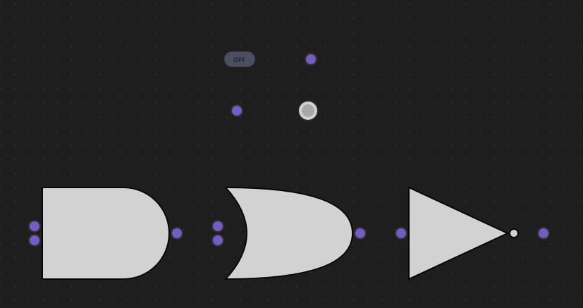
7.2 LogicCircuitView.qml
Create resources/View/LogicCircuitView.qml - main view container:
import QtQuick
import QtQuick.Controls
import NodeLink
import QtQuickStream
import LogicCircuit

Item {
    id: view
    property LogicCircuitScene scene

    property SceneSession sceneSession: SceneSession {
        enabledOverview: false
        doNodesNeedImage: false
    }

    // Nodes Scene (flickable canvas)
    NodesScene {
        id: nodesScene
        anchors.fill: parent
        scene: view.scene
        sceneSession: view.sceneSession
        sceneContent: NodesRect {
            scene: view.scene
            sceneSession: view.sceneSession
            nodeViewComponent: Qt.createComponent("LogicCircuitNodeView.qml")
        }
    }

    // Side menu for adding nodes
    SideMenu {
        scene: view.scene
        sceneSession: view.sceneSession
        anchors.right: parent.right
        anchors.rightMargin: 45
        anchors.top: parent.top
        anchors.topMargin: 50
    }
}
Key Features:
- NodesScene: Provides the scrollable canvas for gates
- SideMenu: Allows users to add new gates to the circuit
- SceneSession: Manages view state and interactions
Step 8: Create Main Application
8.1 main.cpp
Create main.cpp:
#include <QtGui/QGuiApplication>
#include <QQmlApplicationEngine>
#include <QQuickStyle>

int main(int argc, char* argv[])
{
    QGuiApplication app(argc, argv);
    QQmlApplicationEngine engine;

    QQuickStyle::setStyle("Material");
    engine.addImportPath(":/");

    const QUrl url(u"qrc:/LogicCircuit/main.qml"_qs);
    QObject::connect(&engine, &QQmlApplicationEngine::objectCreated,
                     &app, [url](QObject *obj, const QUrl &objUrl) {
        if (!obj && url == objUrl)
            QCoreApplication::exit(-1);
    }, Qt::QueuedConnection);
    engine.load(url);

    return app.exec();
}
8.2 main.qml
Create main.qml:
import QtQuick
import QtQuick.Dialogs
import QtQuick.Controls

import QtQuickStream
import NodeLink
import LogicCircuit

Window {
    id: window
    property LogicCircuitScene scene: null

    width: 1280
    height: 960
    visible: true
    title: qsTr("Logic Circuit Example")
    color: "#1e1e1e"

    Material.theme: Material.Dark
    Material.accent: "#4890e2"

    Component.onCompleted: {
        NLCore.defaultRepo = NLCore.createDefaultRepo(["QtQuickStream", "LogicCircuit"])
        NLCore.defaultRepo.initRootObject("LogicCircuitScene");
        window.scene = Qt.binding(function() {
            return NLCore.defaultRepo.qsRootObject;
        });
    }

    // Load Font Awesome fonts
    FontLoader { source: "qrc:/LogicCircuit/resources/fonts/Font Awesome 6 Pro-Thin-100.otf" }
    FontLoader { source: "qrc:/LogicCircuit/resources/fonts/Font Awesome 6 Pro-Solid-900.otf" }
    FontLoader { source: "qrc:/LogicCircuit/resources/fonts/Font Awesome 6 Pro-Regular-400.otf" }
    FontLoader { source: "qrc:/LogicCircuit/resources/fonts/Font Awesome 6 Pro-Light-300.otf" }

    // Main view
    LogicCircuitView {
        id: view
        scene: window.scene
        anchors.fill: parent
    }
}
Key Features:
- Dark Theme: Material Dark theme with custom accent color
- Scene Initialization: Creates the LogicCircuitScene using QtQuickStream
- Full-Screen View: LogicCircuitView fills the window
Step 9: Build and Run
9.1 Configure Build
-
Create a build directory:
bash mkdir build cd build -
Configure with CMake:
bash cmake .. -DCMAKE_PREFIX_PATH=<Qt_Install_Path> -
Build the project:
bash
                        cmake --build .
9.2 Run the Application
Run the executable:
./LogicCircuit  # Linux/Mac
LogicCircuit.exe  # Windows
Step 10: Using the Logic Circuit
Basic Usage
- Add Nodes:
- Click the side menu to add gates
- You'll need: Input nodes, Logic gates (AND/OR/NOT), Output nodes
- Connect Gates:
- Click and drag from an output port (right side)
- Release on an input port (left side)
- A link will be created if the connection is valid
- Toggle Inputs:
- Click on Input nodes to toggle between ON and OFF
- The circuit updates automatically
- Observe Outputs:
- Output nodes show the result:
- Green = ON (true)
- Red = OFF (false)
- Gray = UNDEFINED (not connected or invalid)
- Output nodes show the result:
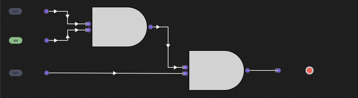
Example: Simple AND Circuit
Setup:
1. Add two Input nodes
2. Add one AND gate
3. Add one Output node
Connections:
- Input 1 → AND (input A)
- Input 2 → AND (input B)
- AND → Output
Test:
- Both Inputs ON → Output: Green (ON)
- One Input OFF → Output: Red (OFF)
- Both Inputs OFF → Output: Red (OFF)
Example: OR Circuit
Setup:
1. Add two Input nodes
2. Add one OR gate
3. Add one Output node
Connections:
- Input 1 → OR (input A)
- Input 2 → OR (input B)
- OR → Output
Test:
- At least one Input ON → Output: Green (ON)
- Both Inputs OFF → Output: Red (OFF)
Example: NOT Circuit
Setup:
1. Add one Input node
2. Add one NOT gate
3. Add one Output node
Connections:
- Input → NOT
- NOT → Output
Test:
- Input ON → Output: Red (OFF) - inverted
- Input OFF → Output: Green (ON) - inverted
Example: Complex Circuit (A AND (B OR C))
Setup:
1. Add three Input nodes (A, B, C)
2. Add one OR gate
3. Add one AND gate
4. Add one Output node
Connections:
- Input B → OR (input A)
- Input C → OR (input B)
- Input A → AND (input A)
- OR → AND (input B)
- AND → Output
Test:
- A=ON, B=ON, C=OFF → Output: Green (ON)
- A=ON, B=OFF, C=ON → Output: Green (ON)
- A=OFF, B=ON, C=ON → Output: Red (OFF)
- A=ON, B=OFF, C=OFF → Output: Red (OFF)
Architecture Overview
Component Hierarchy
LogicCircuitScene (I_Scene)
├── NodeRegistry (defines gate types)
├── SelectionModel (manages selection)
├── UndoCore (undo/redo support)
└── Nodes & Links
    ├── InputNode (toggle switches)
    ├── Logic Gates (AND, OR, NOT)
    └── OutputNode (visual indicators)

LogicCircuitView
├── NodesScene (canvas)
│   └── NodesRect (renders gates)
│       └── LogicCircuitNodeView (custom gate UI)
└── SideMenu (add gates)
Signal Propagation
The circuit uses an iterative propagation algorithm:
- Reset Phase: All gate inputs/outputs are reset to null
- Propagation Phase:
- For each link, if upstream has output, set downstream input
- Update downstream gate if all inputs are ready
- Repeat until no more changes occur
- Update Phase: All gates calculate their outputs based on inputs
This ensures signals propagate correctly through the circuit, even with complex topologies.

Key Concepts
Boolean Logic
The circuit implements fundamental boolean operations:
- AND: Output is true only when both inputs are true
- OR: Output is true when at least one input is true
- NOT: Output is the inverse of the input
Signal Propagation
Signals flow from Input nodes through gates to Output nodes:
- Input nodes provide boolean values (true/false)
- Gates process inputs and produce outputs
- Output nodes display the final result
Gate Symbols
Gates are rendered using standard digital circuit symbols:
- AND: Flat left side, curved right side
- OR: Curved on both sides
- NOT: Triangle with bubble on output
Connection Rules
- Each input port can only have one connection
- Output ports can connect to multiple inputs
- Cannot create cycles (prevents infinite loops)
- Cannot connect a node to itself
Extending the Logic Circuit
Adding New Gates
To add a new gate (e.g., NAND, NOR, XOR):
- Add to LSpecs.qml:
qml enum NodeType { // ... existing NAND = 5, NOR = 6, XOR = 7 } - Create NandNode.qml:
import QtQuick import NodeLink import LogicCircuit LogicNode { nodeType: LSpecs.NodeType.NAND function updateData() { if (nodeData.inputA !== null && nodeData.inputB !== null) { nodeData.output = !(nodeData.inputA && nodeData.inputB); } else { nodeData.output = null; } } } - Add Canvas Component in LogicCircuitNodeView.qml for the symbol
- Register in LogicCircuitScene.qml
Customizing Gate Appearance
- Modify Canvas drawing code in
LogicCircuitNodeView.qml - Change colors in
OutputNode.qml - Adjust sizes in
LogicNode.qmlguiConfig
Adding Truth Table Display
Create a component that shows the truth table for selected gates:
- Display all input combinations
- Show corresponding outputs
- Update in real-time as inputs change
Troubleshooting
Common Issues
- Output Shows UNDEFINED:
- Check that all inputs are connected
- Verify gates have all required inputs
- Ensure Input nodes are toggled ON/OFF
- Signals Not Propagating:
- Check for cycles in the circuit
- Verify connections are valid
- Ensure gates have all inputs connected
- Gate Not Updating:
- Toggle an Input node to trigger update
- Check that connections are properly established
- Verify gate has all required inputs
- Visual Issues:
- Gate symbols not rendering: Check Canvas code
- Colors not updating: Verify statusColor property
- Ports not visible: Check port creation code
Debug Tips
- Enable console logging in
LogicCircuitScene.qml - Check node data:
console.log(node.nodeData.output) - Verify connections:
console.log(link.inputPort, link.outputPort) - Monitor signal propagation: Add logs in
updateLogic()
Truth Tables Reference
AND Gate
| A | B | Output |
|---|---|---|
| 0 | 0 | 0 |
| 0 | 1 | 0 |
| 1 | 0 | 0 |
| 1 | 1 | 1 |
OR Gate
| A | B | Output |
|---|---|---|
| 0 | 0 | 0 |
| 0 | 1 | 1 |
| 1 | 0 | 1 |
| 1 | 1 | 1 |
NOT Gate
| A | Output |
|---|---|
| 0 | 1 |
| 1 | 0 |
Common Combinations
NAND (NOT AND): !(A && B)
| A | B | Output |
|---|---|--------|
| 0 | 0 | 1 |
| 0 | 1 | 1 |
| 1 | 0 | 1 |
| 1 | 1 | 0 |
NOR (NOT OR): !(A || B)
| A | B | Output |
|---|---|--------|
| 0 | 0 | 1 |
| 0 | 1 | 0 |
| 1 | 0 | 0 |
| 1 | 1 | 0 |
XOR (Exclusive OR): (A && !B) || (!A && B)
| A | B | Output |
|---|---|--------|
| 0 | 0 | 0 |
| 0 | 1 | 1 |
| 1 | 0 | 1 |
| 1 | 1 | 0 |
Conclusion
The Logic Circuit Example demonstrates how to build an interactive digital logic simulator using NodeLink. Key takeaways:
- Visual Circuit Design: Create logic circuits without writing code
- Real-Time Simulation: See signal propagation instantly
- Standard Symbols: Use industry-standard gate symbols
- Educational Value: Learn digital logic concepts visually
- Extensible Design: Easy to add new gates and features
This example serves as a foundation for building more sophisticated circuit simulators, such as:
- Sequential logic circuits (flip-flops, registers)
- Arithmetic circuits (adders, multipliers)
- Memory circuits
- Complex digital systems
For more examples, see the other examples in the NodeLink repository.
Chatbot Example
Overview
The Chatbot Example demonstrates how to build an interactive chatbot application using NodeLink's visual node-based programming system. Unlike traditional chatbots that rely on hardcoded logic, this example shows how to create a rule-based chatbot using regular expressions (Regex) and visual node connections. Users can define conversation patterns visually by connecting nodes, making it easy to design and modify chatbot behavior without writing complex code.
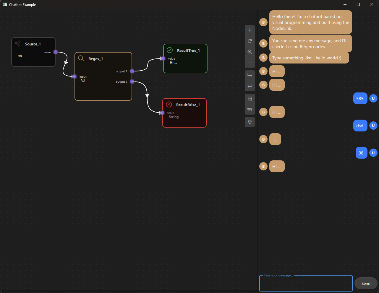
a. Purpose and Use Cases
Purpose
The Chatbot Example demonstrates:
-
Visual Rule-Based Chatbots: Shows how to create chatbots using visual node graphs instead of traditional programming approaches.
-
Pattern Matching with Regex: Illustrates how to use regular expressions to match user input and trigger appropriate responses.
-
Conditional Response Logic: Demonstrates branching logic where different responses are triggered based on pattern matching results.
-
Interactive User Interface: Combines a node-based editor with a real-time chat interface, allowing users to see their chatbot in action.
-
Real-Time Data Flow: Shows how user input flows through the node graph, gets processed, and generates responses in real-time.
-
Dual Output Nodes: Demonstrates nodes with multiple output ports for conditional branching (true/false paths).
Use Cases
- Educational Tool: Learn how to build rule-based chatbots and understand pattern matching concepts
- Prototyping: Quickly prototype chatbot logic and test conversation flows
- Visual Bot Builder: Create chatbots without writing code, ideal for non-programmers
- Pattern Testing: Test regular expressions and see their effects immediately
- Framework Demonstration: Showcase NodeLink's capabilities for building interactive applications
- Custom Application Foundation: Use as a starting point for building more complex conversational interfaces
Example Scenarios
- Simple Greeting Bot: Respond to greetings like "hello", "hi", "hey" with friendly messages
- Keyword-Based Responses: Trigger responses based on specific keywords in user messages
- Pattern Recognition: Match complex patterns like email addresses, phone numbers, or custom formats
- Multi-Path Conversations: Create branching conversations that respond differently based on input patterns
- Interactive Testing: Test chatbot behavior in real-time while building the node graph
Real-World Applications
- Customer Support Bots: Create simple rule-based support chatbots
- FAQ Systems: Build question-answering systems based on pattern matching
- Form Validation: Use regex patterns to validate user input
- Content Filtering: Filter or categorize messages based on patterns
- Educational Games: Create interactive learning experiences with pattern-based responses
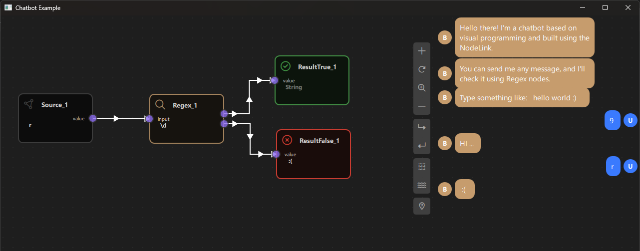
b. Node Types Explained
The Chatbot Example implements four distinct node types, each serving a specific role in the chatbot's decision-making process.
1. Source Node (SourceNode)
Purpose: Receives and stores user input messages from the chat interface.
Type ID: CSpecs.NodeType.Source (0)
Properties:
- Contains a single output port named "value"
- Receives text input from the chat interface
- Acts as the entry point for all user messages
- Can be manually edited for testing purposes
Ports:
- Output Port: "value" (Right side) - Emits the user's message text
Behavior:
- Automatically receives messages when users type in the chat box
- The message text is stored in nodeData.data
- When data changes, it triggers the scene's updateData() function
- Can be manually edited by clicking on the node and typing
Visual Appearance:
- Icon: Document/Text icon (Font Awesome)
- Color: Gray (#444)
- Size: 150x100 pixels
Usage Example:
- User types "hello world" in chat → Source node receives "hello world"
- Source node outputs "hello world" to connected nodes
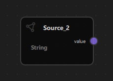
2. Regex Node (RegexNode)
Purpose: Matches user input against a regular expression pattern and routes the result through two different output ports.
Type ID: CSpecs.NodeType.Regex (1)
Properties:
- Has one input port and two output ports
- Contains a regular expression pattern in nodeData.data
- Performs case-insensitive pattern matching
- Routes results through "output 1" (match found) or "output 2" (no match)
Ports:
- Input Port: "input" (Left side) - Receives text to match against the pattern
- Output Port 1: "output 1" (Right side) - Emits when pattern matches (FOUND)
- Output Port 2: "output 2" (Right side) - Emits when pattern doesn't match (NOT_FOUND)
Properties:
- inputFirst: Stores the input text to match
- matchedPattern: Contains "FOUND" or "NOT_FOUND" based on match result
- nodeData.data: Contains the regular expression pattern (e.g., "hello|hi|hey")
Behavior:
1. Receives input text from the connected upstream node
2. Creates a case-insensitive RegExp from nodeData.data
3. Tests the input against the pattern
4. Sets matchedPattern to "FOUND" or "NOT_FOUND"
5. Routes the result through the appropriate output port
Regular Expression Examples:
- "hello|hi|hey" - Matches any of these greetings
- "\\d+" - Matches one or more digits
- "[a-zA-Z]+" - Matches one or more letters
- "^hello" - Matches "hello" at the start of the string
- "world$" - Matches "world" at the end of the string
Visual Appearance:
- Icon: Search icon (Font Awesome \uf002)
- Color: Brown/Tan (#C69C6D)
- Size: 150x100 pixels
Usage Example:
- Pattern: "hello|hi"
- Input: "hello world" → Matches → matchedPattern = "FOUND" → Routes to output 1
- Input: "goodbye" → No match → matchedPattern = "NOT_FOUND" → Routes to output 2
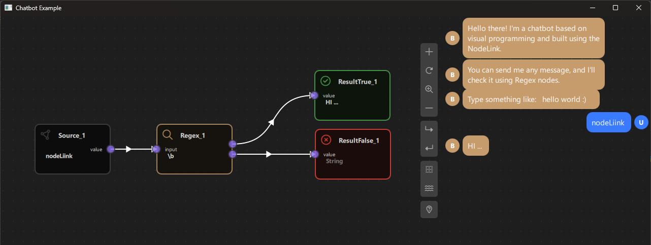
Code Implementation:
function updataData() {
  if (!inputFirst) {
  return
  }
  var re = new RegExp(nodeData.data, "i")  // 'i' flag for case-insensitive
  var found = re.test(inputFirst)
  matchedPattern = found ? "FOUND" : "NOT_FOUND"
}
3. Result True Node (ResultTrueNode)
Purpose: Displays a response message when a pattern match is found (FOUND).
Type ID: CSpecs.NodeType.ResultTrue (2)
Properties:
- Contains a single input port
- Displays response text when triggered
- Automatically sends the response to the chat interface
- Read-only (cannot be edited directly)
Ports:
- Input Port: "value" (Left side) - Receives data from Regex node's output 1
Behavior:
- Should be connected to Regex node's "output 1" port
- When triggered, checks if the upstream Regex node has matchedPattern === "FOUND"
- If true, sets nodeData.data to "HI ..." (or custom response)
- Emits botResponse signal to display the message in the chat box
- If the pattern didn't match, sets data to empty string
Visual Appearance:
- Icon: Checkmark/Circle icon (Font Awesome \uf058)
- Color: Green (#4caf50) - indicates positive/successful match
- Size: 150x100 pixels
Usage Example:
- Regex node matches "hello" → Routes to ResultTrue node
- ResultTrue node displays "HI ..." in chat
- User sees the bot's response
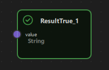
Code Implementation:
// In ChatbotScene.qml
  case CSpecs.NodeType.ResultTrue: {
  downStreamNode.nodeData.data = (upstreamNode.matchedPattern === "FOUND") ? "HI ..." : "";
  botResponse(downStreamNode.nodeData.data)
} break;
4. Result False Node (ResultFalseNode)
Purpose: Displays a response message when a pattern match is not found (NOT_FOUND).
Type ID: CSpecs.NodeType.ResultFalse (3)
Properties:
- Contains a single input port
- Displays response text when no pattern matches
- Automatically sends the response to the chat interface
- Read-only (cannot be edited directly)
Ports:
- Input Port: "value" (Left side) - Receives data from Regex node's output 2
Behavior:
- Should be connected to Regex node's "output 2" port
- When triggered, checks if the upstream Regex node has matchedPattern === "NOT_FOUND"
- If true, sets nodeData.data to " :( " (or custom response)
- Emits botResponse signal to display the message in the chat box
- If the pattern matched, sets data to empty string
Visual Appearance:
- Icon: X-mark/Circle icon (Font Awesome \uf057)
- Color: Red (#f44336) - indicates no match/failure
- Size: 150x100 pixels
Usage Example:
- Regex node doesn't match user input → Routes to ResultFalse node
- ResultFalse node displays " :( " in chat
- User sees the bot's "I don't understand" response
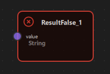
Code Implementation:
// In ChatbotScene.qml
  case CSpecs.NodeType.ResultFalse: {
  downStreamNode.nodeData.data = (upstreamNode.matchedPattern === "NOT_FOUND") ? " :( " : "";
  botResponse(downStreamNode.nodeData.data)
} break;
Node Type Summary Table
| Node Type | Type ID | Input Ports | Output Ports | Purpose | Color |
|---|---|---|---|---|---|
| Source | 0 | 0 | 1 | Receives user input | Gray (#444) |
| Regex | 1 | 1 | 2 | Pattern matching | Brown (#C69C6D) |
| ResultTrue | 2 | 1 | 0 | Response on match | Green (#4caf50) |
| ResultFalse | 3 | 1 | 0 | Response on no match | Red (#f44336) |
Data Flow Architecture
The chatbot follows a simple but powerful data flow pattern:
User Input (Chat Box)
    ↓
  Source Node (stores message)
    ↓
  Regex Node (pattern matching)
    ├─→ [Match Found] → ResultTrue Node → Chat Response ("HI ...")
    └─→ [No Match] → ResultFalse Node → Chat Response (" :( ")
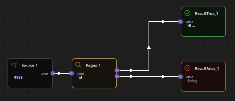
c. Step-by-Step Building Guide
This guide will walk you through building the Chatbot Example from scratch, explaining each component and how they work together.
Prerequisites
- Qt 6.2.4 or later (Qt 6.10.0 recommended)
- CMake 3.1.0 or later
- C++ compiler with C++14 support (MSVC 2019/2022 on Windows)
- NodeLink framework built and installed
- QtQuickStream module built and installed
- Basic understanding of regular expressions (helpful but not required)
Step 1: Project Setup
1.1 Create Project Structure
Create the following directory structure:
chatbot/
  ├── CMakeLists.txt
  ├── main.cpp
  ├── main.qml
  └── resources/
      ├── Core/
      ├── View/
      └── fonts/
1.2 Configure CMakeLists.txt
Create CMakeLists.txt with the following configuration:
cmake_minimum_required(VERSION 3.1.0)

set(CMAKE_AUTOMOC ON)
set(CMAKE_CXX_STANDARD_REQUIRED ON)

# Configure Qt
find_package(QT NAMES Qt6 Qt5 COMPONENTS Core Gui QuickControls2 REQUIRED)
find_package(Qt${QT_VERSION_MAJOR} COMPONENTS Core Gui QuickControls2 REQUIRED)

list(APPEND QML_IMPORT_PATH ${CMAKE_BINARY_DIR}/qml)

# Create executable
qt_add_executable(Chatbot main.cpp)

# Set CSpecs as singleton
set_source_files_properties(
  resources/Core/CSpecs.qml
  PROPERTIES
  QT_QML_SINGLETON_TYPE True
)

# Define QML module
qt_add_qml_module(Chatbot
  URI "Chatbot"
  VERSION 1.0
  QML_FILES
  main.qml
  resources/Core/CSpecs.qml
  resources/Core/ChatbotScene.qml
  resources/Core/SourceNode.qml
  resources/Core/RegexNode.qml
  resources/Core/ResultTrueNode.qml
  resources/Core/ResultFalseNode.qml
  resources/Core/OperationNode.qml
  resources/Core/OperationNodeData.qml
  resources/Core/Chatbox.qml
  resources/View/ChatbotView.qml
  resources/View/ChatbotNodeView.qml
  RESOURCES
  resources/fonts/Font\ Awesome\ 6\ Pro-Thin-100.otf
  resources/fonts/Font\ Awesome\ 6\ Pro-Solid-900.otf
  resources/fonts/Font\ Awesome\ 6\ Pro-Regular-400.otf
  resources/fonts/Font\ Awesome\ 6\ Pro-Light-300.otf
)

target_include_directories(Chatbot PUBLIC
  Qt${QT_VERSION_MAJOR}::QuickControls2)

target_link_libraries(Chatbot PRIVATE
  Qt${QT_VERSION_MAJOR}::Core
  Qt${QT_VERSION_MAJOR}::Gui
  Qt${QT_VERSION_MAJOR}::QuickControls2
  NodeLinkplugin
  QtQuickStreamplugin
)
Key Points:
- Links to NodeLinkplugin and QtQuickStreamplugin
- Sets CSpecs.qml as a singleton for global access
- Includes Font Awesome fonts for icons
- Includes Chatbox.qml for the chat interface
Step 2: Create Specifications (CSpecs.qml)
Create resources/Core/CSpecs.qml - a singleton that defines node type constants:
pragma Singleton

import QtQuick

QtObject {
  enum NodeType {
  Source       = 0,
  Regex        = 1,
  ResultTrue   = 2,
  ResultFalse  = 3,
  Unknown      = 99
  }

  enum OperationType {
  Operation    = 0,
  Regex        = 1,
  Unknown      = 99
  }
}
Purpose: Provides type-safe constants for node types used throughout the application.
Step 3: Create Node Data Models
3.1 OperationNodeData.qml
Create resources/Core/OperationNodeData.qml - data model for operation nodes:
import QtQuick
import NodeLink

I_NodeData {
  property var inputFirst: null
}
Purpose: Extends I_NodeData to store input value for regex operations.
Step 4: Create Base Node Types
4.1 SourceNode.qml
Create resources/Core/SourceNode.qml:
import QtQuick
import NodeLink

Node {
  type: CSpecs.NodeType.Source
  nodeData: I_NodeData {}
  guiConfig.width: 150
  guiConfig.height: 100

  Component.onCompleted: addPorts();

  function addPorts() {
  let _port1 = NLCore.createPort();
  _port1.portType = NLSpec.PortType.Output
  _port1.portSide = NLSpec.PortPositionSide.Right
  _port1.title    = "value";
  addPort(_port1);
  }
}
Key Features:
- Single output port on the right side
- Receives user messages from the chat interface
- Fixed size node (150x100)
4.2 RegexNode.qml
Create resources/Core/RegexNode.qml - the core pattern matching node:
import QtQuick
import NodeLink
import Chatbot

Node {
  type: CSpecs.NodeType.Regex
  nodeData: I_NodeData {}
  property var inputFirst: null
  property var matchedPattern: null
  guiConfig.width: 150
  guiConfig.height: 100

  Component.onCompleted: addPorts();

  function addPorts() {
  let _port1 = NLCore.createPort();
  let _port2 = NLCore.createPort();
  let _port3 = NLCore.createPort();

  _port1.portType = NLSpec.PortType.Input
  _port1.portSide = NLSpec.PortPositionSide.Left
  _port1.enable   = false;
  _port1.title    = "input";

  _port2.portType = NLSpec.PortType.Output
  _port2.portSide = NLSpec.PortPositionSide.Right
  _port2.title    = "output 1";

  _port3.portType = NLSpec.PortType.Output
  _port3.portSide = NLSpec.PortPositionSide.Right
  _port3.title    = "output 2";

  addPort(_port1);
  addPort(_port2);
  addPort(_port3);
  }

  function updataData() {
  if (!inputFirst) {
  return
  }

  var re = new RegExp(nodeData.data, "i")  // Case-insensitive
  var found = re.test(inputFirst)
  matchedPattern = found ? "FOUND" : "NOT_FOUND"
  }
}
Key Features:
- One input port (left) and two output ports (right)
- Stores regex pattern in nodeData.data
- Performs case-insensitive matching
- Sets matchedPattern property for downstream nodes to check
4.3 ResultTrueNode.qml
Create resources/Core/ResultTrueNode.qml:
import QtQuick
import NodeLink

Node {
  type: CSpecs.NodeType.ResultTrue
  nodeData: I_NodeData {}
  guiConfig.width: 150
  guiConfig.height: 100

  Component.onCompleted: addPorts();

  onCloneFrom: function (baseNode) {
  nodeData.data = null;
  }

  function addPorts() {
  let _port1 = NLCore.createPort();
  _port1.portType = NLSpec.PortType.Input
  _port1.portSide = NLSpec.PortPositionSide.Left
  _port1.enable   = false;
  _port1.title    = "value";
  addPort(_port1);
  }
}
Key Features:
- Single input port (left side)
- Connected to Regex node's "output 1"
- Resets data when cloned
4.4 ResultFalseNode.qml
Create resources/Core/ResultFalseNode.qml:
import QtQuick
import NodeLink

Node {
  type: CSpecs.NodeType.ResultFalse
  nodeData: I_NodeData {}
  guiConfig.width: 150
  guiConfig.height: 100

  Component.onCompleted: addPorts();

  onCloneFrom: function (baseNode) {
  nodeData.data = null;
  }

  function addPorts() {
  let _port1 = NLCore.createPort();
  _port1.portType = NLSpec.PortType.Input
  _port1.portSide = NLSpec.PortPositionSide.Left
  _port1.enable   = false;
  _port1.title    = "value";
  addPort(_port1);
  }
}
Key Features:
- Single input port (left side)
- Connected to Regex node's "output 2"
- Resets data when cloned
Step 5: Create the Chat Interface
5.1 Chatbox.qml
Create resources/Core/Chatbox.qml - the chat interface component:
import QtQuick
import QtQuick.Controls
import QtQuick.Layouts

Item {
  id: chatBox
  width: parent ? parent.width : 400
  height: parent ? parent.height : 300

  signal userMessageSent(string message)

  ListModel {
  id: messagesModel
  }

  ColumnLayout {
  anchors.fill: parent
  spacing: 12

  // Message list with scroll view
  ScrollView {
  id: scrollView
  Layout.fillWidth: true
  Layout.fillHeight: true
  clip: true

  Column {
  id: messageList
  width: scrollView.width
  spacing: 10

  Repeater {
  model: messagesModel

  delegate: Item {
  width: parent.width
  implicitHeight: bubble.implicitHeight + dynamicSpacing
  property int dynamicSpacing: Math.max(36, messageText.lineCount * 24)

  Row {
  width: parent.width
  spacing: 6
  anchors.margins: 8
  layoutDirection: model.isUser ? Qt.RightToLeft : Qt.LeftToRight

  // Avatar
  Rectangle {
  width: 28
  height: 28
  radius: 14
  color: model.isUser ? "#3A7AFE" : "#C69C6D"
  anchors.verticalCenter: parent.verticalCenter

  Text {
  anchors.centerIn: parent
  text: model.isUser ? "U" : "B"
  color: "white"
  font.bold: true
  font.pointSize: 10
  }
  }

  // Message bubble
  Rectangle {
  id: bubble
  color: model.isUser ? "#3A7AFE" : "#C69C6D"
  radius: 12
  width: Math.min(parent.width * 0.7, messageText.implicitWidth + 24)
  height: messageText.paintedHeight + 20

  Text {
  id: messageText
  text: model.text
  color: "white"
  wrapMode: Text.WordWrap
  font.pointSize: 11
  anchors.margins: 10
  anchors.fill: parent
  width: bubble.width - 20
  }
  }
  }
  }
  }
  }
  }

  // Input field and send button
  RowLayout {
  Layout.fillWidth: true
  spacing: 6

  TextField {
  id: inputField
  Layout.fillWidth: true
  placeholderText: "Type your message..."
  font.pointSize: 10
  onAccepted: sendMessage()
  }

  Button {
  text: "Send"
  onClicked: sendMessage()
  }
  }
  }

  Component.onCompleted: {
  // Welcome messages
  messagesModel.append({ text: "Hello there! I'm a chatbot based on visual programming and built using the NodeLink.", isUser: false })
  messagesModel.append({ text: "You can send me any message, and I'll check it using Regex nodes.", isUser: false })
  messagesModel.append({ text: "Type something like:   hello world :)   ", isUser: false })
  Qt.callLater(scrollToBottom)
  }

  function scrollToBottom() {
  if (scrollView.flickableItem) {
  scrollView.flickableItem.contentY =
  Math.max(0, scrollView.flickableItem.contentHeight - scrollView.flickableItem.height);
  }
  }

  function sendMessage() {
  if (inputField.text.trim().length === 0)
  return

  let msg = inputField.text.trim()
  inputField.text = ""

  messagesModel.append({ text: msg, isUser: true })
  chatBox.userMessageSent(msg)
  Qt.callLater(scrollToBottom)
  }

  function addMessage(text, fromUser) {
  if (text && text.trim() !== "") {
  messagesModel.append({ text: text, isUser: fromUser })
  Qt.callLater(scrollToBottom)
  }
  }
}
Key Features:
- Message List: Displays chat history with user and bot messages
- Scroll View: Auto-scrolls to bottom when new messages arrive
- Input Field: Text field for user input with Enter key support
- Send Button: Button to send messages
- Welcome Messages: Shows introductory messages on startup
- Signal: Emits userMessageSent signal when user sends a message
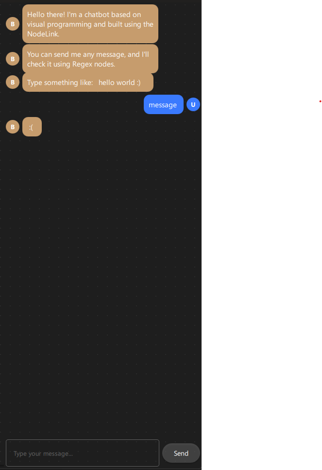
Step 6: Create the Scene
6.1 ChatbotScene.qml
Create resources/Core/ChatbotScene.qml - the main scene that manages nodes, links, and bot responses:
import QtQuick
import QtQuick.Controls
import NodeLink
import Chatbot

I_Scene {
  id: scene

  nodeRegistry: NLNodeRegistry {
  _qsRepo: scene._qsRepo
  imports: ["Chatbot"]
  defaultNode: CSpecs.NodeType.Source

  nodeTypes: [
  CSpecs.NodeType.Source      = "SourceNode",
  CSpecs.NodeType.Regex       = "RegexNode",
  CSpecs.NodeType.ResultTrue  = "ResultTrueNode",
  CSpecs.NodeType.ResultFalse = "ResultFalseNode"
  ];

  nodeNames: [
  CSpecs.NodeType.Source      = "Source",
  CSpecs.NodeType.Regex       = "Regex",
  CSpecs.NodeType.ResultTrue  = "ResultTrue",
  CSpecs.NodeType.ResultFalse = "ResultFalse"
  ];

  nodeIcons: [
  CSpecs.NodeType.Source      = "\ue4e2",
  CSpecs.NodeType.Regex       = "\uf002",
  CSpecs.NodeType.ResultTrue  = "\uf058",
  CSpecs.NodeType.ResultFalse = "\uf057"
  ];

  nodeColors: [
  CSpecs.NodeType.Source      = "#444",
  CSpecs.NodeType.Regex       = "#C69C6D",
  CSpecs.NodeType.ResultTrue  = "#4caf50",
  CSpecs.NodeType.ResultFalse = "#f44336"
  ];
  }

  selectionModel: SelectionModel {
  existObjects: [...Object.keys(nodes), ...Object.keys(links)]
  }

  property UndoCore _undoCore: UndoCore {
  scene: scene
  }

  // Update node data when links/nodes change
  onLinkRemoved: _upateDataTimer.start();
  onNodeRemoved: _upateDataTimer.start();
  onLinkAdded:   updateData();

  property Timer _upateDataTimer: Timer {
  repeat: false
  running: false
  interval: 1
  onTriggered: scene.updateData();
  }

  // Signal to send bot response to chat
  signal botResponse(string text)

  // Create a node with specific type and position
  function createCustomizeNode(nodeType: int, xPos: real, yPos: real): string {
  var title = nodeRegistry.nodeNames[nodeType] + "_" +
  (Object.values(scene.nodes).filter(node => node.type === nodeType).length + 1);
  return createSpecificNode(nodeRegistry.imports, nodeType,
  nodeRegistry.nodeTypes[nodeType],
  nodeRegistry.nodeColors[nodeType],
  title, xPos, yPos);
  }

  // Link validation and creation (similar to Calculator example)
  function linkNodes(portA: string, portB: string) {
  if (!canLinkNodes(portA, portB)) {
  console.error("[Scene] Cannot link Nodes");
  return;
  }
  let link = Object.values(links).find(conObj =>
  conObj.inputPort._qsUuid === portA &&
  conObj.outputPort._qsUuid === portB);
  if (link === undefined)
  createLink(portA, portB);
  }

  function canLinkNodes(portA: string, portB: string): bool {
  // Validation logic (same as Calculator example)
  // ... (see source file for full implementation)
  return true;
  }

  // Update all node data based on connections
  function updateData() {
  var notReadyLinks = [];

  // Initialize result nodes
  Object.values(nodes).forEach(node => {
  switch (node.type) {
  case CSpecs.NodeType.ResultTrue:
  case CSpecs.NodeType.ResultFalse: {
  node.nodeData.data = null;
  } break;
  }
  });

  // Process links and update data
  Object.values(links).forEach(link => {
  var portA = link.inputPort._qsUuid;
  var portB = link.outputPort._qsUuid;

  var upstreamNode   = findNode(portA);
  var downStreamNode = findNode(portB);

  // Find nodes with valid data that connected to upstreamNode
  var upstreamNodeLinks = Object.values(links).filter(linkObj => {
  var node = findNode(linkObj.outputPort._qsUuid);
  var inputNode = findNode(linkObj.inputPort._qsUuid);
  if (node._qsUuid === upstreamNode._qsUuid) {
  if(inputNode.nodeData.data) {
  return linkObj
  }
  }
  });

  if (!upstreamNode.nodeData.data &&
  upstreamNode.type !== CSpecs.NodeType.Source) {
  if (upstreamNodeLinks.length > 1)
  notReadyLinks.push(link);
  return;
  }

  upadateNodeData(upstreamNode, downStreamNode);
  });

  // Handle nodes waiting for multiple inputs
  while (notReadyLinks.length > 0) {
  notReadyLinks.forEach((link, index) => {
  var portA = link.inputPort._qsUuid;
  var portB = link.outputPort._qsUuid;

  var upstreamNode   = findNode(portA);
  var downStreamNode = findNode(portB);

  var upstreamNodeLinks = Object.values(links).filter(linkObj =>
  findNodeId(linkObj.outputPort._qsUuid) === upstreamNode._qsUuid);

  if (upstreamNode.nodeData.data) {
  notReadyLinks.splice(index, 1);
  }

  upadateNodeData(upstreamNode, downStreamNode);
  });
  }
  }

  // Update specific node data
  function upadateNodeData(upstreamNode: Node, downStreamNode: Node) {
  switch (downStreamNode.type) {
  case CSpecs.NodeType.Regex: {
  downStreamNode.inputFirst = upstreamNode.nodeData.data;
  downStreamNode.updataData();
  } break;

  case CSpecs.NodeType.ResultTrue: {
  downStreamNode.nodeData.data = (upstreamNode.matchedPattern === "FOUND") ? "HI ..." : "";
  botResponse(downStreamNode.nodeData.data)
  } break;

  case CSpecs.NodeType.ResultFalse: {
  downStreamNode.nodeData.data = (upstreamNode.matchedPattern === "NOT_FOUND") ? " :( " : "";
  botResponse(downStreamNode.nodeData.data)
  } break;
  }
  }
}
Key Features:
- Node Registry: Defines all available node types with colors and icons
- Link Validation: Ensures valid connections
- Data Propagation: Automatically updates node values when connections change
- Bot Response Signal: Emits botResponse signal to send messages to chat
- Conditional Logic: Checks matchedPattern to determine which response to send
Data Flow Logic:
1. User sends message → Source node receives it
2. Source node outputs to Regex node
3. Regex node matches pattern and sets matchedPattern
4. ResultTrue/ResultFalse nodes check matchedPattern
5. Appropriate response is sent via botResponse signal
6. Chat interface displays the response
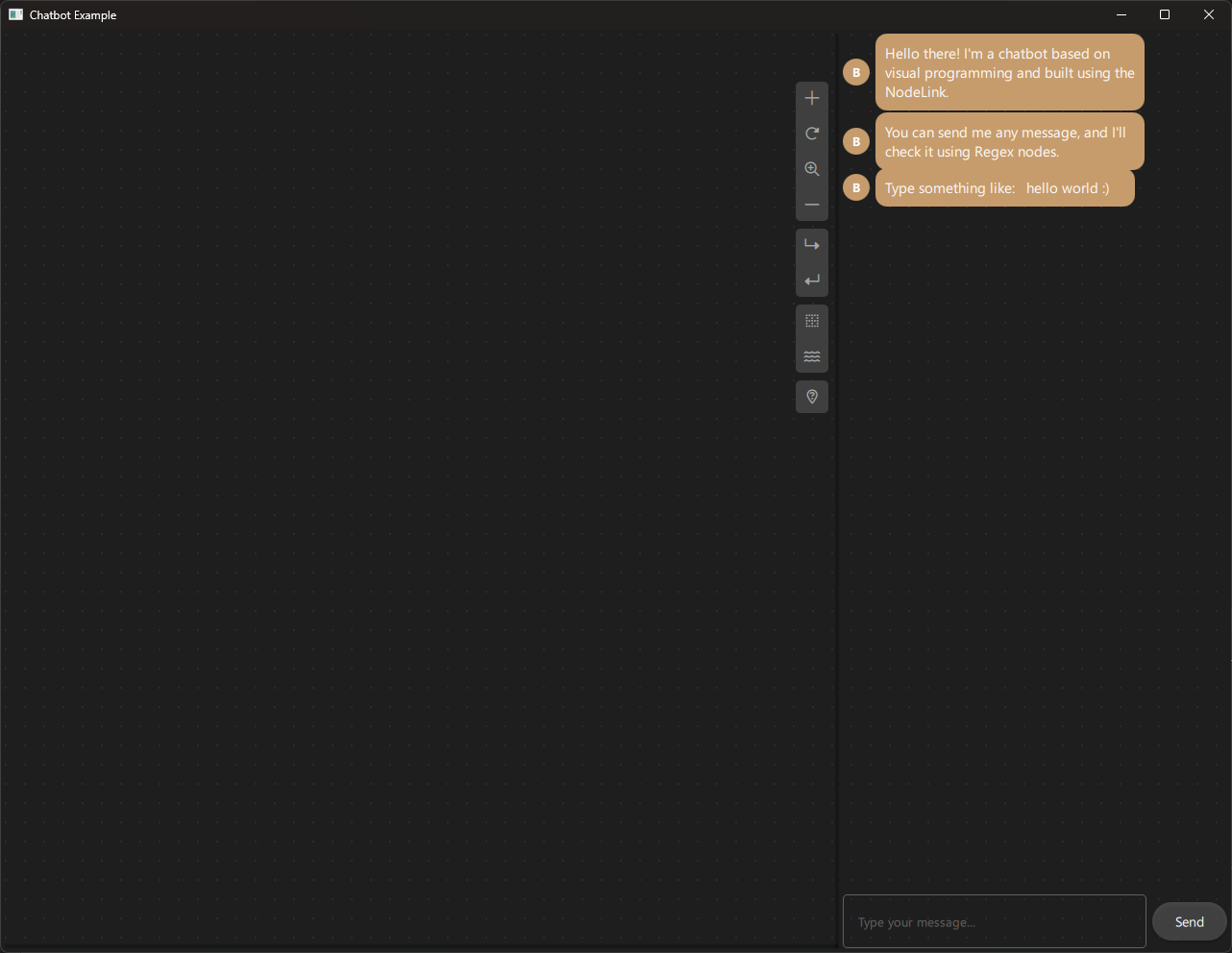
Step 7: Create Views
7.1 ChatbotNodeView.qml
Create resources/View/ChatbotNodeView.qml - custom view for displaying nodes:
import QtQuick
import QtQuick.Controls
import NodeLink
import Chatbot

NodeView {
  id: nodeView

  contentItem: Item {
  id: mainContentItem
  property bool iconOnly: ((node?.operationType ?? -1) > -1) ||
  nodeView.isNodeMinimal

  // Header with icon and title
  Item {
  id: titleItem
  anchors.left: parent.left
  anchors.right: parent.right
  anchors.top: parent.top
  anchors.margins: 12
  visible: !mainContentItem.iconOnly
  height: 20

  Text {
  id: iconText
  font.family: NLStyle.fontType.font6Pro
  font.pixelSize: 20
  anchors.left: parent.left
  anchors.verticalCenter: parent.verticalCenter
  text: scene.nodeRegistry.nodeIcons[node.type]
  color: node.guiConfig.color
  }

  NLTextArea {
  id: titleTextArea
  anchors.right: parent.right
  anchors.left: iconText.right
  anchors.verticalCenter: parent.verticalCenter
  anchors.leftMargin: 5
  height: 40
  readOnly: !nodeView.edit
  placeholderText: qsTr("Enter title")
  color: NLStyle.primaryTextColor
  text: node.title
  onTextChanged: {
  if (node && node.title !== text)
  node.title = text;
  }
  }
  }

  // Value display/input field
  NLTextField {
  id: textArea
  anchors.top: titleItem.bottom
  anchors.right: parent.right
  anchors.bottom: parent.bottom
  anchors.left: parent.left
  anchors.margins: 12
  anchors.topMargin: 5
  visible: !mainContentItem.iconOnly
  placeholderText: qsTr("String")
  color: NLStyle.primaryTextColor
  text: node?.nodeData?.data
  readOnly: !nodeView.edit ||
  (node.type === CSpecs.NodeType.ResultTrue) ||
  (node.type === CSpecs.NodeType.ResultFalse)
  wrapMode: TextEdit.WrapAnywhere
  onTextChanged: {
  if (node && (node.nodeData?.data ?? "") !== text) {
  if (node.type === CSpecs.NodeType.Source ||
  node.type === CSpecs.NodeType.Regex) {
  node.nodeData.data = text;
  scene.updateData();
  }
  }
  }
  }

  // Minimal view (icon only at low zoom)
  Rectangle {
  id: minimalRectangle
  anchors.fill: parent
  anchors.margins: 10
  color: mainContentItem.iconOnly ? "#282828" : "transparent"
  radius: NLStyle.radiusAmount.nodeView

  Text {
  font.family: NLStyle.fontType.font6Pro
  font.pixelSize: 60
  anchors.centerIn: parent
  text: scene.nodeRegistry.nodeIcons[node.type]
  color: node.guiConfig.color
  visible: mainContentItem.iconOnly
  }
  }
  }
}
Key Features:
- Editable Title: Users can rename nodes
- Value Display: Shows node data (editable for Source/Regex, read-only for Results)
- Minimal Mode: Shows icon only when zoomed out
- String Input: Accepts text input for Source and Regex nodes
7.2 ChatbotView.qml
Create resources/View/ChatbotView.qml - main view container:
import QtQuick
import QtQuick.Controls
import NodeLink
import QtQuickStream
import Chatbot

Item {
  id: view
  property ChatbotScene scene

  property SceneSession sceneSession: SceneSession {
  enabledOverview: false;
  doNodesNeedImage: false
  }

  // Nodes Scene (flickable canvas)
  NodesScene {
  id: nodesScene
  anchors.fill: parent
  scene: view.scene
  sceneSession: view.sceneSession
  sceneContent: NodesRect {
  scene: view.scene
  sceneSession: view.sceneSession
  nodeViewComponent: Qt.createComponent("ChatbotNodeView.qml")
  }
  }

  // Side menu for adding nodes
  SideMenu {
  scene: view.scene
  sceneSession: view.sceneSession
  anchors.right: parent.right
  anchors.rightMargin: 45
  anchors.top: parent.top
  anchors.topMargin: 50
  }
}
Key Features:
- NodesScene: Provides the scrollable canvas for nodes
- SideMenu: Allows users to add new nodes to the scene
- SceneSession: Manages view state and interactions
Step 8: Create Main Application
8.1 main.cpp
Create main.cpp:
#include <QtGui/QGuiApplication>
#include <QQmlApplicationEngine>
#include <QQuickStyle>

int main(int argc, char* argv[])
{
  QGuiApplication app(argc, argv);
  QQmlApplicationEngine engine;

  // Set Material style
  QQuickStyle::setStyle("Material");

  // Import all items into QML engine
  engine.addImportPath(":/");

  const QUrl url(u"qrc:/Chatbot/main.qml"_qs);
  QObject::connect(&engine, &QQmlApplicationEngine::objectCreated,
  &app, [url](QObject *obj, const QUrl &objUrl) {
  if (!obj && url == objUrl)
  QCoreApplication::exit(-1);
  }, Qt::QueuedConnection);
  engine.load(url);

  return app.exec();
}
8.2 main.qml
Create main.qml:
import QtQuick
import QtQuick.Dialogs
import QtQuick.Controls
import QtQuick.Layouts

import QtQuickStream
import NodeLink
import Chatbot

Window {
  id: window
  property ChatbotScene scene: null

  width: 1280
  height: 960
  visible: true
  title: qsTr("Chatbot Example")
  color: "#1e1e1e"

  Material.theme: Material.Dark
  Material.accent: "#4890e2"

  Component.onCompleted: {
  // Create root object
  NLCore.defaultRepo = NLCore.createDefaultRepo(["QtQuickStream", "Chatbot"])
  NLCore.defaultRepo.initRootObject("ChatbotScene");
  window.scene = Qt.binding(function() {
  return NLCore.defaultRepo.qsRootObject;
  });

  // Connect bot response signal to chat box
  Qt.callLater(() => {
  if (window.scene) {
  window.scene.botResponse.connect(function(msg) {
  chatBox.addMessage(msg, false)
  })
  }
  })
  }

  // Load Font Awesome fonts
  FontLoader { source: "qrc:/Chatbot/resources/fonts/Font Awesome 6 Pro-Thin-100.otf" }
  FontLoader { source: "qrc:/Chatbot/resources/fonts/Font Awesome 6 Pro-Solid-900.otf" }
  FontLoader { source: "qrc:/Chatbot/resources/fonts/Font Awesome 6 Pro-Regular-400.otf" }
  FontLoader { source: "qrc:/Chatbot/resources/fonts/Font Awesome 6 Pro-Light-300.otf" }

  // Main layout: Node view (left) and Chat box (right)
  RowLayout {
  anchors.fill: parent
  spacing: 4
  anchors.margins: 4

  // Node-based view (left)
  ChatbotView {
  id: view
  scene: window.scene
  Layout.fillWidth: true
  Layout.fillHeight: true
  }

  // Chat box (right)
  Chatbox {
  id: chatBox
  Layout.preferredWidth: 400
  Layout.fillHeight: true
  onUserMessageSent: {
  // Find Source node and update it with user message
  let sourceNode = Object.values(window.scene.nodes).find(n => n.type === 0)
  if (sourceNode) {
  sourceNode.nodeData.data = message
  window.scene.updateData()
  }
  }
  }
  }
}
Key Features:
- Dark Theme: Material Dark theme with custom accent color
- Scene Initialization: Creates the ChatbotScene using QtQuickStream
- Signal Connection: Connects bot response signal to chat box
- Split Layout: Node editor on left, chat interface on right
- Message Handling: Updates Source node when user sends a message
Step 9: Build and Run
9.1 Configure Build
-
Create a build directory:
bash mkdir build cd build -
Configure with CMake:
bash cmake .. -DCMAKE_PREFIX_PATH=<Qt_Install_Path> -
Build the project:
bash
                        cmake --build .
9.2 Run the Application
Run the executable:
./Chatbot  # Linux/Mac
Chatbot.exe  # Windows
Step 10: Using the Chatbot
Basic Usage
- Add Nodes:
- Click the side menu to add nodes
-
You'll need at least: 1 Source, 1 Regex, 1 ResultTrue, 1 ResultFalse
-
Configure Regex Node:
- Click on the Regex node
- Type a regular expression pattern (e.g.,
"hello|hi|hey") -
Press Enter or click outside
-
Connect Nodes:
- Connect Source output → Regex input
- Connect Regex "output 1" → ResultTrue input
-
Connect Regex "output 2" → ResultFalse input
-
Test the Chatbot:
- Type a message in the chat box (right side)
- If the message matches the regex pattern, you'll see "HI ..."
- If it doesn't match, you'll see " :( "

Example: Greeting Bot
Setup:
1. Add a Source node
2. Add a Regex node, set pattern to: "hello|hi|hey|greetings"
3. Add a ResultTrue node
4. Add a ResultFalse node
Connections:
- Source → Regex (input)
- Regex (output 1) → ResultTrue
- Regex (output 2) → ResultFalse
Test:
- User: "hello" → Bot: "HI ..."
- User: "hi there" → Bot: "HI ..."
- User: "goodbye" → Bot: " :( "
Example: Number Detection
Setup:
1. Add a Source node
2. Add a Regex node, set pattern to: "\\d+" (matches one or more digits)
3. Add ResultTrue and ResultFalse nodes
4. Connect as above
Test:
- User: "123" → Bot: "HI ..."
- User: "abc" → Bot: " :( "
- User: "I have 5 apples" → Bot: "HI ..." (contains digits)
Example: Email Pattern
Setup:
1. Regex pattern: "[a-zA-Z0-9._%+-]+@[a-zA-Z0-9.-]+\\.[a-zA-Z]{2,}"
Test:
- User: "test@example.com" → Bot: "HI ..."
- User: "not an email" → Bot: " :( "
Architecture Overview
Component Hierarchy
ChatbotScene (I_Scene)
  ├── NodeRegistry (defines node types)
  ├── SelectionModel (manages selection)
  ├── UndoCore (undo/redo support)
  └── Nodes & Links
      ├── SourceNode (user input)
      ├── RegexNode (pattern matching)
      ├── ResultTrueNode (match response)
      └── ResultFalseNode (no-match response)

Main Window
  ├── ChatbotView (left side)
  │   ├── NodesScene (canvas)
  │   │   └── NodesRect (renders nodes)
  │   │       └── ChatbotNodeView (custom node UI)
  │   └── SideMenu (add nodes)
  └── Chatbox (right side)
      ├── Message List (scrollable)
      └── Input Field + Send Button
Data Flow
User Types Message
    ↓
Chatbox emits userMessageSent signal
    ↓
Source Node receives message (nodeData.data)
    ↓
Source Node outputs to Regex Node
    ↓
Regex Node matches pattern
    ├─→ [Match] → matchedPattern = "FOUND" → ResultTrue → "HI ..."
    └─→ [No Match] → matchedPattern = "NOT_FOUND" → ResultFalse → " :( "
    ↓
botResponse signal emitted
    ↓
Chatbox displays response
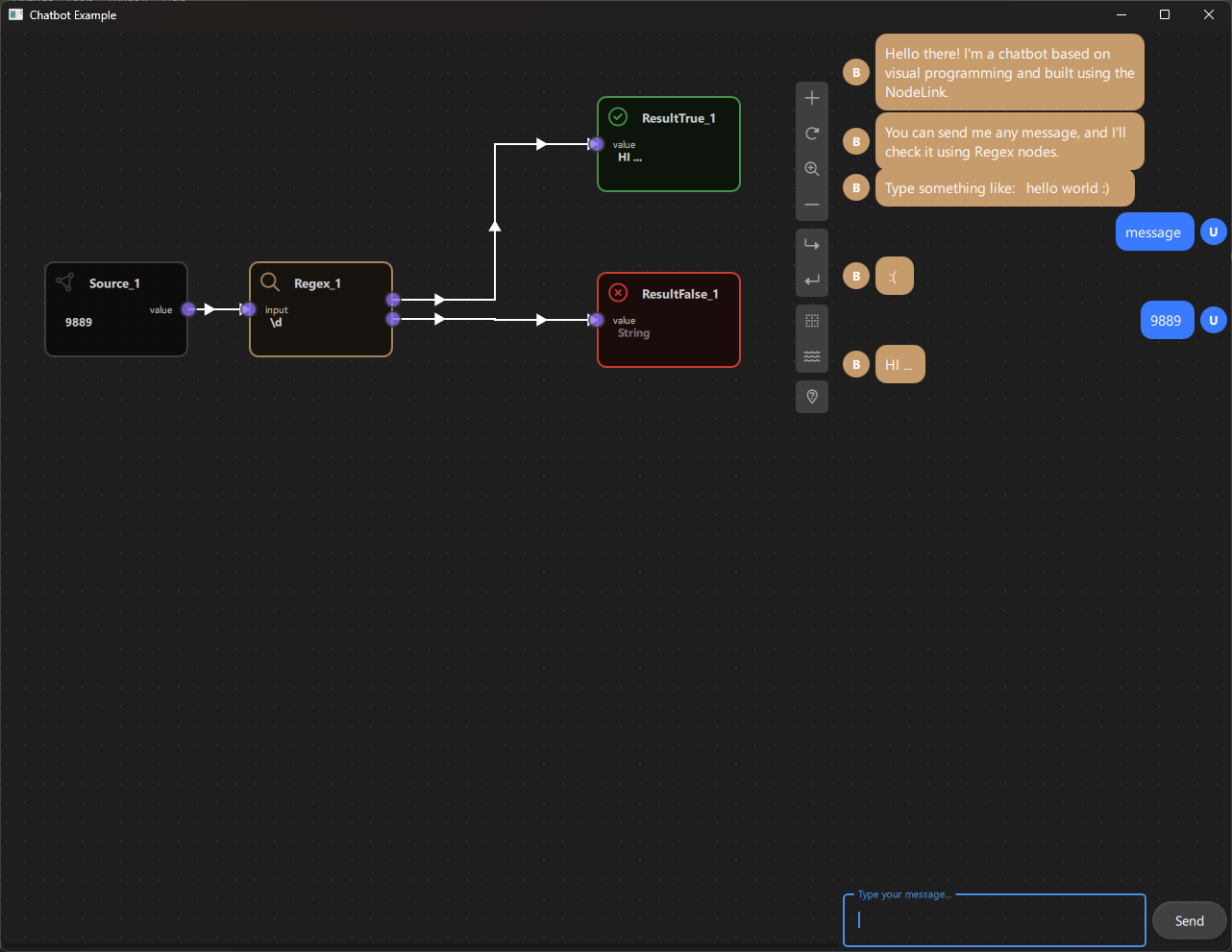
Key Concepts
Regular Expressions (Regex)
Regular expressions are patterns used to match character combinations in strings. The chatbot uses JavaScript's RegExp object.
Common Patterns:
- "hello" - Exact match
- "hello|hi" - Matches "hello" OR "hi"
- "\\d+" - One or more digits
- "[a-z]+" - One or more lowercase letters
- "^start" - Starts with "start"
- "end$" - Ends with "end"
- ".*" - Any characters (wildcard)
Flags:
- "i" - Case-insensitive (used in the chatbot)
Dual Output Ports
The Regex node has two output ports to enable conditional branching:
- Output 1: Triggered when pattern matches
- Output 2: Triggered when pattern doesn't match
This allows the chatbot to respond differently based on whether the pattern matched.
Signal-Based Communication
The chatbot uses Qt signals to communicate between components:
- userMessageSent: Chatbox → Source Node
- botResponse: Scene → Chatbox
This decouples the components and makes the system more flexible.
Extending the Chatbot
Adding Custom Response Messages
Modify ChatbotScene.qml to change response messages:
case CSpecs.NodeType.ResultTrue: {
  downStreamNode.nodeData.data = (upstreamNode.matchedPattern === "FOUND")
  ? "Great! I understood that!" : "";
  botResponse(downStreamNode.nodeData.data)
} break;
Adding Multiple Regex Patterns
You can chain multiple Regex nodes:
- Source → Regex1 (pattern: "hello")
- Regex1 (output 1) → Regex2 (pattern: "world")
- Regex2 (output 1) → ResultTrue
This creates an AND condition: message must match both patterns.
Adding New Node Types
To add a new node type (e.g., "KeywordNode"):
-
Add to CSpecs.qml:
qml enum NodeType { // ... existing Keyword = 4 } -
Create KeywordNode.qml:
qml Node { type: CSpecs.NodeType.Keyword // ... implementation } -
Register in ChatbotScene.qml:
qml
                        nodeTypes: [
                        // ... existing
                        CSpecs.NodeType.Keyword = "KeywordNode"
                        ]
Customizing Chat Interface
Modify Chatbox.qml to:
- Change colors and styling
- Add emoji support
- Add message timestamps
- Add user avatars
- Add typing indicators
Troubleshooting
Common Issues
- No Response from Bot:
- Check that nodes are properly connected
- Verify Regex pattern is correct
-
Ensure Source node receives the message
-
Regex Not Matching:
- Test your regex pattern in an online regex tester
- Remember the pattern is case-insensitive
-
Check for special characters that need escaping
-
Multiple Responses:
- Ensure only one Source node is connected
-
Check that Result nodes are connected to correct Regex outputs
-
Chat Not Updating:
- Verify
botResponsesignal is connected - Check that
addMessagefunction is called
Debug Tips
- Enable console logging in
ChatbotScene.qml - Check node data:
console.log(node.nodeData.data) - Verify pattern matching:
console.log(regexNode.matchedPattern) - Check signal connections:
console.log("Signal connected:", scene.botResponse)
Regular Expression Reference
Basic Patterns
| Pattern | Matches | Example |
|---|---|---|
"hello" |
Exact string | "hello" |
"hello\|hi" |
Either string | "hello" or "hi" |
"\\d" |
Single digit | "5" |
"\\d+" |
One or more digits | "123" |
"[a-z]" |
Single lowercase letter | "a" |
"[A-Z]+" |
One or more uppercase letters | "HELLO" |
"." |
Any single character | "a", "1", "!" |
".*" |
Any characters | "anything" |
Special Characters
| Character | Meaning |
|---|---|
^ |
Start of string |
$ |
End of string |
\| |
OR operator |
+ |
One or more |
* |
Zero or more |
? |
Zero or one |
\\ |
Escape character |
Common Use Cases
- Email:
"[a-zA-Z0-9._%+-]+@[a-zA-Z0-9.-]+\\.[a-zA-Z]{2,}" - Phone:
"\\d{3}-\\d{3}-\\d{4}" - URL:
"https?://[^\\s]+" - Greeting:
"hello\|hi\|hey\|greetings"
Conclusion
The Chatbot Example demonstrates how to build interactive, rule-based chatbots using NodeLink's visual programming system. Key takeaways:
- Visual Rule Definition: Create chatbot logic without writing complex code
- Pattern Matching: Use regular expressions for flexible input matching
- Conditional Logic: Branch responses based on pattern matching results
- Real-Time Interaction: See chatbot responses immediately as you build
- Extensible Design: Easy to add new node types and behaviors
This example serves as a foundation for building more sophisticated conversational interfaces, such as:
- Multi-turn conversations
- Context-aware responses
- Natural language processing integration
- Database-backed responses
- Multi-language support
For more examples, see the other examples in the NodeLink repository.
Performance Analyzer
Overview
The Performance Analyzer Example is a benchmarking and stress-testing tool designed to evaluate NodeLink's performance under various load conditions. This example allows you to create large numbers of nodes and links programmatically, measure operation times, and monitor system performance metrics. It's an essential tool for developers who want to understand NodeLink's scalability, optimize their applications, or test the framework's limits.
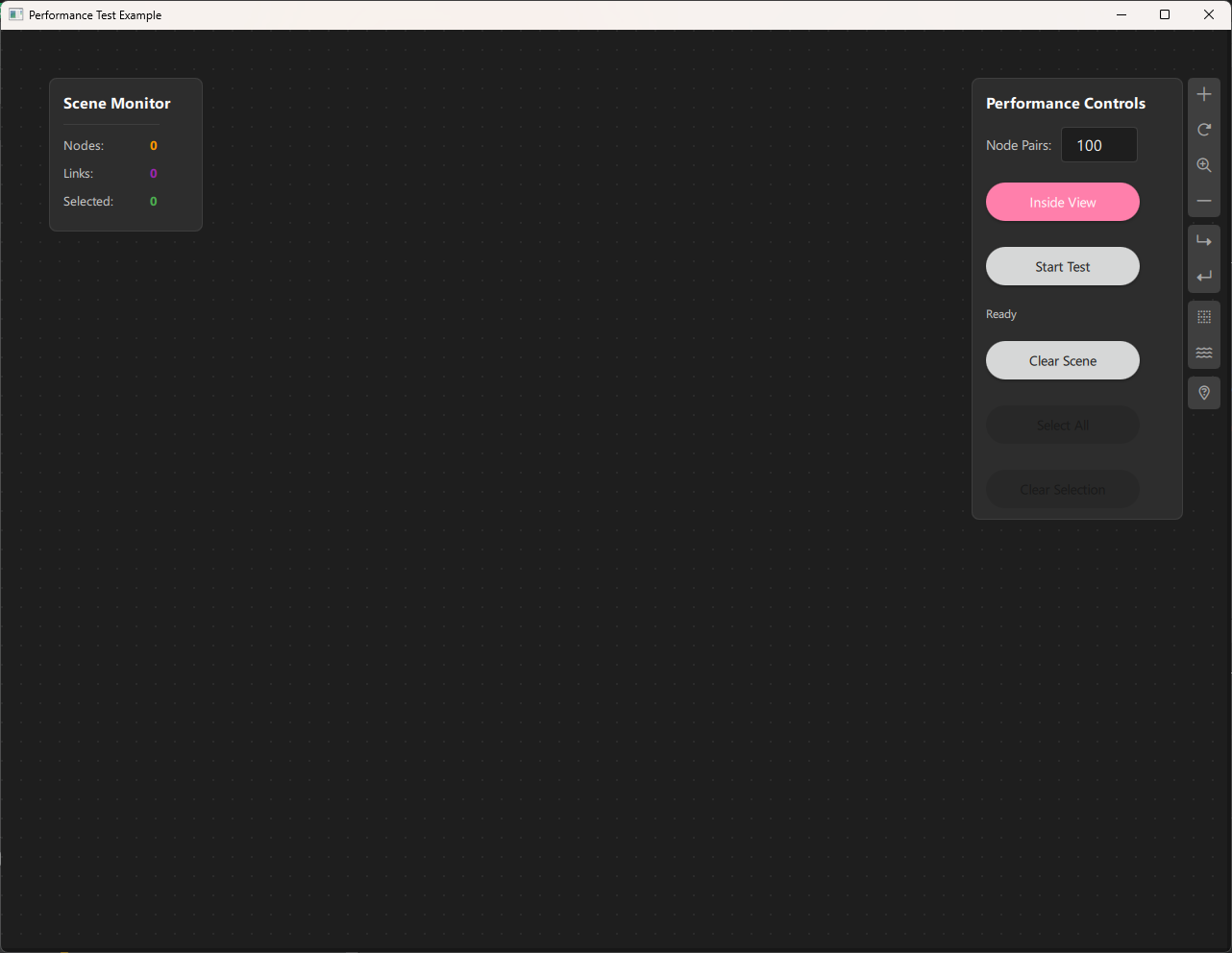
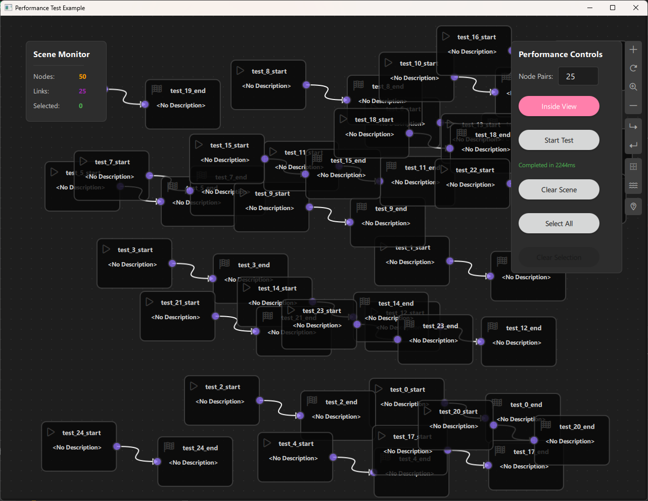
a. Purpose and Use Cases
Purpose
The Performance Analyzer Example demonstrates:
-
Performance Benchmarking: Measure NodeLink's performance when handling large numbers of nodes and links.
-
Stress Testing: Test the framework's limits by creating thousands of nodes and connections.
-
Batch Operations: Create multiple nodes and links efficiently using batch creation methods.
-
Performance Monitoring: Real-time monitoring of scene statistics (node count, link count, selection count).
-
Operation Timing: Measure execution time for critical operations like node creation, selection, and scene clearing.
-
Scalability Analysis: Understand how NodeLink performs with different scene sizes and configurations.
Use Cases
- Framework Development: Test NodeLink's performance during development and optimization
- Performance Optimization: Identify bottlenecks and optimize node/link creation and management
- Stress Testing: Verify that NodeLink can handle large-scale scenes without performance degradation
- Benchmarking: Compare performance across different versions or configurations
- Capacity Planning: Determine maximum scene sizes for production applications
- Debugging: Identify performance issues in custom node-based applications
Example Scenarios
- Mass Node Creation: Create 100, 1000, or 10000 node pairs and measure creation time
- Selection Performance: Test selection/deselection performance with large scenes
- Scene Clearing: Measure time to clear large scenes
- Viewport Testing: Test performance when nodes are spawned inside vs. across the entire scene
- Memory Profiling: Monitor memory usage with different scene sizes
Real-World Applications
- Large-Scale Visualizations: Test performance for applications with many nodes (data visualization, network diagrams)
- Complex Workflows: Benchmark performance for workflow builders with hundreds of steps
- Real-Time Applications: Ensure smooth performance for applications requiring frequent updates
- Production Planning: Determine optimal scene sizes for production deployments
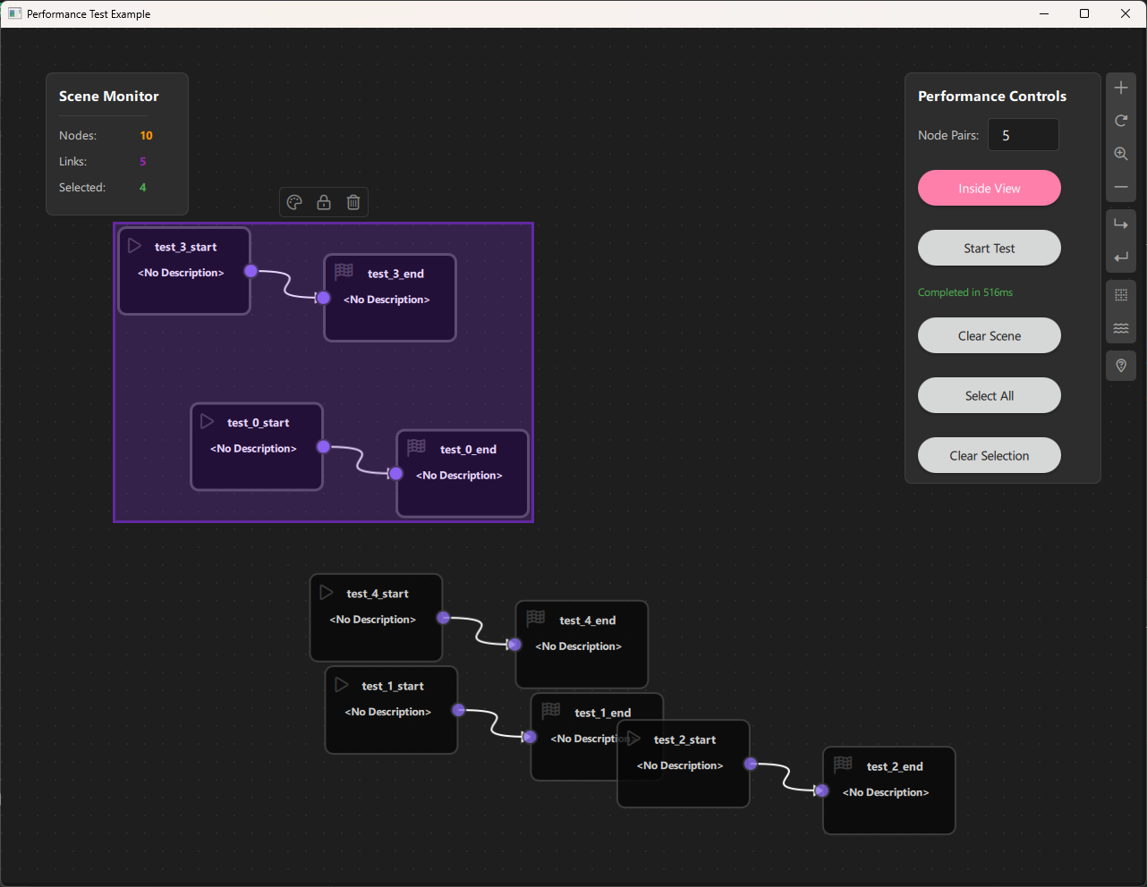
b. Node Types Explained
The Performance Analyzer Example implements two simple node types designed for performance testing rather than functional complexity.
1. Start Node (StartNode)
Purpose: A simple node with an output port, used as the starting point in node pairs for performance testing.
Type ID: CSpecs.NodeType.StartNode (0)
Properties:
- Contains a single output port
- Minimal implementation for performance testing
- Acts as the source node in test pairs
Ports:
- Output Port: (Right side) - Emits data to connected End nodes
Properties:
- guiConfig.width: 100 pixels
- guiConfig.height: 100 pixels
- guiConfig.color: Gray (#444444)
Behavior:
- Simple node with minimal overhead
- Designed for fast creation and rendering
- Used in pairs with End nodes for link testing
Visual Appearance:
- Icon: Play button (Font Awesome \uf04b)
- Color: Gray (#444)
- Size: 100x100 pixels (fixed)
Usage: Created programmatically in batches for performance testing.
2. End Node (EndNode)
Purpose: A simple node with an input port, used as the endpoint in node pairs for performance testing.
Type ID: CSpecs.NodeType.EndNode (1)
Properties:
- Contains a single input port
- Minimal implementation for performance testing
- Acts as the destination node in test pairs
Ports:
- Input Port: (Left side) - Receives data from connected Start nodes
Properties:
- guiConfig.width: 100 pixels
- guiConfig.height: 100 pixels
- guiConfig.color: Gray (#444444)
Behavior:
- Simple node with minimal overhead
- Designed for fast creation and rendering
- Used in pairs with Start nodes for link testing
Visual Appearance:
- Icon: Stop button (Font Awesome \uf11e)
- Color: Gray (#444)
- Size: 100x100 pixels (fixed)
Usage: Created programmatically in batches for performance testing.
Node Pair Structure
For performance testing, nodes are created in pairs:
- Start Node: Output port on the right
- End Node: Input port on the left
- Link: Connects Start output to End input
This simple structure allows testing:
- Node creation performance
- Link creation performance
- Scene rendering performance
- Selection performance
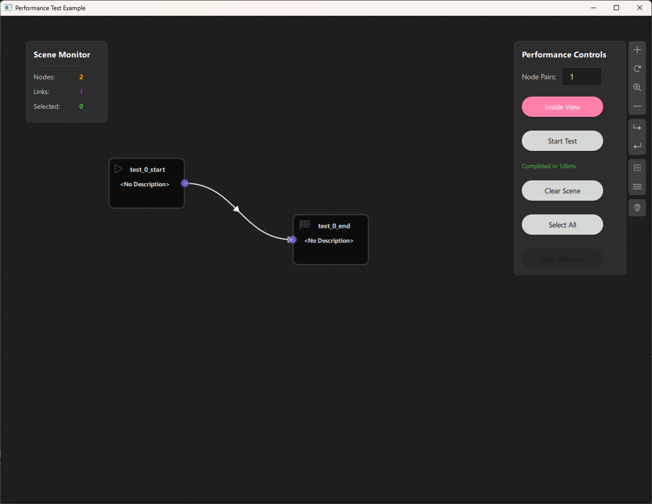
Node Type Summary Table
| Node Type | Type ID | Input Ports | Output Ports | Purpose |
|---|---|---|---|---|
| Start | 0 | 0 | 1 | Source node for testing |
| End | 1 | 1 | 0 | Destination node for testing |
c. Step-by-Step Building Guide
This guide will walk you through building the Performance Analyzer Example from scratch, explaining each component and how they work together.
Prerequisites
- Qt 6.2.4 or later (Qt 6.10.0 recommended)
- CMake 3.1.0 or later
- C++ compiler with C++14 support (MSVC 2019/2022 on Windows)
- NodeLink framework built and installed
- QtQuickStream module built and installed
Step 1: Project Setup
1.1 Create Project Structure
Create the following directory structure:
performanceAnalyzer/
├── CMakeLists.txt
├── main.cpp
├── Main.qml
└── resources/
    ├── Core/
    ├── View/
    └── fonts/
1.2 Configure CMakeLists.txt
Create CMakeLists.txt with the following configuration:
cmake_minimum_required(VERSION 3.1.0)
set(MODULE_NAME PerformanceAnalyzer)

set(CMAKE_AUTOMOC ON)
set(CMAKE_CXX_STANDARD_REQUIRED ON)

find_package(QT NAMES Qt6 Qt5 COMPONENTS Core Gui QuickControls2 REQUIRED)
find_package(Qt${QT_VERSION_MAJOR} COMPONENTS Core Gui QuickControls2 REQUIRED)

list(APPEND QML_IMPORT_PATH ${CMAKE_BINARY_DIR}/qml)

# Create executable
qt_add_executable(${MODULE_NAME} main.cpp)

# Set CSpecs as singleton
set_source_files_properties(
    resources/Core/CSpecs.qml
    PROPERTIES
        QT_QML_SINGLETON_TYPE True
)

# Define QML module
qt_add_qml_module(${MODULE_NAME}
    URI ${MODULE_NAME}
    VERSION 1.0
    QML_FILES
        Main.qml
        resources/Core/CSpecs.qml
        resources/Core/StartNode.qml
        resources/Core/EndNode.qml
        resources/Core/PerformanceScene.qml
        resources/View/PerformanceAnalyzerView.qml
    RESOURCES
        resources/fonts/Font\ Awesome\ 6\ Pro-Thin-100.otf
        resources/fonts/Font\ Awesome\ 6\ Pro-Solid-900.otf
        resources/fonts/Font\ Awesome\ 6\ Pro-Regular-400.otf
        resources/fonts/Font\ Awesome\ 6\ Pro-Light-300.otf
)

target_include_directories(${MODULE_NAME} PUBLIC
    Qt${QT_VERSION_MAJOR}::QuickControls2)

target_link_libraries(${MODULE_NAME} PRIVATE
    Qt${QT_VERSION_MAJOR}::Core
    Qt${QT_VERSION_MAJOR}::Gui
    Qt${QT_VERSION_MAJOR}::QuickControls2
    NodeLinkplugin
    QtQuickStreamplugin
)
Key Points:
- Links to NodeLinkplugin and QtQuickStreamplugin
- Sets CSpecs.qml as a singleton for global access
- Includes Font Awesome fonts for icons
Step 2: Create Specifications (CSpecs.qml)
Create resources/Core/CSpecs.qml - a singleton that defines node type constants:
pragma Singleton
import QtQuick

QtObject {
    enum NodeType {
        StartNode = 0,
        EndNode = 1
    }
}Purpose: Provides type-safe constants for node types used in performance testing.
Step 3: Create Node Types
3.1 StartNode.qml
Create resources/Core/StartNode.qml:
import QtQuick
import NodeLink

Node {
    type: CSpecs.NodeType.StartNode
    nodeData: I_NodeData {}

    guiConfig.width: 100
    guiConfig.height: 100

    Component.onCompleted: addPorts();

    onCloneFrom: function (baseNode) {
        nodeData.data = null;
    }

    function addPorts() {
        let _port1 = NLCore.createPort();
        _port1.portType = NLSpec.PortType.Output
        _port1.portSide = NLSpec.PortPositionSide.Right
        _port1.enable = true
        addPort(_port1);
    }
}
Key Features:
- Single output port on the right side
- Fixed size (100x100) for consistent performance
- Minimal implementation for fast creation
3.2 EndNode.qml
Create resources/Core/EndNode.qml:
import QtQuick
import NodeLink

Node {
    type: CSpecs.NodeType.EndNode
    nodeData: I_NodeData {}

    guiConfig.width: 100
    guiConfig.height: 100

    Component.onCompleted: addPorts();

    onCloneFrom: function (baseNode) {
        nodeData.data = null;
    }

    function addPorts() {
        let _port1 = NLCore.createPort();
        _port1.portType = NLSpec.PortType.Input
        _port1.portSide = NLSpec.PortPositionSide.Left
        _port1.enable = false
        addPort(_port1);
    }
}
Key Features:
- Single input port on the left side
- Fixed size (100x100) for consistent performance
- Minimal implementation for fast creation
Step 4: Create the Scene
4.1 PerformanceScene.qml
Create resources/Core/PerformanceScene.qml - the main scene with batch creation methods:
import QtQuick
import NodeLink
import PerformanceAnalyzer
import QtQuickStream

Scene {
    id: scene

    nodeRegistry: NLNodeRegistry {
        _qsRepo: scene._qsRepo
        imports: ["PerformanceAnalyzer"]
        defaultNode: CSpecs.NodeType.StartNode

        nodeTypes: [
            CSpecs.NodeType.StartNode = "StartNode",
            CSpecs.NodeType.EndNode = "EndNode"
        ];

        nodeNames: [
            CSpecs.NodeType.StartNode = "Start",
            CSpecs.NodeType.EndNode = "End"
        ];

        nodeIcons: [
            CSpecs.NodeType.StartNode = "\uf04b",
            CSpecs.NodeType.EndNode = "\uf11e"
        ];

        nodeColors: [
            CSpecs.NodeType.StartNode = "#444",
            CSpecs.NodeType.EndNode = "#444"
        ];
    }

    selectionModel: SelectionModel {
        existObjects: [...Object.keys(nodes), ...Object.keys(links)]
    }

    property UndoCore _undoCore: UndoCore {
        scene: scene
    }

    // Batch link creation for performance
    function createLinks(linkDataArray) {
        if (!linkDataArray || linkDataArray.length === 0) {
            return;
        }

        var addedLinks = [];

        for (var i = 0; i < linkDataArray.length; i++) {
            var linkData = linkDataArray[i];

            // Validate the link can be created
            if (!canLinkNodes(linkData.portA, linkData.portB)) {
                console.warn("Cannot create link between " + linkData.portA + " and " + linkData.portB);
                continue;
            }

            var nodeX = linkData.nodeA
            var nodeY = linkData.nodeB

            // Update children and parents
            nodeX.children[nodeY._qsUuid] = nodeY;
            nodeX.childrenChanged();

            nodeY.parents[nodeX._qsUuid] = nodeX;
            nodeY.parentsChanged();

            // Create the link object
            var obj = NLCore.createLink();
            obj.inputPort = findPort(linkData.portA);
            obj.outputPort = findPort(linkData.portB);
            obj._qsRepo = sceneActiveRepo;

            // Add to local administration
            links[obj._qsUuid] = obj;
            addedLinks.push(obj);
        }

        if (addedLinks.length > 0) {
            linksChanged();
            linksAdded(addedLinks);
        }
    }

    // Batch node pair creation for performance testing
    function createPairNodes(pairs) {
        // pairs format: [{xPos, yPos, nodeName}, {xPos, yPos, nodeName}, ...]
        var nodesToAdd = []
        var linksToCreate = []
        if (!pairs || pairs.length === 0) return;

        // Pre-allocate arrays for better performance
        nodesToAdd.length = pairs.length * 2;
        linksToCreate.length = pairs.length;

        var nodeIndex = 0;

        for (var i = 0; i < pairs.length; i++) {
            var pair = pairs[i]

            // Create start node
            var startNode = NLCore.createNode()
            startNode.type = CSpecs.NodeType.StartNode
            startNode._qsRepo = scene?._qsRepo ?? NLCore.defaultRepo
            startNode.title = pair.nodeName + "_start"
            startNode.guiConfig.position.x = pair.xPos
            startNode.guiConfig.position.y = pair.yPos
            startNode.guiConfig.color = "#444444"
            startNode.guiConfig.width = 150
            startNode.guiConfig.height = 100

            var outputPort = NLCore.createPort()
            outputPort.portType = NLSpec.PortType.Output
            outputPort.portSide = NLSpec.PortPositionSide.Right
            startNode.addPort(outputPort)

            // Create end node
            var endNode = NLCore.createNode()
            endNode.type = CSpecs.NodeType.EndNode
            endNode._qsRepo = scene?._qsRepo ?? NLCore.defaultRepo
            endNode.title = pair.nodeName + "_end"
            endNode.guiConfig.position.x = pair.xPos + 230
            endNode.guiConfig.position.y = pair.yPos + 30
            endNode.guiConfig.color = "#444444"
            endNode.guiConfig.width = 150
            endNode.guiConfig.height = 100

            var inputPort = NLCore.createPort()
            inputPort.portType = NLSpec.PortType.Input
            inputPort.portSide = NLSpec.PortPositionSide.Left
            endNode.addPort(inputPort)

            nodesToAdd[nodeIndex++] = startNode;
            nodesToAdd[nodeIndex++] = endNode;

            linksToCreate[i] = {
                nodeA: startNode,
                nodeB: endNode,
                portA: outputPort._qsUuid,
                portB: inputPort._qsUuid,
            };
        }

        // Add all nodes at once
        addNodes(nodesToAdd, false)

        // Create all links at once
        createLinks(linksToCreate)
    }

    // Clear scene efficiently
    function clearScene() {
        console.time("Scene_clear")
        gc()  // Garbage collection
        scene.selectionModel.clear()
        var nodeIds = Object.keys(nodes)
        scene.deleteNodes(nodeIds)
        links = []
        console.timeEnd("Scene_clear")
    }
}
Key Features:
- Batch Creation: createPairNodes() creates multiple node pairs efficiently
- Batch Linking: createLinks() creates multiple links in one operation
- Performance Optimized: Pre-allocates arrays and minimizes function calls
- Scene Clearing: Efficient scene clearing with garbage collection
Performance Optimizations:
1. Pre-allocated arrays for nodes and links
2. Batch node addition using addNodes()
3. Batch link creation using createLinks()
4. Minimal validation during batch operations
5. Garbage collection before clearing

Step 5: Create Views
5.1 PerformanceAnalyzerView.qml
Create resources/View/PerformanceAnalyzerView.qml - main view container:
import QtQuick
import QtQuick.Controls
import QtQuick.Layouts
import NodeLink
import QtQuickStream
import PerformanceAnalyzer

Item {
    id: view
    property PerformanceScene scene: null

    property SceneSession sceneSession: SceneSession {
        enabledOverview: false;
        doNodesNeedImage: false
    }

    // Nodes Scene (flickable canvas)
    NodesScene {
        id: nodesScene
        anchors.fill: parent
        scene: view.scene
        sceneSession: view.sceneSession
        sceneContent: NodesRect {
            scene: view.scene
            sceneSession: view.sceneSession
        }
    }

    // Side menu for adding nodes
    SideMenu {
        scene: view.scene
        sceneSession: view.sceneSession
        anchors.right: parent.right
        anchors.rightMargin: 45
        anchors.top: parent.top
        anchors.topMargin: 50
    }
}
Key Features:
- NodesScene: Provides the scrollable canvas for nodes
- SideMenu: Allows manual node addition (for testing)
- SceneSession: Manages view state and interactions
Step 6: Create Main Application
6.1 main.cpp
Create main.cpp:
#include <QtGui/QGuiApplication>
#include <QQmlApplicationEngine>
#include <QQuickStyle>

int main(int argc, char* argv[])
{
    QGuiApplication app(argc, argv);
    QQmlApplicationEngine engine;

    QQuickStyle::setStyle("Material");
    engine.addImportPath(":/");

    const QUrl url(u"qrc:/PerformanceAnalyzer/Main.qml"_qs);
    QObject::connect(&engine, &QQmlApplicationEngine::objectCreated,
                     &app, [url](QObject *obj, const QUrl &objUrl) {
        if (!obj && url == objUrl)
            QCoreApplication::exit(-1);
    }, Qt::QueuedConnection);
    engine.load(url);

    return app.exec();
}
6.2 Main.qml
Create Main.qml - the main application with performance controls:
import QtQuick
import QtQuickStream
import QtQuick.Controls
import NodeLink
import PerformanceAnalyzer

ApplicationWindow {
    id: window

    visible: true
    width: 1280
    height: 960
    title: qsTr("Performance Test Example")
    color: "#1e1e1e"

    property PerformanceScene scene: null
    property int nodeCount: 100
    property bool spawnInsideView: true

    Component.onCompleted: {
        NLCore.defaultRepo = NLCore.createDefaultRepo(["QtQuickStream", "PerformanceAnalyzer"])
        NLCore.defaultRepo.initRootObject("PerformanceScene")
        window.scene = Qt.binding(function() {
            return NLCore.defaultRepo.qsRootObject
        })
    }

    PerformanceAnalyzerView {
        id: view
        scene: window.scene
        anchors.fill: parent
    }

    property var startTime

    BusyIndicator {
        id: busyIndicator
        running: false
        anchors.centerIn: parent
    }

    // Select all nodes function with timing
    function selectAll() {
        busyIndicator.running = true
        statusText.text = "Selecting..."
        statusText.color = "#FF9800"

        Qt.callLater(function () {
            const startTime = Date.now()
            console.log("(" + Object.keys(scene.nodes).length + ") Nodes, (" +
                        Object.keys(scene.links).length + ") Links and (" +
                        Object.keys(scene.containers).length + ") Containers to select")

            scene.selectionModel.selectAll(scene.nodes, [], scene.containers)

            const elapsed = Date.now() - startTime
            console.log("Selected items:", Object.keys(scene.selectionModel.selectedModel).length)
            console.log("Time elapsed:", elapsed, "ms")
            statusText.text = "Selected all items (" + elapsed + "ms)"
            statusText.color = "#4CAF50"
            busyIndicator.running = false
        })
    }

    // Keyboard shortcut for select all
    Shortcut {
        sequence: "Ctrl+A"
        onActivated: selectAll()
    }

    // Performance Controls Panel
    Rectangle {
        anchors.right: view.right
        anchors.top: view.top
        anchors.topMargin: 50
        anchors.rightMargin: 50
        width: 220
        height: 460
        color: "#2d2d2d"
        border.color: "#3e3e3e"
        radius: 8
        z: 10

        Column {
            anchors.fill: parent
            anchors.margins: 15
            spacing: 15

            Text {
                text: "Performance Controls"
                color: "#ffffff"
                font.bold: true
                font.pixelSize: 16
            }

            // Node pair count input
            Row {
                spacing: 10
                width: parent.width - 30

                Text {
                    text: "Node Pairs:"
                    color: "#cccccc"
                    anchors.verticalCenter: parent.verticalCenter
                    font.pixelSize: 14
                }

                TextField {
                    id: nodePairInput
                    width: 80
                    text: "100"
                    validator: IntValidator { bottom: 1; top: 10000 }
                    color: "#ffffff"
                    background: Rectangle {
                        color: "#1e1e1e"
                        border.color: "#3e3e3e"
                        radius: 4
                    }
                }
            }

            // Spawn mode toggle
            Button {
                id: spawnModeButton
                width: parent.width - 30
                checkable: true
                checked: spawnInsideView
                text: checked ? "Inside View" : "Across Scene"
                onToggled: spawnInsideView = checked
                highlighted: true
            }

            // Start test button
            Button {
                id: startButton
                text: "Start Test"
                width: parent.width - 30
                onClicked: {
                    if (!nodePairInput.acceptableInput) {
                        statusText.text = "Enter a value between 1 and 10000"
                        statusText.color = "#F44336"
                        return
                    }
                    nodeCount = parseInt(nodePairInput.text)
                    timer.running = true
                    startTime = Date.now()
                    statusText.text = "Creating " + nodeCount + " pairs..."
                    statusText.color = "#4CAF50"
                    enabled = false
                    busyIndicator.running = true
                }
            }

            // Status text
            Text {
                id: statusText
                text: "Ready"
                color: "#cccccc"
                font.pixelSize: 12
                width: parent.width - 30
                wrapMode: Text.WordWrap
            }

            // Clear scene button
            Button {
                text: "Clear Scene"
                width: parent.width - 30
                onClicked: {
                    scene.clearScene()
                    statusText.text = "Scene cleared"
                    statusText.color = "#cccccc"
                }
            }

            // Select all button
            Button {
                text: "Select All"
                width: parent.width - 30
                enabled: scene?.nodes ? Object.keys(scene.nodes).length > 0 : false
                onClicked: selectAll()
            }

            // Clear selection button
            Button {
                text: "Clear Selection"
                width: parent.width - 30
                enabled: scene?.selectionModel ? Object.keys(scene.selectionModel.selectedModel).length > 0 : false
                onClicked: {
                    const startTime = Date.now()
                    console.log("Items to deselect:", Object.keys(scene.selectionModel.selectedModel).length)
                    scene.selectionModel.clear()
                    const elapsed = Date.now() - startTime
                    console.log("Time elapsed:", elapsed, "ms")
                    statusText.text = `Cleared selection (${elapsed}ms)`
                    statusText.color = "#FF9800"
                }
            }
        }
    }

    // Scene Monitor Panel
    Rectangle {
        anchors.left: view.left
        anchors.top: view.top
        anchors.topMargin: 50
        anchors.leftMargin: 50
        width: 160
        height: 160
        color: "#2d2d2d"
        border.color: "#3e3e3e"
        radius: 8
        z: 10

        Column {
            anchors.fill: parent
            anchors.margins: 15
            spacing: 12

            Text {
                text: "Scene Monitor"
                color: "#ffffff"
                font.bold: true
                font.pixelSize: 16
            }

            Rectangle {
                width: parent.width - 30
                height: 1
                color: "#3e3e3e"
            }

            // Node count
            Row {
                spacing: 10
                Text {
                    text: "Nodes:"
                    color: "#cccccc"
                    font.pixelSize: 13
                    width: 80
                }
                Text {
                    id: nodeCountText
                    text: "0"
                    color: "#FF9800"
                    font.pixelSize: 13
                    font.bold: true
                }
            }

            // Link count
            Row {
                spacing: 10
                Text {
                    text: "Links:"
                    color: "#cccccc"
                    font.pixelSize: 13
                    width: 80
                }
                Text {
                    id: linkCountText
                    text: "0"
                    color: "#9C27B0"
                    font.pixelSize: 13
                    font.bold: true
                }
            }

            // Selected count
            Row {
                spacing: 10
                Text {
                    text: "Selected:"
                    color: "#cccccc"
                    font.pixelSize: 13
                    width: 80
                }
                Text {
                    id: selectedCountText
                    text: "0"
                    color: "#4CAF50"
                    font.pixelSize: 13
                    font.bold: true
                }
            }
        }
    }

    // Helper function for random positioning
    function randBetween(min, max) {
        return Math.random() * (max - min) + min;
    }

    // Node creation timer
    Timer {
        id: timer
        interval: 1
        running: false
        repeat: false
        onTriggered: {
            // Create all node pairs in one batch
            var pairs = []
            var guiCfg = scene.sceneGuiConfig
            const invZoom = 1 / guiCfg.zoomFactor
            const left = guiCfg.contentX * invZoom
            const top = guiCfg.contentY * invZoom
            const right = left + guiCfg.sceneViewWidth * invZoom - 380
            const bottom = top + guiCfg.sceneViewHeight * invZoom - 130

            for (let i = 0; i < nodeCount; ++i) {
                const xPos = spawnInsideView ? randBetween(left, right)
                                             : Math.random() * guiCfg.contentWidth
                const yPos = spawnInsideView ? randBetween(top, bottom)
                                             : Math.random() * guiCfg.contentHeight

                pairs.push({ xPos, yPos, nodeName: "test_" + i })
            }

            scene.createPairNodes(pairs)

            var elapsedTime = Date.now() - startTime
            statusText.text = "Completed in " + elapsedTime + "ms"
            statusText.color = "#4CAF50"
            console.log("Elapsed time: " + elapsedTime + "ms")
            startButton.enabled = true
            busyIndicator.running = false
            running = false
        }
    }

    // Node monitoring timer (updates every 500ms)
    Timer {
        interval: 500
        running: true
        repeat: true
        onTriggered: {
            updateNodesInfo()
        }
    }

    // Update monitoring information
    function updateNodesInfo() {
        if (scene) {
            nodeCountText.text = Object.keys(scene.nodes).length
            linkCountText.text = Object.keys(scene.links).length
            selectedCountText.text = Object.keys(scene.selectionModel?.selectedModel).length ?? 0
        }
    }

    // Load Font Awesome fonts
    FontLoader { source: "qrc:/PerformanceAnalyzer/resources/fonts/Font Awesome 6 Pro-Thin-100.otf" }
    FontLoader { source: "qrc:/PerformanceAnalyzer/resources/fonts/Font Awesome 6 Pro-Solid-900.otf" }
    FontLoader { source: "qrc:/PerformanceAnalyzer/resources/fonts/Font Awesome 6 Pro-Regular-400.otf" }
    FontLoader { source: "qrc:/PerformanceAnalyzer/resources/fonts/Font Awesome 6 Pro-Light-300.otf" }
}
Key Features:
- Performance Controls: Panel for configuring and starting tests
- Scene Monitor: Real-time statistics display
- Batch Creation: Creates all node pairs in one operation
- Timing: Measures and displays operation times
- Spawn Modes: Inside viewport or across entire scene
Step 7: Build and Run
7.1 Configure Build
-
Create a build directory:
bash mkdir build cd build -
Configure with CMake:
bash cmake .. -DCMAKE_PREFIX_PATH=<Qt_Install_Path> -
Build the project:
bash
                        cmake --build .
7.2 Run the Application
Run the executable:
./PerformanceAnalyzer  # Linux/Mac
PerformanceAnalyzer.exe  # Windows
Step 8: Using the Performance Analyzer
Basic Usage
- Configure Test:
- Enter number of node pairs (1-10000)
- Choose spawn mode: "Inside View" or "Across Scene"
-
Click "Start Test"
-
Monitor Performance:
- Watch the Scene Monitor for real-time statistics
- Check console for detailed timing information
-
Status text shows operation completion time
-
Test Operations:
- Select All: Select all nodes/links (Ctrl+A)
- Clear Selection: Deselect all items
- Clear Scene: Remove all nodes and links
Performance Testing Scenarios
Scenario 1: Small Scale (100 pairs)
- Node Pairs: 100
- Expected: Fast creation (< 100ms)
- Use Case: Testing basic functionality
Scenario 2: Medium Scale (1000 pairs)
- Node Pairs: 1000
- Expected: Moderate creation time (< 1000ms)
- Use Case: Testing typical application loads
Scenario 3: Large Scale (5000 pairs)
- Node Pairs: 5000
- Expected: Longer creation time (< 5000ms)
- Use Case: Stress testing
Scenario 4: Extreme Scale (10000 pairs)
- Node Pairs: 10000
- Expected: Maximum creation time
- Use Case: Finding performance limits
Interpreting Results
Creation Time:
- Measures time to create nodes, ports, and links
- Includes batch operations
- Displayed in milliseconds
Selection Time:
- Measures time to select all items
- Includes nodes, links, and containers
- Displayed in milliseconds
Scene Statistics:
- Nodes: Total number of nodes in scene
- Links: Total number of links in scene
- Selected: Number of currently selected items
Performance Tips
- Batch Operations: Always use batch creation methods for multiple nodes
- Spawn Mode: "Inside View" is faster than "Across Scene"
- Clear Before Test: Clear scene before running new tests for accurate timing
- Monitor Memory: Watch memory usage with large scenes
- Console Logging: Check console for detailed performance metrics
Architecture Overview
Component Hierarchy
PerformanceScene (Scene)
├── NodeRegistry (defines node types)
├── SelectionModel (manages selection)
├── UndoCore (undo/redo support)
└── Batch Operations
    ├── createPairNodes() (batch node creation)
    └── createLinks() (batch link creation)

Main Window
├── PerformanceAnalyzerView (canvas)
│   ├── NodesScene
│   └── SideMenu
├── Performance Controls Panel
│   ├── Node pair input
│   ├── Spawn mode toggle
│   ├── Start test button
│   └── Operation buttons
└── Scene Monitor Panel
    ├── Node count
    ├── Link count
    └── Selected count
Performance Optimizations
- Pre-allocated Arrays: Arrays are pre-sized to avoid resizing
- Batch Operations: Multiple nodes/links created in single operations
- Minimal Validation: Reduced validation during batch creation
- Efficient Clearing: Garbage collection before scene clearing
- Lazy Updates: UI updates only when necessary
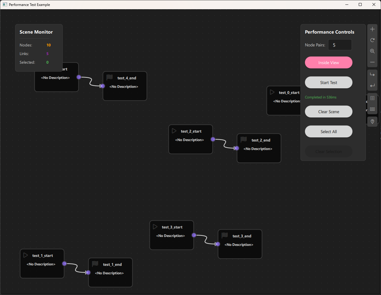
Key Concepts
Batch Creation
Instead of creating nodes one by one, batch creation:
- Creates all nodes in memory first
- Adds them to the scene in one operation
- Creates all links in one operation
- Significantly faster than individual creation
Performance Metrics
Key metrics to monitor:
- Creation Time: Time to create nodes and links
- Selection Time: Time to select/deselect items
- Clear Time: Time to clear the scene
- Memory Usage: Memory consumed by the scene
- Frame Rate: Rendering performance
Spawn Modes
Inside View:
- Nodes created only in visible viewport
- Faster rendering
- Better for testing viewport performance
Across Scene:
- Nodes created across entire scene
- Tests scene-wide performance
- Better for testing scalability
Extending the Performance Analyzer
Adding New Metrics
To add new performance metrics:
-
Add monitoring code in
Main.qml:
qml function measureOperation() { const startTime = Date.now() // Perform operation const elapsed = Date.now() - startTime console.log("Operation time:", elapsed, "ms") } -
Add UI elements to display metrics
-
Update monitoring timer to refresh metrics
Custom Node Types
To test with custom node types:
- Add node types to
CSpecs.qml - Create node QML files
- Register in
PerformanceScene.qml - Modify
createPairNodes()to use custom types
Performance Profiling
Integrate with profiling tools:
- Qt Creator Profiler
- Chrome DevTools (for QML)
- Custom performance counters
- Memory profilers
Troubleshooting
Common Issues
- Slow Creation:
- Reduce node count
- Use "Inside View" mode
- Check for memory issues
-
Verify batch operations are used
-
High Memory Usage:
- Clear scene regularly
- Monitor memory with profiling tools
-
Reduce node count if needed
-
UI Freezing:
- Use
Qt.callLater()for heavy operations - Break operations into smaller chunks
-
Show busy indicator during operations
-
Inaccurate Timing:
- Clear scene before each test
- Close other applications
- Run multiple tests and average results
Debug Tips
- Enable console logging for detailed metrics
- Use
console.time()andconsole.timeEnd()for timing - Monitor memory with system tools
- Check QML profiler for rendering issues
- Verify batch operations are actually batching
Performance Benchmarks
Typical Performance (Reference)
These are example benchmarks - actual performance depends on hardware:
| Node Pairs | Nodes | Links | Creation Time | Selection Time |
|---|---|---|---|---|
| 100 | 200 | 100 | ~50ms | ~10ms |
| 500 | 1000 | 500 | ~200ms | ~50ms |
| 1000 | 2000 | 1000 | ~400ms | ~100ms |
| 5000 | 10000 | 5000 | ~2000ms | ~500ms |
| 10000 | 20000 | 10000 | ~4000ms | ~1000ms |
Note: These are approximate values and will vary based on:
- Hardware specifications
- Operating system
- Qt version
- NodeLink optimizations
Conclusion
The Performance Analyzer Example provides essential tools for:
- Benchmarking: Measure NodeLink's performance
- Optimization: Identify performance bottlenecks
- Testing: Verify framework scalability
- Development: Test during framework development
Key takeaways:
- Batch Operations: Always use batch methods for multiple items
- Performance Monitoring: Real-time statistics help identify issues
- Scalability: NodeLink can handle large scenes efficiently
- Optimization: Pre-allocation and batching significantly improve performance
This example serves as a foundation for:
- Performance testing in custom applications
- Benchmarking framework improvements
- Stress testing production applications
- Capacity planning for large-scale deployments
For more examples, see the other examples in the NodeLink repository.
Simple NodeLink
Overview
The Simple NodeLink Example is the most basic example demonstrating how to get started with NodeLink. This minimal example shows the fundamental concepts of creating nodes, connecting them, and using basic NodeLink features like save/load, copy/paste, and cloning. It's the perfect starting point for developers new to NodeLink who want to understand the core framework concepts before building more complex applications.
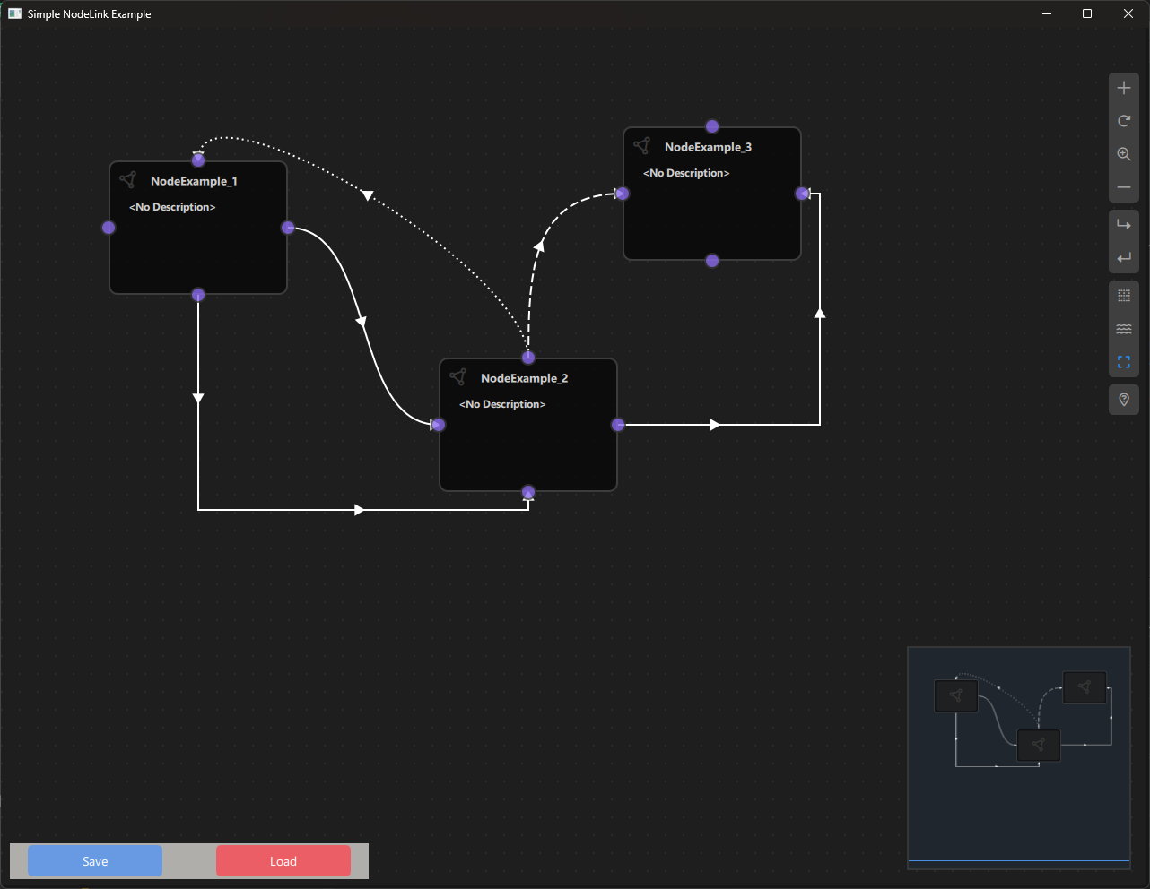
a. Purpose and Use Cases
Purpose
The Simple NodeLink Example demonstrates:
-
Basic Node Creation: Shows how to create a simple custom node with ports.
-
Port Configuration: Demonstrates how to add ports to nodes in different positions (top, bottom, left, right).
-
Node Registry Setup: Illustrates how to register node types in the node registry.
-
Scene Management: Shows basic scene creation and management using NodeLink's Scene component.
-
Save/Load Functionality: Demonstrates how to save and load scenes using QtQuickStream.
-
Copy/Paste Operations: Shows how to copy and paste nodes using keyboard shortcuts.
-
Node Cloning: Demonstrates how to clone selected nodes.
-
Basic UI Integration: Shows how to integrate NodeLink with a Qt Quick application.
Use Cases
- Learning Tool: Perfect starting point for developers new to NodeLink
- Template Project: Use as a template for creating new NodeLink applications
- Quick Prototyping: Rapidly prototype node-based interfaces
- Framework Introduction: Understand core NodeLink concepts and architecture
- Testing: Test NodeLink features in a minimal environment
- Customization Base: Start with this example and add custom functionality
Example Scenarios
- First NodeLink Project: Create your first NodeLink application
- Understanding Ports: Learn how ports work and how to configure them
- Scene Persistence: Learn how to save and load node graphs
- Node Operations: Practice copying, pasting, and cloning nodes
- Custom Node Development: Use as a base for creating custom node types
Real-World Applications
- Learning Projects: Educational projects to understand NodeLink
- Prototype Development: Quick prototypes before building full applications
- Framework Testing: Test NodeLink features and capabilities
- Custom Application Foundation: Starting point for building custom node-based applications
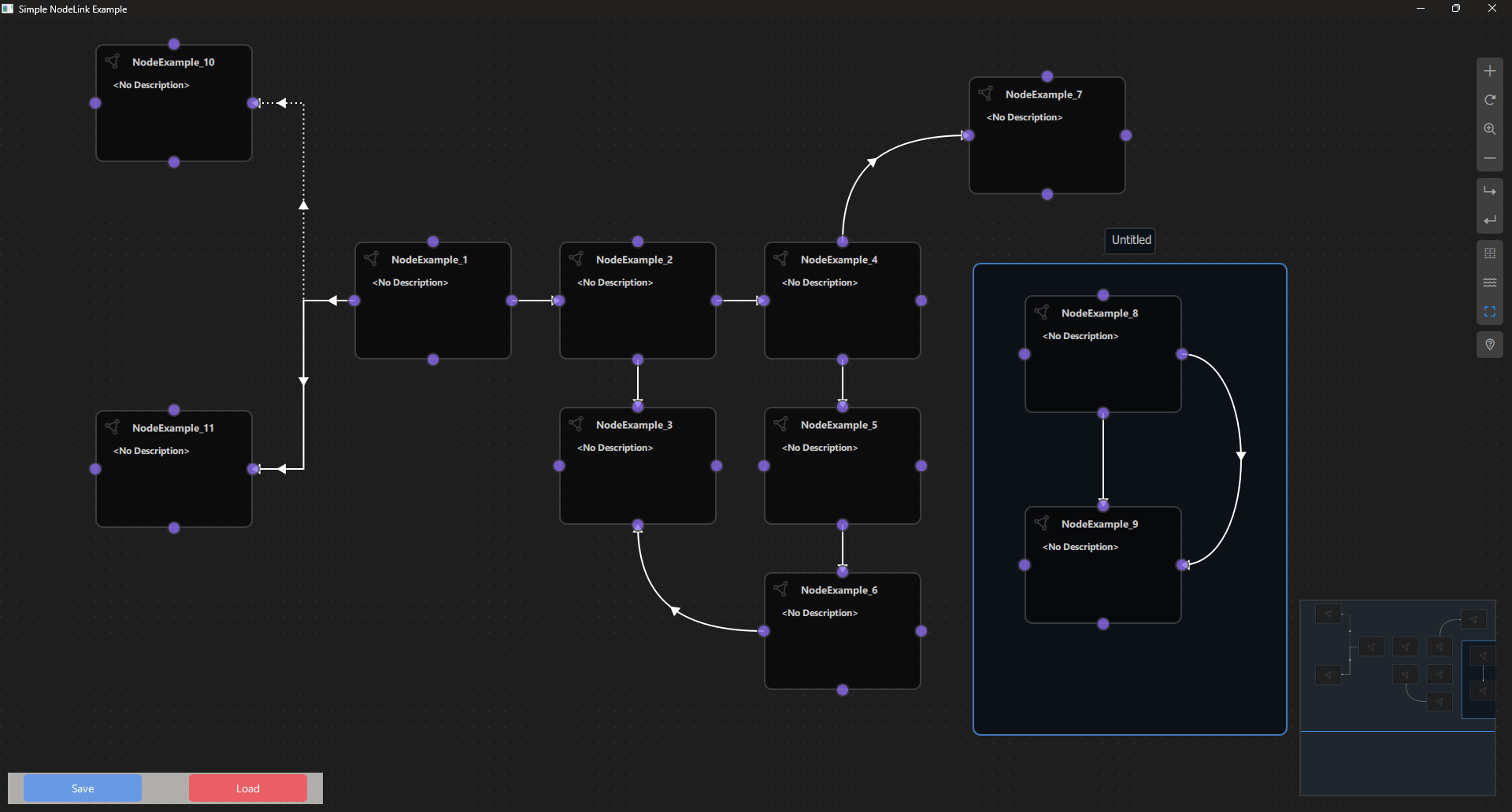
b. Node Types Explained
The Simple NodeLink Example implements one basic node type designed to demonstrate fundamental NodeLink concepts.
Node Example (NodeExample)
Purpose: A simple example node that demonstrates how to create a custom node with ports on all four sides.
Type ID: 0
Properties:
- Contains four ports, one on each side (top, bottom, left, right)
- All ports are bidirectional (InAndOut type)
- Minimal implementation to show basic node structure
Ports:
- Top Port: InAndOut type (Top side)
- Bottom Port: InAndOut type (Bottom side)
- Left Port: InAndOut type (Left side)
- Right Port: InAndOut type (Right side)
Port Types:
- InAndOut: Bidirectional port that can act as both input and output
- Ports can be connected to other ports regardless of direction
Properties:
- type: Set to 0 (node type identifier)
- Default node appearance and behavior from NodeLink base classes
Behavior:
- Can be connected to other nodes via any of its four ports
- Supports all standard NodeLink operations (select, move, delete, clone)
- No custom logic - purely for demonstration purposes
Visual Appearance:
- Icon: Document icon (Font Awesome \ue4e2)
- Color: Gray (#444)
- Default NodeLink node styling
Usage:
- Add nodes using the side menu
- Connect nodes by dragging from one port to another
- Use standard NodeLink operations (select, move, delete, clone)
Code Implementation:
Node {
    type: 0

    Component.onCompleted: addPorts();

    function addPorts() {
        let _port1 = NLCore.createPort();
        let _port2 = NLCore.createPort();
        let _port3 = NLCore.createPort();
        let _port4 = NLCore.createPort();

        _port1.portType = NLSpec.PortType.InAndOut
        _port1.portSide = NLSpec.PortPositionSide.Top

        _port2.portType = NLSpec.PortType.InAndOut
        _port2.portSide = NLSpec.PortPositionSide.Bottom

        _port3.portType = NLSpec.PortType.InAndOut
        _port3.portSide = NLSpec.PortPositionSide.Left

        _port4.portType = NLSpec.PortType.InAndOut
        _port4.portSide = NLSpec.PortPositionSide.Right

        addPort(_port1);
        addPort(_port2);
        addPort(_port3);
        addPort(_port4);
    }
}
Container Node
The example also includes support for Container nodes (from NodeLink core), which allow grouping nodes together.
Type ID: 1
Properties:
- Groups multiple nodes together
- Can contain other nodes and containers
- Provides organizational structure for complex scenes
Visual Appearance:
- Icon: Folder icon (Font Awesome \uf247)
- Color: Primary color from NLStyle
Node Type Summary Table
| Node Type | Type ID | Ports | Port Type | Purpose |
|---|---|---|---|---|
| NodeExample | 0 | 4 (all sides) | InAndOut | Basic example node |
| Container | 1 | N/A | N/A | Node grouping |
c. Step-by-Step Building Guide
This guide will walk you through building the Simple NodeLink Example from scratch, explaining each component and how they work together.
Prerequisites
- Qt 6.2.4 or later (Qt 6.10.0 recommended)
- CMake 3.1.0 or later
- C++ compiler with C++14 support (MSVC 2019/2022 on Windows)
- NodeLink framework built and installed
- QtQuickStream module built and installed
Step 1: Project Setup
1.1 Create Project Structure
Create the following directory structure:
simpleNodeLink/
├── CMakeLists.txt
├── main.cpp
├── main.qml
└── NodeExample.qml
1.2 Configure CMakeLists.txt
Create CMakeLists.txt with the following configuration:
cmake_minimum_required(VERSION 3.1.0)

set(CMAKE_AUTOMOC ON)
set(CMAKE_CXX_STANDARD_REQUIRED ON)

# Configure Qt
find_package(QT NAMES Qt6 Qt5 COMPONENTS Core Gui QuickControls2 REQUIRED)
find_package(Qt${QT_VERSION_MAJOR} COMPONENTS Core Gui QuickControls2 REQUIRED)

set(QML_IMPORT_PATH ${CMAKE_BINARY_DIR}/qml/NodeLink/resources/View)
set(QT_QML_OUTPUT_DIRECTORY ${CMAKE_BINARY_DIR}/qml)

# Create executable
qt_add_executable(SimpleNodeLink main.cpp)

# Define QML module
qt_add_qml_module(SimpleNodeLink
    URI "SimpleNodeLink"
    VERSION 1.0
    QML_FILES
        main.qml
        NodeExample.qml
)

target_include_directories(SimpleNodeLink PUBLIC
    Qt${QT_VERSION_MAJOR}::QuickControls2)

target_link_libraries(SimpleNodeLink PRIVATE
    Qt${QT_VERSION_MAJOR}::Core
    Qt${QT_VERSION_MAJOR}::Gui
    Qt${QT_VERSION_MAJOR}::QuickControls2
    NodeLinkplugin
    QtQuickStreamplugin
)
Key Points:
- Links to NodeLinkplugin and QtQuickStreamplugin
- Sets QML import paths for NodeLink resources
- Minimal QML files (just main.qml and NodeExample.qml)
Step 2: Create Node Example
2.1 NodeExample.qml
Create NodeExample.qml - a simple example node:
import QtQuick
import NodeLink

Node {
    type: 0

    Component.onCompleted: addPorts();

    function addPorts() {
        let _port1 = NLCore.createPort();
        let _port2 = NLCore.createPort();
        let _port3 = NLCore.createPort();
        let _port4 = NLCore.createPort();

        _port1.portType = NLSpec.PortType.InAndOut
        _port1.portSide = NLSpec.PortPositionSide.Top

        _port2.portType = NLSpec.PortType.InAndOut
        _port2.portSide = NLSpec.PortPositionSide.Bottom

        _port3.portType = NLSpec.PortType.InAndOut
        _port3.portSide = NLSpec.PortPositionSide.Left

        _port4.portType = NLSpec.PortType.InAndOut
        _port4.portSide = NLSpec.PortPositionSide.Right

        addPort(_port1);
        addPort(_port2);
        addPort(_port3);
        addPort(_port4);
    }
}
Key Features:
- Inherits from Node base class
- Sets type to 0 (node type identifier)
- Adds four ports in addPorts() function
- All ports are bidirectional (InAndOut)
- Ports positioned on all four sides
Step 3: Create Main Application
3.1 main.cpp
Create main.cpp:
#include <QtGui/QGuiApplication>
#include <QQmlApplicationEngine>
#include <QQuickStyle>

int main(int argc, char* argv[])
{
    QGuiApplication app(argc, argv);
    QQmlApplicationEngine engine;

    QQuickStyle::setStyle("Material");
    engine.addImportPath(":/");

    const QUrl url(u"qrc:/SimpleNodeLink/main.qml"_qs);
    QObject::connect(&engine, &QQmlApplicationEngine::objectCreated,
                     &app, [url](QObject *obj, const QUrl &objUrl) {
        if (!obj && url == objUrl)
            QCoreApplication::exit(-1);
    }, Qt::QueuedConnection);
    engine.load(url);

    return app.exec();
}
3.2 main.qml
Create main.qml - the main application with scene setup and controls:
import QtQuick
import QtQuickStream
import QtQuick.Dialogs
import QtQuick.Controls
import NodeLink

Window {
    id: window

    // Scene property (will be overridden by load)
    property Scene scene: Scene { }

    // Node registry setup
    property NLNodeRegistry nodeRegistry: NLNodeRegistry {
        _qsRepo: NLCore.defaultRepo
        imports: ["SimpleNodeLink", "NodeLink"];
        defaultNode: 0
    }

    width: 1280
    height: 960
    visible: true
    title: qsTr("Simple NodeLink Example")
    color: "#1e1e1e"

    Material.theme: Material.Dark
    Material.accent: "#4890e2"

    Component.onCompleted: {
        // Prepare node registry
        var nodeType = 0;
        nodeRegistry.nodeTypes[nodeType] = "NodeExample";
        nodeRegistry.nodeNames[nodeType] = "NodeExample";
        nodeRegistry.nodeIcons[nodeType] = "\ue4e2";
        nodeRegistry.nodeColors[nodeType] = "#444";

        // Register Container node type
        nodeRegistry.nodeTypes[nodeType + 1] = "Container";
        nodeRegistry.nodeNames[nodeType + 1] = "Container";
        nodeRegistry.nodeIcons[nodeType + 1] = "\uf247";
        nodeRegistry.nodeColors[nodeType + 1] = NLStyle.primaryColor;

        // Initialize QtQuickStream repository
        NLCore.defaultRepo = NLCore.createDefaultRepo(["QtQuickStream", "NodeLink", "SimpleNodeLink"])
        NLCore.defaultRepo.initRootObject("Scene");

        // Set registry to scene
        window.scene = Qt.binding(function() {
            return NLCore.defaultRepo.qsRootObject;
        });
        window.scene.nodeRegistry = Qt.binding(function() {
            return window.nodeRegistry;
        });
    }

    // Main view
    NLView {
        id: view
        scene: window.scene
        anchors.fill: parent
    }

    // Save/Load controls
    Rectangle {
        anchors.left: parent.left
        anchors.bottom: parent.bottom
        anchors.margins: 10
        width: 400
        height: 40
        color: "#b0aeab"

        Button {
            text: "Save"
            width: 150
            anchors.left: parent.left
            anchors.margins: 20
            anchors.verticalCenter: parent.verticalCenter
            background: Rectangle {
                radius: 5
                color: "#6899e3"
            }
            onClicked: {
                saveDialog.visible = true
            }
        }

        Button {
            text: "Load"
            anchors.right: parent.right
            anchors.margins: 20
            anchors.verticalCenter: parent.verticalCenter
            width: 150
            background: Rectangle {
                radius: 5
                color: "#eb5e65"
            }
            onClicked: loadDialog.visible = true
        }
    }

    // Save dialog
    FileDialog {
        id: saveDialog
        currentFile: "QtQuickStream.QQS.json"
        fileMode: FileDialog.SaveFile
        nameFilters: [ "QtQuickStream Files (*.QQS.json)" ]
        onAccepted: {
            NLCore.defaultRepo.saveToFile(saveDialog.currentFile);
        }
    }

    // Load dialog
    FileDialog {
        id: loadDialog
        currentFile: "QtQuickStream.QQS.json"
        fileMode: FileDialog.OpenFile
        nameFilters: [ "QtQuickStream Files (*.QQS.json)" ]
        onAccepted: {
            NLCore.defaultRepo.clearObjects();
            NLCore.defaultRepo.loadFromFile(loadDialog.currentFile);
        }
    }

    // Keyboard shortcuts
    Shortcut {
        sequence: "Ctrl+C"
        onActivated: {
            view.copyNodes();
        }
    }

    Shortcut {
        sequence: "Ctrl+V"
        onActivated: {
            view.pasteNodes()
        }
    }

    Shortcut {
        sequence: "Ctrl+A"
        onActivated: scene?.selectionModel.selectAll(
            scene.nodes, scene.links, scene.containers
        );
    }

    Shortcut {
        sequence: "Ctrl+D"
        onActivated: {
            var copiedNodes = ({});
            var copiedContainers = ({});
            Object.keys(scene?.selectionModel.selectedModel ?? []).forEach(key => {
                if (Object.keys(scene.nodes).includes(key)) {
                    var copiedNode = scene?.cloneNode(key);
                    copiedNodes[copiedNode._qsUuid] = copiedNode;
                }
                if (Object.keys(scene?.containers).includes(key)) {
                    var copiedContainer = scene?.cloneContainer(key);
                    copiedContainers[copiedContainer._qsUuid] = copiedContainer;
                }
            });
            scene?.selectionModel.selectAll(copiedNodes, ({}), copiedContainers);
        }
    }
}
Key Features:
- Scene Setup: Creates a Scene using QtQuickStream
- Node Registry: Registers NodeExample and Container node types
- NLView: Main view component for displaying the node graph
- Save/Load: File dialogs for saving and loading scenes
- Keyboard Shortcuts: Copy, paste, select all, and clone operations
Step 4: Build and Run
4.1 Configure Build
-
Create a build directory:
bash mkdir build cd build -
Configure with CMake:
bash cmake .. -DCMAKE_PREFIX_PATH=<Qt_Install_Path> -
Build the project:
bash
                        cmake --build .
4.2 Run the Application
Run the executable:
./SimpleNodeLink  # Linux/Mac
SimpleNodeLink.exe  # Windows
Step 5: Using the Simple NodeLink Example
Basic Usage
- Add Nodes:
- Click the side menu (right side)
- Select "NodeExample" to add a node
-
Nodes appear on the canvas
-
Connect Nodes:
- Click and drag from one port to another
- A link will be created between the ports
-
Ports can connect in any direction (InAndOut type)
-
Move Nodes:
- Click and drag nodes to move them
-
Selected nodes can be moved together
-
Select Nodes:
- Click on a node to select it
- Drag to select multiple nodes
-
Use Ctrl+A to select all
-
Delete Nodes:
- Select nodes and press Delete key
- Or use the context menu
Save and Load
- Save Scene:
- Click the "Save" button (bottom left)
- Choose a location and filename
-
Scene is saved as
.QQS.jsonfile -
Load Scene:
- Click the "Load" button (bottom left)
- Select a previously saved
.QQS.jsonfile - Scene is loaded and displayed
Keyboard Shortcuts
- Ctrl+C: Copy selected nodes
- Ctrl+V: Paste copied nodes
- Ctrl+A: Select all nodes and links
- Ctrl+D: Clone selected nodes
- Delete: Delete selected nodes
Architecture Overview
Component Hierarchy
Main Window
├── Scene (QtQuickStream)
│   ├── NodeRegistry (defines node types)
│   ├── SelectionModel (manages selection)
│   ├── Nodes (NodeExample instances)
│   ├── Links (connections between nodes)
│   └── Containers (node groups)
├── NLView (main view component)
│   ├── NodesScene (canvas)
│   └── SideMenu (add nodes)
└── Save/Load Controls
    ├── Save Button
    └── Load Button
Data Flow
User Action
    ↓
NLView (handles interaction)
    ↓
Scene (manages nodes/links)
    ↓
QtQuickStream (persistence)
Key Concepts
Node Creation
Nodes are created by:
1. Defining a QML component that inherits from Node
2. Setting a unique type identifier
3. Adding ports in Component.onCompleted
4. Registering in the node registry
Port Types
- Input: Can only receive connections
- Output: Can only send connections
- InAndOut: Bidirectional - can both send and receive
Port Positions
- Top: Port on the top side of the node
- Bottom: Port on the bottom side
- Left: Port on the left side
- Right: Port on the right side
Scene Persistence
Scenes are saved/loaded using QtQuickStream:
- Save: Serializes all nodes, links, and containers to JSON
- Load: Deserializes from JSON and recreates the scene
- Format: .QQS.json (QtQuickStream JSON format)
Extending the Simple Example
Adding Custom Node Types
To add a new node type:
- Create Node QML File:
// MyCustomNode.qml
import QtQuick
import NodeLink

Node {
    type: 1  // Unique type ID
    Component.onCompleted: addPorts();
    function addPorts() {
        // Add your ports here
    }
}-
Register in main.qml:
qml nodeRegistry.nodeTypes[1] = "MyCustomNode"; nodeRegistry.nodeNames[1] = "My Custom Node"; nodeRegistry.nodeIcons[1] = "\uf123"; // Font Awesome icon nodeRegistry.nodeColors[1] = "#FF5733"; -
Add to CMakeLists.txt:
cmake
                        QML_FILES
                        main.qml
                        NodeExample.qml
                        MyCustomNode.qml
Adding Custom Logic
To add custom behavior to nodes:
-
Add Properties:
qml Node { property string myData: "Hello" // ... } -
Add Functions:
qml Node { function doSomething() { console.log("Doing something"); } } -
Handle Events:
qml
                        Node {
                        onSomeEvent: {
                        // Handle event
                        }
                        }
Customizing Appearance
Modify node appearance:
- Size: Set guiConfig.width and guiConfig.height
- Color: Set guiConfig.color
- Icon: Change icon in node registry
- Custom View: Create custom NodeView component
Troubleshooting
Common Issues
- Nodes Not Appearing:
- Check node registry registration
- Verify QML file is included in CMakeLists.txt
-
Check console for import errors
-
Ports Not Visible:
- Verify
addPorts()is called inComponent.onCompleted - Check port properties are set correctly
-
Ensure ports are added to the node
-
Save/Load Not Working:
- Check file permissions
- Verify QtQuickStream is properly linked
-
Check console for error messages
-
Shortcuts Not Working:
- Ensure window has focus
- Check for conflicting shortcuts
- Verify scene is properly initialized
Debug Tips
- Enable console logging:
console.log("Debug message") - Check QML errors in console
- Verify all imports are correct
- Test node creation step by step
- Check NodeLink documentation for API details
Next Steps
After understanding this simple example, you can:
- Explore Other Examples:
- Calculator Example: Learn about data flow
- Chatbot Example: Learn about pattern matching
- Logic Circuit Example: Learn about complex node logic
-
Performance Analyzer: Learn about optimization
-
Build Custom Applications:
- Start with this example as a template
- Add your own node types
- Implement custom logic
-
Create domain-specific applications
-
Learn Advanced Features:
- Custom node views
- Complex data types
- Undo/redo system
- Container nesting
- Custom link types
Conclusion
The Simple NodeLink Example provides a minimal, clean introduction to NodeLink framework. Key takeaways:
- Basic Setup: How to set up a NodeLink application
- Node Creation: How to create custom nodes with ports
- Scene Management: How to work with scenes
- Persistence: How to save and load scenes
- Operations: Basic node operations (copy, paste, clone)
This example serves as the foundation for:
- Learning NodeLink concepts
- Building custom node-based applications
- Understanding the framework architecture
- Prototyping new ideas
For more advanced examples, see the other examples in the NodeLink repository.
Vision Link
Overview
The VisionLink Example demonstrates how to build a visual image processing application using NodeLink. This example allows users to create image processing pipelines by connecting nodes that load, process, and display images. It showcases how to integrate C++ image processing code with QML nodes, handle image data flow through the node graph, and create interactive controls for real-time image manipulation. Perfect for learning how to build domain-specific node-based applications with custom data types and processing logic.
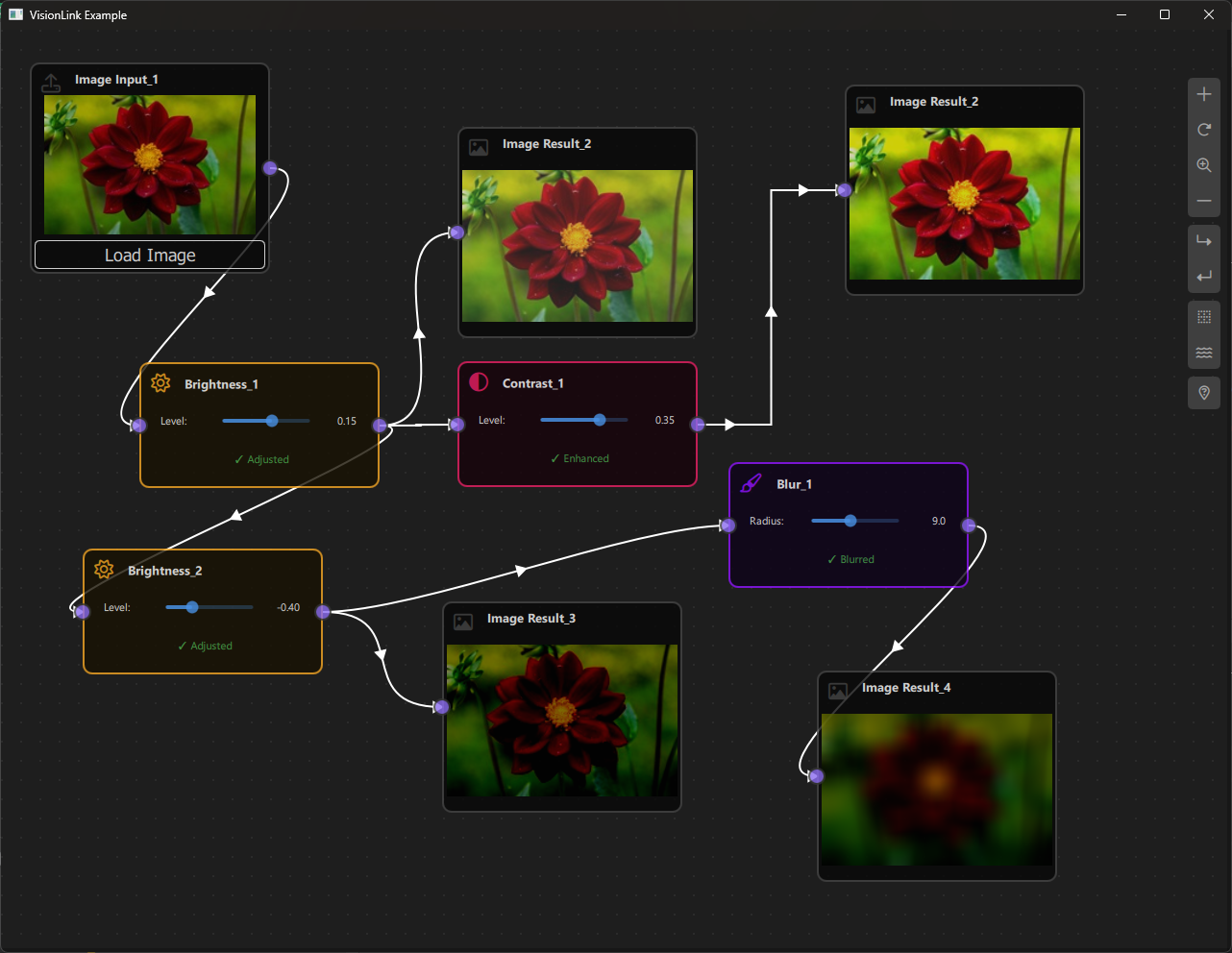
a. Purpose and Use Cases
Purpose
The VisionLink Example demonstrates:
-
Image Processing Pipelines: Create visual pipelines for processing images using connected nodes.
-
C++/QML Integration: Shows how to integrate C++ image processing code with QML node-based interfaces.
-
Custom Data Types: Demonstrates handling complex data types (images) through the node graph.
-
Real-Time Processing: Process images in real-time as parameters change or images are loaded.
-
Interactive Controls: Provides sliders and controls for adjusting processing parameters interactively.
-
Image Visualization: Displays images directly in nodes for visual feedback.
-
Data Flow Management: Handles complex data propagation through processing chains.
Use Cases
- Image Editing Tools: Build custom image editing applications with visual workflows
- Photo Processing: Create photo processing pipelines for batch operations
- Computer Vision: Prototype computer vision algorithms visually
- Educational Tool: Learn image processing concepts through visual programming
- Prototyping: Quickly prototype image processing workflows
- Custom Filters: Create and test custom image filters and effects
Example Scenarios
- Basic Image Processing: Load an image, apply blur, adjust brightness, and view the result
- Multi-Step Pipelines: Chain multiple operations (blur → brightness → contrast)
- Parameter Tuning: Adjust processing parameters in real-time and see immediate results
- Image Comparison: Process the same image with different parameters side-by-side
- Workflow Design: Design reusable image processing workflows
Real-World Applications
- Photo Editing Software: Build custom photo editing tools
- Image Filter Apps: Create Instagram-like filter applications
- Scientific Image Processing: Process microscopy or medical images
- Artistic Tools: Create digital art processing tools
- Quality Control: Automated image quality enhancement pipelines
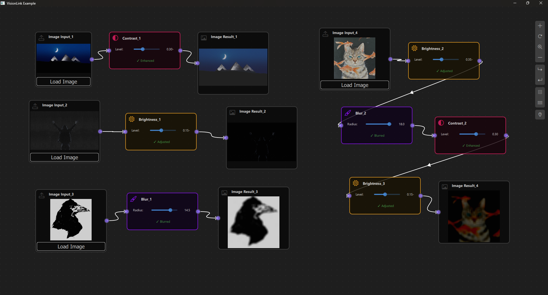
b. Node Types Explained
The VisionLink Example implements five node types, each serving a specific role in the image processing pipeline.
1. Image Input Node (ImageInputNode)
Purpose: Loads image files from disk and provides them to the processing pipeline.
Type ID: CSpecs.NodeType.ImageInput (0)
Properties:
- Contains a single output port
- Loads images from file system
- Displays image preview in the node
- Acts as the starting point for image processing pipelines
Ports:
- Output Port: (Right side) - Emits the loaded image data
Properties:
- imagePath: String path to the loaded image file
- nodeData.data: QImage object containing the loaded image
Behavior:
- Click "Load Image" button to open file dialog
- Supports common image formats (PNG, JPG, JPEG, BMP)
- Displays image preview in the node
- When image is loaded, triggers scene update to propagate to connected nodes
- Image data is stored as QImage object
Visual Appearance:
- Icon: Upload icon (Font Awesome \uf093)
- Color: Gray (#444)
- Size: 250x220 pixels
- Shows image preview when loaded
- "Load Image" button at the bottom
Usage Example:
- Click "Load Image" → Select image file → Image loads and displays
- Image is available at output port for connected nodes
Code Implementation:
function loadImage(path) {
    imagePath = path;
    var loadedImage = ImageProcessor.loadImage(path);
    if (ImageProcessor.isValidImage(loadedImage)) {
        nodeData.data = loadedImage;
    } else {
        nodeData.data = null;
    }
}
2. Blur Operation Node (BlurOperationNode)
Purpose: Applies blur effect to input images using a configurable blur radius.
Type ID: CSpecs.NodeType.Blur (2)
Properties:
- Has one input port and one output port
- Applies box blur algorithm to images
- Configurable blur radius (0.0 to 20.0)
Ports:
- Input Port: (Left side) - Receives image to blur
- Output Port: (Right side) - Emits blurred image
Properties:
- blurRadius: Real value (0.0 to 20.0) controlling blur intensity
- nodeData.input: Input image data
- nodeData.data: Processed blurred image
Behavior:
- Waits for input image to be connected
- Applies blur using box blur algorithm (implemented in C++)
- Updates output when blur radius changes
- Shows status indicator (✓ Blurred or Waiting...)
Visual Appearance:
- Icon: Blur icon (Font Awesome \uf1fc)
- Color: Purple (#9013FE)
- Size: 250x70 pixels (expands based on content)
- Slider control for blur radius
- Status text showing processing state
Usage Example:
- Connect ImageInput output → Blur input
- Adjust blur radius slider (0-20)
- Output shows blurred image
Code Implementation:
function updataData() {
    if (!nodeData.input) {
        nodeData.data = null;
        return;
    }
    var inputImage = nodeData.input;
    if (!ImageProcessor.isValidImage(inputImage)) {
        nodeData.data = null;
        return;
    }
    var blurredImage = ImageProcessor.applyBlur(inputImage, blurRadius);
    nodeData.data = blurredImage;
}
3. Brightness Operation Node (BrightnessOperationNode)
Purpose: Adjusts the brightness of input images.
Type ID: CSpecs.NodeType.Brightness (3)
Properties:
- Has one input port and one output port
- Adjusts image brightness by adding/subtracting from pixel values
- Configurable brightness level (-1.0 to 1.0)
Ports:
- Input Port: (Left side) - Receives image to adjust
- Output Port: (Right side) - Emits brightness-adjusted image
Properties:
- brightnessLevel: Real value (-1.0 to 1.0) where 0 = normal, negative = darker, positive = brighter
- nodeData.input: Input image data
- nodeData.data: Processed image with adjusted brightness
Behavior:
- Waits for input image to be connected
- Adjusts brightness by modifying RGB values
- Updates output when brightness level changes
- Shows status indicator (✓ Adjusted or Waiting...)
Visual Appearance:
- Icon: Sun/Brightness icon (Font Awesome \uf185)
- Color: Orange (#F5A623)
- Size: 250x70 pixels (expands based on content)
- Slider control for brightness level (-1.0 to 1.0)
- Status text showing processing state
Usage Example:
- Connect ImageInput output → Brightness input
- Adjust brightness slider (-1.0 to 1.0)
- Output shows brighter or darker image

Code Implementation:
function updataData() {
    if (!nodeData.input) {
        nodeData.data = null;
        return;
    }
    var inputImage = nodeData.input;
    if (!ImageProcessor.isValidImage(inputImage)) {
        nodeData.data = null;
        return;
    }
    var processedImage = ImageProcessor.applyBrightness(inputImage, brightnessLevel);
    nodeData.data = processedImage;
}
4. Contrast Operation Node (ContrastOperationNode)
Purpose: Adjusts the contrast of input images.
Type ID: CSpecs.NodeType.Contrast (4)
Properties:
- Has one input port and one output port
- Adjusts image contrast by scaling pixel values around midpoint
- Configurable contrast level (-1.0 to 1.0)
Ports:
- Input Port: (Left side) - Receives image to adjust
- Output Port: (Right side) - Emits contrast-adjusted image
Properties:
- contrastLevel: Real value (-1.0 to 1.0) where 0 = normal, negative = less contrast, positive = more contrast
- nodeData.input: Input image data
- nodeData.data: Processed image with adjusted contrast
Behavior:
- Waits for input image to be connected
- Adjusts contrast using formula: newValue = factor * (oldValue - 128) + 128
- Updates output when contrast level changes
- Shows status indicator (✓ Enhanced or Waiting...)
Visual Appearance:
- Icon: Contrast/Eye icon (Font Awesome \uf042)
- Color: Pink (#E91E63)
- Size: 250x70 pixels (expands based on content)
- Slider control for contrast level (-1.0 to 1.0)
- Status text showing processing state
Usage Example:
- Connect ImageInput output → Contrast input
- Adjust contrast slider (-1.0 to 1.0)
- Output shows image with adjusted contrast
Code Implementation:
function updataData() {
    if (!nodeData.input) {
        nodeData.data = null;
        return;
    }
    var inputImage = nodeData.input;
    if (!ImageProcessor.isValidImage(inputImage)) {
        nodeData.data = null;
        return;
    }
    var processedImage = ImageProcessor.applyContrast(inputImage, contrastLevel);
    nodeData.data = processedImage;
}
5. Image Result Node (ImageResultNode)
Purpose: Displays the final processed image result.
Type ID: CSpecs.NodeType.ImageResult (1)
Properties:
- Contains a single input port
- Displays processed images for visual feedback
- Read-only display node
Ports:
- Input Port: (Left side) - Receives processed image to display
Properties:
- nodeData.data: QImage object to display
Behavior:
- Receives image from connected operation node
- Converts QImage to data URL for display
- Updates automatically when input image changes
- Shows "No Image" when no input is connected
Visual Appearance:
- Icon: Image/Photo icon (Font Awesome \uf03e)
- Color: Gray (#444)
- Size: 250x220 pixels
- Displays image preview with aspect ratio preserved
- Shows status text when no image is available
Usage Example:
- Connect any operation node output → ImageResult input
- ImageResult displays the processed image
- Useful for viewing final results or intermediate steps
Display Behavior:
- Converts QImage to base64 data URL
- Displays image using QML Image component
- Preserves aspect ratio
- Shows loading/error states
Node Type Summary Table
| Node Type | Type ID | Input Ports | Output Ports | Operation | Color |
|---|---|---|---|---|---|
| ImageInput | 0 | 0 | 1 | Load image from file | Gray (#444) |
| ImageResult | 1 | 1 | 0 | Display image | Gray (#444) |
| Blur | 2 | 1 | 1 | Apply blur effect | Purple (#9013FE) |
| Brightness | 3 | 1 | 1 | Adjust brightness | Orange (#F5A623) |
| Contrast | 4 | 1 | 1 | Adjust contrast | Pink (#E91E63) |
Data Flow Architecture
The image processing follows a pipeline pattern:
Image Input Node (loads image)
    ↓
Operation Nodes (Blur/Brightness/Contrast)
    ↓
Image Result Node (displays result)
Images flow through the pipeline as QImage objects, processed by C++ code for performance.
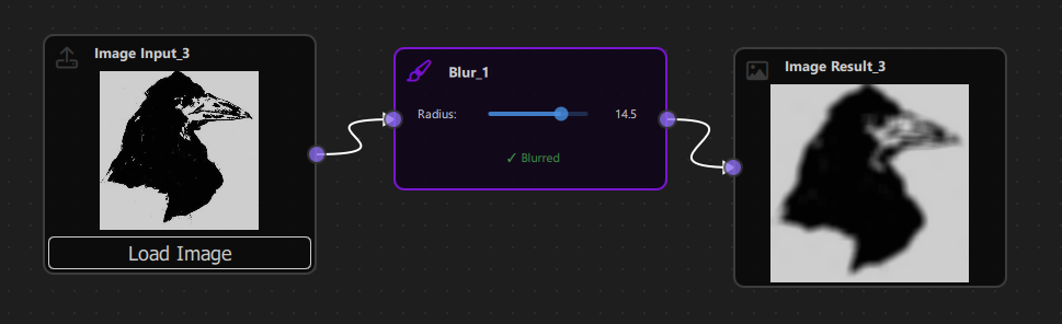
c. Step-by-Step Building Guide
This guide will walk you through building the VisionLink Example from scratch, explaining each component and how they work together.
Prerequisites
- Qt 6.2.4 or later (Qt 6.10.0 recommended)
- CMake 3.1.0 or later
- C++ compiler with C++14 support (MSVC 2019/2022 on Windows)
- NodeLink framework built and installed
- QtQuickStream module built and installed
- Basic understanding of C++/QML integration
Step 1: Project Setup
1.1 Create Project Structure
Create the following directory structure:
visionLink/
├── CMakeLists.txt
├── main.cpp
├── main.qml
├── ImageProcessor.h
├── ImageProcessor.cpp
└── resources/
    ├── Core/
    ├── View/
    └── fonts/
1.2 Configure CMakeLists.txt
Create CMakeLists.txt with the following configuration:
cmake_minimum_required(VERSION 3.1.0)

set(CMAKE_AUTOMOC ON)
set(CMAKE_CXX_STANDARD_REQUIRED ON)

# Configure Qt
find_package(QT NAMES Qt6 Qt5 COMPONENTS Core Gui QuickControls2 REQUIRED)
find_package(Qt${QT_VERSION_MAJOR} COMPONENTS Core Gui QuickControls2 REQUIRED)

list(APPEND QML_IMPORT_PATH ${CMAKE_BINARY_DIR}/qml)

# Create executable
qt_add_executable(VisionLink main.cpp)

# Set singletons
set_source_files_properties(
    resources/Core/CSpecs.qml
    resources/Core/ImageProcessor.qml
    PROPERTIES
        QT_QML_SINGLETON_TYPE True
)

# Define QML module
qt_add_qml_module(VisionLink
    URI "VisionLink"
    VERSION 1.0
    QML_FILES
        main.qml
        resources/Core/CSpecs.qml
        resources/Core/ImageProcessor.qml
        resources/Core/VisionLinkScene.qml
        resources/Core/ImageInputNode.qml
        resources/Core/ImageResultNode.qml
        resources/Core/OperationNode.qml
        resources/Core/OperationNodeData.qml
        resources/Core/BlurOperationNode.qml
        resources/Core/BrightnessOperationNode.qml
        resources/Core/ContrastOperationNode.qml
        resources/View/VisionLinkView.qml
        resources/View/VisionLinkNodeView.qml
    SOURCES
        ImageProcessor.h
        ImageProcessor.cpp
    RESOURCES
        resources/fonts/Font\ Awesome\ 6\ Pro-Thin-100.otf
        resources/fonts/Font\ Awesome\ 6\ Pro-Solid-900.otf
        resources/fonts/Font\ Awesome\ 6\ Pro-Regular-400.otf
        resources/fonts/Font\ Awesome\ 6\ Pro-Light-300.otf
)

target_include_directories(VisionLink PUBLIC
    Qt${QT_VERSION_MAJOR}::QuickControls2)

target_link_libraries(VisionLink PRIVATE
    Qt${QT_VERSION_MAJOR}::Core
    Qt${QT_VERSION_MAJOR}::Gui
    Qt${QT_VERSION_MAJOR}::QuickControls2
    NodeLinkplugin
    QtQuickStreamplugin
)
Key Points:
- Links to NodeLinkplugin and QtQuickStreamplugin
- Sets CSpecs.qml and ImageProcessor.qml as singletons
- Includes C++ source files for image processing
- Includes Font Awesome fonts for icons
Step 2: Create C++ Image Processor
2.1 ImageProcessor.h
Create ImageProcessor.h - C++ header for image processing:
#ifndef IMAGEPROCESSOR_H
#define IMAGEPROCESSOR_H

#include <QObject>
#include <QImage>
#include <QString>
#include <QUrl>
#include <QVariant>
#include <QQmlEngine>
#include <QJSEngine>

class ImageProcessor : public QObject
{
    Q_OBJECT
    QML_NAMED_ELEMENT(ImageProcessorCPP)
    QML_SINGLETON

public:
    explicit ImageProcessor(QObject *parent = nullptr);

    static ImageProcessor* create(QQmlEngine *qmlEngine, QJSEngine *jsEngine)
    {
        Q_UNUSED(jsEngine);
        return new ImageProcessor(qmlEngine);
    }

    Q_INVOKABLE QVariant loadImage(const QString &path);
    Q_INVOKABLE QVariant applyBlur(const QVariant &imageData, qreal radius);
    Q_INVOKABLE QVariant applyBrightness(const QVariant &imageData, qreal level);
    Q_INVOKABLE QVariant applyContrast(const QVariant &imageData, qreal level);
    Q_INVOKABLE QString saveToDataUrl(const QVariant &imageData);
    Q_INVOKABLE bool isValidImage(const QVariant &imageData) const;

private:
    QImage variantToImage(const QVariant &imageData) const;
    QVariant imageToVariant(const QImage &image) const;
    QImage boxBlur(const QImage &source, int radius);
    QImage adjustBrightness(const QImage &source, qreal level);
    QImage adjustContrast(const QImage &source, qreal level);
};

#endif // IMAGEPROCESSOR_H
Key Features:
- QML singleton accessible from QML
- Methods for loading and processing images
- Helper methods for QVariant/QImage conversion
- Image processing algorithms (blur, brightness, contrast)
2.2 ImageProcessor.cpp
Create ImageProcessor.cpp - C++ implementation (see source file for full implementation).
Key Algorithms:
- Box Blur: Two-pass blur (horizontal then vertical) for performance
- Brightness: Adds/subtracts value from RGB channels
- Contrast: Scales pixel values around midpoint (128)
Key Features:
- Handles file:// URL cleanup
- Ensures detached image copies for memory safety
- Converts images to data URLs for QML display
- Validates image data
Step 3: Create QML Image Processor Wrapper
3.1 ImageProcessor.qml
Create resources/Core/ImageProcessor.qml - QML wrapper for C++ processor:
pragma Singleton

import QtQuick
import VisionLink

QtObject {
    function loadImage(path) {
        return ImageProcessorCPP.loadImage(path);
    }

    function applyBlur(imageData, radius) {
        return ImageProcessorCPP.applyBlur(imageData, radius);
    }

    function applyBrightness(imageData, level) {
        return ImageProcessorCPP.applyBrightness(imageData, level);
    }

    function applyContrast(imageData, level) {
        return ImageProcessorCPP.applyContrast(imageData, level);
    }

    function saveToDataUrl(imageData) {
        return ImageProcessorCPP.saveToDataUrl(imageData);
    }

    function isValidImage(imageData) {
        return ImageProcessorCPP.isValidImage(imageData);
    }
}Purpose: Provides a clean QML interface to C++ image processing functions.
Step 4: Create Specifications
4.1 CSpecs.qml
Create resources/Core/CSpecs.qml:
pragma Singleton
import QtQuick

QtObject {
    enum NodeType {
        ImageInput      = 0,
        ImageResult     = 1,
        Blur            = 2,
        Brightness      = 3,
        Contrast        = 4,
        Operation       = 5,
        Unknown         = 99
    }

    enum OperationType {
        Blur            = 0,
        Brightness      = 1,
        Contrast        = 2,
        Unknown         = 99
    }
}
Step 5: Create Node Data Models
5.1 OperationNodeData.qml
Create resources/Core/OperationNodeData.qml:
import QtQuick
import NodeLink

I_NodeData {
    property var input: null
}Purpose: Stores input image data for operation nodes.
Step 6: Create Base Node Types
6.1 OperationNode.qml
Create resources/Core/OperationNode.qml - base class for operation nodes:
import QtQuick
import NodeLink

Node {
    property int operationType: CSpecs.OperationType.Blur

    type: CSpecs.NodeType.Operation
    nodeData: OperationNodeData {}

    guiConfig.width: 250
    guiConfig.height: 70

    Component.onCompleted: addPorts();

    function addPorts() {
        let _port1 = NLCore.createPort();
        let _port2 = NLCore.createPort();

        _port1.portType = NLSpec.PortType.Input
        _port1.portSide = NLSpec.PortPositionSide.Left
        _port1.enable = false;

        _port2.portType = NLSpec.PortType.Output
        _port2.portSide = NLSpec.PortPositionSide.Right

        addPort(_port1);
        addPort(_port2);
    }
}
Step 7: Create Specific Operation Nodes
7.1 BlurOperationNode.qml
Create resources/Core/BlurOperationNode.qml:
import QtQuick
import NodeLink
import VisionLink

OperationNode {
    operationType: CSpecs.OperationType.Blur
    type: CSpecs.NodeType.Blur

    property real blurRadius: 5.0

    function updataData() {
        if (!nodeData.input) {
            nodeData.data = null;
            return;
        }
        var inputImage = nodeData.input;
        if (!ImageProcessor.isValidImage(inputImage)) {
            nodeData.data = null;
            return;
        }
        var blurredImage = ImageProcessor.applyBlur(inputImage, blurRadius);
        nodeData.data = blurredImage;
    }
}
7.2 BrightnessOperationNode.qml
Create resources/Core/BrightnessOperationNode.qml:
import QtQuick
import NodeLink
import VisionLink

OperationNode {
    operationType: CSpecs.OperationType.Brightness
    type: CSpecs.NodeType.Brightness

    property real brightnessLevel: 0.0

    function updataData() {
        if (!nodeData.input) {
            nodeData.data = null;
            return;
        }
        var inputImage = nodeData.input;
        if (!ImageProcessor.isValidImage(inputImage)) {
            nodeData.data = null;
            return;
        }
        var processedImage = ImageProcessor.applyBrightness(inputImage, brightnessLevel);
        nodeData.data = processedImage;
    }
}
7.3 ContrastOperationNode.qml
Create resources/Core/ContrastOperationNode.qml:
import QtQuick
import NodeLink
import VisionLink

OperationNode {
    operationType: CSpecs.OperationType.Contrast
    type: CSpecs.NodeType.Contrast

    property real contrastLevel: 0.0

    function updataData() {
        if (!nodeData.input) {
            nodeData.data = null;
            return;
        }
        var inputImage = nodeData.input;
        if (!ImageProcessor.isValidImage(inputImage)) {
            nodeData.data = null;
            return;
        }
        var processedImage = ImageProcessor.applyContrast(inputImage, contrastLevel);
        nodeData.data = processedImage;
    }
}
Step 8: Create Input and Result Nodes
8.1 ImageInputNode.qml
Create resources/Core/ImageInputNode.qml:
import QtQuick
import NodeLink

Node {
    type: CSpecs.NodeType.ImageInput
    nodeData: I_NodeData {}

    guiConfig.width: 250
    guiConfig.height: 220

    property string imagePath: ""

    Component.onCompleted: addPorts();

    onCloneFrom: function (baseNode) {
        nodeData.data = null;
        imagePath = "";
    }

    function addPorts() {
        let _port1 = NLCore.createPort();
        _port1.portType = NLSpec.PortType.Output
        _port1.portSide = NLSpec.PortPositionSide.Right
        addPort(_port1);
    }

    function loadImage(path) {
        imagePath = path;
        var loadedImage = ImageProcessor.loadImage(path);
        if (ImageProcessor.isValidImage(loadedImage)) {
            nodeData.data = loadedImage;
        } else {
            nodeData.data = null;
        }
    }
}
8.2 ImageResultNode.qml
Create resources/Core/ImageResultNode.qml:
import QtQuick
import NodeLink

Node {
    type: CSpecs.NodeType.ImageResult
    nodeData: I_NodeData {}

    guiConfig.width: 250
    guiConfig.height: 220

    Component.onCompleted: addPorts();

    onCloneFrom: function (baseNode) {
        nodeData.data = null;
    }

    function addPorts() {
        let _port1 = NLCore.createPort();
        _port1.portType = NLSpec.PortType.Input
        _port1.portSide = NLSpec.PortPositionSide.Left
        addPort(_port1);
    }
}
Step 9: Create the Scene
9.1 VisionLinkScene.qml
Create resources/Core/VisionLinkScene.qml - the main scene with image data propagation:
import QtQuick
import QtQuick.Controls
import NodeLink
import VisionLink

I_Scene {
    id: scene

    nodeRegistry: NLNodeRegistry {
        _qsRepo: scene._qsRepo
        imports: ["VisionLink"]
        defaultNode: CSpecs.NodeType.ImageInput

        nodeTypes: [
            CSpecs.NodeType.ImageInput = "ImageInputNode",
            CSpecs.NodeType.ImageResult = "ImageResultNode",
            CSpecs.NodeType.Blur = "BlurOperationNode",
            CSpecs.NodeType.Brightness = "BrightnessOperationNode",
            CSpecs.NodeType.Contrast = "ContrastOperationNode"
        ];

        nodeNames: [
            CSpecs.NodeType.ImageInput = "Image Input",
            CSpecs.NodeType.ImageResult = "Image Result",
            CSpecs.NodeType.Blur = "Blur",
            CSpecs.NodeType.Brightness = "Brightness",
            CSpecs.NodeType.Contrast = "Contrast"
        ];

        nodeIcons: [
            CSpecs.NodeType.ImageInput = "\uf093",
            CSpecs.NodeType.ImageResult = "\uf03e",
            CSpecs.NodeType.Blur = "\uf1fc",
            CSpecs.NodeType.Brightness = "\uf185",
            CSpecs.NodeType.Contrast = "\uf042"
        ];

        nodeColors: [
            CSpecs.NodeType.ImageInput = "#444",
            CSpecs.NodeType.ImageResult = "#444",
            CSpecs.NodeType.Blur = "#9013FE",
            CSpecs.NodeType.Brightness = "#F5A623",
            CSpecs.NodeType.Contrast = "#E91E63"
        ];
    }

    selectionModel: SelectionModel {
        existObjects: [...Object.keys(nodes), ...Object.keys(links)]
    }

    property UndoCore _undoCore: UndoCore {
        scene: scene
    }

    onLinkRemoved: _upateDataTimer.start();
    onNodeRemoved: _upateDataTimer.start();
    onLinkAdded: updateData();

    property Timer _upateDataTimer: Timer {
        repeat: false
        running: false
        interval: 1
        onTriggered: scene.updateData();
    }

    function createCustomizeNode(nodeType, xPos, yPos) {
        var title = nodeRegistry.nodeNames[nodeType] + "_" +
                   (Object.values(scene.nodes).filter(node => node.type === nodeType).length + 1);
        return createSpecificNode(nodeRegistry.imports, nodeType,
                                 nodeRegistry.nodeTypes[nodeType],
                                 nodeRegistry.nodeColors[nodeType],
                                 title, xPos, yPos);
    }

    // Update all node data with iterative propagation
    function updateData() {
        // Reset operation and result nodes
        Object.values(nodes).forEach(node => {
            switch (node.type) {
                case CSpecs.NodeType.Blur:
                case CSpecs.NodeType.Brightness:
                case CSpecs.NodeType.Contrast: {
                    node.nodeData.data = null;
                    node.nodeData.input = null;
                } break;
                case CSpecs.NodeType.ImageResult: {
                    node.nodeData.data = null;
                } break;
            }
        });

        // Iterative propagation algorithm
        var allLinks = Object.values(links);
        var remainingLinks = allLinks.slice();
        var maxIterations = 100;
        var iteration = 0;

        while (remainingLinks.length > 0 && iteration < maxIterations) {
            iteration++;
            var linksProcessedThisIteration = [];
            var linksStillWaiting = [];

            remainingLinks.forEach(function(link) {
                var portA = link.inputPort._qsUuid;
                var portB = link.outputPort._qsUuid;
                var upstreamNode = findNode(portA);
                var downStreamNode = findNode(portB);

                var upstreamHasData = upstreamNode.nodeData.data !== null &&
                                     upstreamNode.nodeData.data !== undefined;

                if (upstreamNode.type === CSpecs.NodeType.ImageInput) {
                    upstreamHasData = true;
                }

                if (upstreamHasData) {
                    upadateNodeData(upstreamNode, downStreamNode);
                    linksProcessedThisIteration.push(link);
                } else {
                    linksStillWaiting.push(link);
                }
            });

            remainingLinks = linksStillWaiting;

            if (linksProcessedThisIteration.length === 0) {
                break;
            }
        }
    }

    // Update data from a specific node (for parameter changes)
    function updateDataFromNode(startingNode) {
        if (startingNode.type === CSpecs.NodeType.Blur ||
            startingNode.type === CSpecs.NodeType.Brightness ||
            startingNode.type === CSpecs.NodeType.Contrast) {
            startingNode.updataData();
        }

        // Propagate to downstream nodes
        var nodesToUpdate = [startingNode];
        var processedNodes = [];
        var maxIterations = 100;
        var iteration = 0;

        while (nodesToUpdate.length > 0 && iteration < maxIterations) {
            iteration++;
            var currentNode = nodesToUpdate.shift();
            processedNodes.push(currentNode._qsUuid);

            var downstreamLinks = Object.values(links).filter(function(link) {
                var upstreamNodeId = findNodeId(link.inputPort._qsUuid);
                return upstreamNodeId === currentNode._qsUuid;
            });

            downstreamLinks.forEach(function(link) {
                var portB = link.outputPort._qsUuid;
                var downStreamNode = findNode(portB);
                upadateNodeData(currentNode, downStreamNode);

                if (processedNodes.indexOf(downStreamNode._qsUuid) === -1) {
                    nodesToUpdate.push(downStreamNode);
                }
            });
        }
    }

    // Update specific node data
    function upadateNodeData(upstreamNode, downStreamNode) {
        switch (downStreamNode.type) {
            case CSpecs.NodeType.Blur:
            case CSpecs.NodeType.Brightness:
            case CSpecs.NodeType.Contrast: {
                downStreamNode.nodeData.input = upstreamNode.nodeData.data;
                downStreamNode.updataData();
            } break;
            case CSpecs.NodeType.ImageResult: {
                downStreamNode.nodeData.data = upstreamNode.nodeData.data;
            } break;
        }
    }

    // Link validation (same as other examples)
    function linkNodes(portA, portB) {
        if (!canLinkNodes(portA, portB)) {
            console.error("[Scene] Cannot link Nodes");
            return;
        }
        let link = Object.values(links).find(conObj =>
            conObj.inputPort._qsUuid === portA &&
            conObj.outputPort._qsUuid === portB);
        if (link === undefined)
            createLink(portA, portB);
    }

    function canLinkNodes(portA, portB) {
        // Validation logic (see source file)
        return true;
    }
}
Key Features:
- Iterative Propagation: Handles complex image data flow
- Parameter Updates: updateDataFromNode() for real-time parameter changes
- Image Data Handling: Properly propagates QImage objects through the graph
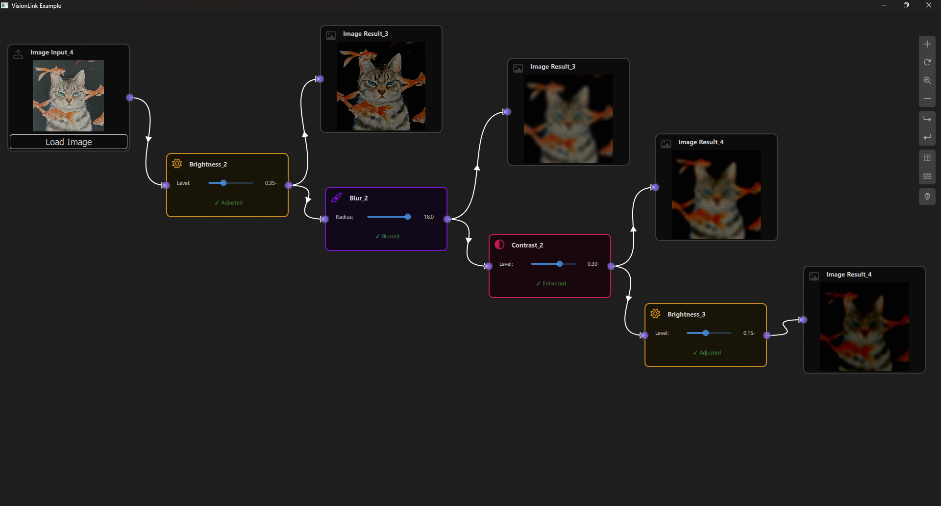
Step 10: Create Views
10.1 VisionLinkNodeView.qml
Create resources/View/VisionLinkNodeView.qml - custom view with image display and controls (see source file for full implementation).
Key Features:
- Dynamic Components: Different views for each node type
- Image Display: Shows image previews in ImageInput and ImageResult nodes
- Interactive Controls: Sliders for operation parameters
- Status Indicators: Shows processing state
- Minimal Mode: Icon-only view when zoomed out
10.2 VisionLinkView.qml
Create resources/View/VisionLinkView.qml:
import QtQuick
import QtQuick.Controls
import NodeLink
import QtQuickStream
import VisionLink

Item {
    id: view
    property VisionLinkScene scene

    property SceneSession sceneSession: SceneSession {
        enabledOverview: false;
        doNodesNeedImage: false
    }

    NodesScene {
        id: nodesScene
        anchors.fill: parent
        scene: view.scene
        sceneSession: view.sceneSession
        sceneContent: NodesRect {
            scene: view.scene
            sceneSession: view.sceneSession
            nodeViewComponent: Qt.createComponent("VisionLinkNodeView.qml")
        }
    }

    SideMenu {
        scene: view.scene
        sceneSession: view.sceneSession
        anchors.right: parent.right
        anchors.rightMargin: 45
        anchors.top: parent.top
        anchors.topMargin: 50
    }
}
Step 11: Create Main Application
11.1 main.cpp
Create main.cpp:
#include <QtGui/QGuiApplication>
#include <QQmlApplicationEngine>
#include <QQuickStyle>

int main(int argc, char* argv[])
{
    QGuiApplication app(argc, argv);
    QQmlApplicationEngine engine;

    QQuickStyle::setStyle("Material");
    engine.addImportPath(":/");

    const QUrl url(u"qrc:/VisionLink/main.qml"_qs);
    QObject::connect(&engine, &QQmlApplicationEngine::objectCreated,
                     &app, [url](QObject *obj, const QUrl &objUrl) {
        if  (!obj && url == objUrl)
            QCoreApplication::exit(-1);
    }, Qt::QueuedConnection);
    engine.load(url);

    return app.exec();
}
11.2 main.qml
Create main.qml:
import QtQuick
import QtQuick.Dialogs
import QtQuick.Controls
11.2 main.qml
Create main.qml:
import QtQuick
import QtQuick.Dialogs
import QtQuick.Controls
import QtQuickStream
import NodeLink
import VisionLink
Window {
id: window
property VisionLinkScene scene: null
width: 1280
height: 960
visible: true
title: qsTr("VisionLink Example")
color: "#1e1e1e"
Material.theme: Material.Dark
Material.accent: "#4890e2"
Component.onCompleted: {
NLCore.defaultRepo = NLCore.createDefaultRepo(["QtQuickStream", "VisionLink"])
NLCore.defaultRepo.initRootObject("VisionLinkScene");
window.scene = Qt.binding(function() {
return NLCore.defaultRepo.qsRootObject;
});
}
FontLoader { source: "qrc:/VisionLink/resources/fonts/Font Awesome 6 Pro-Thin-100.otf" }
FontLoader { source: "qrc:/VisionLink/resources/fonts/Font Awesome 6 Pro-Solid-900.otf" }
FontLoader { source: "qrc:/VisionLink/resources/fonts/Font Awesome 6 Pro-Regular-400.otf" }
FontLoader { source: "qrc:/VisionLink/resources/fonts/Font Awesome 6 Pro-Light-300.otf" }
VisionLinkView {
id: view
scene: window.scene
anchors.fill: parent
}
}
Step 12: Build and Run
12.1 Configure Build
-
Create a build directory:
bash
mkdir build
cd build
-
Configure with CMake:
bash
cmake .. -DCMAKE_PREFIX_PATH=<Qt_Install_Path>
-
Build the project:
bash
cmake --build .
12.2 Run the Application
Run the executable:
./VisionLink # Linux/Mac
VisionLink.exe # Windows
Step 13: Using VisionLink
Basic Usage
- Load Image:
- Add an ImageInput node
- Click "Load Image" button
-
Select an image file
-
Apply Operations:
- Add operation nodes (Blur, Brightness, Contrast)
- Connect ImageInput output → Operation input
- Adjust sliders to change parameters
-
See real-time updates
-
View Results:
- Add ImageResult node
- Connect operation output → ImageResult input
- View processed image
Example: Blur Pipeline
Setup:
1. Add ImageInput node → Load image
2. Add Blur node
3. Add ImageResult node
Connections:
- ImageInput → Blur
- Blur → ImageResult
Usage:
- Adjust blur radius slider
- See blurred result in ImageResult node
Example: Multi-Step Pipeline
Setup:
1. ImageInput → Blur → Brightness → Contrast → ImageResult
Usage:
- Adjust any operation parameter
- See final result in ImageResult
- All downstream nodes update automatically

Architecture Overview
Component Hierarchy
VisionLinkScene (I_Scene)
├── NodeRegistry (defines node types)
├── SelectionModel (manages selection)
├── UndoCore (undo/redo support)
└── Nodes & Links
├── ImageInputNode (loads images)
├── OperationNodes (Blur, Brightness Contrast)
└── ImageResultNode (displays results)
ImageProcessor (C++ Singleton)
├── loadImage() (loads from file)
├── applyBlur() (box blur algorithm)
├── applyBrightness() (brightness adjustment)
├── applyContrast() (contrast adjustment)
└── saveToDataUrl() (converts to base64)
Main Window
├── VisionLinkView
│ ├── NodesScene (canvas)
│ │ └── NodesRect (renders nodes)
│ │ └── VisionLinkNodeView (custom node UI)
│ └── SideMenu (add nodes)
Data Flow
Image File
↓
ImageInputNode (loads QImage)
↓
OperationNode (processes QImage)
↓
ImageResultNode (displays QImage)
Images flow as QImage objects through the pipeline, processed by C++ for performance.
Key Concepts
C++/QML Integration
- QML Singleton: C++ class registered as QML singleton
- QVariant Transfer: Images transferred as QVariant containing QImage
- Memory Management: Detached copies ensure proper memory handling
- Data URLs: Images converted to base64 data URLs for QML display
Image Processing
- Box Blur: Two-pass blur algorithm (horizontal + vertical)
- Brightness: Adds/subtracts value from RGB channels
- Contrast: Scales pixel values around midpoint
Data Propagation
- Iterative Algorithm: Handles complex processing chains
- Parameter Updates: Real-time updates when parameters change
- Validation: Checks for valid images before processing
Extending VisionLink
Adding New Operations
To add a new operation (e.g., Grayscale):
-
Add to CSpecs.qml:
qml
enum NodeType {
// ... existing
Grayscale = 5
}
-
Add C++ Method in ImageProcessor:
cpp
Q_INVOKABLE QVariant applyGrayscale(const QVariant &imageData);
-
Create GrayscaleOperationNode.qml:
qml
OperationNode {
operationType: CSpecs.OperationType.Grayscale
type: CSpecs.NodeType.Grayscale
function updataData() {
// Implementation
}
}
-
Register in VisionLinkScene.qml
-
Add View Component in VisionLinkNodeView.qml
Performance Optimization
- Use C++ for heavy processing
- Cache processed images when possible
- Optimize blur algorithm (use GPU if available)
- Reduce image resolution for previews
Troubleshooting
Common Issues
- Images Not Loading:
- Check file path format
- Verify image format is supported
-
Check file permissions
-
Processing Slow:
- Large images take longer
- Consider downscaling for preview
-
Optimize C++ algorithms
-
Images Not Displaying:
- Check data URL conversion
- Verify QImage is valid
-
Check console for errors
-
Parameters Not Updating:
- Verify
updateDataFromNode() is called
- Check slider value changes
- Ensure scene update is triggered
Debug Tips
- Enable console logging
- Check image validity:
ImageProcessor.isValidImage()
- Verify data propagation:
console.log(node.nodeData.data)
- Monitor memory usage with large images
Conclusion
The VisionLink Example demonstrates how to build sophisticated image processing applications with NodeLink. Key takeaways:
- C++ Integration: Use C++ for performance-critical operations
- Complex Data Types: Handle images and other complex data through nodes
- Real-Time Processing: Update results as parameters change
- Visual Feedback: Display images directly in nodes
- Extensible Design: Easy to add new operations and effects
This example serves as a foundation for building:
- Professional image editing tools
- Computer vision applications
- Scientific image processing
- Artistic image manipulation tools
- Automated image processing pipelines
For more examples, see the other examples in the NodeLink repository.
🏗️ Architecture (MVC)
NodeLink follows a Model-View-Controller pattern. You typically implement or configure:
-
A graph model that knows which nodes exist, how they are connected, and what data
they carry.
-
A NodeEditor view that visualizes the model using QML components.
-
A controller layer (C++ / QML logic) that translates UI actions into model
changes.
Application Layer
Your custom nodes, scenes, and application logic
▼
View Layer (View)
NLView → NodesScene → NodeView, LinkView, PortView
(Visual representation and user interaction)
▼
Controller / Coordinator Layer
SceneSession, UndoCore, NLView
(Coordinates between Model and View)
▼
Model Layer (Core)
Scene, Node, Link, Port, Container, SelectionModel
(Data models and business logic)
▼
Persistence Layer
QtQuickStream (QSRepository, QSSerializer)
(Serialization and storage)
Directory Structure
resources/
├── Core/ # Model Layer
│ ├── Scene.qml
│ ├── Node.qml
│ ├── Link.qml
│ ├── Port.qml
│ ├── Container.qml
│ ├── SelectionModel.qml
│ └── ...
│
└── View/ # View Layer
├── NLView.qml
├── NodesScene.qml
├── NodeView.qml
├── LinkView.qml
├── PortView.qml
├── SceneSession.qml
└── ...
MVC Pattern in NodeLink (Traditional MVC vs NodeLink MVC)
Traditional MVC:
- Model: Data and business logic
- View: User interface
- Controller: Handles user input and updates Model/View
NodeLink MVC:
- Model (Core): Data models, business logic, scene management
- View (View): Visual components, rendering, user interaction
- Controller/Coordinator: SceneSession, UndoCore, NLView coordinate between Model and View
Key Differences:
- QML Property Binding: Views automatically update when models change (declarative)
- Signal/Slot Communication: Models emit signals, views react via Connections
- SceneSession: Acts as a ViewModel/Controller hybrid managing view state
- Separation: Clear separation between data (Core) and presentation (View)
Model Layer (Core)
Purpose:
The Model layer contains all data structures, business logic, and scene management. Models are data-only
and have no knowledge of how they're displayed.
Core Components
Scene (resources/Core/Scene.qml)
The root model managing all nodes, links, and containers:
// resources/Core/Scene.qml
I_Scene {
// Data properties
property var nodes: ({}) // Map
property var links: ({}) // Map
property var containers: ({}) // Map
// Business logic
function addNode(node) { ... }
function deleteNode(uuid) { ... }
function linkNodes(portA, portB) { ... }
function unlinkNodes(portA, portB) { ... }
// Signals
signal nodeAdded(Node node)
signal nodeRemoved(Node node)
signal linkAdded(Link link)
signal linkRemoved(Link link)
}
Responsibilities:
- Manage collection of nodes, links, containers
- Provide business logic (add, delete, link, unlink)
- Emit signals when data changes
- No UI/rendering logic
Data Flow
Model → View Flow
Property Binding (Automatic):
// View automatically updates when model changes
NodeView {
x: node.guiConfig.position.x // Bound to model
y: node.guiConfig.position.y // Bound to model
color: node.guiConfig.color // Bound to model
}
Signal/Slot (Reactive):
// View reacts to model signals
Connections {
target: scene
function onNodeAdded(node) {
// Create view for new node
createNodeView(node)
}
}
View → Model Flow
Direct Property Updates:
// View updates model when user interacts
MouseArea {
onPositionChanged: {
// Update model position
node.guiConfig.position.x += deltaX
node.guiConfig.position.y += deltaY
}
}
Function Calls:
// View calls model functions
MouseArea {
onClicked: {
// Call model function
scene.selectionModel.selectNode(node)
}
}
Controller Coordination
SceneSession Coordinates State:
// Controller manages view state
SceneSession {
property bool connectingMode: false
}
// View reads controller state
NodeView {
enabled: !sceneSession.connectingMode
}
// Model operation updates controller
Scene {
function linkNodes(portA, portB) {
// ... link logic ...
sceneSession.connectingMode = false // Update controller
}
}
Complete Data Flow Example
User Drags Node:
1. User drags NodeView (View)
↓
2. NodeView.MouseArea.onPositionChanged (View)
↓
3. node.guiConfig.position.x += deltaX (Model update)
↓
4. NodeView.x property binding updates (View auto-update)
↓
5. PortView positions update (View auto-update)
↓
6. LinkView repaints (View auto-update)
↓
7. UndoCore observer detects change (Controller)
↓
8. UndoCore creates command (Controller)
Component Hierarchy
Model Hierarchy
Scene (I_Scene)
├── Node (I_Node)
│ ├── Port
│ ├── NodeGuiConfig
│ └── I_NodeData
├── Link
│ ├── Port (inputPort)
│ ├── Port (outputPort)
│ └── LinkGUIConfig
├── Container
│ ├── Node (contained)
│ └── ContainerGuiConfig
├── SelectionModel
└── SceneGuiConfig
View Hierarchy
NLView
├── NodesScene (I_NodesScene)
│ ├── NodesRect (I_NodesRect)
│ │ ├── NodeView (I_NodeView)
│ │ │ ├── PortView
│ │ │ └── ContentItem (custom)
│ │ ├── LinkView (I_LinkView)
│ │ └── ContainerView
│ └── SceneViewBackground
├── NodesOverview
└── SideMenu
Controller Hierarchy
NLView (Coordinator)
├── SceneSession (View State)
│ └── ZoomManager
└── UndoCore (Undo/Redo)
├── UndoStack
└── Observers
├── UndoNodeObserver
├── UndoLinkObserver
└── UndoSceneObserver
🧩 Nodes
(resources/Core/Node.qml)
Represents a single node in the graph:
// resources/Core/Node.qml
I_Node {
// Data properties
property string title: ""
property int type: 0
property var ports: ({}) // Map
property var children: ({}) // Map
property var parents: ({}) // Map
// Configuration
property NodeGuiConfig guiConfig: NodeGuiConfig { ... }
property I_NodeData nodeData: null
// Business logic
function addPort(port) { ... }
function deletePort(port) { ... }
// Signals
signal portAdded(var portId)
signal nodeCompleted()
}
Responsibilities:
- Store node data (title, type, ports)
- Manage parent/child relationships
- Provide node-specific logic
- No visual representation
🔌 Link
(resources/Core/Link.qml)
Represents a connection between two ports:
// resources/Core/Link.qml
QSObject {
// Data properties
property Port inputPort: null
property Port outputPort: null
property var controlPoints: []
property int direction: NLSpec.LinkDirection.LeftToRight
// Configuration
property LinkGUIConfig guiConfig: LinkGUIConfig { ... }
}
Responsibilities:
- Store connection data (ports, control points)
- Manage link properties
- No visual representation
🔌 Ports
(resources/Core/Port.qml)
Represents a connection point on a node:
// resources/Core/Port.qml
QSObject {
// Data properties
property Node node: null // Parent node
property int portType: NLSpec.PortType.Input
property int portSide: NLSpec.PortPositionSide.Left
property string title: ""
property string color: "white"
property bool enable: true
// Computed position (set by view)
property vector2d _position: Qt.vector2d(0, 0)
}
Responsibilities:
- Store port data (type, side, title)
- Reference parent node
- No visual representation
SelectionModel
(resources/Core/SelectionModel.qml)
Manages selected objects:
// resources/Core/SelectionModel.qml
QtObject {
// Data properties
property var selectedModel: ({}) // Map
property var existObjects: [] // All object UUIDs
// Business logic
function selectNode(node) { ... }
function clear() { ... }
function isSelected(uuid) { ... }
// Signals
signal selectedObjectChanged()
}
Responsibilities:
- Track selected nodes, links, containers
- Provide selection logic
- Emit signals when selection changes
- No visual representation
Model Characteristics:
- Data-Only: Models contain no QML visual elements (Rectangle, Item, etc.)
- Business Logic: Models contain functions for manipulating data
- Signals: Models emit signals when data changes
- Serializable: Models inherit from QSObject for serialization
- No View Dependencies: Models don't import or reference View components
View Layer (View)
Purpose:
The View layer contains all visual components that render the models. Views are presentation-only and
react to model changes.
NLView
(resources/View/NLView.qml)
The main view component that coordinates the entire UI:
// resources/View/NLView.qml
Item {
property Scene scene
property SceneSession sceneSession: SceneSession {}
// Main scene view
Loader {
sourceComponent: nodesScene
}
// Overview
NodesOverview {
scene: view.scene
sceneSession: view.sceneSession
}
// Side menu
SideMenu {
scene: view.scene
sceneSession: view.sceneSession
}
}
Responsibilities:
- Compose main UI (scene, overview, menu)
- Coordinate between components
- Handle copy/paste operations
NodeView
(resources/View/NodeView.qml)
Visual representation of a Node:
// resources/View/NodeView.qml
InteractiveNodeView {
property var node // Model reference
property I_Scene scene
property SceneSession sceneSession
// Visual properties bound to model
x: node.guiConfig.position.x
y: node.guiConfig.position.y
width: node.guiConfig.width
height: node.guiConfig.height
color: node.guiConfig.color
// Selection state bound to model
property bool isSelected: scene.selectionModel.isSelected(node._qsUuid)
// User interaction
MouseArea {
onClicked: {
scene.selectionModel.selectNode(node)
}
onPositionChanged: {
// Update model position
node.guiConfig.position.x += deltaX
node.guiConfig.position.y += deltaY
}
}
}
Responsibilities:
- Render node visually (Rectangle, text, etc.)
- Handle user interaction (click, drag)
- Update model when user interacts
- React to model changes (property binding)
LinkView
(resources/View/LinkView.qml)
Visual representation of a Link:
// resources/View/LinkView.qml
Canvas {
property var link // Model reference
property I_Scene scene
property SceneSession sceneSession
// Visual properties bound to model
property vector2d inputPos: link.inputPort._position
property vector2d outputPos: link.outputPort._position
property bool isSelected: scene.selectionModel.isSelected(link._qsUuid)
// Paint link
onPaint: {
var context = getContext("2d")
LinkPainter.createLink(context, inputPos, outputPos, ...)
}
}
Responsibilities:
- Render link visually (Canvas, Bezier curves)
- React to model changes (port positions, selection)
- Handle link-specific rendering
PortView
(resources/View/PortView.qml)
Visual representation of a Port:
// resources/View/PortView.qml
Rectangle {
property Port port // Model reference
property var node // Parent node view
// Visual properties bound to model
color: port.color
visible: port.enable
// Update model position
Component.onCompleted: {
port._position = Qt.vector2d(x, y)
}
}
Responsibilities:
- Render port visually (circle, rectangle)
- Update model position when moved
- Handle port interaction (hover, click)
View Characteristics
- Visual Only: Views contain QML visual elements (Rectangle, Canvas, etc.)
- Property Binding: Views bind to model properties for automatic updates
- User Interaction: Views handle mouse/keyboard events
- Model Updates: Views update models when user interacts
- Reactive: Views automatically update when models change
Controller/Coordinator Layer
Purpose:
The Controller/Coordinator layer bridges the Model and View layers, managing state, coordinating
operations, and handling complex interactions.
SceneSession
(resources/View/SceneSession.qml)
Manages view state and coordinates between model and view:
// resources/View/SceneSession.qml
QtObject {
// View state (not saved)
property bool connectingMode: false
property bool isShiftModifierPressed: false
property bool isCtrlPressed: false
property bool isRubberBandMoving: false
property bool isSceneEditable: true
// View configuration
property ZoomManager zoomManager: ZoomManager {}
property var portsVisibility: ({})
property var linkColorOverrideMap: ({})
// Signals
signal sceneForceFocus
signal marqueeSelectionStart(var mouse)
signal updateMarqueeSelection(var mouse)
}
Responsibilities:
- Manage view state (selection mode, connecting mode, etc.)
- Coordinate zoom/pan operations
- Handle view-specific settings (port visibility, link colors)
- Provide signals for view coordination
- Not serialized (temporary state)
UndoCore
(resources/Core/Undo/UndoCore.qml)
Manages undo/redo operations:
// resources/Core/Undo/UndoCore.qml
QtObject {
property Scene scene
property UndoStack undoStack: UndoStack {}
// Observer pattern
property UndoNodeObserver nodeObserver: UndoNodeObserver {}
property UndoLinkObserver linkObserver: UndoLinkObserver {}
property UndoSceneObserver sceneObserver: UndoSceneObserver {}
}
Responsibilities:
- Track model changes via observers
- Create commands for undo/redo
- Execute undo/redo operations
- Coordinate between model and view during undo/redo
NLViewController
(resources/View/NLView.qml)
Main coordinator component:
// resources/View/NLView.qml
Item {
property Scene scene
property SceneSession sceneSession: SceneSession {}
// Coordinate copy/paste
function copyNodes() {
// Copy from model
var selectedNodes = Object.values(scene.selectionModel.selectedModel)
// Store in NLCore
NLCore._copiedNodes = selectedNodes
}
function pasteNodes() {
// Create new nodes from copied data
// Add to scene
scene.addNodes(newNodes, false)
}
}
Responsibilities:
- Coordinate between scene (model) and views
- Handle complex operations (copy/paste, clone)
- Manage component lifecycle
- Bridge model and view layers
Controller Characteristics:
- State Management: Controllers manage view state and temporary data
- Coordination:Controllers coordinate between models and views
- Complex Operations:Controllers handle multi-step operations
- No Direct Rendering:Controllers don't render UI directly
- Business Logic:Controllers contain coordination logic
Key Design Patterns
1. Observer Pattern
Models emit signals, views observe:
// Model emits signal
Scene {
signal nodeAdded(Node node)
function addNode(node) {
nodes[node._qsUuid] = node
nodeAdded(node) // Emit signal
}
}
// View observes
Connections {
target: scene
function onNodeAdded(node) {
createNodeView(node) // React
}
}
2. Property Binding
Views automatically update when models change:
// View binds to model
NodeView {
x: node.guiConfig.position.x // Auto-updates
y: node.guiConfig.position.y // Auto-updates
}
3. Factory Pattern
NLCore provides factory functions:
// Factory creates models
var node = NLCore.createNode()
var port = NLCore.createPort()
var link = NLCore.createLink()
4. Command Pattern
Undo/Redo uses commands:
// Command encapsulates operation
AddNodeCommand {
node: newNode
scene: scene
function execute() {
scene.addNode(node)
}
function undo() {
scene.deleteNode(node._qsUuid)
}
}
5. Registry Pattern
NLNodeRegistry maps types to components:
// Registry maps type to component
NLNodeRegistry {
nodeTypes: {
0: "SourceNode",
1: "AdditiveNode"
}
nodeView: "NodeView.qml"
linkView: "LinkView.qml"
}
🧯 Troubleshooting
Common issues
-
Empty or broken scene: verify the QML import
(
import NodeLink 1.0) and ensure the module is deployed and found by the engine.
-
Missing Qt modules: ensure
QtQuick and
QtQuick.Controls are installed and available in your Qt installation.
-
CMake errors: remove your build directory and reconfigure.
-
Submodule problems: run
git submodule update --init --recursive.
❓ FAQ
Can I use NodeLink without QML?
The core concept (graph model) can be used headlessly, but NodeLink is primarily designed as a QML
node editor. For pure C++ or non-Qt UIs, you would need to build your own view layer.
Can I embed multiple NodeEditors in one app?
Yes. You can either attach each editor to an independent model, or share a model between editors for
multiple views of the same graph.
Is NodeLink suitable for commercial projects?
Yes. It is licensed under Apache-2.0, which permits use in both open-source and closed-source
applications, as long as you respect the license terms.
📄 License & Attribution
NodeLink is released under the Apache License, Version 2.0. You are free to:
- Use the library in open-source and commercial products.
- Modify and redistribute the code under the same license.
- Bundle NodeLink with your Qt applications.
When redistributing, you must:
- Include the
LICENSE file from the repository.
- Provide attribution (for example, “NodeLink by RONIA AB”).
Core Library (The Engine)
Overview
The Core Library is the engine that powers NodeLink. It provides the fundamental data models, business logic, and core services for building node-based applications. The Core Library is completely independent of the View layer, making it possible to use NodeLink's engine with different UI implementations.
Core Library Architecture
Purpose
The Core Library provides:
- Data Models: Scene, Node, Link, Port, Container
- Business Logic: Scene management, node operations, linking
- Core Services: Factory functions, registry, selection, undo/redo
- Serialization: Integration with QtQuickStream
- Type System: Specifications, enums, interfaces
Key Principles
- Data-Only: Core components contain no UI/rendering logic
- Serializable: All components inherit from
QSObject for persistence
- Signal-Based: Components emit signals for change notification
- Extensible: Interface-based design allows customization
- Independent: No dependencies on View layer
Directory Structure
resources/Core/
├── NLCore.qml # Engine singleton
├── NLSpec.qml # Specifications and enums
├── NLNodeRegistry.qml # Node type registry
├── NLUtils.qml # Utilities
│
├── I_Scene.qml # Scene interface
├── Scene.qml # Scene implementation
├── SceneGuiConfig.qml # Scene GUI configuration
│
├── I_Node.qml # Node interface
├── Node.qml # Node implementation
├── NodeGuiConfig.qml # Node GUI configuration
├── I_NodeData.qml # Node data interface
├── NodeData.qml # Node data implementation
│
├── Link.qml # Link model
├── LinkGUIConfig.qml # Link GUI configuration
│
├── Port.qml # Port model
│
├── Container.qml # Container model
├── ContainerGuiConfig.qml # Container GUI configuration
│
├── SelectionModel.qml # Selection management
├── SelectionSpecificTool.qml
│
├── ImagesModel.qml # Image management
│
└── Undo/ # Undo/Redo system
├── UndoCore.qml
├── UndoStack.qml
├── CommandStack.qml
└── Commands/
├── AddNodeCommand.qml
├── RemoveNodeCommand.qml
├── CreateLinkCommand.qml
└── ...
NLCore - The Engine Singleton
Overview
NLCore is the central singleton that provides factory functions and core services for NodeLink.
Location: resources/Core/NLCore.qml
Type: QML Singleton (pragma Singleton)
Properties
NLCore {
// Default repository (QtQuickStream)
property QSRepository defaultRepo: QSRepository { ... }
// Copy/paste storage
property var _copiedNodes: ({})
property var _copiedLinks: ({})
property var _copiedContainers: ({})
}
Factory Functions
Create Scene
// Create a new scene
var scene = NLCore.createScene();
scene.title = "My Scene";
Implementation:
function createScene() {
let obj = QSSerializer.createQSObject("Scene", ["NodeLink"], defaultRepo);
obj._qsRepo = defaultRepo;
return obj;
}
Create Node
// Create a new node
var node = NLCore.createNode();
node.type = 0;
node.title = "My Node";
Implementation:
function createNode() {
let obj = QSSerializer.createQSObject("Node", ["NodeLink"], defaultRepo);
obj._qsRepo = defaultRepo;
return obj;
}
Create Port
// Create a new port
var port = NLCore.createPort();
port.portType = NLSpec.PortType.Input;
port.portSide = NLSpec.PortPositionSide.Left;
port.title = "input";
Implementation:
function createPort(qsRepo = null) {
if (!qsRepo)
qsRepo = defaultRepo;
let obj = QSSerializer.createQSObject("Port", ["NodeLink"], qsRepo);
obj._qsRepo = qsRepo;
return obj;
}
Create Link
// Create a new link
var link = NLCore.createLink();
link.inputPort = inputPort;
link.outputPort = outputPort;
Implementation:
function createLink() {
let obj = QSSerializer.createQSObject("Link", ["NodeLink"], defaultRepo);
obj._qsRepo = defaultRepo;
return obj;
}
Default Repository
NLCore.defaultRepo is the default QtQuickStream repository used for serialization:
// Initialize repository
NLCore.defaultRepo = NLCore.createDefaultRepo([
"QtQuickStream",
"NodeLink",
"YourApp"
]);
// Initialize root object
NLCore.defaultRepo.initRootObject("Scene");
Copy/Paste Storage
NLCore provides temporary storage for copy/paste operations:
// Copy nodes
NLCore._copiedNodes = selectedNodes;
NLCore._copiedNodesChanged();
// Paste nodes
var copiedNodes = NLCore._copiedNodes;
// ... create new nodes from copied data ...
Core Components
Scene
Location: resources/Core/Scene.qml
Interface: I_Scene (resources/Core/I_Scene.qml)
The Scene is the root model that manages all nodes, links, and containers in a graph.
Properties
Scene {
// Collections
property var nodes: ({}) // Map<UUID, Node>
property var links: ({}) // Map<UUID, Link>
property var containers: ({}) // Map<UUID, Container>
// Metadata
property string title: "<Untitled>"
// Services
property SelectionModel selectionModel: SelectionModel { ... }
property NLNodeRegistry nodeRegistry: null
property UndoCore _undoCore: UndoCore { ... }
// Configuration
property SceneGuiConfig sceneGuiConfig: SceneGuiConfig { ... }
}
Key Functions
// Node management
function addNode(node) { ... }
function deleteNode(uuid) { ... }
function addNodes(nodeArray, autoSelect = true) { ... }
function deleteNodes(nodeUUIds) { ... }
function cloneNode(uuid) { ... }
// Link management
function linkNodes(portA, portB) { ... }
function unlinkNodes(portA, portB) { ... }
function createLink(portA, portB) { ... }
// Container management
function addContainer(container) { ... }
function deleteContainer(uuid) { ... }
function createContainer() { ... }
function cloneContainer(uuid) { ... }
// Utilities
function findNode(uuid) { ... }
function findPort(uuid) { ... }
function canLinkNodes(portA, portB) { ... }
function createCustomizeNode(nodeType, xPos, yPos) { ... }
Signals
signal nodeAdded(Node node)
signal nodeRemoved(Node node)
signal nodesAdded(list<Node> nodes)
signal nodesRemoved(list<Node> nodes)
signal linkAdded(Link link)
signal linkRemoved(Link link)
signal linksAdded(list<Link> links)
signal containerAdded(Container container)
signal containerRemoved(Container container)
Node
Location: resources/Core/Node.qml
Interface: I_Node (resources/Core/I_Node.qml)
A Node represents a single element in the graph with ports for connections.
Properties
Node {
// Identity
property string title: "<No Title>"
property int type: 0
property int objectType: NLSpec.ObjectType.Node
// Structure
property var ports: ({}) // Map<UUID, Port>
property var children: ({}) // Map<UUID, Node>
property var parents: ({}) // Map<UUID, Node>
// Configuration
property NodeGuiConfig guiConfig: NodeGuiConfig { ... }
property I_NodeData nodeData: null
property ImagesModel imagesModel: ImagesModel { ... }
}
Key Functions
// Port management
function addPort(port) { ... }
function deletePort(port) { ... }
function findPort(uuid) { ... }
function findPortByPortSide(side) { ... }
Signals
signal portAdded(var portId)
signal nodeCompleted()
Link
Location: resources/Core/Link.qml
A Link represents a connection between two ports.
Properties
Link {
// Connection
property Port inputPort: null
property Port outputPort: null
// Geometry
property var controlPoints: [] // Array of vector2d
// Configuration
property int direction: NLSpec.LinkDirection.LeftToRight
property LinkGUIConfig guiConfig: LinkGUIConfig { ... }
}
Port
Location: resources/Core/Port.qml
A Port represents a connection point on a node.
Properties
Port {
// Parent
property Node node: null // Parent node
// Type and position
property int portType: NLSpec.PortType.Input
property int portSide: NLSpec.PortPositionSide.Left
// Appearance
property string title: ""
property string color: "white"
property bool enable: true
// Position (set by view)
property vector2d _position: Qt.vector2d(0, 0)
property real _measuredTitleWidth: 0
}
Container
Location: resources/Core/Container.qml
Interface: I_Node (inherits from)
A Container groups nodes and other containers together.
Properties
Container {
// Identity
property string title: "Untitled"
property int objectType: NLSpec.ObjectType.Container
// Contents
property var nodes: ({}) // Map<UUID, Node>
property var containersInside: ({}) // Map<UUID, Container>
// Configuration
property ContainerGuiConfig guiConfig: ContainerGuiConfig { ... }
}
Key Functions
function addNode(node) { ... }
function removeNode(node) { ... }
function addContainerInside(container) { ... }
function removeContainerInside(container) { ... }
Interfaces
I_Node
Location: resources/Core/I_Node.qml
Base interface for all objects in the scene (Node, Container).
I_Node {
property int objectType: NLSpec.ObjectType.Unknown
property I_NodeData nodeData: null
signal cloneFrom(baseNode: I_Node)
onCloneFrom: function (baseNode) {
objectType = baseNode.objectType;
nodeData?.setProperties(baseNode.nodeData);
}
}
Purpose:
- Provides common interface for Node and Container
- Enables polymorphic operations
- Supports cloning mechanism
I_Scene
Location: resources/Core/I_Scene.qml
Base interface for Scene.
I_Scene {
property string title: "<Untitled>"
property var nodes: ({})
property var links: ({})
property var containers: ({})
property SelectionModel selectionModel: null
property NLNodeRegistry nodeRegistry: null
property SceneGuiConfig sceneGuiConfig: SceneGuiConfig { ... }
signal nodeAdded(Node node)
signal nodeRemoved(Node node)
// ... more signals ...
}
Purpose:
- Defines Scene contract
- Enables custom Scene implementations
- Provides type safety
I_NodeData
Location: resources/Core/I_NodeData.qml
Base interface for node-specific data.
I_NodeData {
property var data: null
}
Purpose:
- Stores node-specific data
- Enables type-safe data access
- Supports serialization
Usage:
// Custom node data
NodeData {
property real value: 0.0
property string text: ""
}
Configuration Objects
NodeGuiConfig
Location: resources/Core/NodeGuiConfig.qml
Stores GUI-related properties for nodes.
NodeGuiConfig {
property string description: ""
property string logoUrl: ""
property vector2d position: Qt.vector2d(0, 0)
property real width: 200
property real height: 150
property string color: "#4A90E2"
property int colorIndex: 0
property real opacity: 1.0
property bool locked: false
property bool autoSize: true
property real minWidth: 120
property real minHeight: 80
property real baseContentWidth: 0
}
LinkGUIConfig
Location: resources/Core/LinkGUIConfig.qml
Stores GUI-related properties for links.
LinkGUIConfig {
property string description: ""
property string color: "#FFFFFF"
property int colorIndex: 0
property int style: NLSpec.LinkStyle.Solid
property int type: NLSpec.LinkType.Bezier
property bool _isEditableDescription: true
}
ContainerGuiConfig
Location: resources/Core/ContainerGuiConfig.qml
Stores GUI-related properties for containers.
ContainerGuiConfig {
property real width: 400
property real height: 300
property string color: "#4A90E2"
property int colorIndex: 0
property vector2d position: Qt.vector2d(0, 0)
property bool locked: false
property real containerTextHeight: 30
}
SceneGuiConfig
Location: resources/Core/SceneGuiConfig.qml
Stores GUI-related properties for scenes.
SceneGuiConfig {
property real zoomFactor: 1.0
property real contentWidth: 10000
property real contentHeight: 10000
property real contentX: 0
property real contentY: 0
property real sceneViewWidth: 1280
property real sceneViewHeight: 960
property vector2d _mousePosition: Qt.vector2d(0, 0)
}
Registry System
NLNodeRegistry
Location: resources/Core/NLNodeRegistry.qml
Maps node type IDs to QML component names, display names, icons, and colors.
Properties
NLNodeRegistry {
// Imports for creating nodes
property var imports: []
// Type mappings
property var nodeTypes: ({}) // Map<id, "ComponentName">
property var nodeNames: ({}) // Map<id, "Display Name">
property var nodeIcons: ({}) // Map<id, "\uf123">
property var nodeColors: ({}) // Map<id, "#4A90E2">
// Default node type
property int defaultNode: 0
// View component URLs
property string nodeView: "NodeView.qml"
property string linkView: "LinkView.qml"
property string containerView: "ContainerView.qml"
}
Usage
// Register node types
nodeRegistry.imports = ["NodeLink", "MyApp"];
nodeRegistry.nodeTypes[0] = "SourceNode";
nodeRegistry.nodeNames[0] = "Source";
nodeRegistry.nodeIcons[0] = "\uf04b";
nodeRegistry.nodeColors[0] = "#4A90E2";
nodeRegistry.nodeTypes[1] = "AdditiveNode";
nodeRegistry.nodeNames[1] = "Add";
nodeRegistry.nodeIcons[1] = "\uf067";
nodeRegistry.nodeColors[1] = "#9C27B0";
Selection Management
SelectionModel
Location: resources/Core/SelectionModel.qml
Manages selected objects in the scene.
Properties
SelectionModel {
    property var selectedModel: ({})   // Map<UUID, Object>
    property var existObjects: []      // All object UUIDs
    property bool notifySelectedObject: true
}
Key Functions
// Selection operations
function selectNode(node) { ... }
function selectLink(link) { ... }
function selectContainer(container) { ... }
function selectAll(nodes, links, containers) { ... }

// Deselection
function clear() { ... }
function clearAllExcept(uuid) { ... }
function remove(uuid) { ... }

// Queries
function isSelected(uuid): bool { ... }
function lastSelectedObject(objType) { ... }
Signals
signal selectedObjectChanged()
Usage
// Select a node
scene.selectionModel.selectNode(node);

// Check if selected
if (scene.selectionModel.isSelected(node._qsUuid)) {
    // Node is selected
}

// Clear selection
scene.selectionModel.clear();

// Select all
scene.selectionModel.selectAll(scene.nodes, scene.links, scene.containers);
Undo/Redo System
UndoCore
Location: resources/Core/Undo/UndoCore.qml
Manages undo/redo operations for the scene.
UndoCore {
    required property I_Scene scene
    property CommandStack undoStack: CommandStack { }

    // Observers track changes
    property UndoSceneObserver undoSceneObserver: UndoSceneObserver { ... }
    property UndoNodeObserver undoNodeObserver: UndoNodeObserver { ... }
    property UndoLinkObserver undoLinkObserver: UndoLinkObserver { ... }
}
CommandStack
Location: resources/Core/Undo/CommandStack.qml
Manages undo/redo command stacks.
CommandStack {
    property var undoStack: []
    property var redoStack: []
    readonly property bool isValidUndo: undoStack.length > 0
    readonly property bool isValidRedo: redoStack.length > 0
    property bool isReplaying: false

    function push(cmd, appliedAlready = true) { ... }
    function undo() { ... }
    function redo() { ... }
    function clear() { ... }
}
Commands
Commands encapsulate operations for undo/redo:
AddNodeCommand: Add node operationRemoveNodeCommand: Remove node operationCreateLinkCommand: Create link operationUnlinkCommand: Remove link operationPropertyCommand: Property change operationAddContainerCommand: Add container operationRemoveContainerCommand: Remove container operation
Specifications and Enums
NLSpec
Location: resources/Core/NLSpec.qml
Type: QML Singleton
Defines all enums and specifications used throughout NodeLink.
Object Types
enum ObjectType {
    Node = 0,
    Link = 1,
    Container = 2,
    Unknown = 99
}
Port Types
enum PortType {
    Input = 0,
    Output = 1,
    InAndOut = 2
}
Port Positions
enum PortPositionSide {
    Top = 0,
    Bottom = 1,
    Left = 2,
    Right = 3,
    Unknown = 99
}
Link Types
enum LinkType {
    Bezier = 0,      // Bezier curve
    LLine = 1,       // L-shaped line
    Straight = 2,    // Straight line
    Unknown = 99
}
Link Directions
enum LinkDirection {
    Nondirectional = 0,
    Unidirectional = 1,
    Bidirectional = 2
}
Link Styles
enum LinkStyle {
    Solid = 0,
    Dash = 1,
    Dot = 2
}
Selection Tool Types
enum SelectionSpecificToolType {
    Node = 0,        // Single node selection
    Link = 1,        // Single link selection
    Any = 2,         // Single selection (any type)
    All = 3,         // Multiple selection (any types)
    Unknown = 99
}
Selection Type
enum Selection Type {
    Rectangle  = 0,        // Rectangle type selection
    Lasso  = 1,        // Lasso type selection
    Unknown = 99
}
Undo Configuration
property QtObject undo: QtObject {
    property bool blockObservers: false
}
Utilities
NLUtils
Location: resources/Core/NLUtils.qml
Wrapper for C++ utility functions.
NLUtilsCPP {
    // Image conversion
    function imageURLToImageString(url): string { ... }

    // Key sequence formatting
    function keySequenceToString(keySequence): string { ... }
}
Repository Management
QtQuickStream Integration
NodeLink uses QtQuickStream for serialization. All Core components inherit from QSObject:
// All core components inherit from QSObject
QSObject {
    property string _qsUuid: ""        // Unique identifier
    property QSRepository _qsRepo: null // Repository reference
    property QSObject _qsParent: null   // Parent object
}
Repository Lifecycle
// 1. Create repository
NLCore.defaultRepo = NLCore.createDefaultRepo([
    "QtQuickStream",
    "NodeLink",
    "YourApp"
]);

// 2. Initialize root object
NLCore.defaultRepo.initRootObject("Scene");

// 3. Get scene
var scene = NLCore.defaultRepo.qsRootObject;

// 4. Save
NLCore.defaultRepo.saveToFile("scene.QQS.json");

// 5. Load
NLCore.defaultRepo.loadFromFile("scene.QQS.json");
Factory Functions
Creating Objects
All Core objects should be created using factory functions:
// ✅ Correct: Use factory functions
var node = NLCore.createNode();
var port = NLCore.createPort();
var link = NLCore.createLink();
var scene = NLCore.createScene();

// ❌ Incorrect: Don't create directly
var node = Qt.createQmlObject("Node {}", parent);  // Wrong!
Why Factory Functions?
- Repository Assignment: Automatically assigns
_qsRepo - Serialization: Ensures objects are registered for serialization
- Type Safety: Validates component types
- Consistency: Ensures all objects follow same creation pattern
Custom Node Creation
For custom nodes, use QSSerializer.createQSObject:
// Create custom node
var node = QSSerializer.createQSObject(
    "MyCustomNode",           // Component name
    ["NodeLink", "MyApp"],    // Imports
    scene._qsRepo             // Repository
);
node._qsRepo = scene._qsRepo;
node.type = 0;
Core Library Usage
Basic Setup
import QtQuick
import NodeLink
import QtQuickStream

ApplicationWindow {
    Component.onCompleted: {
        // 1. Initialize repository
        NLCore.defaultRepo = NLCore.createDefaultRepo([
            "QtQuickStream",
            "NodeLink"
        ]);

        // 2. Initialize scene
        NLCore.defaultRepo.initRootObject("Scene");
        var scene = NLCore.defaultRepo.qsRootObject;

        // 3. Setup registry
        scene.nodeRegistry = NLNodeRegistry {
            imports: ["NodeLink"]
            // ... register node types ...
        };

        // 4. Create nodes
        var node = NLCore.createNode();
        node.type = 0;
        node.title = "My Node";
        scene.addNode(node);
    }
}
Working with Nodes
// Create node
var node = NLCore.createNode();
node.type = 0;
node.title = "Source";
node.guiConfig.position = Qt.vector2d(100, 100);
node.guiConfig.color = "#4A90E2";

// Add ports
var inputPort = NLCore.createPort();
inputPort.portType = NLSpec.PortType.Input;
inputPort.portSide = NLSpec.PortPositionSide.Left;
inputPort.title = "input";
node.addPort(inputPort);

var outputPort = NLCore.createPort();
outputPort.portType = NLSpec.PortType.Output;
outputPort.portSide = NLSpec.PortPositionSide.Right;
outputPort.title = "output";
node.addPort(outputPort);

// Add to scene
scene.addNode(node);
Working with Links
// Create link between two ports
var link = scene.createLink(
    outputPort._qsUuid,  // From port
    inputPort._qsUuid    // To port
);

// Or manually
var link = NLCore.createLink();
link.inputPort = inputPort;
link.outputPort = outputPort;
link.guiConfig.color = "#FFFFFF";
scene.links[link._qsUuid] = link;
scene.linksChanged();
Selection Management
// Select node
scene.selectionModel.selectNode(node);

// Check selection
if (scene.selectionModel.isSelected(node._qsUuid)) {
    console.log("Node is selected");
}

// Get selected nodes
var selectedNodes = Object.values(scene.selectionModel.selectedModel)
    .filter(obj => obj.objectType === NLSpec.ObjectType.Node);

// Clear selection
scene.selectionModel.clear();
Best Practices
1. Always Use Factory Functions
// ✅ Good
var node = NLCore.createNode();

// ❌ Bad
var node = Qt.createQmlObject("Node {}", parent);
2. Set Repository
// ✅ Good
var node = NLCore.createNode();
node._qsRepo = scene._qsRepo;

// ❌ Bad
var node = NLCore.createNode();
// Missing _qsRepo assignment
3. Use Signals for Notifications
// ✅ Good: Listen to signals
Connections {
    target: scene
    function onNodeAdded(node) {
        console.log("Node added:", node.title);
    }
}

// ❌ Bad: Poll for changes
Timer {
    interval: 100
    onTriggered: {
        // Check if nodes changed
    }
}
4. Validate Operations
// ✅ Good: Check before linking
if (scene.canLinkNodes(portA, portB)) {
    scene.linkNodes(portA, portB);
} else {
    console.warn("Cannot link these ports");
}

// ❌ Bad: Link without validation
scene.linkNodes(portA, portB);  // May fail silently
5. Use Interfaces for Extensibility
// ✅ Good: Use interface
function processNode(node: I_Node) {
    if (node.objectType === NLSpec.ObjectType.Node) {
        // Handle node
    } else if (node.objectType === NLSpec.ObjectType.Container) {
        // Handle container
    }
}

// ❌ Bad: Check concrete type
function processNode(node) {
    if (node instanceof Node) {  // Not extensible
        // ...
    }
}
main.cpp (Main Application Entry Point)
Overview
The main.cpp file serves as the entry point for the Qt application, responsible for setting up the QML runtime environment and loading the main QML file.
Class Description
The main function is the entry point of the application, and it utilizes the following Qt classes:
QGuiApplication: The main application object, which provides the QML runtime environment.QQmlApplicationEngine: The QML engine, responsible for loading and executing QML files.
Properties and Explanations
None.
Signals
None.
Functions
main(int argc, char* argv[]): The entry point of the application.QObject::connect(): Connects theobjectCreatedsignal of theQQmlApplicationEngineto a lambda function, which handles the case where the QML file fails to load.
Example Usage in QML
Not applicable, as this file is written in C++.
Extension/Override Points
To extend or customize the application entry point, you can:
- Override the
QGuiApplicationclass to provide custom application-wide functionality. - Modify the QML engine loading process to use a different QML file or add custom loading logic.
Caveats or Assumptions
- The QML file
main.qmlis assumed to be located in theqrc:/ColorTools/resource path. - The application uses the
Qt::QueuedConnectiontype for signal-slot connections.
Related Components
main.qml: The main QML file loaded by the application.NodeLinkModel: The Model component, which provides data and business logic for the application.NodeLinkView: The View component, which provides the user interface for the application.
Code Snippets
The following code snippet demonstrates how to load a QML file using the QQmlApplicationEngine:
QQmlApplicationEngine engine;
const QUrl url(u"qrc:/ColorTools/main.qml"_qs);
engine.load(url);
Note that this code snippet is a subset of the main.cpp file and is provided for illustrative purposes only.
main.qml (Main QML Application Window)
Overview
The main.qml file serves as the entry point for the Qt/QML application, defining the main application window and its layout. It demonstrates a simple color wheel application using the NodeLink MVC architecture.
Architecture
In the context of the NodeLink MVC (Model-View-Controller) architecture, main.qml acts as the View, which is responsible for rendering the UI components. The ColorTool and ColorPickerDialog components interact with each other to provide a color selection interface.
Component Description
The main.qml file defines an ApplicationWindow with a Pane containing a Column layout. This layout includes a ColorTool component, which provides a color selection interface.
Properties and Explanations
The following properties are relevant:
widthandheight: Define the size of the application window (1920x1080).visible: A boolean indicating whether the window is visible (true).title: The title of the application window ("Color Wheel").
Signals
No custom signals are defined in this file. However, the following signals are used:
onCurrentColorChanged: Emitted by theColorToolcomponent when the current color changes.onAccepted: Emitted by theColorPickerDialogcomponent when a color is selected.
Functions
No custom functions are defined in this file.
Example Usage in QML
To use this component, simply create a new QML file (e.g., main.qml) and paste the provided code. You can then run the application using qmlscene or another QML runtime.
Extension/Override Points
To extend or customize this component, consider the following:
- Override the
ColorToolcomponent to provide a custom color selection interface. - Modify the
ColorPickerDialogcomponent to change the color picker layout or behavior.
Caveats or Assumptions
The following assumptions are made:
- The
ColorToolandColorPickerDialogcomponents are defined in separate files and imported correctly. - The NodeLink MVC architecture is implemented correctly, with the Model and Controller components interacting with the View (this file).
Related Components
The following components are related:
ColorTool: A custom component providing a color selection interface.ColorPickerDialog: A custom dialog component for selecting colors.
Usage Example
// Create a new QML file (e.g., main.qml) and paste the provided code
import QtQuick
import QtQuick.Controls

ApplicationWindow {
    // ... (paste the code here)
}
NodeExample.qml
Overview
The NodeExample.qml file provides an example implementation of a Node in the NodeLink MVC architecture. This node demonstrates how to create a basic node with multiple ports.
NodeLink MVC Architecture
In the NodeLink MVC architecture, NodeExample.qml serves as a View component. It represents a visual node that can be used in a NodeLink diagram. The node is designed to work with the NodeLink Model and Controller components, which manage the node's data and behavior.
Component Description
The NodeExample component is a QML-based node that inherits from the Node type. It has a type property set to 0, which can be used to identify the node type.
Properties
The following properties are exposed by the NodeExample component:
type: An integer property that identifies the node type (set to0by default).
Signals
The NodeExample component does not emit any custom signals. However, it inherits signals from the Node base type, such as onClicked and onDoubleClicked.
Functions
The NodeExample component provides the following functions:
addPorts(): A temporary function that creates and adds four ports to the node. This function is called when the component is completed.
Example Usage in QML
To use the NodeExample component in a QML file, simply import the NodeLink module and create an instance of the node:
import NodeLink

NodeExample {
    x: 100
    y: 100
}
Extension/Override Points
To extend or customize the behavior of the NodeExample component, you can:
- Override the
addPorts()function to create custom ports or modify the existing port creation logic. - Add custom properties or signals to the node.
- Create a new node type by inheriting from
NodeExampleand adding custom features.
Caveats or Assumptions
The NodeExample component assumes that the NodeLink module is properly installed and imported in the QML file. Additionally, the component uses the NLCore object to create ports, which is assumed to be available in the NodeLink module.
Related Components
The NodeExample component is related to the following components in the NodeLink module:
Node: The base node type thatNodeExampleinherits from.Port: The port type that is created and added to the node using theaddPorts()function.NLCore: The core object that provides functions for creating ports and other NodeLink-related functionality.
ImageProcessor.cpp
Overview
The ImageProcessor class provides a set of image processing functions for loading, manipulating, and converting images. It is designed to work seamlessly with the NodeLink MVC architecture, providing a robust and efficient way to handle image-related tasks.
NodeLink MVC Architecture
In the NodeLink MVC architecture, the ImageProcessor class acts as a service provider, offering a range of image processing functions that can be used by the application's controllers and models. By separating image processing logic into a dedicated class, the architecture remains modular and maintainable.
Class Description
The ImageProcessor class is a QObject-based class that provides the following key features:
- Image loading from file paths or URLs
- Application of box blur, brightness, and contrast filters
- Conversion of images to base64 data URLs for use in QML
- Validation of image data
Properties
The ImageProcessor class does not have any properties.
Signals
The ImageProcessor class does not emit any signals.
Functions
Image Loading
loadImage(const QString &path): Loads an image from a file path or URL and returns it as a QVariant.isValidImage(const QVariant &imageData): Checks if a QVariant contains valid image data.
Image Filters
applyBlur(const QVariant &imageData, qreal radius): Applies a box blur filter to an image.applyBrightness(const QVariant &imageData, qreal level): Adjusts the brightness of an image.applyContrast(const QVariant &imageData, qreal level): Adjusts the contrast of an image.
Image Conversion
saveToDataUrl(const QVariant &imageData): Converts an image to a base64 data URL.
Example Usage in QML
import QtQuick 2.12
import QtQuick.Window 2.12

Window {
    visible: true
    width: 640
    height: 480

    ImageProcessor {
        id: imageProcessor
    }

    Image {
        id: image
        source: ""
        anchors.centerIn: parent
    }

    Component.onCompleted: {
        var imageData = imageProcessor.loadImage("path/to/image.jpg")
        if (imageProcessor.isValidImage(imageData)) {
            var blurredImage = imageProcessor.applyBlur(imageData, 5.0)
            var dataUrl = imageProcessor.saveToDataUrl(blurredImage)
            image.source = dataUrl
        }
    }
}
Extension/Override Points
To extend or override the functionality of the ImageProcessor class, you can:
- Subclass
ImageProcessorand override specific functions - Add new functions to the class to provide additional image processing capabilities
Caveats or Assumptions
- The
ImageProcessorclass assumes that the input image data is in a format that can be processed by the Qt image classes. - The class uses a simple box blur algorithm, which may not be suitable for all use cases.
Related Components
QImage: The Qt image class used by theImageProcessorclass to represent and manipulate images.QVariant: The Qt variant class used by theImageProcessorclass to store and pass image data.
ImageProcessor.h
Overview
The ImageProcessorCPP class provides a set of image loading and processing functions, designed to be used within the NodeLink MVC architecture. It allows for the manipulation of images, including loading, applying effects, and saving.
NodeLink MVC Architecture
In the NodeLink MVC architecture, ImageProcessorCPP serves as a Model component, providing a set of functions for image processing. It can be used by Views (QML components) to load and manipulate images.
Class Description
The ImageProcessorCPP class is a singleton QObject that provides a set of image processing functions. It is designed to be used in QML, with a set of Q_INVOKABLE functions that can be called from QML.
Properties
None.
Signals
None.
Functions
Constructors
explicit ImageProcessor(QObject *parent = nullptr): Constructor for theImageProcessorCPPclass.
Image Processing Functions
Q_INVOKABLE QVariant loadImage(const QString &path): Loads an image from a file path and returns it as a QVariant.Q_INVOKABLE QVariant applyBlur(const QVariant &imageData, qreal radius): Applies a blur effect to an image.Q_INVOKABLE QVariant applyBrightness(const QVariant &imageData, qreal level): Adjusts the brightness of an image.Q_INVOKABLE QVariant applyContrast(const QVariant &imageData, qreal level): Adjusts the contrast of an image.Q_INVOKABLE QString saveToDataUrl(const QVariant &imageData): Saves an image to a data URL.Q_INVOKABLE bool isValidImage(const QVariant &imageData) const: Checks if an image is valid.
Private Helper Functions
QImage variantToImage(const QVariant &imageData) const: Converts a QVariant to a QImage.QVariant imageToVariant(const QImage &image) const: Converts a QImage to a QVariant.QImage boxBlur(const QImage &source, int radius): Applies a box blur effect to an image.QImage adjustBrightness(const QImage &source, qreal level): Adjusts the brightness of an image.QImage adjustContrast(const QImage &source, qreal level): Adjusts the contrast of an image.
Example Usage in QML
import QtQuick 2.0
import NodeLink 1.0

Item {
    ImageProcessorCPP {
        id: imageProcessor
    }

    Component.onCompleted: {
        var imageData = imageProcessor.loadImage("path/to/image.jpg")
        var blurredImage = imageProcessor.applyBlur(imageData, 10)
        var brightenedImage = imageProcessor.applyBrightness(blurredImage, 1.5)
        var dataUrl = imageProcessor.saveToDataUrl(brightenedImage)
        console.log(dataUrl)
    }
}
Extension/Override Points
To extend or override the functionality of ImageProcessorCPP, you can:
- Create a subclass of
ImageProcessorCPPand override the desired functions. - Use a different image processing library or algorithm.
Caveats or Assumptions
- The
ImageProcessorCPPclass assumes that the image data is in a format that can be processed by the Qt image classes. - The
applyBlur,applyBrightness, andapplyContrastfunctions modify the image data in memory, and do not save the changes to disk.
Related Components
ImageView: A QML component that displays an image.ImageModel: A data model that stores image data.
QSCoreCpp.h
Overview
The QSCoreCpp class is the core component of any QtQuickStream application, providing access to the default repository (defaultRepo) and a collection of QtQuickStream repositories (qsRepos). It serves as a central hub for managing repositories and facilitating communication between them.
NodeLink MVC Architecture
In the NodeLink MVC architecture, QSCoreCpp acts as the Model component, responsible for managing the data and business logic of the application. It interacts with the Controller and View components to provide a seamless user experience.
Component Description
QSCoreCpp is a C++ class that inherits from QObject, allowing it to be easily integrated with QML. It provides a set of properties, signals, and functions that enable repository management and communication.
Properties
The following properties are available:
coreId: A unique identifier for the core component, represented as a string. (READ-ONLY)defaultRepo: The default repository used by the application, represented as aQSRepositoryCppobject. (READ/WRITE)qsRepos: A collection of QtQuickStream repositories, represented as aQVariantMap. (READ-ONLY)
Signals
The following signals are emitted:
defaultRepoChanged(): Emitted when thedefaultRepoproperty changes.qsReposChanged(): Emitted when theqsReposproperty changes.sigCreateRepo(const QString &repoId, bool isRemote = false): Emitted to create a new repository with the specified ID and remote status.
Functions
The following functions are available:
QSCoreCpp(QObject *parent = nullptr): Constructor.getCoreIdStr() const: Returns the core ID as a string.getDefaultRepo() const: Returns the default repository.onRepoMessage(const QVariantList &targetIds, const QByteArray &msg): Slot function to handle repository messages.onRepoMessageToAll(const QByteArray &msg): Slot function to handle repository messages sent to all repositories.addRepo(QSRepositoryCpp *repo): Adds a repository to the collection.setDefaultRepo(QSRepositoryCpp* repo): Sets the default repository.
Example Usage in QML
import QtQuick 2.15
import QtQuickStream 1.0

ApplicationWindow {
    id: window
    visible: true

    // Create a QSCoreCpp instance
    QSCoreCpp {
        id: core
    }

    // Access the default repository
    Component.onCompleted: {
        console.log("Default Repository:", core.defaultRepo)
    }

    // Create a new repository
    Button {
        text: "Create Repository"
        onClicked: core.sigCreateRepo("myRepo")
    }
}
Extension/Override Points
To extend or override the behavior of QSCoreCpp, you can:
- Create a subclass of
QSCoreCppand override its functions or add new ones. - Use the
QSRepositoryCppclass to create custom repository implementations.
Caveats or Assumptions
- The
QSCoreCppclass assumes that theQSRepositoryCppclass is available and properly configured. - The
sigCreateReposignal is emitted to create a new repository, but the actual creation process is not implemented inQSCoreCpp. This should be handled by the application or a custom repository implementation.
Related Components
QSRepositoryCpp: The repository class used byQSCoreCppto manage data and communication.NodeLink: The MVC architecture thatQSCoreCppis a part of.
QSObjectCpp.h
Overview
The QSObjectCpp class provides a base class for objects in the NodeLink MVC architecture, offering UUID and JSON serialization functionality. It serves as a foundation for creating serializable objects that can be easily stored, retrieved, and manipulated within the application.
NodeLink MVC Architecture
In the NodeLink MVC architecture, QSObjectCpp acts as a model component, providing a standardized way to represent and manage data. It integrates with the QSRepositoryCpp class, which handles data storage and retrieval.
Component Description
QSObjectCpp is a QML-enabled QObject that provides the following key features:
- UUID Generation and Management: Each instance of
QSObjectCppis assigned a unique UUID, which can be used for identification and serialization purposes. - JSON Serialization: The class provides a mechanism for serializing and deserializing its properties to and from JSON format.
- Repository Integration:
QSObjectCppinstances can be associated with aQSRepositoryCppinstance, enabling data storage and retrieval.
Properties
The following properties are exposed by QSObjectCpp:
_qsInterfaceType: A constant string property representing the interface type of the object._qsParent: A QObject pointer property referencing the parent object._qsRepo: A QSRepositoryCpp pointer property referencing the associated repository._qsUuid: A string property representing the UUID of the object.qsIsAvailable: A boolean property indicating the availability of the object.qsType: A constant string property representing the type of the object.
Signals
The following signals are emitted by QSObjectCpp:
isAvailableChanged(): Emitted when theqsIsAvailableproperty changes.repoChanged(): Emitted when the_qsRepoproperty changes.uuidChanged(): Emitted when the_qsUuidproperty changes.
Functions
The following functions are provided by QSObjectCpp:
getInterfaceMetaObject(): Returns the QMetaObject associated with the interface type.getInterfaceType(): Returns the interface type as a string.getIsAvailable(): Returns the availability status of the object.getRepo(): Returns the associated repository.getType(): Returns the type of the object.getUuid(): Returns the UUID of the object.getUuidStr(): Returns the UUID as a string.setIsAvailable(bool): Sets the availability status of the object.
Example Usage in QML
import QtQuick 2.15
import QtQuick.Window 2.15
import com.example.qsobjectcpp 1.0

Window {
    visible: true
    width: 640
    height: 480

    QSObjectCpp {
        id: obj
        qsType: "exampleType"
        qsIsAvailable: true
        _qsUuid: "123e4567-e89b-12d3-a456-426614174000"
    }

    Component.onCompleted: {
        console.log(obj.qsType) // Output: exampleType
        console.log(obj.qsIsAvailable) // Output: true
        console.log(obj._qsUuid) // Output: 123e4567-e89b-12d3-a456-426614174000
    }
}
Extension/Override Points
To extend or override the behavior of QSObjectCpp, you can:
- Subclass
QSObjectCppand add custom properties, functions, or signals. - Override the
deriveTypes()function to customize the type derivation process.
Caveats or Assumptions
- UUID Stability: Once a repository is set, the UUID of a
QSObjectCppinstance should not be changed. - Serialization Limitations: Qt's list<SomeType> will not deserialize properly.
- Private Attributes: Attributes starting with an underscore (_) will not be serialized or deserialized.
Related Components
QSRepositoryCpp: The repository class that integrates withQSObjectCppfor data storage and retrieval.
Future Development
- Thread Safety: Add mutex locking to ensure thread safety.
By following these guidelines and using QSObjectCpp as a foundation, you can create robust and serializable objects within the NodeLink MVC architecture.
QSRepositoryCpp.h
Overview
The QSRepositoryCpp class is a container that stores and manages QSObjectCpp instances. It provides functionality for serialization to and from disk and enables other mechanisms such as RPCs.
NodeLink MVC Architecture
In the NodeLink MVC architecture, QSRepositoryCpp serves as a model component. It manages a collection of QSObjectCpp instances and provides data binding and notification mechanisms.
Component Description
QSRepositoryCpp is a QML-enabled C++ class that inherits from QSObjectCpp. It provides properties, signals, and slots for managing QSObjectCpp instances.
Properties
The following properties are available:
qsRootObject: The root object of the repository._addedObjects: A list of added objects._deletedObjects: A list of deleted objects._forwardedRepos: A list of forwarded repositories._updatedObjects: A list of updated objects._qsObjects: A map of QSObjects._isLoading: A boolean indicating whether the repository is loading.name: The name of the repository.
Signals
The following signals are emitted:
addedObjectsChanged(): Emitted when the list of added objects changes.deletedObjectsChanged(): Emitted when the list of deleted objects changes.forwardedReposChanged(): Emitted when the list of forwarded repositories changes.updatedObjectsChanged(): Emitted when the list of updated objects changes.objectAdded(QSObjectCpp *qsObject): Emitted when an object is added to the repository.objectDeleted(const QString &uuidStr): Emitted when an object is deleted from the repository.isLoadingChanged(): Emitted when the loading state of the repository changes.nameChanged(): Emitted when the name of the repository changes.objectsChanged(): Emitted when the map of QSObjects changes.rootObjectChanged(): Emitted when the root object of the repository changes.messageReceived(const QString &sourceId, const QByteArray &msg): Emitted when a message is received from an RPC.sendMessage(const QVariantList &targetIds, const QByteArray &msg): Emitted when a message is sent to a list of targets.sendMessageToAll(const QByteArray &msg): Emitted when a message is sent to all targets.
Functions
The following functions are available:
forwardRepo(QSRepositoryCpp *qsRepository): Forwards a repository.unforwardRepo(QSRepositoryCpp *qsRepository): Unforwards a repository.registerObject(QSObjectCpp *qsObject): Registers an object with the repository.unregisterObject(QSObjectCpp *qsObject): Unregisters an object with the repository.addObject(const QString &uuidStr, QSObjectCpp *qsObject, bool force = false): Adds an object to the repository.clearObjects(): Clears all objects from the repository.delObject(const QString &uuidStr, bool suppressSignal = false): Deletes an object from the repository.
Example Usage in QML
import QtQuick 2.15
import NodeLink 1.0

QSRepositoryCpp {
    id: repository
    name: "My Repository"

    // Create and add an object to the repository
    QSObjectCpp {
        id: myObject
        uuid: "my-object-uuid"
    }

    Component.onCompleted: {
        repository.registerObject(myObject)
    }
}
Extension/Override Points
The following points can be extended or overridden:
observeObject(QSObjectCpp *qsObject): Called when an object is observed by the repository.unobserveObject(QSObjectCpp *qsObject): Called when an object is unobserved by the repository.
Caveats or Assumptions
The following caveats or assumptions should be noted:
- The repository assumes that all objects have a unique UUID.
- The repository does not handle object lifetime; objects must be managed by the application.
Related Components
The following components are related to QSRepositoryCpp:
QSObjectCpp: The base class for all objects managed by the repository.NodeLink: The NodeLink framework that provides the architecture and infrastructure for building node-based applications.
QSCore.qml
Overview
The QSCore.qml file provides the core functionality for the QtQuickStream framework. It acts as the central hub for managing repositories and provides essential functions for creating and handling repository objects.
NodeLink MVC Architecture
In the NodeLink MVC architecture, QSCore.qml serves as the Model component. It encapsulates the data and business logic related to repository management, providing a bridge between the C++ backend and the QML frontend.
Component Description
The QSCore.qml component is an instance of QSCoreCpp, a C++-based QML component that provides the underlying functionality for repository management. This QML component extends the C++ backend with QML-specific functionality and signal handling.
Properties
The following properties are exposed by the QSCore.qml component:
id: The identifier of the core component, set to "core" by default.
Signals
The QSCore.qml component handles the following signal:
sigCreateRepo(repoId, isRemote): Emitted by the C++ backend to create a new repository. This signal is handled by theonSigCreateRepohandler, which calls thecreateRepofunction.
Functions
The QSCore.qml component provides the following functions:
createDefaultRepo(imports: object)
Creates a new default repository with the specified imports.
- Parameters:
imports(object) - The imports for the new repository. - Returns: The newly created repository object.
createRepo(repoId: string, isRemote: bool)
Creates a new repository with the specified ID and remote status.
- Parameters:
repoId(string) - The ID of the repository.isRemote(bool) - Whether the repository is remote or not.
- Returns: The newly created repository object.
Example Usage in QML
import QtQuick
import QtQuickStream

Item {
    Component.onCompleted: {
        // Create a new default repository with some imports
        var imports = { "someImport": "someValue" };
        var newRepo = core.createDefaultRepo(imports);

        // Create a new repository with a specific ID and remote status
        var repoId = "myRepoId";
        var isRemote = true;
        var customRepo = core.createRepo(repoId, isRemote);
    }
}
Extension/Override Points
To extend or override the functionality of the QSCore.qml component, you can:
- Create a custom QML component that inherits from
QSCoreCppand provides additional functionality. - Override the
createRepoorcreateDefaultRepofunctions to provide custom repository creation logic.
Caveats or Assumptions
- The
QSCore.qmlcomponent assumes that theQSUtilsingleton has been initialized properly. - The component relies on the C++ backend to provide the underlying functionality for repository management.
Related Components
The following components are related to QSCore.qml:
QSRepository.qml: Represents a repository object created by theQSCore.qmlcomponent.QSUtil.qml: Provides utility functions for the QtQuickStream framework.QSSerializer.qml: Provides serialization functionality for QtQuickStream objects.
QSFileIO.qml
Overview
The QSFileIO QML component is a singleton wrapper around the C++-implemented FileIO class. It provides a convenient interface for performing file input/output operations within the QtQuickStream framework.
NodeLink MVC Architecture
In the NodeLink MVC architecture, QSFileIO serves as a model component, responsible for encapsulating data access and manipulation logic. It interacts with the C++-implemented FileIO class to provide file I/O capabilities.
Component Description
The QSFileIO component is a singleton, meaning only one instance of it exists throughout the application. It acts as a proxy to the underlying FileIO C++ class, exposing its functionality through QML.
Properties
The following properties are available:
- None (all properties are inherited from the
FileIOclass)
Signals
The following signals are emitted:
- None (all signals are inherited from the
FileIOclass)
Functions
The following functions are available:
- None (all functions are inherited from the
FileIOclass)
Example Usage in QML
import QtQuick 2.0
import QtQuickStream 1.0

Item {
    Component.onCompleted: {
        // Use QSFileIO to read/write files
        QSFileIO.writeFile("example.txt", "Hello, World!")
        var content = QSFileIO.readFile("example.txt")
        console.log(content) // Output: "Hello, World!"
    }
}
Extension/Override Points
To extend or override the behavior of QSFileIO, you can:
- Create a custom QML component that inherits from
QSFileIO - Implement a custom C++ class that inherits from the underlying
FileIOclass and provides additional functionality
Caveats or Assumptions
- The
QSFileIOcomponent assumes that the underlyingFileIOC++ class is properly implemented and registered with the QtQuickStream framework. - File I/O operations may be subject to platform-specific limitations and security restrictions.
Related Components
FileIO(C++ class)NodeLink(MVC architecture framework)QtQuickStream(QML framework)
Note: As QSFileIO is a singleton wrapper, it does not have a detailed property, signal and function list. For a detailed list, please refer to the FileIO C++ class documentation.
QSObject.qml
Overview
The QSObject.qml provides additional JavaScript/QML helper functionality for managing objects in the NodeLink MVC architecture. It extends the QSObjectCpp class with utility functions for adding, removing, and updating elements in containers, as well as setting properties.
Architecture
In the NodeLink MVC architecture, QSObject.qml serves as a utility component that facilitates interactions between the Model, View, and Controller. It provides a set of functions that can be used to manage objects and their relationships, making it easier to implement complex logic in QML.
Component Description
The QSObject.qml component is an extension of QSObjectCpp and provides the following features:
- Signal handling for loaded and removed objects
- Utility functions for adding, removing, and updating elements in containers
- Functionality for setting properties on objects
Properties
The following properties are available:
_qsRepo: The repository associated with the object_qsParent: The parent object
Signals
The following signals are emitted:
loadedFromStorage(): Emitted when the object is loaded from storageremovedFromRepo(): Emitted when the object is removed from the repository
Functions
The following functions are available:
addElement
function addElement(container, element: QSObject, containerChangedSignal, emit = true)Adds an element to a container and emits the specified signal.
container: The container to add the element toelement: The element to addcontainerChangedSignal: The signal to emit when the container changesemit: Whether to emit the signal (default:true)
setElements
function setElements(container, elements, containerChangedSignal)Adds or removes elements from a container to match the specified elements and emits the specified signal.
container: The container to updateelements: The elements to add or removecontainerChangedSignal: The signal to emit when the container changes
removeElement
function removeElement(container, element: QSObject, containerChangedSignal, emit = true)Removes an element from a container and emits the specified signal.
container: The container to remove the element fromelement: The element to removecontainerChangedSignal: The signal to emit when the container changesemit: Whether to emit the signal (default:true)
setProperties
function setProperties(propertiesMap: object, qsRepo = _qsRepo)Copies all properties from the specified map to the object.
propertiesMap: The map of properties to setqsRepo: The repository to use (default:_qsRepo)
Example Usage in QML
import QtQuick

Item {
    id: root

    // Create a QSObject instance
    QSObject.qml {
        id: qsObject
    }

    // Define a container and elements
    property var container: ({})
    property var elements: [
        QSObject.qml { id: element1 },
        QSObject.qml { id: element2 }
    ]

    // Add elements to container
    Component.onCompleted: {
        qsObject.addElement(container, element1, onContainerChanged)
        qsObject.addElement(container, element2, onContainerChanged)
    }

    // Handle container changes
    function onContainerChanged() {
        console.log("Container changed")
    }
}
Extension/Override Points
To extend or override the behavior of QSObject.qml, you can:
- Create a custom QML component that extends
QSObject.qml - Override specific functions or signals in your custom component
Caveats or Assumptions
- The
QSObject.qmlcomponent assumes that theQSObjectCppclass is available and properly configured. - The component uses JavaScript and QML features that may not be compatible with all platforms or environments.
Related Components
QSObjectCpp: The C++ class thatQSObject.qmlextendsQSSerializer: The serializer class used byQSObject.qmlto set properties
By using QSObject.qml, you can simplify the management of objects and their relationships in your QML applications, making it easier to implement complex logic and interactions.
QSRepository.qml
Overview
The QSRepository component serves as a central container for storing and managing QSObject instances. It provides functionality for serialization and deserialization to and from disk, enabling features like data persistence and restoration.
Architecture
Within the NodeLink MVC architecture, QSRepository acts as a model component. It interacts with the controller by providing data access and manipulation capabilities, while also notifying the view of changes through signals.
Component Description
QSRepository is a QML component that wraps a C++ implementation (QSRepositoryCpp). It manages a collection of QSObject instances and provides methods for initializing, serializing, and deserializing the repository.
Properties
_rootkey: A readonly property representing the root key of the repository ("root").qsRootInterface: A property storing the interface type of the root object._allImports: An internal property containing a list of all imports used for creating objects._localImports: A property intended to be set by the concrete application (e.g.,SystemGUI), providing local imports.imports: A property set by the system core (e.g.,SystemCore), listing default imports (["QtQuickStream"]).name: A property reflecting the name of the root object or"Uninitialized Repo"if not set.
Signals
No signals are explicitly declared in this component. However, it reacts to changes in qsRootObject and name through on-changed handlers.
Functions
Initialization
initRootObject(rootObjectType: string): Initializes the root object of the repository based on the provided type. It returnstrueif successful.
Serialization and Deserialization
dumpRepo(serialType: QSSerializer.SerialType): Returns a JSON object representing the repository's data, withQSObjectreferences replaced by URLs.loadRepo(jsonObjects: object, deleteOldObjects: bool): Loads the repository from a JSON object, optionally deleting old objects. Returnstrueif successful.loadQSObjects(jsonObjects: object): LoadsQSObjectinstances from a JSON object.
File Operations
loadFromFile(fileName: string): Loads the repository from a file.saveToFile(fileName: string): Saves the repository to a file.
Example Usage in QML
import QtQuick 2.15

Item {
    QSRepository {
        id: repository
        _localImports: ["MyCustomModule"]
        imports: ["QtQuickStream", "MyOtherModule"]

        Component.onCompleted: {
            repository.initRootObject("MyRootObjectType.qml")
            // Use the repository
            repository.saveToFile("myrepo.json")
        }
    }
}
Extension/Override Points
- Concrete applications can extend or override the behavior by setting
_localImportsand providing customQSObjecttypes. - System cores can modify the default
importsproperty to include additional modules.
Caveats or Assumptions
- The component assumes that
QSObjecttypes are correctly registered and available in the import list. - It relies on the
QSSerializercomponent for serialization and deserialization operations.
Related Components
QSObject: The base class for objects managed by the repository.QSSerializer: Provides serialization and deserialization functionality forQSObjectinstances.NodeLink MVC: The architectural pattern thatQSRepositoryis part of.
QSSerializer.qml
Overview
The QSSerializer is a singleton QML object responsible for transforming objects from their in-memory form to a format that can be saved or loaded to/from disk. It plays a crucial role in the NodeLink MVC architecture by providing a way to serialize and deserialize QtQuickStream objects.
NodeLink MVC Architecture
In the NodeLink MVC architecture, the QSSerializer acts as a utility component that helps with data persistence and retrieval. It works closely with the QSRepository component to resolve object references and handle serialization/deserialization tasks.
Component Description
The QSSerializer component provides a set of functions for serializing and deserializing QtQuickStream objects. It supports two serialization types: STORAGE and NETWORK, which determine how objects are represented during serialization.
Properties
blackListedPropNames: A readonly property containing an array of property names that should be excluded from serialization.protoString: A readonly property representing the protocol string used for QtQuickStream object references.protoStrLen: A readonly property representing the length of the protocol string.
Signals
None
Functions
createQSObject
- Purpose: Creates a new QtQuickStream object based on its type and imports.
- Parameters:
qsType: The type of the object to create.imports: An optional array of imports required for the object.parent: The parent object for the newly created object.
- Returns: The newly created object.
fromQSUrlProps
- Purpose: Restores QtQuickStream URLs by object references and handles problematic data types.
- Parameters:
obj: The object to restore properties for.props: The properties to restore.repo: The QSRepository instance used for resolving object references.
- Returns: The object with restored properties.
fromQSUrlProp
- Purpose: Restores a single QtQuickStream URL by object reference and handles problematic data types.
- Parameters:
objProp: The property to restore.propValue: The value of the property to restore.repo: The QSRepository instance used for resolving object references.
- Returns: The restored property value.
getQSProps
- Purpose: Returns a map of properties where QtQuickStream objects are replaced by their URLs.
- Parameters:
obj: The object to serialize properties for.serialType: The serialization type (STORAGE or NETWORK).
- Returns: A map of serialized properties.
getQSProp
- Purpose: Replaces QtQuickStream objects by their URLs during serialization.
- Parameters:
propValue: The property value to serialize.serialType: The serialization type (STORAGE or NETWORK).
- Returns: The serialized property value.
Helper Functions
isPropertyBlackListed: Returns whether a property should be excluded from serialization.getQSUrl: Returns a QtQuickStream URL for a given object.isQVector: Returns whether an object is a Qt vector.isQSObject: Returns whether an object is a QtQuickStream object.isRegisteredQSObject: Returns whether an object is a registered QtQuickStream object.resolveQSUrl: Returns an object reference based on a QtQuickStream URL.
Example Usage in QML
import QtQuick 2.15
import QtQuickStream 1.0

Item {
    id: root

    // Create a serializer instance
    QtObject {
        id: serializer
        // Use QSSerializer as a singleton
        function createQSObject(qsType, imports, parent) {
            return QSSerializer.createQSObject(qsType, imports, parent);
        }
    }

    // Serialize an object
    function serializeObject(obj) {
        var props = QSSerializer.getQSProps(obj, QSSerializer.SerialType.STORAGE);
        console.log(props);
    }

    // Deserialize an object
    function deserializeObject(props, repo) {
        var obj = QSSerializer.fromQSUrlProps({}, props, repo);
        console.log(obj);
    }
}
Extension/Override Points
- To add custom serialization logic, override the
getQSPropfunction. - To add custom deserialization logic, override the
fromQSUrlPropfunction.
Caveats or Assumptions
- The
QSSerializerassumes that QtQuickStream objects have a_qsUuidproperty. - The
QSSerializeruses a simple protocol string to identify QtQuickStream URLs.
Related Components
QSRepository: A component responsible for managing QtQuickStream objects and providing a way to resolve object references.QSObject: A base class for QtQuickStream objects that provides a_qsUuidproperty and other essential functionality.
QSObjectCpp.cpp
Overview
The QSObjectCpp class is a base class for objects in the QtQuickStream (QS) framework. It provides a common interface for QS objects, including properties, signals, and functions for managing object metadata and repository registration.
High-Level Purpose
The QSObjectCpp class serves as a foundation for creating QS objects that can be used in QML applications. It provides a standardized way of managing object metadata, such as UUIDs, types, and interfaces, and facilitates registration with a repository.
NodeLink MVC Architecture
In the NodeLink MVC architecture, QSObjectCpp objects play a crucial role as model objects. They represent the data and behavior of a node in the application, and provide a interface for interacting with the node.
Component or Class Description
The QSObjectCpp class is a C++ class that inherits from QObject. It provides a set of properties, signals, and functions for managing object metadata and repository registration.
Properties
The following properties are available:
isAvailable: A boolean indicating whether the object is available.repo: A pointer to the repository that the object is registered with.uuid: A UUID that uniquely identifies the object.uuidStr: A string representation of the UUID.type: A string representing the type of the object.interfaceType: A string representing the interface type of the object.
Signals
The following signals are emitted:
isAvailableChanged(): Emitted when theisAvailableproperty changes.repoChanged(): Emitted when therepoproperty changes.uuidChanged(): Emitted when theuuidproperty changes.
Functions
The following functions are available:
getInterfaceMetaObject(): Returns the most specific superclass that whose name starts withI_.getInterfacePropNames(): Returns a list of property names belonging to the interface of this object.deriveTypes(): Finds and caches the type and interface type of the object.setRepo(QSRepositoryCpp *newRepo): Sets the repository that the object is registered with.setUuidStr(const QString &uuid): Sets the UUID of the object.
Example Usage in QML
import QtQuick 2.0
import QtQuickStream 1.0

QSObjectCpp {
    id: myObject
    objectName: "MyObject"

    // Accessing properties
    onIsAvailableChanged: console.log("Is available:", isAvailable)
    onRepoChanged: console.log("Repo changed:", repo)
    onUuidChanged: console.log("UUID changed:", uuidStr)

    // Calling functions
    function getInterfacePropNames() {
        return myObject.getInterfacePropNames()
    }
}
Extension/Override Points
To extend or override the behavior of QSObjectCpp, you can:
- Subclass
QSObjectCppand add custom properties, signals, and functions. - Override the
deriveTypes()function to customize the type and interface type derivation process. - Implement custom repository registration and unregistration logic.
Caveats or Assumptions
- The
QSObjectCppclass assumes that the object is registered with a repository. - The
setUuidStr()function can only be called if the object is not registered with a repository.
Related Components
QSRepositoryCpp: The repository class that manages QS objects.QSNodeLink: The NodeLink class that represents a connection between QS objects.
QSRepositoryCpp.cpp
Overview
The QSRepositoryCpp class is a C++ implementation of a repository in the NodeLink MVC architecture. It manages a collection of QSObjectCpp instances, providing functionality for adding, removing, and updating objects.
Purpose
The primary purpose of QSRepositoryCpp is to serve as a centralized storage and management system for QSObjectCpp instances. It provides a way to register, unregister, and forward objects, as well as propagate availability changes to its contained objects.
NodeLink MVC Architecture
In the NodeLink MVC architecture, QSRepositoryCpp acts as a model component, responsible for managing a collection of data objects (QSObjectCpp instances). It interacts with other components, such as views and controllers, to provide data access and manipulation functionality.
Class Description
QSRepositoryCpp is a subclass of QSObjectCpp and provides the following key features:
- Manages a collection of
QSObjectCppinstances - Supports adding, removing, and updating objects
- Propagates availability changes to its contained objects
- Allows forwarding of objects from other repositories
Properties
The following properties are available:
addedObjects: A list of added objectsdeletedObjects: A list of deleted object UUIDsforwardedRepos: A list of forwarded repositoriesisLoading: A flag indicating whether the repository is currently loadingname: The name of the repositoryobjects: A map of objects, keyed by their UUIDsrootObject: The root object of the repository (not used in this implementation)updatedObjects: A list of updated objects
Signals
The following signals are emitted:
addedObjectsChanged(): Emitted when the list of added objects changesdeletedObjectsChanged(): Emitted when the list of deleted object UUIDs changesforwardedReposChanged(): Emitted when the list of forwarded repositories changesobjectAdded(QSObjectCpp* qsObject): Emitted when an object is added to the repositoryobjectDeleted(const QString &uuidStr): Emitted when an object is removed from the repositoryobjectsChanged(): Emitted when the collection of objects changesupdatedObjectsChanged(): Emitted when the list of updated objects changes
Functions
The following functions are available:
addObject(const QString &uuidStr, QSObjectCpp *qsObject, bool force = false): Adds an object to the repositoryclearObjects(): Removes all objects from the repositorydelObject(const QString &uuidStr, bool suppressSignal = false): Removes an object from the repositoryforwardRepo(QSRepositoryCpp *qsRepository): Forwards objects from another repositoryonIsAvailableChanged(): Propagates availability changes to contained objectsonObjectChanged(): Handles object changesobserveObject(QSObjectCpp *qsObject): Connects to object change signalsregisterObject(QSObjectCpp *qsObject): Registers an object with the repositoryunforwardRepo(QSRepositoryCpp *qsRepository): Stops forwarding objects from another repositoryunobserveObject(QSObjectCpp *qsObject): Disconnects from object change signalsunregisterObject(QSObjectCpp *qsObject): Unregisters an object from the repository
Example Usage in QML
import QtQuick 2.15

Item {
    id: root

    // Create a QSRepositoryCpp instance
    property QSRepositoryCpp repository: QSRepositoryCpp {
        id: repository
    }

    // Register an object with the repository
    Component.onCompleted: {
        var obj = QSObjectCpp {
            id: obj
        }
        repository.registerObject(obj)
    }
}
Extension/Override Points
To extend or override the behavior of QSRepositoryCpp, you can:
- Subclass
QSRepositoryCppand override its virtual functions - Connect to its signals and handle events as needed
Caveats or Assumptions
- This implementation assumes that
QSObjectCppinstances have a unique UUID. - The
isLoadingflag is used to prevent unnecessary signal emissions during loading.
Related Components
QSObjectCpp: The object class managed byQSRepositoryCppNodeLink: The MVC framework thatQSRepositoryCppis part of
Container.qml
Overview
The Container.qml file defines a QML component that represents a container for grouping items in the NodeLink architecture. This component is a crucial part of the NodeLink Model-View-Controller (MVC) architecture, serving as a model that can hold multiple nodes and containers.
NodeLink MVC Architecture
In the NodeLink MVC architecture, the Container component acts as a model. It manages a collection of nodes and containers, providing methods for adding and removing them. The view components can then bind to the properties of this model to display the contents of the container.
Component Description
The Container component is an instance of I_Node, which is a base interface for all nodes in the NodeLink architecture. It has several properties and methods that enable it to manage its contents and notify about changes.
Properties
title: A string property that represents the name of the container. Default value is "Untitled".nodes: A var property that holds an object with nodes inside the container, where each key is a unique node ID.containersInside: A var property that holds an object with containers inside the container, where each key is a unique container ID.guiConfig: AContainerGuiConfigproperty that holds the UI configuration for the container.
Signals
The Container component emits the following signals:
nodesChanged: Emitted when the list of nodes inside the container changes.containersInsideChanged: Emitted when the list of containers inside the container changes.
Functions
addNode(node: Node): Adds a node to the container.removeNode(node: Node): Removes a node from the container.addContainerInside(container: Container): Adds a container to the container.removeContainerInside(container: Container): Removes a container from the container.onCloneFrom(container): An override function that manages the cloning of containers, enabling each subclass to copy its own properties.
Example Usage in QML
import NodeLink

Container {
    id: myContainer
    title: "My Container"

    // Adding nodes
    Component.onCompleted: {
        var node1 = Node {}
        myContainer.addNode(node1)

        var node2 = Node {}
        myContainer.addNode(node2)
    }
}
Extension/Override Points
onCloneFrom(container): Subclasses can override this function to copy their own properties when cloning a container.
Caveats or Assumptions
- The
Containercomponent assumes that the nodes and containers added to it have a unique_qsUuidproperty. - The
guiConfigproperty is an instance ofContainerGuiConfig, which is not defined in this file. It is assumed to be defined elsewhere in the project.
Related Components
I_Node: The base interface for all nodes in the NodeLink architecture.Node: A QML component that represents a node in the NodeLink architecture.ContainerGuiConfig: A QML component that holds the UI configuration for a container.
ContainerGuiConfig.qml
Overview
The ContainerGuiConfig QML component provides a configuration object for container GUI elements in the NodeLink framework. It encapsulates properties that define the visual appearance and behavior of a container in the NodeLink scene.
NodeLink MVC Architecture
In the NodeLink Model-View-Controller (MVC) architecture, ContainerGuiConfig serves as a configuration object that can be used by the View components to display container GUI elements. It does not directly interact with the Model or Controller but provides essential data for rendering and user interaction.
Component Description
ContainerGuiConfig is a QSObject that aggregates properties related to the GUI configuration of a container. It includes properties for zoom factor, size, color, position, lock status, and title text height.
Properties
The following properties are available:
zoomFactor: The zoom factor of the container, default is1.0.widthandheight: The width and height of the container, default is200.color: The color of the container, default isNLStyle.primaryColor.colorIndex: The color index of the container, default is-1.position: The position of the container in the scene, default isQt.vector2d(0.0, 0.0).locked: A boolean indicating whether the container is locked, default isfalse.containerTextHeight: The height of the title text, default is35.
Signals
None.
Functions
None.
Example Usage in QML
import QtQuick
import NodeLink

// Create a ContainerGuiConfig object
ContainerGuiConfig {
    id: containerConfig
    zoomFactor: 1.5
    width: 300
    height: 200
    color: "blue"
    position: Qt.vector2d(100, 100)
}

// Use the config object in a NodeLink component
NodeLinkComponent {
    containerGuiConfig: containerConfig
}
Extension/Override Points
To extend or customize the behavior of ContainerGuiConfig, you can:
- Create a custom QML component that inherits from
ContainerGuiConfigand overrides specific properties or adds new ones. - Use the
ContainerGuiConfigobject as a property in a custom NodeLink component and bind its properties to custom logic.
Caveats or Assumptions
- The
ContainerGuiConfigobject assumes that it will be used in a NodeLink scene context. - The
QSObjectbase class requires theComponent.onDestructionhandler to unregister the object from the_qsRepowhen destroyed.
Related Components
NodeLinkComponent: A NodeLink component that can use theContainerGuiConfigobject to display a container GUI element.NLStyle: A NodeLink style component that provides default colors and styles for NodeLink components.
ImagesModel.qml
Overview
The ImagesModel component is a QML object that manages a collection of images for a node in the NodeLink MVC architecture. It provides properties and functions to add and delete images, as well as notify listeners of changes to the image collection.
NodeLink MVC Architecture
In the NodeLink MVC architecture, ImagesModel serves as a model component that stores and manages the images associated with a node. It interacts with the controller to provide data and notify listeners of changes.
Component Description
ImagesModel is a QSObject that provides the following features:
- Manages a list of image sources
- Allows adding and deleting images
- Notifies listeners of changes to the image collection
Properties
| Property Name | Type | Description |
|---|---|---|
imagesSources |
var | A list of image sources (e.g., base64 encoded strings) |
coverImageIndex |
int | The index of the cover image (-1 means no cover image) |
Signals
| Signal Name | Description |
|---|---|
imagesSourcesChanged() |
Emitted when the imagesSources list changes |
Functions
| Function Name | Description |
|---|---|
addImage(base64int) |
Adds an image to the imagesSources list |
deleteImage(base64int) |
Deletes an image from the imagesSources list |
Example Usage in QML
import NodeLink 1.0

Node {
    id: node

    // Create an ImagesModel instance
    property ImagesModel imagesModel: ImagesModel {
        id: imagesModel
    }

    // Add an image
    Component.onCompleted: imagesModel.addImage("base64 encoded string")

    // Delete an image
    Button {
        text: "Delete Image"
        onClicked: imagesModel.deleteImage("base64 encoded string")
    }
}
Extension/Override Points
To extend or override the behavior of ImagesModel, you can:
- Create a custom model that inherits from
ImagesModeland overrides its functions - Use a different data storage mechanism (e.g., a database) to store the image sources
Caveats or Assumptions
- The
imagesSourceslist is not persisted across application restarts - The
coverImageIndexproperty is not validated to ensure it is within the bounds of theimagesSourceslist
Related Components
Node: The node component that usesImagesModelto manage its imagesImageViewer: A component that displays the images managed byImagesModel
I_Node.qml
Overview
The I_Node QML component serves as the base interface for all objects within the NodeLink scene. It provides a foundation for node-like objects, defining essential properties, signals, and functions that can be extended or overridden by derived classes.
NodeLink MVC Architecture
In the NodeLink Model-View-Controller (MVC) architecture, I_Node acts as a crucial part of the Model component. It represents the data and behavior of nodes within the scene, providing a blueprint for concrete node implementations. The I_Node component interacts with the NodeLink module, facilitating the management of node data and behavior.
Component Description
The I_Node component is a QSObject that encapsulates the basic characteristics of a node. It includes properties for the node's type and associated data, as well as signals and functions for managing node cloning.
Properties
objectType: An integer property that specifies the type of the node, defaulting toNLSpec.ObjectType.Unknown. This property can be overridden by derived classes to specify a more specific node type.nodeData: A property of typeI_NodeDatathat holds the node's data. This property is initially set tonulland can be set by derived classes to associate specific data with the node.
Signals
cloneFrom(baseNode: I_Node): Emitted when a node is cloned or copied. This signal allows derived classes to implement custom cloning behavior.
Functions
onCloneFrom(baseNode: I_Node): A slot function that is automatically called when thecloneFromsignal is emitted. It manages the cloning of nodes by copying direct properties from the base node. Derived classes can extend this function to copy their specific properties.
Example Usage in QML
import NodeLink

// Create a concrete node component that extends I_Node
Item {
    id: myNode
    objectType: NLSpec.ObjectType.CustomNode
    nodeData: MyNodeData { /* initialize node data */ }

    // Handle cloning
    onCloneFrom: function(baseNode) {
        // Extend the base cloning behavior
        mySpecificProperty = baseNode.mySpecificProperty;
    }
}
Extension/Override Points
- Derived classes can override the
objectTypeproperty to specify a custom node type. - The
nodeDataproperty can be set to associate specific data with the node. - The
onCloneFromfunction can be extended to implement custom cloning behavior for derived classes.
Caveats or Assumptions
- The
I_Nodecomponent assumes that derived classes will properly implement thecloneFromsignal and theonCloneFromfunction to ensure correct node cloning behavior. - The component uses the
QSObjecttype, which may have specific requirements or limitations.
Related Components
I_NodeData: The interface for node data, which is used by thenodeDataproperty.NLSpec: The specification module for NodeLink, which defines constants and types used by theI_Nodecomponent.- Concrete node components (e.g.,
MyNode.qml): Derived classes that extend theI_Nodecomponent to implement specific node behavior.
I_NodeData.qml
Overview
The I_NodeData QML interface serves as the base class for defining node data in the NodeLink architecture. It provides a fundamental structure for node data, allowing for flexibility and extensibility.
NodeLink MVC Architecture
In the NodeLink Model-View-Controller (MVC) architecture, I_NodeData plays a crucial role in the Model component. It acts as a data container and interface for node-specific data, which is then utilized by the Controller to manage node behavior and the View to display node information.
Component Description
The I_NodeData interface is a QSObject that defines a single property for storing node data. This property can hold any type of data, including arrays, maps of objects, or any other QML-supported types.
Properties
data: A property of typevarthat can store any type of data, including arrays and maps of objects. This allows for flexible and dynamic data storage for node-specific information.
Signals
None.
Functions
None.
Example Usage in QML
import QtQuick
import NodeLink

// Create an instance of I_NodeData
I_NodeData {
    id: nodeData
    data: { "name": "Example Node", "type": "info" }
}

// Accessing the data property
console.log(nodeData.data.name)  // Outputs: Example Node
Extension/Override Points
To create a custom node data class, you can create a QML object that inherits from I_NodeData and adds additional properties or functions as needed. For example:
// CustomNodeData.qml
import QtQuick
import NodeLink

I_NodeData {
    property string nodeName
    property string nodeType

    // Additional functions or properties can be added here
}
Caveats or Assumptions
- The
dataproperty is not restricted to a specific type, which may require careful handling to avoid type-related errors. - This interface does not provide any data validation or serialization mechanisms; these may need to be implemented by derived classes.
Related Components
Node: The base class for nodes in the NodeLink architecture, which likely utilizesI_NodeDatafor its data storage.NodeController: The controller class that manages node behavior and interacts with node data through this interface.
By using the I_NodeData interface, developers can ensure consistency and flexibility in node data management within the NodeLink architecture.
I_Scene.qml
Overview
The I_Scene QML component represents a scene in the NodeLink architecture, responsible for managing nodes, links, and containers. It provides a comprehensive set of properties, signals, and functions to interact with the scene.
NodeLink MVC Architecture
In the NodeLink MVC (Model-View-Controller) architecture, I_Scene serves as the Model component. It manages the data and business logic of the scene, including nodes, links, and containers. The View components, such as NodeOverview and LinkView, interact with the I_Scene model to display and update the scene.
Component Description
The I_Scene component is a QSObject that provides a centralized management system for nodes, links, and containers. It maintains a map of nodes, links, and containers, and provides signals and functions to add, remove, and manipulate these objects.
Properties
title: The title of the scene (string, default: "") nodes: A map of nodes in the scene (var, default: {})links: A map of links in the scene (var, default: {})containers: A map of containers in the scene (var, default: {})selectionModel: The selection model for the scene (SelectionModel, default: null)nodeRegistry: The node registry for the scene (NLNodeRegistry, default: null)sceneActiveRepo: The active repository for the scene (var, default: NLCore.defaultRepo)sceneGuiConfig: The GUI configuration for the scene (SceneGuiConfig)
Signals
nodeAdded(Node node): Emitted when a node is added to the scenenodesAdded(var nodes): Emitted when multiple nodes are added to the scenenodeRemoved(Node node): Emitted when a node is removed from the scenelinkAdded(Link link): Emitted when a link is added to the scenelinksAdded(var links): Emitted when multiple links are added to the scenelinkRemoved(Link link): Emitted when a link is removed from the scenecontainerAdded(Container container): Emitted when a container is added to the scenecontainersRemoved(var containers): Emitted when multiple containers are removed from the scenecontainerRemoved(Container container): Emitted when a container is removed from the scenecopyCalled(): Emitted when the copy action is triggeredpasteCalled(): Emitted when the paste action is triggeredcontentMoveRequested(diff: vector2d): Emitted when the content move is requestedcontentResizeRequested(diff: vector2d): Emitted when the content resize is requested
Functions
createContainer(): Creates a new containeraddContainer(container: Container): Adds a container to the scenedeleteContainer(containerUUId: string): Deletes a container from the scenedeleteContainers(containerUUIds: string): Deletes multiple containers from the sceneisSceneEmpty(): Checks if the scene is emptyaddNode(node: Node, autoSelect: bool): Adds a node to the sceneaddNodes(nodeArray: list<Node>, autoSelect: bool): Adds multiple nodes to the scenecreateSpecificNode(imports, nodeType: int, nodeTypeName: string, nodeColor: string, title: string, xPos: real, yPos: real): Creates a node with a specific type and positiondeleteNode(nodeUUId: string): Deletes a node from the scenedeleteNodes(nodeUUIds: list<string>): Deletes multiple nodes from the scenecloneContainer(nodeUuid: string): Clones a containercloneNode(nodeUuid: string): Clones a nodecopyScene(): Copies the scene and returns a new scenecreateLinks(linkDataArray): Creates multiple linkscreateLink(portA: string, portB: string): Creates a link between two portsunlinkNodes(portA: string, portB: string): Unlinks two portsfindNodeId(portId: string): Finds the node ID associated with a port IDfindNodeByItsId(nodeId: string): Finds a node by its IDfindNode(portId: string): Finds a node associated with a port IDfindPort(portId: string): Finds a port objectdeleteSelectedObjects(): Deletes selected objects (nodes and links)findNodesInContainerItem(containerItem): Finds nodes in a container itemfindNodesInLasso(points): Finds nodes in a polygon (lasso model)copyNodes(): Copies nodespasteNodes(): Pastes nodessnappedPosition(position): Calculates the snapped position for a given positionsnapAllNodesToGrid(): Snaps all nodes and containers to the grid
Example Usage in QML
import QtQuick 2.15
import NodeLink 1.0

Item {
    I_Scene {
        id: scene
        title: "My Scene"
        nodeRegistry: NLNodeRegistry {}
        selectionModel: SelectionModel {}
    }

    // Add a node to the scene
    Component.onCompleted: {
        var node = QSSerializer.createQSObject("Node", ["NodeLink"], scene.sceneActiveRepo);
        scene.addNode(node, true);
    }
}
Extension/Override Points
- To extend or override the behavior of the
I_Scenecomponent, you can create a custom QML component that inherits fromI_Sceneand overrides specific functions or properties.
Caveats or Assumptions
- The
I_Scenecomponent assumes that thenodeRegistryandselectionModelproperties are properly initialized before use. - The
sceneActiveRepoproperty is used to store and retrieve data from the scene's repository.
Related Components
NLNodeRegistry: The node registry component that manages node types and imports.SelectionModel: The selection model component that manages the selection of nodes and links.SceneGuiConfig: The GUI configuration component that manages the scene's GUI properties.
Link.qml
Overview
The Link component represents a connection between two nodes in the NodeLink architecture. It maintains references to the input and output ports, as well as control points for line rendering. This allows for interactive connection selection and manipulation.
NodeLink MVC Architecture
In the NodeLink Model-View-Controller (MVC) architecture, the Link component serves as a model that represents a connection between two nodes. It interacts with the Port components, which are part of the node architecture, to establish and manage connections.
Component Description
The Link component inherits from I_Node and has the following key features:
- Maintains references to
inputPortandoutputPort - Stores an array of
controlPointsfor line rendering - Supports different
directiontypes (unidirectional, bidirectional) - Has a
guiConfigproperty for customizing the link's UI appearance
Properties
The Link component has the following properties:
inputPort: The input port of the link (type:Port)outputPort: The output port of the link (type:Port)controlPoints: An array of control points for line rendering (type:var)direction: The direction of the link (type:int, values:NLSpec.LinkDirection.Unidirectional, etc.)guiConfig: The UI configuration for the link (type:LinkGUIConfig)
Signals
The Link component does not emit any custom signals. However, it inherits signals from its base class I_Node.
Functions
The Link component has the following functions:
onCloneFrom(baseLink): A callback function for handling link GUI configuration when copying and pasting. It sets the properties of the current link's GUI configuration to match the provided base link.
Example Usage in QML
import NodeLink

Link {
    id: myLink
    inputPort: Port { }
    outputPort: Port { }
    controlPoints: [ { x: 10, y: 20 }, { x: 30, y: 40 } ]
    direction: NLSpec.LinkDirection.Unidirectional
    guiConfig: LinkGUIConfig { }
}
Extension/Override Points
To extend or customize the behavior of the Link component, you can:
- Override the
onCloneFromfunction to implement custom cloning logic - Create a custom
LinkGUIConfigcomponent to modify the link's UI appearance
Caveats or Assumptions
- The
inputPortandoutputPortproperties are expected to be of typePort - The
controlPointsarray should contain objects withxandyproperties - The
directionproperty should be one of the values defined inNLSpec.LinkDirection
Related Components
Port: Represents a node port that can be connected to a linkNode: The base component for nodes in the NodeLink architectureLinkGUIConfig: A component for customizing the UI appearance of links
LinkGUIConfig.qml
Overview
The LinkGUIConfig component is a QML object that stores UI-related properties for a link in the NodeLink MVC architecture. It provides a centralized way to manage link-specific settings, such as description, color, style, and type.
Architecture Integration
In the NodeLink MVC architecture, LinkGUIConfig serves as a configuration object for link-related UI components. It is typically used in conjunction with the Link model and LinkView components to provide a cohesive user interface for link editing and visualization.
Component Description
The LinkGUIConfig component is a QSObject that exposes several properties to control the appearance and behavior of a link in the UI.
Properties
description: A string property that stores the link's description. (Default: "")color: A string property that sets the link's color. (Default: "white")colorIndex: An integer property that stores the link's color index. (Default: -1)style: An integer property that sets the link's style, using values fromNLSpec.LinkStyle. (Default:NLSpec.LinkStyle.Solid)type: An integer property that sets the link's type, using values fromNLSpec.LinkType. (Default:NLSpec.LinkType.Bezier)_isEditableDescription: A boolean property that indicates whether the link's description is editable. (Default:false)
Signals
None
Functions
None
Example Usage in QML
import QtQuick

Item {
    LinkGUIConfig {
        id: linkConfig
        description: "Example Link"
        color: "blue"
        style: NLSpec.LinkStyle.Dashed
        type: NLSpec.LinkType.Straight
    }

    // Use linkConfig properties in your UI components
    Text {
        text: linkConfig.description
    }
}
Extension/Override Points
To extend or customize the behavior of LinkGUIConfig, you can:
- Create a custom QML component that inherits from
LinkGUIConfigand adds or overrides properties and functions. - Use the
_isEditableDescriptionproperty to implement custom editing logic for the link's description.
Caveats or Assumptions
- The
LinkGUIConfigcomponent assumes that it will be used in a NodeLink MVC architecture context, where theLinkmodel andLinkViewcomponents are available. - The component uses
NLSpec.LinkStyleandNLSpec.LinkTypeenums, which are assumed to be defined elsewhere in the application.
Related Components
Link: The model component that represents a link in the NodeLink MVC architecture.LinkView: The view component that displays a link in the UI, using the properties stored inLinkGUIConfig.
NLCore.qml
Overview
The NLCore QML component is a singleton that serves as the core of the NodeLink framework. It is responsible for creating the default repository scene and handling top-level functionalities such as de/serialization and network connectivity.
NodeLink MVC Architecture
In the NodeLink Model-View-Controller (MVC) architecture, NLCore acts as a controller, providing an interface to create and manage scenes, nodes, ports, and links. It interacts with the model (repository) to create and retrieve data.
Component Description
The NLCore component is a subclass of QSCore and provides the following key features:
- Creates scenes, nodes, ports, and links using the
QSSerializer - Manages copied nodes, links, and containers for paste functionality
- Provides functions for creating scenes, nodes, ports, and links
Properties
The following properties are exposed by the NLCore component:
_internal: An internal QtObject containing information about the imports used by the component_copiedNodes: A dictionary of shallow-copied nodes used for paste functionality_copiedLinks: A dictionary of shallow-copied links used for paste functionality_copiedContainers: A dictionary of shallow-copied containers used for paste functionality
Signals
None
Functions
The following functions are provided by the NLCore component:
createScene(): Creates a new scene object using theQSSerializercreateNode(): Creates a new node object using theQSSerializercreatePort(qsRepo = null): Creates a new port object using theQSSerializer. IfqsRepois not provided, it defaults to thedefaultRepocreateLink(): Creates a new link object using theQSSerializer
Example Usage in QML
import NodeLink 1.0

Item {
    id: root

    // Access the NLCore singleton
    property NLCore core: NLCore {}

    // Create a new scene
    Component.onCompleted: {
        var scene = core.createScene()
        console.log("Scene created:", scene)
    }
}
Extension/Override Points
To extend or override the behavior of the NLCore component, you can:
- Create a custom QML component that imports and extends
NLCore - Override the functions provided by
NLCoreto customize their behavior
Caveats or Assumptions
- The
NLCorecomponent assumes that theQSSerializeranddefaultRepoare properly configured and available - The component uses shallow copying for nodes, links, and containers, which may not be suitable for all use cases
Related Components
The following components are related to NLCore:
QSSerializer: Responsible for serializing and deserializing NodeLink objectsScene: The scene object created byNLCoreNode: The node object created byNLCorePort: The port object created byNLCoreLink: The link object created byNLCore
NLNodeRegistry.qml
Overview
The NLNodeRegistry component is a crucial part of the NodeLink MVC architecture, responsible for registering and managing node types, their corresponding views, and other relevant metadata. It acts as a central registry for all node-related information, enabling the creation and customization of nodes within the application.
Architecture Integration
In the NodeLink MVC architecture, NLNodeRegistry plays a key role in the Model layer, providing essential data and configuration for node creation and rendering. It interacts closely with the NLNode and NLLink components, as well as the NodeLink model, to ensure a cohesive and extensible node-based system.
Component Description
The NLNodeRegistry component is a QSObject that encapsulates the following key features:
- Node type registration
- Node metadata management (names, icons, colors)
- Default node type configuration
- View URL management for nodes, links, and containers
Properties
The following properties are exposed by the NLNodeRegistry component:
imports: A list of imports required to create a node type.nodeTypes: A map of node type IDs to their corresponding class names.nodeNames: A map of node type IDs to their display names.nodeIcons: A map of node type IDs to their icon URLs.nodeColors: A map of node type IDs to their color values.defaultNode: The ID of the default node type.nodeView,linkView,containerView: URLs for the node, link, and container views, respectively.
Signals
None.
Functions
None.
Example Usage in QML
import NodeLink

NLNodeRegistry {
    id: nodeRegistry

    // Register node types
    nodeTypes: {
        1: "MyNodeType1",
        2: "MyNodeType2"
    }

    // Configure node metadata
    nodeNames: {
        1: "Node 1",
        2: "Node 2"
    }

    nodeIcons: {
        1: "qrc:/icons/node1.png",
        2: "qrc:/icons/node2.png"
    }

    nodeColors: {
        1: "#FF0000",
        2: "#00FF00"
    }

    // Set default node type
    defaultNode: 1

    // Configure view URLs
    nodeView: "qrc:/views/MyNodeView.qml"
    linkView: "qrc:/views/MyLinkView.qml"
    containerView: "qrc:/views/MyContainerView.qml"
}
Extension/Override Points
To extend or customize the behavior of NLNodeRegistry, you can:
- Subclass
NLNodeRegistryand override its properties or add new ones. - Use the
importsproperty to add custom imports for node creation. - Provide custom node type registrations, metadata, and view URLs.
Caveats or Assumptions
- The
NLNodeRegistrycomponent assumes that node types are registered with unique IDs. - The component uses the
qrc:/format for registering view URLs; ensure that these URLs are correctly configured in your project's resource file.
Related Components
NLNode: Represents a node in the NodeLink graph.NLLink: Represents a link between nodes in the NodeLink graph.NodeLink: The main model component that manages the node-link graph and interacts withNLNodeRegistry.
NLSpec.qml
Overview
NLSpec.qml is a singleton QML file that provides a centralized specification for various enumerations and properties used throughout the NodeLink (NL) framework. It serves as a reference point for developers to ensure consistency across the application.
NodeLink MVC Architecture
In the NodeLink MVC architecture, NLSpec.qml acts as a supporting module that provides essential definitions for the Model, View, and Controller components. It does not directly correspond to a specific MVC component but rather supplements the architecture by offering a unified set of specifications.
Component Description
NLSpec.qml defines a QtObject with several enumerations and properties that describe various aspects of the NodeLink framework, including:
- Object types
- Selection tool object types
- Port positions on node sides
- Port types for data flow
- Link types
- Link directions
- Link styles
- Node types
Properties
The following properties are exposed by NLSpec.qml:
undo: A QtObject with a single propertyblockObservers, which is a boolean flag indicating whether observers should be blocked during undo operations.
Enumerations
The following enumerations are defined in NLSpec.qml:
ObjectType
Node(0): Represents a node object.Link(1): Represents a link object.Container(2): Represents a container object.Unknown(99): Represents an unknown object type.
SelectionSpecificToolType
Node(0): Selection tool type for single node selection.Link(1): Selection tool type for single link selection.Any(2): Selection tool type for single selection with any type.All(3): Selection tool type for multiple selection with any types.Unknown(99): Unknown selection tool type.
PortPositionSide
Top(0): Port position on the top side of a node.Bottom(1): Port position on the bottom side of a node.Left(2): Port position on the left side of a node.Right(3): Port position on the right side of a node.Unknown(99): Unknown port position.
PortType
Input(0): Input port type.Output(1): Output port type.InAndOut(2): Port type that supports both input and output.
LinkType
Bezier(0): Bezier curve link type.LLine(1): L-shaped line link type.Straight(2): Straight line link type.Unknown(99): Unknown link type.
LinkDirection
Nondirectional(0): Nondirectional link.Unidirectional(1): Unidirectional link.Bidirectional(2): Bidirectional link.
LinkStyle
Solid(0): Solid line style.Dash(1): Dashed line style.Dot(2): Dotted line style.
NodeType
CustomNode(98): Custom node type.Unknown(99): Unknown node type.
Example Usage in QML
import NLSpec 1.0

QtObject {
    property int linkType: NLSpec.LinkType.Bezier
    property int nodeType: NLSpec.NodeType.CustomNode

    Component.onCompleted: {
        console.log("Link type:", linkType)
        console.log("Node type:", nodeType)
    }
}
Extension/Override Points
Developers can extend or override the enumerations and properties provided by NLSpec.qml by creating custom QML modules or C++ classes that inherit from the existing types.
Caveats or Assumptions
- The enumerations and properties defined in NLSpec.qml are intended to be used consistently throughout the NodeLink framework.
- The
undoproperty is used to block observers during undo operations, which may have implications for the application's behavior.
Related Components
- NodeLink Model: Uses NLSpec.qml to define the structure and behavior of nodes and links.
- NodeLink View: Uses NLSpec.qml to render nodes and links according to their types and properties.
- NodeLink Controller: Uses NLSpec.qml to manage the interactions between nodes and links.
NLUtils.qml
Overview
The NLUtils component is a utility module within the NodeLink framework, providing a set of helper functions and properties to facilitate development and integration with the NodeLink MVC architecture.
Architecture Integration
In the NodeLink MVC architecture, NLUtils serves as a supporting module that can be used across various components, including models, views, and controllers. It does not directly correspond to a specific MVC layer but rather acts as a utility belt, offering functionalities that can be leveraged to simplify development and improve code readability.
Component Description
NLUtils is essentially a QML wrapper around the NLUtilsCPP C++ class, which is implemented in C++. This component exposes a set of static utility functions and properties that can be easily accessed and used within QML files.
Properties
| Property Name | Type | Description |
|---|---|---|
| None | - | NLUtils does not expose any properties. It is used solely for its functions. |
Signals
| Signal Name | Parameters | Description |
|---|---|---|
| None | - | NLUtils does not emit any signals. |
Functions
The following functions are available in NLUtils. Note that since NLUtils is a wrapper around NLUtilsCPP, the actual implementation details are in C++, but they are exposed in a QML-friendly manner.
| Function Name | Parameters | Return Type | Description |
|---|---|---|---|
| None | - | - | Currently, no functions are directly exposed through NLUtils.qml. The actual utility functions are part of the NLUtilsCPP class and would be documented separately. |
Example Usage in QML
import QtQuick 2.0
import NodeLink 1.0

Item {
    id: root

    // Example usage, assuming a utility function 'exampleFunction' exists in NLUtilsCPP
    // and is properly exposed.
    Component.onCompleted: {
        // NLUtils.exampleFunction(); // Uncomment if exampleFunction is available
    }
}
Extension/Override Points
To extend or override the behavior of NLUtils, you would typically work with the NLUtilsCPP class, as it contains the core implementation. This might involve:
- C++ Implementation: Modifying or extending the C++ class
NLUtilsCPPto add new functionalities or modify existing ones. - QML Wrappers: If additional QML-specific functionality is needed, creating a new QML component that wraps
NLUtilsand adds the required features.
Caveats or Assumptions
- The actual functionality of
NLUtilsdepends on the implementation ofNLUtilsCPP. - Usage of
NLUtilsassumes that the NodeLink framework and its dependencies are properly set up and configured.
Related Components
NLUtilsCPP: The C++ class providing the core implementation of the utility functions.- [Other NodeLink components]: Depending on the specific functionalities used from
NLUtils, various other NodeLink components might be relevant, such as models, views, and controllers.
Node.qml
Overview
The Node QML component is a model that manages node properties, serving as a fundamental building block in the NodeLink MVC architecture. It encapsulates the data and behavior of a node, including its GUI configuration, title, type, children, parents, and ports.
NodeLink MVC Architecture
In the NodeLink MVC architecture, the Node component acts as the Model, which holds the data and business logic of a node. It interacts with the NodeGuiConfig component to manage the node's GUI properties and with the Port component to manage the node's ports.
Component Description
The Node component is an implementation of the I_Node interface and provides the following key features:
- Manages node properties, such as title, type, children, parents, and ports
- Handles node cloning and property copying
- Emits signals for port additions and node completion
- Provides functions for adding, deleting, and finding ports
Properties
The Node component has the following properties:
guiConfig: ANodeGuiConfigobject that manages the node's GUI propertiestitle: A string representing the node's title, defaulting to "" type: An integer representing the node's type, defaulting to 0children: A map of child node IDs to actual node objectsparents: A map of parent node IDs to actual node objectsports: A map of port UUIDs toPortobjectsimagesModel: AnImagesModelobject that manages the node's images
Signals
The Node component emits the following signals:
portAdded(var portId): Emitted when a new port is added to the nodenodeCompleted(): Emitted when all node properties are set and the component is completed
Functions
The Node component provides the following functions:
addPort(port: Port): Adds a new port to the node's port mapdeletePort(port: Port): Deletes a port from the node's port mapfindPort(portId: string): Port: Finds a port by its UUIDfindPortByPortSide(portSide: int): Port: Finds a port by its port side
Example Usage in QML
import NodeLink

Node {
    id: myNode
    title: "My Node"
    type: 1

    // Add a new port to the node
    function addMyPort() {
        var myPort = Port {}
        myNode.addPort(myPort)
    }

    // Delete a port from the node
    function deleteMyPort(portId) {
        var myPort = myNode.findPort(portId)
        if (myPort) {
            myNode.deletePort(myPort)
        }
    }
}
Extension/Override Points
To extend or override the behavior of the Node component, you can:
- Create a custom node component that inherits from
Node - Override the
onCloneFromfunction to customize node cloning behavior - Connect to the
portAddedandnodeCompletedsignals to perform custom actions
Caveats or Assumptions
- The
Nodecomponent assumes that theI_Nodeinterface is implemented correctly - The component uses the
_qsRepoobject to manage object registration and destruction
Related Components
NodeGuiConfig: Manages the node's GUI propertiesPort: Represents a port in the node's port mapImagesModel: Manages the node's images
By using the Node QML component, you can create and manage nodes in your NodeLink-based application, leveraging its built-in features and signals to simplify your development process.
NodeData.qml
Overview
The NodeData.qml file provides a basic implementation of the I_NodeData interface, which is a crucial part of the NodeLink Model-View-Controller (MVC) architecture. This component serves as a foundation for representing data associated with nodes in a graph or network.
NodeLink MVC Architecture
In the NodeLink MVC architecture, NodeData.qml acts as the Model component. It encapsulates the data and business logic related to nodes, providing a standardized interface for accessing and manipulating node data. This allows for a clear separation of concerns between the data representation, visualization, and control logic.
Component Description
The NodeData.qml component implements the I_NodeData interface, which defines the contract for node data objects. This interface ensures that any node data object provides a consistent set of properties and methods, facilitating interoperability and reuse across the NodeLink framework.
Properties
The following properties are inherited from the I_NodeData interface:
- id: A unique identifier for the node data object (not explicitly declared in this file, but assumed to be part of the interface)
- Other properties may be defined in the
I_NodeDatainterface or implementing classes
Signals
No custom signals are defined in this component. However, it may emit signals as specified in the I_NodeData interface.
Functions
No custom functions are defined in this component. However, it must implement the functions specified in the I_NodeData interface.
Example Usage in QML
import QtQuick
import NodeLink

Node {
    id: exampleNode
    data: NodeData {
        // Access and manipulate node data properties here
    }
}
Extension/Override Points
To extend or customize the behavior of NodeData.qml, you can:
- Implement a custom node data class that inherits from
NodeData.qmland overrides specific properties or functions. - Provide a custom implementation of the
I_NodeDatainterface.
Caveats or Assumptions
- This component assumes that the
I_NodeDatainterface is properly defined and implemented. - The actual properties, signals, and functions available in this component depend on the definition of the
I_NodeDatainterface.
Related Components
I_NodeData: The interface that defines the contract for node data objects.Node.qml: A sample node component that usesNodeData.qmlto represent its data.- Other NodeLink components that interact with node data objects.
NodeGuiConfig.qml
Overview
The NodeGuiConfig component is a QML object that stores the UI properties of a node in the NodeLink architecture. It provides a centralized location for managing node-specific properties, such as position, size, color, and opacity.
NodeLink MVC Architecture
In the NodeLink Model-View-Controller (MVC) architecture, NodeGuiConfig serves as a View Configuration object. It provides the necessary properties for rendering a node in the graphical user interface (GUI). The NodeLink Controller updates this object's properties, which in turn are used by the NodeLink View to render the node.
Component Description
The NodeGuiConfig component is a QSObject that stores the UI properties of a node. It is designed to be used as a configuration object for nodes in the NodeLink GUI.
Properties
The following properties are available:
description: A string describing the node (default: ""). logoUrl: A URL pointing to the node's logo image (default: "").position: A 2D vector representing the node's position in the world (default: Qt.vector2d(0.0, 0.0)).widthandheight: The node's width and height (default: NLStyle.node.width and NLStyle.node.height).color: The node's color (default: NLStyle.node.color).colorIndex: An integer index representing the node's color (default: -1).opacity: The node's opacity (default: NLStyle.node.opacity).locked: A boolean indicating whether the node is locked (default: false).autoSize: A boolean indicating whether the node should auto-size based on its content and port titles (default: true).minWidthandminHeight: The minimum width and height of the node (default: 120 and 80).baseContentWidth: The base content width of the node (default: 100).
Signals
None.
Functions
None.
Example Usage in QML
import QtQuick
import NodeLink
Node {
id: myNode
config: NodeGuiConfig {
description: "My Node"
logoUrl: "qrc:/images/node_logo.png"
position: Qt.vector2d(100, 100)
width: 200
height: 100
color: "blue"
}
}Extension/Override Points
To extend or override the behavior of NodeGuiConfig, you can:
- Create a custom QML object that inherits from
NodeGuiConfigand adds or overrides properties and functions. - Use a different QML object that provides similar properties and functions.
Caveats or Assumptions
- The
logoUrlproperty currently uses a string to store the image URL. In the future, this may be changed to a byte array to store the image data directly. - The
NodeGuiConfigobject is automatically unregistered from the_qsRepowhen it is destroyed.
Related Components
Node: The Node component that usesNodeGuiConfigto store its UI properties.NLStyle: The NodeLink style object that provides default values for node properties.
Port.qml
Overview
The Port QML component represents a port in the NodeLink architecture, managing its properties and behavior. It is a crucial part of the NodeLink Model-View-Controller (MVC) architecture, serving as a model that interacts with the view and controller to facilitate the creation and manipulation of nodes and their ports.
NodeLink MVC Architecture
In the NodeLink MVC architecture, the Port component acts as the model. It encapsulates the data and properties of a port, such as its position, type, and enablement. The view (e.g., a QML visual component) binds to the properties of the Port model to display the port's information. The controller interacts with the Port model to update its properties and respond to user interactions.
Component Description
The Port component is a QSObject that manages port properties. It is designed to be used within a node to represent input or output ports.
Properties
The following properties are exposed by the Port component:
node: The parent node of the port.color: The color of the port (default: "white").portSide: The side of the node where the port is located (default:NLSpec.PortPositionSide.Top).portType: The type of port (input, output, or both) (default:NLSpec.PortType.InAndOut).enable: A flag indicating whether the port is enabled (default:true)._position: A cached vector2d representing the global position of the port in the UI (initialized to (-1, -1)).title: The title of the port, which is always visible._measuredTitleWidth: The measured width of the title for auto-sizing purposes (initialized to -1).
Signals
The Port component does not emit any signals.
Functions
The Port component does not expose any functions.
Example Usage in QML
import NodeLink
Node {
id: myNode
Port {
node: myNode
title: "Input Port"
portType: NLSpec.PortType.Input
portSide: NLSpec.PortPositionSide.Left
}
Port {
node: myNode
title: "Output Port"
portType: NLSpec.PortType.Output
portSide: NLSpec.PortPositionSide.Right
}
}Extension/Override Points
To extend or customize the behavior of the Port component, you can:
- Create a custom QML component that inherits from
Portand overrides its properties or behavior. - Use a
QSObjectto create a custom model that interacts with thePortcomponent.
Caveats or Assumptions
- The
_positionproperty is cached and may not always reflect the actual position of the port in the UI. Use this property with caution. - The
_measuredTitleWidthproperty is used for auto-sizing and should not be modified directly.
Related Components
Node: The parent component of thePortcomponent, representing a node in the NodeLink architecture.NLSpec: A specification component that provides constants and enumerations for the NodeLink architecture, such asPortPositionSideandPortType.
Scene.qml
Overview
The Scene component is a crucial part of the NodeLink MVC architecture, responsible for managing nodes and links between them. It provides a comprehensive set of properties, functions, and signals to facilitate the creation, manipulation, and interaction of nodes and links within a scene.
Architecture Integration
In the NodeLink MVC architecture, the Scene component serves as the central hub for node and link management. It interacts closely with other components, such as nodes, links, and the undo core, to provide a seamless and intuitive user experience.
Component Description
The Scene component is an instance of I_Scene and provides the following key features:
- Node and link management
- Undo and redo functionality through the
_undoCoreproperty - Automatic node reordering
- Customizable node creation
- Link creation and validation
Properties
The Scene component has the following properties:
selectionModel: ASelectionModelinstance that manages the selection of nodes and links in the scene._undoCore: AnUndoCoreinstance that provides undo and redo functionality.
Functions
The Scene component provides the following functions:
automaticNodeReorder(nodes, rootId, keepRootPosition): Reorders nodes in the scene based on their hierarchy and position.createCustomizeNode(nodeType, xPos, yPos): Creates a custom node with the specified type and position. This function can be overridden in custom scenes.linkNodes(portA, portB): Links two nodes via their ports. This function can be overridden in custom scenes.canLinkNodes(portA, portB): Checks if two nodes can be linked via their ports. This function can be overridden in custom scenes.
Signals
The Scene component does not emit any signals.
Example Usage in QML
import QtQuick
import NodeLink
Scene {
id: myScene
// Create a custom node
function createCustomNode() {
var nodeType = 1; // Node type
var xPos = 100; // X position
var yPos = 100; // Y position
return createCustomizeNode(nodeType, xPos, yPos);
}
// Link two nodes
function linkTwoNodes() {
var portA = "portA"; // Port A UUID
var portB = "portB"; // Port B UUID
linkNodes(portA, portB);
}
}Extension/Override Points
The Scene component provides several extension and override points:
createCustomizeNode(nodeType, xPos, yPos): Can be overridden to create custom nodes.linkNodes(portA, portB): Can be overridden to customize link creation.canLinkNodes(portA, portB): Can be overridden to customize link validation.
Caveats and Assumptions
The Scene component assumes that nodes and links are properly registered and managed within the NodeLink framework. It also assumes that the undo core is properly configured and integrated.
Related Components
The Scene component interacts closely with the following components:
Node: Represents a node in the scene.Link: Represents a link between two nodes.UndoCore: Provides undo and redo functionality.SelectionModel: Manages the selection of nodes and links in the scene.
SceneGuiConfig.qml
Overview
The SceneGuiConfig QML component is designed to store and manage the visual properties of a scene within the NodeLink MVC architecture. It provides a centralized location for scene-specific GUI configuration, facilitating the synchronization of visual settings across different parts of the application.
NodeLink MVC Architecture
In the NodeLink MVC (Model-View-Controller) architecture, SceneGuiConfig serves as a supporting model component. It does not directly control the scene's logic but provides essential visual configuration properties that can be observed and bound to by views and controllers. This separation allows for a flexible and decoupled design, enabling easier maintenance and extension of the application's GUI.
Component Description
SceneGuiConfig is a QSObject that encapsulates several key visual properties of a scene. These include zoom factors, content dimensions, and positions within a flickable area, as well as scene view dimensions. The component automatically unregisters itself from the _qsRepo upon destruction, ensuring proper cleanup.
Properties
The following properties are exposed by SceneGuiConfig:
zoomFactor: A real number representing the current zoom factor of the scene. Defaults to1.0.contentWidthandcontentHeight: Real numbers specifying the width and height of the flickable content in the UI session. Defaults are provided byNLStyle.scene.defaultContentWidthandNLStyle.scene.defaultContentHeight, respectively.contentXandcontentY: Real numbers representing the current X and Y positions of the content within the flickable area. Defaults are provided byNLStyle.scene.defaultContentXandNLStyle.scene.defaultContentY, respectively.sceneViewWidthandsceneViewHeight: Real numbers specifying the width and height of the scene view within the flickable area. These properties do not have default values and must be set explicitly._mousePosition: Avector2drepresenting the current mouse position within the scene. This is used for operations like pasting based on mouse positions. Note: This property is prefixed with an underscore, indicating it is intended for internal use or subclassing.
Signals
This component does not emit any signals.
Functions
There are no functions provided by SceneGuiConfig.
Example Usage in QML
import QtQuick
import NodeLink
// Assuming access to a SceneGuiConfig instance named 'sceneGuiConfig'
SceneGuiConfig {
id: sceneGuiConfig
// Example of binding a property
contentWidth: 800
contentHeight: 600
// ...
}
// Usage in another component
Flickable {
id: flickable
width: sceneGuiConfig.contentWidth
height: sceneGuiConfig.contentHeight
contentX: sceneGuiConfig.contentX
contentY: sceneGuiConfig.contentY
// ...
}Extension/Override Points
To extend or customize the behavior of SceneGuiConfig, you can:
- Subclass
SceneGuiConfigand add custom properties or functions as needed. - Override the
Component.onDestructionhandler if additional cleanup is required.
Caveats or Assumptions
- The
_mousePositionproperty is currently used for pasting based on mouse positions but is marked for a potential better approach in the future. - It is assumed that
_qsRepois properly set up and accessible within the context whereSceneGuiConfigis used.
Related Components
NLStyle: Provides default style values used bySceneGuiConfig.- Other components within the NodeLink MVC architecture that interact with or observe
SceneGuiConfigfor scene GUI configuration.
SelectionModel.qml
Overview
The SelectionModel.qml component is a crucial part of the NodeLink MVC architecture, responsible for managing the selection of nodes, links, and containers in a scene. It keeps track of the currently selected items and provides methods for selecting, deselecting, and checking the selection status of objects.
Component Description
The SelectionModel.qml component is a QtObject that stores the selection state of nodes, links, and containers in a scene. It provides a centralized way to manage the selection of objects, ensuring that the selection state is consistent across the application.
Properties
selectedModel: A map of selected objects, where each key is a unique identifier (UUID) and the value is the corresponding model object (Node, Link, or Container).existObjects: A list of UUIDs of all existing objects in the scene.notifySelectedObject: A boolean flag that indicates whether theselectedObjectChangedsignal should be emitted when the selection changes.
Signals
selectedObjectChanged(): Emitted when the selection changes, indicating that theselectedModelproperty has been updated.
Functions
checkSelectedObjects(): Checks the selection state of all objects in the scene and updates theselectedModelproperty accordingly. This function is called when theexistObjectsproperty changes.clear(): Clears all objects from the selection model.clearAllExcept(qsUuid: string): Clears all objects from the selection model except for the one with the specified UUID.remove(qsUuid: string): Removes an object from the selection model.selectNode(node: Node): Selects a node object and adds it to the selection model.selectContainer(container: Container): Selects a container object and adds it to the selection model.selectLink(link: Link): Selects a link object and adds it to the selection model.isSelected(qsUuid: string): bool: Checks whether an object with the specified UUID is selected.lastSelectedObject(objType: int): Returns the last selected object of the specified type.selectAll(nodes, links, containers): Selects all nodes, links, and containers in the scene.
Example Usage in QML
import QtQuick 2.0
import NodeLink 1.0
Item {
SelectionModel {
id: selectionModel
}
Node {
id: node1
_qsUuid: "node1_uuid"
}
Node {
id: node2
_qsUuid: "node2_uuid"
}
// Select node1
selectionModel.selectNode(node1)
// Check if node1 is selected
console.log(selectionModel.isSelected("node1_uuid")) // Output: true
// Clear selection
selectionModel.clear()
// Select all nodes
selectionModel.selectAll([node1, node2], [], [])
}Extension/Override Points
The SelectionModel.qml component can be extended or overridden by subclassing it and adding custom functionality. For example, you can add additional selection logic or integrate it with other components.
Caveats or Assumptions
- The
SelectionModel.qmlcomponent assumes that theexistObjectsproperty is updated whenever objects are added or removed from the scene. - The component uses the
notifySelectedObjectflag to control whether theselectedObjectChangedsignal is emitted. This flag should be set tofalsewhen updating the selection model programmatically to avoid unnecessary signal emissions.
Related Components
Node.qml: Represents a node object in the scene.Link.qml: Represents a link object in the scene.Container.qml: Represents a container object in the scene.
By using the SelectionModel.qml component, you can easily manage the selection of objects in your NodeLink-based application, ensuring a consistent and efficient selection mechanism.
SelectionSpecificTool.qml
Overview
The SelectionSpecificTool component is a QtObject that represents a selection tool button model. It provides a way to create a customizable button that can be used in a menu or toolbar to perform a specific action on a selected node.
NodeLink MVC Architecture
In the NodeLink MVC architecture, SelectionSpecificTool fits into the View category. It is a UI component that displays a button and emits a signal when clicked. The button's visibility and behavior can be controlled through its properties.
Component Description
The SelectionSpecificTool component is a simple QtObject that has a few properties and a signal. It does not have any visual representation on its own and is intended to be used as a model for a button in a menu or toolbar.
Properties
name: A string property that can be used for debugging purposes. It is optional and defaults to an empty string.icon: A string property that specifies the icon to be displayed on the button. The icon should be a font character from Font Awesome 6.enable: A boolean property that controls the visibility of the button. It is optional and defaults totrue.type: An integer property that specifies the type of node or link that the tool applies to. It can take one of the following values:NLSpec.SelectionSpecificToolType.Any: The tool applies to any type of node or link.- Other values are not specified in this documentation, but can be found in the
NLSpecenum.
Signals
clicked(node: I_Node): A signal that is emitted when the button is clicked. The signal includes the node that was clicked on.
Functions
None.
Example Usage in QML
import QtQuick
import NodeLink
// Create a SelectionSpecificTool instance
SelectionSpecificTool {
id: myTool
name: "My Tool"
icon: "\uF0A8" // Font Awesome 6 icon
enable: true
type: NLSpec.SelectionSpecificToolType.Any
// Connect to the clicked signal
onClicked: (node) => {
console.log("My tool clicked on node:", node)
// Perform action on node
}
}Extension/Override Points
The SelectionSpecificTool component can be extended or overridden by creating a custom QML component that inherits from it. This allows developers to add custom properties, signals, or functions to the component.
Caveats or Assumptions
- The
iconproperty assumes that the Font Awesome 6 font is available in the application. - The
typeproperty assumes that theNLSpecenum is defined and accessible.
Related Components
I_Node: The interface for nodes in the NodeLink architecture.NLSpec: The specification for NodeLink enums and constants.
CommandStack.qml
Overview
The CommandStack component is a QtObject that manages a stack of commands for undo and redo functionality. It is designed to work within the NodeLink MVC architecture.
NodeLink MVC Architecture
In the NodeLink MVC architecture, the CommandStack component serves as a central hub for managing commands that modify the model. It provides a way to record, undo, and redo changes made to the model.
Component Description
The CommandStack component is a QtObject that provides the following features:
- A stack of undo commands
- A stack of redo commands
- Methods for pushing, undoing, and redoing commands
- Signals for notifying observers of changes to the command stacks
Properties
The CommandStack component has the following properties:
undoStack: A list of commands that can be undoneredoStack: A list of commands that can be redoneisValidUndo: A boolean indicating whether there are commands in the undo stackisValidRedo: A boolean indicating whether there are commands in the redo stackisReplaying: A boolean indicating whether the command stack is currently replaying commands (i.e., executing undo or redo)
Signals
The CommandStack component emits the following signals:
stacksUpdated(): Emitted when the undo or redo stacks changeundoRedoDone(): Emitted when an undo or redo operation is completed
Functions
The CommandStack component provides the following functions:
clearRedo(): Clears the redo stackpush(cmd, appliedAlready = true): Pushes a command onto the undo stack_finalizePending(): Finalizes a batch of pending commandsundo(): Undoes the top command on the undo stackredo(): Redoes the top command on the redo stackresetStacks(): Resets both the undo and redo stacks
Example Usage in QML
import QtQuick
import NodeLink
Item {
CommandStack {
id: commandStack
}
// Create a command
var myCommand = {
undo: function() {
console.log("Undoing command")
},
redo: function() {
console.log("Redoing command")
}
}
// Push the command onto the stack
commandStack.push(myCommand)
// Undo the command
commandStack.undo()
// Redo the command
commandStack.redo()
}Extension/Override Points
The CommandStack component can be extended or overridden by creating a custom command stack component that inherits from CommandStack. This allows developers to add custom functionality or modify the existing behavior of the command stack.
Caveats or Assumptions
The CommandStack component assumes that commands have undo and redo functions that can be called to perform the corresponding actions. It also assumes that commands are objects with undo and redo properties.
Related Components
The CommandStack component is related to the following components:
NodeLink.Model: The model component that the command stack interacts withNodeLink.Controller: The controller component that uses the command stack to manage changes to the model
Command Object Structure
A command object should have the following structure:
var command = {
undo: function() {
// Undo the command
},
redo: function() {
// Redo the command
}
}This structure allows the command stack to call the undo and redo functions on the command object to perform the corresponding actions.
HashCompareString.qml
Overview
The HashCompareString QML component serves as a bridge between QML and the HashCompareStringCPP C++ class, facilitating the comparison of strings using hash functions. This singleton component is designed to work within the NodeLink Model-View-Controller (MVC) architecture.
Architecture Integration
In the NodeLink MVC architecture, HashCompareString acts as a model component that provides a QML interface to the HashCompareStringCPP C++ class. This allows QML views to interact with the string comparison functionality without directly accessing C++ code.
Component Description
The HashCompareString component is a singleton, meaning only one instance of it can exist throughout the application. It wraps the functionality of HashCompareStringCPP, making it accessible from QML.
Properties
| Property Name | Type | Description |
|---|---|---|
| None | - | This component does not expose any properties. |
Signals
| Signal Name | Parameters | Description |
|---|---|---|
| None | - | This component does not emit any signals. |
Functions
| Function Name | Parameters | Return Type | Description |
|---|---|---|---|
| None | - | - | This component does not expose any functions. |
Example Usage in QML
import QtQuick
import NodeLink
Item {
// Using the singleton instance
HashCompareString {
id: hashCompareString
}
// Example usage (assuming HashCompareStringCPP has a function compareStrings(string, string))
// Note: Actual usage depends on the implementation of HashCompareStringCPP
Component.onCompleted: {
console.log("Comparing strings:", hashCompareString.compareStrings("Hello", "World"))
}
}Extension/Override Points
To extend or customize the behavior of HashCompareString, you can:
-
Modify the C++ Backend: Since
HashCompareStringis a wrapper aroundHashCompareStringCPP, modifications and extensions should be made at the C++ level. This involves altering theHashCompareStringCPPclass to add new functionality or override existing behavior. -
Create a Subclass: While not directly applicable due to the singleton nature and the fact that it's a QML wrapper, you can create similar components that wrap different C++ classes, providing a similar interface but with different implementations.
Caveats or Assumptions
-
C++ Implementation: The functionality of
HashCompareStringis entirely dependent on the implementation ofHashCompareStringCPP. Any changes or assumptions about the behavior of string comparisons should be validated against the C++ code. -
Singleton Pattern: Being a singleton,
HashCompareStringshould be used judiciously to avoid tight coupling between different parts of the application.
Related Components
HashCompareStringCPP: The C++ class that provides the actual string comparison functionality.- Other NodeLink MVC components that might interact with or depend on string comparison operations.
This documentation provides a comprehensive overview of the HashCompareString.qml component, its role within the NodeLink architecture, and how to interact with it from QML.
UndoContainerGuiObserver.qml
Overview
The UndoContainerGuiObserver is a QML component that observes changes to the properties of a ContainerGuiConfig object and pushes undo commands onto a CommandStack when changes occur. This component is part of the NodeLink MVC architecture and plays a crucial role in enabling undo/redo functionality for GUI configurations.
NodeLink MVC Architecture
In the NodeLink MVC architecture, the UndoContainerGuiObserver acts as a controller component that listens to changes in the model (ContainerGuiConfig) and updates the command stack accordingly. This allows users to undo and redo changes made to the GUI configuration.
Component Description
The UndoContainerGuiObserver is an Item component that observes changes to the following properties of the ContainerGuiConfig object:
positionwidthheightcolor
When a change is detected, it pushes an undo command onto the CommandStack.
Properties
guiConfig: TheContainerGuiConfigobject being observed.undoStack: TheCommandStackwhere undo commands are pushed._cache: An internal cache object used to store the previous values of the observed properties.
Signals
None.
Functions
_ensureCache(): Ensures that the internal cache is initialized with the current values of the observed properties._positionsEqual(a, b): Compares two positions for equality, taking into account floating-point precision issues._copyPos(p): Creates a copy of a position object.pushProp(key, oldV, newV, apply): Pushes an undo command onto theCommandStackfor a change to a specific property.
Example Usage in QML
import NodeLink 1.0
Item {
id: root
ContainerGuiConfig {
id: guiConfig
position: Qt.vector2d(10, 20)
width: 100
height: 50
color: "red"
}
CommandStack {
id: undoStack
}
UndoContainerGuiObserver {
guiConfig: guiConfig
undoStack: undoStack
}
}Extension/Override Points
To extend or override the behavior of the UndoContainerGuiObserver, you can:
- Create a custom component that inherits from
UndoContainerGuiObserverand overrides specific functions or properties. - Use a different command stack or modify the existing one to suit your needs.
Caveats or Assumptions
- The
UndoContainerGuiObserverassumes that theContainerGuiConfigobject has the necessary properties (e.g.,position,width,height,color) and that they are bindable. - The component uses a simple caching mechanism to store the previous values of the observed properties. This cache is not persisted across sessions.
Related Components
ContainerGuiConfig: The model object being observed.CommandStack: The command stack where undo commands are pushed.NodeLink: The overall framework that this component is part of.
UndoContainerObserver.qml
Overview
The UndoContainerObserver is a QML component that updates the UndoStack when properties of a Container change. It plays a crucial role in the NodeLink MVC architecture by providing a way to track and revert changes made to container properties.
NodeLink MVC Architecture
In the NodeLink MVC architecture, the UndoContainerObserver acts as an observer of the Container model. When a property of the Container changes, the observer creates a PropertyCommand and pushes it onto the UndoStack. This allows the application to maintain a history of changes and provide undo/redo functionality.
Component Description
The UndoContainerObserver is an Item component that observes a Container and updates the UndoStack accordingly. It has two main properties: container and undoStack, which are used to track the container being observed and the undo stack being updated.
Properties
container: TheContainerbeing observed.undoStack: TheCommandStackbeing updated.
Signals
None.
Functions
_ensureCache(): Ensures that the internal cache is initialized with the current container properties.pushProp(targetObj, key, oldV, newV): Creates aPropertyCommandand pushes it onto theUndoStackif the property change is significant.
Example Usage in QML
import NodeLink 1.0
Item {
UndoContainerObserver {
id: observer
container: myContainer
undoStack: myUndoStack
}
Container {
id: myContainer
title: "My Container"
}
CommandStack {
id: myUndoStack
}
}Extension/Override Points
To extend or override the behavior of the UndoContainerObserver, you can:
- Create a custom observer component that inherits from
UndoContainerObserverand overrides its functions. - Use the
Connectionscomponent to connect to thecontainersignals and implement custom logic.
Caveats or Assumptions
- The
UndoContainerObserverassumes that thecontainerproperty is a validContainerobject. - The observer only tracks changes to the
titleproperty of theContainer. Structural changes (e.g., nodes or containers inside) are handled by scene commands.
Related Components
Container: The model being observed.CommandStack: The stack being updated with property commands.UndoContainerGuiObserver: A related observer component that tracks GUI-related changes to the container.PropertyCommand: The command type used to represent property changes.
UndoCore.qml
Overview
The UndoCore.qml file provides the core functionality for managing undo and redo operations within the NodeLink MVC architecture. It acts as a central component that coordinates the interaction between the scene, undo/redo stacks, and observers.
Architecture Integration
In the NodeLink MVC architecture, UndoCore plays a crucial role in the Model-View-Controller (MVC) pattern by providing a mechanism for tracking and reverting changes made to the scene. It integrates with the I_Scene interface, which represents the scene being managed, and utilizes command-based undo/redo stacks (CommandStack) to store and execute commands.
Component Description
The UndoCore component is a QtObject that serves as a container for managing undo/redo functionality. It has the following key responsibilities:
- Hosting the undo/redo stacks (
CommandStack) - Providing an observer (
UndoSceneObserver) for monitoring scene changes - Ensuring integration with the scene (
I_Scene)
Properties
The UndoCore component has the following properties:
scene: A required property of typeI_Scenethat represents the scene being managed. Note: The type is specified asI_Sceneto avoid application crashes when using theScenetype directly.undoStack: A property of typeCommandStackthat represents the undo stack. It is initialized with a defaultCommandStackinstance.undoSceneObserver: A property of typeUndoSceneObserverthat observes scene changes and interacts with the undo stack.
Signals
The UndoCore component does not emit any signals directly. However, the undoSceneObserver property may emit signals related to scene changes.
Functions
The UndoCore component does not provide any functions beyond those inherited from QtObject.
Example Usage in QML
To use the UndoCore component in a QML file, you can create an instance and bind its scene property to your scene instance:
import QtQuick
import NodeLink
// Assuming you have a scene instance
I_Scene {
id: myScene
// Other properties and children
}
// Create an UndoCore instance
UndoCore {
id: undoCore
scene: myScene
}Extension/Override Points
To extend or customize the behavior of UndoCore, you can:
- Subclass
UndoCoreand override its properties or behavior. - Provide a custom
CommandStackinstance to modify the undo/redo stack behavior. - Implement a custom
UndoSceneObserverto handle scene changes differently.
Caveats or Assumptions
- The
sceneproperty must be set to an instance ofI_Sceneto avoid application crashes. - The
undoStackproperty is initialized with a defaultCommandStackinstance, which can be replaced with a custom instance.
Related Components
The following components are related to UndoCore:
I_Scene: The interface representing the scene being managed.CommandStack: The component providing the undo/redo stack functionality.UndoSceneObserver: The observer component monitoring scene changes and interacting with the undo stack.
UndoLinkGuiObserver.qml
Overview
The UndoLinkGuiObserver is a QML component that observes changes to the properties of a LinkGUIConfig object and pushes undo commands onto a CommandStack when changes occur. This allows for easy implementation of undo/redo functionality in a NodeLink-based application.
Architecture
The UndoLinkGuiObserver fits into the NodeLink MVC architecture as a supporting component that works closely with the LinkGUIConfig model and the CommandStack controller. It observes changes to the LinkGUIConfig properties and pushes undo commands onto the CommandStack, which can then be used to undo and redo changes.
Component Description
The UndoLinkGuiObserver is an Item component that has the following properties:
guiConfig: TheLinkGUIConfigobject being observed.undoStack: TheCommandStackonto which undo commands are pushed.
The component uses a cache to store the previous values of the LinkGUIConfig properties, allowing it to compute the old and new values of each property when a change occurs.
Properties
guiConfig: TheLinkGUIConfigobject being observed. (required)undoStack: TheCommandStackonto which undo commands are pushed. (required)_cache: An internal cache used to store the previous values of theLinkGUIConfigproperties.
Signals
None.
Functions
_ensureCache(): Ensures that the cache is initialized with the current values of theLinkGUIConfigproperties._positionsEqual(a, b): Compares two positions (objects withxandyproperties) for equality._copyPos(p): Creates a copy of a position object.pushProp(key, oldV, newV, apply): Pushes an undo command onto theCommandStackfor a change to aLinkGUIConfigproperty.
Example Usage in QML
import NodeLink 1.0
Item {
LinkGUIConfig {
id: guiConfig
}
CommandStack {
id: undoStack
}
UndoLinkGuiObserver {
guiConfig: guiConfig
undoStack: undoStack
}
}Extension/Override Points
The UndoLinkGuiObserver can be extended or overridden by creating a custom component that inherits from UndoLinkGuiObserver and overrides one or more of its functions.
Caveats or Assumptions
- The
UndoLinkGuiObserverassumes that theLinkGUIConfigobject has properties that can be observed (e.g.description,color, etc.). - The
UndoLinkGuiObserverassumes that theCommandStackhas apushfunction that can be used to add undo commands.
Related Components
LinkGUIConfig: The model object being observed by theUndoLinkGuiObserver.CommandStack: The controller that manages the undo/redo stack.NodeLink: The overall framework that this component is a part of.
UndoLinkObserver.qml
Overview
The UndoLinkObserver is a QML component that updates the UndoStack when properties of a Link change. It plays a crucial role in the NodeLink MVC architecture by providing undo and redo functionality for link property changes.
NodeLink MVC Architecture
In the NodeLink MVC architecture, the UndoLinkObserver acts as an observer of the Link model. When a Link property changes, the observer notifies the UndoStack, which stores the changes as commands. These commands can then be used to undo or redo the changes.
Component Description
The UndoLinkObserver is an Item component that:
- Observes a
Linkobject and its properties - Updates the
UndoStackwhen aLinkproperty changes - Provides a cache to store the previous values of
Linkproperties
Properties
link: TheLinkobject being observedundoStack: TheCommandStackused to store undo and redo commands_cache: An internal cache to store the previous values ofLinkproperties
Signals
None
Functions
_ensureCache(): Ensures that the cache is initialized with the current values ofLinkpropertiespushProp(targetObj, key, oldV, newV): Pushes a command to theUndoStackto update a property of theLinkobject
Example Usage in QML
import NodeLink
// Create a Link object
Link {
id: myLink
title: "My Link"
type: "input"
}
// Create an UndoStack
CommandStack {
id: myUndoStack
}
// Create an UndoLinkObserver
UndoLinkObserver {
link: myLink
undoStack: myUndoStack
}Extension/Override Points
To extend or override the behavior of the UndoLinkObserver, you can:
- Create a custom observer component that inherits from
UndoLinkObserver - Override the
pushPropfunction to customize the command creation process - Add additional observers to handle other types of changes
Caveats or Assumptions
- The
UndoLinkObserverassumes that theLinkobject hastitleandtypeproperties - The observer only handles changes to
titleandtypeproperties; other properties may require additional observers - The
UndoStackmust be properly configured to handle the commands pushed by the observer
Related Components
Link: The model object being observedCommandStack: The stack that stores undo and redo commandsUndoLinkGuiObserver: A related observer that handles GUI-related changes to theLinkobject
UndoNodeGuiObserver.qml
Overview
The UndoNodeGuiObserver is a QML component that observes changes to a NodeGuiConfig object's properties and pushes undo commands onto a CommandStack when changes occur. This component is part of the NodeLink MVC architecture and plays a crucial role in enabling undo/redo functionality for NodeGuiConfig properties.
NodeLink MVC Architecture
In the NodeLink MVC architecture, the UndoNodeGuiObserver acts as a controller component that listens to changes in the NodeGuiConfig model and updates the CommandStack accordingly. This allows users to undo and redo changes made to NodeGuiConfig properties.
Component Description
The UndoNodeGuiObserver is an Item component that observes changes to a NodeGuiConfig object's properties and pushes undo commands onto a CommandStack. It uses a cache to store the previous values of the properties and compares them with the new values to determine if an undo command should be pushed.
Properties
guiConfig: TheNodeGuiConfigobject being observed.undoStack: TheCommandStackwhere undo commands are pushed._cache: An internal cache object that stores the previous values of theNodeGuiConfigproperties.
Signals
None.
Functions
_ensureCache(): Ensures that the cache is initialized with the current values of theNodeGuiConfigproperties._positionsEqual(a, b): Compares twoQVector2Dobjects for equality._copyPos(p): Creates a copy of aQVector2Dobject.pushProp(key, oldV, newV, apply): Pushes an undo command onto theCommandStackif the value of a property has changed.
Example Usage in QML
import NodeLink 1.0
Item {
NodeGuiConfig {
id: nodeConfig
}
CommandStack {
id: commandStack
}
UndoNodeGuiObserver {
guiConfig: nodeConfig
undoStack: commandStack
}
}Extension/Override Points
To extend or override the behavior of the UndoNodeGuiObserver, you can:
- Create a custom component that inherits from
UndoNodeGuiObserverand overrides its functions. - Use a different cache implementation by replacing the
_cacheproperty. - Modify the
pushPropfunction to handle custom properties or undo command logic.
Caveats or Assumptions
- The
UndoNodeGuiObserverassumes that theNodeGuiConfigobject has properties that can be observed (e.g.,position,width,height, etc.). - The
UndoNodeGuiObserveruses a simple cache implementation that stores the previous values of the properties. This cache is not persisted across sessions.
Related Components
NodeGuiConfig: The model object being observed by theUndoNodeGuiObserver.CommandStack: The stack where undo commands are pushed by theUndoNodeGuiObserver.NodeLink: The overall framework that includes theUndoNodeGuiObserverand other related components.
UndoNodeObserver.qml
Overview
The UndoNodeObserver is a QML component that plays a crucial role in the NodeLink MVC architecture by updating the UndoStack when properties of a Node change. This allows for efficient undo and redo functionality within the application.
NodeLink MVC Architecture
In the NodeLink MVC (Model-View-Controller) architecture, UndoNodeObserver acts as a bridge between the Model (Node) and the Controller (CommandStack or UndoStack). It observes changes to a Node's properties and pushes corresponding commands onto the UndoStack, enabling the tracking of changes for undo and redo operations.
Component Description
The UndoNodeObserver component is designed to be used in conjunction with a Node and an UndoStack. It listens for changes to the Node's properties (currently title and type) and creates commands to push onto the UndoStack to record these changes.
Properties
node: TheNodeobject being observed for property changes.undoStack: TheCommandStackorUndoStackwhere commands are pushed to record changes._cache: An internal property used to cache the initial state of theNode's properties.
Signals
The UndoNodeObserver component does not emit any signals directly. However, it reacts to signals emitted by the Node object it observes.
Functions
_ensureCache(): Ensures that the internal cache (_cache) is initialized with the current state of theNode's properties. This is called when the component is completed and when properties change.pushProp(targetObj, key, oldV, newV): Creates a command to change a property oftargetObjand pushes it onto theundoStack. The command hasundoandredofunctions to set the property tooldVandnewV, respectively.
Example Usage in QML
import NodeLink 1.0
Item {
Node {
id: myNode
title: "My Node"
type: "example"
}
UndoStack {
id: myUndoStack
}
UndoNodeObserver {
node: myNode
undoStack: myUndoStack
}
}Extension/Override Points
To extend or customize the behavior of UndoNodeObserver, you can:
- Add observers for additional
Nodeproperties by following the pattern established withtitleandtypeproperty change handlers. - Modify the command creation process in
pushPropto suit specific requirements, such as adding more complex logic for certain property types.
Caveats or Assumptions
- This component assumes that the
Nodeobject hastitleandtypeproperties, and that these properties are relevant for undo/redo operations. - The component uses a simple caching mechanism (
_cache) to store the initial state ofNodeproperties. This might need to be adjusted or expanded for more complex property types or scenarios.
Related Components
Node: The model object being observed for changes.UndoStack: The controller component managing the stack of undo/redo commands.UndoNodeGuiObserver: Another observer component that handles GUI-related aspects of undo/redo forNodeinstances.
UndoSceneObserver.qml
Overview
The UndoSceneObserver is a QML component that plays a crucial role in integrating the scene model with the command stack, enabling undo functionality within the NodeLink MVC architecture. It acts as an observer, monitoring changes to the scene model and updating the command stack accordingly.
NodeLink MVC Architecture
In the NodeLink MVC (Model-View-Controller) architecture, UndoSceneObserver serves as a bridge between the Model (scene) and the Controller (command stack). It ensures that any changes to the scene model are properly recorded and can be undone or redone through the command stack.
Component Description
The UndoSceneObserver component is an Item that requires two properties:
scene: An instance ofI_Scene, representing the scene model.undoStack: An instance ofCommandStack, representing the command stack.
Properties
| Property | Type | Description | Required |
|---|---|---|---|
scene |
I_Scene |
The scene model being observed. | Yes |
undoStack |
CommandStack |
The command stack for undo/redo functionality. | Yes |
Signals
None.
Functions
None.
Child Components
The UndoSceneObserver component contains three Repeater components, each responsible for observing a different aspect of the scene model:
UndoNodeObserver: Observes changes to nodes within the scene.UndoLinkObserver: Observes changes to links within the scene.UndoContainerObserver: Observes changes to containers within the scene.
Example Usage in QML
import NodeLink
// Assuming you have a scene model and a command stack
Item {
property I_Scene myScene
property CommandStack myUndoStack
UndoSceneObserver {
scene: myScene
undoStack: myUndoStack
}
}Extension/Override Points
To extend or customize the behavior of UndoSceneObserver, you can:
- Create custom observer components (e.g.,
UndoNodeObserver,UndoLinkObserver,UndoContainerObserver) to handle specific types of scene model changes. - Modify the
Repeatercomponents to filter or transform the scene model data before passing it to the observer components.
Caveats or Assumptions
- The
UndoSceneObserverassumes that the scene model and command stack are properly initialized and configured. - The component relies on the
I_SceneandCommandStackinterfaces being correctly implemented.
Related Components
I_Scene: The scene model interface.CommandStack: The command stack interface.UndoNodeObserver,UndoLinkObserver,UndoContainerObserver: Observer components for nodes, links, and containers, respectively.
UndoStack.qml
Overview
The UndoStack component is responsible for managing undo and redo operations in the NodeLink MVC architecture. It maintains two stacks, one for undo and one for redo, and provides functions for updating, undoing, and redoing actions.
Architecture
The UndoStack component fits into the NodeLink MVC architecture as a supporting component that works closely with the I_Scene interface. It uses the sceneActiveRepo property to interact with the scene's repository.
Component Description
The UndoStack component is a QtObject that provides the following properties and functions:
Properties
scene: The target scene, required.isValidRedo: A boolean indicating whether a redo operation is valid.isValidUndo: A boolean indicating whether an undo operation is valid.undoStack: The undo stack, an array of scene models.redoStack: The redo stack, an array of scene models.sceneActiveRepo: The active repository of the scene, defaults toNLCore.defaultRepo.undoMax: The maximum size of the undo stack, defaults to 6.
Signals
stacksUpdated(): Emitted when the undo and redo stacks are updated.undoRedoDone(): Emitted when an undo or redo operation is completed.updateUndoStack(): Emitted when the undo stack needs to be updated.
Functions
updateStacks(): Updates the undo and redo stacks based on the current scene model.redo(): Performs a redo operation.undo(): Performs an undo operation.dumpRepo(scene: I_Scene): Dumps the scene's repository to a string.setSceneObject(sceneString: string): Sets the scene model from a string.resetStacks(): Resets the undo and redo stacks.
Example Usage in QML
import QtQuick
import NodeLink
Item {
UndoStack {
id: undoStack
scene: myScene
}
// Perform an undo operation
function undo() {
undoStack.undo();
}
// Perform a redo operation
function redo() {
undoStack.redo();
}
}Extension/Override Points
The UndoStack component provides several points for extension or override:
dumpRepo(scene: I_Scene): Can be overridden to provide a custom way of dumping the scene's repository.setSceneObject(sceneString: string): Can be overridden to provide a custom way of setting the scene model from a string.
Caveats or Assumptions
- The
UndoStackcomponent assumes that thesceneproperty is set to a validI_Sceneobject. - The
UndoStackcomponent uses a timer to update the stacks, which may not be suitable for all use cases.
Related Components
I_Scene: The interface for scenes that interact with theUndoStackcomponent.NLCore: The core module that provides thedefaultRepoproperty used by theUndoStackcomponent.
AddContainerCommand.qml
Overview
The AddContainerCommand is a QtObject that represents a command to add a container to a scene in the NodeLink MVC architecture. It provides a way to encapsulate the addition of a container as a command that can be executed, undone, and redone.
NodeLink MVC Architecture
In the NodeLink MVC architecture, AddContainerCommand serves as a command object that interacts with the I_Scene interface and a Container object. It is typically used in conjunction with a CommandHistory to manage the execution, undoing, and redoing of commands.
Component Description
The AddContainerCommand QtObject has the following properties and functions:
Properties
scene: The scene to which the container will be added. This property must be set to an object that implements theI_Sceneinterface.container: The container to be added to the scene.
Signals
None
Functions
redo(): Executes the command to add the container to the scene.undo(): Reverts the command to remove the container from the scene.
Example Usage in QML
import QtQuick
import NodeLink
// Create a scene that implements I_Scene
I_Scene {
id: myScene
}
// Create a container
Container {
id: myContainer
}
// Create an AddContainerCommand
AddContainerCommand {
id: addCommand
scene: myScene
container: myContainer
}
// Execute the command
addCommand.redo()
// Undo the command
addCommand.undo()Extension/Override Points
To extend or override the behavior of AddContainerCommand, you can:
- Create a subclass of
AddContainerCommandand override theredo()andundo()functions to provide custom behavior. - Provide a custom implementation of the
I_Sceneinterface to change how containers are added and removed.
Caveats or Assumptions
- The
AddContainerCommandassumes that thesceneproperty is set to an object that implements theI_Sceneinterface. - The
AddContainerCommandassumes that thecontainerproperty is set to a validContainerobject.
Related Components
I_Scene: The interface that defines the scene to which containers are added.Container: The object that represents the container to be added to the scene.CommandHistory: The component that manages the execution, undoing, and redoing of commands.
AddNodeCommand.qml
Overview
The AddNodeCommand QML component is a concrete implementation of the Command pattern, specifically designed to add a node to a scene within the NodeLink MVC architecture. This component is essential for managing changes in the scene graph, allowing for easy undo and redo functionality.
NodeLink MVC Architecture
In the NodeLink MVC (Model-View-Controller) architecture, AddNodeCommand serves as a Controller component. It encapsulates the logic required to add a node to the scene model and provides a way to reverse this action (undo). This fits into the broader architecture by enabling the management of scene state changes in a structured and reversible manner.
Component Description
The AddNodeCommand component is a QtObject that holds references to a scene and a node. It provides redo and undo functions to add and remove the specified node from the scene, respectively.
Properties
- scene: A reference to the scene (
I_Scene) where the node will be added or removed. This property is essential for executing the add and delete operations. - node: The node (
Node) that will be added to or removed from the scene. This property directly references the node affected by the command.
Signals
This component does not emit any signals.
Functions
- redo(): Adds the specified
nodeto thescene. This method modifies the scene by including the node if bothsceneandnodeproperties are valid. - undo(): Removes the specified
nodefrom thesceneusing its unique identifier (_qsUuid). This method reverts the addition of the node to the scene.
Example Usage in QML
import QtQuick
import NodeLink
// Assuming you have a scene and a node defined
Item {
id: root
property var myScene: // Initialize your scene here
property var myNode: // Initialize your node here
Component.onCompleted: {
var addCommand = Qt.createQmlObject('import NodeLink; AddNodeCommand { scene: root.myScene; node: root.myNode }', root, "AddNodeCommand");
addCommand.redo(); // Adds the node to the scene
addCommand.undo(); // Removes the node from the scene
}
}Extension/Override Points
To extend or customize the behavior of AddNodeCommand, you could:
- Subclass
AddNodeCommandand override theredoandundofunctions to add custom logic before or after adding/removing a node. - Implement additional validation or actions in the
redoandundofunctions based on specific requirements.
Caveats or Assumptions
- This component assumes that the
sceneproperty implements theI_Sceneinterface and providesaddNodeanddeleteNodefunctions. - It assumes that the
nodeproperty has a_qsUuidproperty for identification.
Related Components
I_Scene: The interface that a scene must implement to work withAddNodeCommand.Node: The type of object that represents a node in the scene.- Other command classes (e.g.,
DeleteNodeCommand,MoveNodeCommand): These classes, similar toAddNodeCommand, provide a comprehensive command management system for the scene.
CreateLinkCommand.qml
Overview
The CreateLinkCommand is a QtObject that represents a command to create a link between two nodes in the NodeLink MVC architecture. It provides a way to encapsulate the creation and deletion of links, making it easier to manage the history of changes in a scene.
NodeLink MVC Architecture
In the NodeLink MVC architecture, the CreateLinkCommand serves as a command object that interacts with the I_Scene interface. It is responsible for creating and deleting links between nodes, and it notifies the scene about these changes.
Component Description
The CreateLinkCommand is a QtObject that has the following properties:
scene: The scene in which the link will be created. It must implement theI_Sceneinterface.inputPortUuid: The UUID of the input port of the link.outputPortUuid: The UUID of the output port of the link.createdLink: The link that was created, set after theredofunction is called.
Properties
| Property | Type | Description |
|---|---|---|
| scene | var | The scene in which the link will be created. |
| inputPortUuid | string | The UUID of the input port of the link. |
| outputPortUuid | string | The UUID of the output port of the link. |
| createdLink | var | The link that was created, set after the redo function is called. |
Signals
None.
Functions
redo()
The redo function creates a link between the input and output ports in the scene. It checks if the scene, input port UUID, and output port UUID are valid before creating the link.
undo()
The undo function deletes the link between the input and output ports in the scene. It checks if the scene, input port UUID, and output port UUID are valid before deleting the link.
Example Usage in QML
import QtQuick
import NodeLink
Item {
id: root
// Create a scene
Scene {
id: scene
}
// Create a CreateLinkCommand
CreateLinkCommand {
id: createLinkCommand
scene: scene
inputPortUuid: "inputPortUuid"
outputPortUuid: "outputPortUuid"
}
// Create a link
Button {
text: "Create Link"
onClicked: createLinkCommand.redo()
}
// Undo the link creation
Button {
text: "Undo"
onClicked: createLinkCommand.undo()
}
}Extension/Override Points
To extend or override the behavior of the CreateLinkCommand, you can:
- Create a subclass of
CreateLinkCommandand override theredoandundofunctions. - Provide a custom implementation of the
I_Sceneinterface to change how the command interacts with the scene.
Caveats or Assumptions
- The
CreateLinkCommandassumes that the scene implements theI_Sceneinterface. - The
CreateLinkCommanddoes not handle cases where the input or output port UUIDs are invalid.
Related Components
I_Scene: The interface that the scene must implement to interact with theCreateLinkCommand.Link: The class that represents a link between two nodes in the scene.Scene: The class that represents a scene in the NodeLink MVC architecture.
PropertyCommand.qml
Overview
The PropertyCommand QML component is a fundamental building block in the NodeLink MVC architecture, designed to manage property changes on target objects. It encapsulates the logic for setting, undoing, and redoing property modifications, making it an essential part of the application's command history and undo/redo functionality.
Architecture Integration
In the NodeLink MVC architecture, PropertyCommand serves as a command object that encapsulates a specific property change on a model object. It acts as a bridge between the Model and Controller components, allowing for easy tracking and reversal of changes made to the model's properties.
Component Description
PropertyCommand is a QtObject that represents a single command to change a property on a target object. It maintains references to the target object, the property key, and the old and new values of the property. Optionally, a custom applier function can be provided to handle complex property setting logic.
Properties
- target: The object on which the property change will be applied.
- key: The name of the property to be modified.
- oldValue: The original value of the property before the change.
- newValue: The new value of the property after the change.
- apply: An optional custom function that takes two arguments,
targetandvalue, to apply the property change. If not provided, the property change is applied directly usingtarget[key] = value.
Signals
None.
Functions
- setProp(value): Sets the property on the target object to the specified
value. If a custom applier function is provided, it is called withtargetandvalueas arguments; otherwise, the property is set directly. - undo(): Reverts the property change by calling
setProp(oldValue). - redo(): Applies the property change by calling
setProp(newValue).
Example Usage in QML
import QtQuick 2.0
Item {
id: root
property int myProperty: 0
PropertyCommand {
id: command
target: root
key: "myProperty"
oldValue: 0
newValue: 10
}
Component.onCompleted: {
console.log(myProperty) // prints 0
command.setProp(5)
console.log(myProperty) // prints 5
command.undo()
console.log(myProperty) // prints 0
command.redo()
console.log(myProperty) // prints 10
}
}Extension/Override Points
To extend or customize the behavior of PropertyCommand, you can:
- Provide a custom applier function using the
applyproperty. - Subclass
PropertyCommandto create specialized command objects for specific use cases.
Caveats or Assumptions
- The target object must have a property with the same name as the
keyproperty. - If a custom applier function is provided, it must handle the property change logic correctly.
Related Components
NodeLinkModel: The model component that usesPropertyCommandto manage property changes.CommandHistory: The component responsible for managing the command history and undo/redo functionality.
RemoveContainerCommand.qml
Overview
The RemoveContainerCommand is a QtObject designed to manage the removal and restoration of a container within a scene in the context of the NodeLink MVC architecture. It encapsulates the logic for deleting a container from a scene and provides methods to redo and undo this action.
NodeLink MVC Architecture
In the NodeLink MVC (Model-View-Controller) architecture, RemoveContainerCommand serves as a command object that can be used to manage changes to the model (in this case, the scene and its containers). It acts as a bridge between the controller (which initiates actions) and the model (which manages the data and state), allowing for easy implementation of undo/redo functionality.
Component Description
The RemoveContainerCommand QtObject has the following key characteristics:
- It holds references to the
sceneand thecontainerit operates on. - It provides
redoandundofunctions to execute and reverse the removal of the container.
Properties
| Property | Type | Description |
|---|---|---|
scene |
var |
A reference to the scene (I_Scene) where the container will be removed. |
container |
var |
The container (Container) to be removed from the scene. |
Signals
None.
Functions
redo()
- Description: Deletes the specified container from the scene.
- Parameters: None.
- Returns: None.
undo()
- Description: Adds the previously deleted container back to the scene.
- Parameters: None.
- Returns: None.
Example Usage in QML
import QtQuick
import NodeLink
// Assuming you have a scene and a container
Item {
NodeLinkScene {
id: myScene
}
// Create a RemoveContainerCommand
RemoveContainerCommand {
id: removeCommand
scene: myScene
container: myScene.getContainer("containerId")
}
// To remove the container
Button {
text: "Remove Container"
onClicked: removeCommand.redo()
}
// To undo the removal
Button {
text: "Undo Removal"
onClicked: removeCommand.undo()
}
}Extension/Override Points
To extend or customize the behavior of RemoveContainerCommand, you could:
- Override the
redoandundofunctions to add additional logic or error handling. - Add more properties to store custom data related to the removal and restoration process.
Caveats or Assumptions
- It is assumed that the
sceneandcontainerproperties are properly set before callingredoorundo. - The command does not handle cases where the container does not exist in the scene or where the scene is null.
Related Components
NodeLinkScene: The scene object that manages containers and provides methods to add and delete containers.Container: The container object that represents a node within the scene.- Other command objects (e.g.,
AddContainerCommand) that work in conjunction withRemoveContainerCommandto manage changes to the scene.
RemoveNodeCommand.qml
Overview
The RemoveNodeCommand is a QtObject designed to manage the removal and restoration of nodes within a scene in the NodeLink MVC architecture. It encapsulates the logic for deleting a node and its associated links, as well as undoing these actions to restore the node and its connections.
NodeLink MVC Architecture Fit
In the NodeLink MVC (Model-View-Controller) architecture, RemoveNodeCommand serves as a command object that can be used to execute or undo changes to the model (in this case, the scene and its nodes). It interacts with the I_Scene interface to perform node deletion and addition, and it maintains a reference to the affected Node and its associated links.
Component Description
The RemoveNodeCommand QtObject has the following key features:
- It holds references to the scene and the node to be removed.
- It stores information about links connected to the node before its removal.
- It provides
redoandundofunctions to execute and reverse the removal of the node.
Properties
| Property | Type | Description |
|---|---|---|
scene |
var |
Reference to the scene (I_Scene) where the node exists. |
node |
var |
Reference to the node (Node) to be removed. |
links |
var |
A list of objects containing inputPortUuid and outputPortUuid to restore connections. |
Signals
None.
Functions
redo()
Deletes the specified node from the scene.
- Description: When called, this function removes the node from the scene if both
sceneandnodeare valid. - Parameters: None.
- Returns: None.
undo()
Adds the removed node back to the scene and restores its connections.
- Description: This function adds the node back to the scene and recreates links that were connected to it before its removal.
- Parameters: None.
- Returns: None.
Example Usage in QML
import QtQuick
import NodeLink
// Assuming you have a scene and a node
NodeLink.I_Scene {
id: myScene
}
NodeLink.Node {
id: myNode
scene: myScene
}
// Create RemoveNodeCommand instance
RemoveNodeCommand {
id: removeCommand
scene: myScene
node: myNode
links: [{inputPortUuid: myNode.inputPorts[0].uuid, outputPortUuid: myNode.outputPorts[0].uuid}]
}
// To remove the node
removeCommand.redo()
// To undo and add the node back
removeCommand.undo()Extension/Override Points
To extend or customize the behavior of RemoveNodeCommand, you could:
- Override the
redoandundofunctions to add custom logic before or after node removal and restoration. - Add additional properties or functions to handle more complex node relationships or scene interactions.
Caveats or Assumptions
- This command assumes that the node to be removed and its links are properly set before executing
redoorundo. - It is the user's responsibility to ensure that the scene and node references are valid and that the links list accurately reflects the connections to be restored.
Related Components
I_Scene: The interface for scenes where nodes are managed.Node: Represents a node within a scene.- Other command objects (e.g.,
AddNodeCommand,CreateLinkCommand) for comprehensive scene management.
UnlinkCommand.qml
Overview
The UnlinkCommand QML component is a part of the NodeLink framework, designed to encapsulate the logic for unlinking two nodes within a scene. It adheres to the Command pattern, allowing for the action of unlinking nodes to be executed and then undone.
NodeLink MVC Architecture
In the NodeLink Model-View-Controller (MVC) architecture, UnlinkCommand serves as a Controller component. It acts as an intermediary between the Model (I_Scene) and the View, encapsulating the business logic required to unlink nodes. This component is pivotal in managing the state changes within the scene, specifically when nodes are to be disconnected.
Component Description
The UnlinkCommand component is a QtObject that encapsulates the functionality to unlink two nodes, identified by their input and output port UUIDs, within a given scene. It maintains references to the scene and the UUIDs of the input and output ports involved in the unlinking process.
Properties
- scene: A reference to the scene (
I_Scene) where the unlinking operation takes place. This property is essential for executing the unlink command. - inputPortUuid: The UUID of the input port of the node to be unlinked.
- outputPortUuid: The UUID of the output port of the node to be unlinked.
Signals
This component does not emit any signals.
Functions
- redo(): Executes the unlink command. It checks if the scene and both port UUIDs are valid, then calls
scene.unlinkNodes(inputPortUuid, outputPortUuid)to perform the unlinking. - undo(): Reverses the unlink command. It checks if the scene and both port UUIDs are valid, then calls
scene.createLink(inputPortUuid, outputPortUuid)to recreate the link between the nodes.
Example Usage in QML
import QtQuick
import NodeLink
Item {
id: root
// Assuming scene is an I_Scene instance
property var scene: // initialize your scene here
UnlinkCommand {
id: unlinkCmd
scene: root.scene
inputPortUuid: "input-port-uuid"
outputPortUuid: "output-port-uuid"
}
// To unlink nodes
function unlinkNodes() {
unlinkCmd.redo()
}
// To undo unlinking
function undoUnlink() {
unlinkCmd.undo()
}
}Extension/Override Points
To extend or customize the behavior of UnlinkCommand, you can:
- Subclass
UnlinkCommandand override theredo()andundo()functions to add custom logic before or after unlinking/relinking nodes. - Provide a custom implementation of
I_Sceneto change how nodes are unlinked and linked.
Caveats or Assumptions
- This component assumes that the scene (
I_Scene) and the port UUIDs are correctly set before executing theredo()orundo()functions. - It is the responsibility of the scene implementation to manage the actual unlinking and linking of nodes, including any necessary validation.
Related Components
I_Scene: The interface for scenes where nodes are managed.LinkCommand: A command to create links between nodes (if available in the framework).- Other command classes (e.g.,
DeleteNodeCommand,CreateNodeCommand) for comprehensive node and link management within the NodeLink framework.
ContainerOverview.qml
Overview
The ContainerOverview.qml file provides a QML component for displaying a container's overview in a NodeLink scene. This component is part of the NodeLink MVC architecture and plays a crucial role in visualizing container nodes in an overview.
NodeLink MVC Architecture
In the NodeLink MVC (Model-View-Controller) architecture, ContainerOverview.qml serves as a view component. It is responsible for rendering the visual representation of a container node in the overview. The model provides the data (e.g., node properties), and this component uses that data to display the container's overview. The controller would handle interactions and updates to the model.
Component Description
The ContainerOverview component is a specialized ContainerView that displays a container node in an overview. It takes into account the node's properties, such as position, size, and selection state, to render the overview accurately.
Properties
isSelected: A boolean property indicating whether the container node is currently selected. This property is automatically updated based on the scene's selection model.nodeRectTopLeft: Avector2dproperty representing the top-left position of the node's rectangle. This is used for calculating the position of the overview.overviewScaleFactor: A real property representing the scale factor used for mapping the scene to the overview.
Object Properties
The component's visual properties are dynamically calculated based on the node's GUI configuration and the overview scale factor:
x: The x-coordinate of the component, calculated based on the node's position and the overview scale factor.y: The y-coordinate of the component, calculated based on the node's position and the overview scale factor.width: The width of the component, scaled based on the node's width and the overview scale factor.height: The height of the component, scaled based on the node's height and the overview scale factor.border.color: The color of the border, which changes based on the node's locked state and selection state.border.width: The width of the border, which increases when the node is selected.opacity: The opacity of the component, which decreases when the node is not selected.radius: The corner radius of the component, scaled based on the node's view style and the overview scale factor.isNodeMinimal: A boolean property set totrue, indicating that this is a minimal node view.
Signals
This component does not emit any custom signals.
Functions
This component does not have any custom functions.
Example Usage in QML
import NodeLink
// Assuming you have a NodeLink scene set up
NodeLinkScene {
id: scene
// Create a container node
ContainerNode {
id: containerNode
guiConfig: NodeGuiConfig {
position: Qt.point(100, 100)
width: 200
height: 100
color: "blue"
}
}
// Use the ContainerOverview component
ContainerOverview {
node: containerNode
scene: scene
viewProperties: ViewProperties {
nodeRectTopLeft: Qt.point(0, 0)
overviewScaleFactor: 0.5
}
}
}Extension/Override Points
To extend or customize the behavior of this component, you can:
- Override the visual properties (e.g.,
x,y,width,height) to provide a custom layout. - Create a custom
ContainerViewcomponent to change the appearance of the container node.
Caveats or Assumptions
- This component assumes that the
nodeproperty is a validContainerNodeobject. - The component uses the
sceneproperty to access the selection model and other scene-related data.
Related Components
ContainerNode.qml: The model component representing a container node.ContainerView.qml: The base view component for container nodes.NodeLinkScene.qml: The main scene component that manages the NodeLink MVC architecture.
ContainerView.qml
Overview
The ContainerView component is a visual representation of a container in the NodeLink MVC architecture. It provides an interactive node view that can be resized, dragged, and dropped. The component is responsible for managing the container's position, size, and child nodes.
NodeLink MVC Architecture
In the NodeLink MVC architecture, the ContainerView component corresponds to the View layer. It receives data from the Model layer (represented by the Container object) and updates the UI accordingly. The component also sends user interactions (e.g., drag and drop) to the Controller layer for processing.
Component Description
The ContainerView component is an instance of InteractiveNodeView and provides the following features:
- Interactive node view with draggable and resizable functionality
- Display of container title and child nodes
- Management of container position, size, and child nodes
Properties
The following properties are exposed by the ContainerView component:
container: TheContainerobject associated with this viewisNodeMinimal: A boolean indicating whether the node is in a minimal state (based on the zoom factor)
Signals
The ContainerView component does not emit any custom signals. However, it inherits signals from its parent InteractiveNodeView component.
Functions
The following functions are provided by the ContainerView component:
updateInnerItems(): Updates the child nodes and containers inside the containerisInsideBound(node): Checks if a given node is inside the container bounds
Example Usage in QML
import NodeLink
ContainerView {
id: myContainerView
container: myContainer
}Extension/Override Points
To extend or override the behavior of the ContainerView component, you can:
- Override the
updateInnerItems()function to customize the logic for updating child nodes and containers - Override the
isInsideBound(node)function to customize the logic for checking if a node is inside the container bounds
Caveats or Assumptions
The following caveats or assumptions apply to the ContainerView component:
- The component assumes that the
containerproperty is set to a validContainerobject - The component uses the
sceneSessionobject to access global scene data (e.g., zoom factor, selection model)
Related Components
The following components are related to the ContainerView component:
Container: The model object representing a container in the NodeLink MVC architectureInteractiveNodeView: The parent component ofContainerView, providing interactive node view functionalityNodeLink: The main module providing the NodeLink MVC architecture and related components
ImagesFlickable.qml
Overview
The ImagesFlickable component is a QML component designed to display a horizontal list of images associated with a node in the NodeLink MVC architecture. It appears on top of each node that has images.
Architecture
In the NodeLink MVC architecture, ImagesFlickable is a view component that complements the I_Node model. It is used to visualize and interact with the images of a node.
Component Description
The ImagesFlickable component is a Rectangle that contains a ListView with a horizontal orientation. The list displays images from the imagesModel of the associated node. Each image is represented by a Rectangle delegate that contains an Image and several interactive elements.
Properties
scene: The scene object that this component belongs to.sceneSession: The current scene session.selectionModel: The selection model of the scene.selectedItems: A list of currently selected items.node: The node that this component is associated with.selectedAlone: A boolean indicating whether the node is the only selected item.
Signals
None.
Functions
None.
Example Usage in QML
import NodeLink
// Assuming 'node' is an I_Node object
ImagesFlickable {
node: node
scene: myScene
sceneSession: mySceneSession
}Extension/Override Points
To extend or customize the behavior of ImagesFlickable, you can:
- Override the
ListViewdelegate to change the appearance or behavior of individual images. - Add custom interactive elements to the image delegates.
Caveats or Assumptions
- The component assumes that the
nodeproperty is an object that conforms to theI_Nodeinterface. - The component uses the
imagesModelproperty of the node to retrieve the list of images.
Related Components
I_Node: The interface for nodes in the NodeLink MVC architecture.ImageViewer: A component used to display an image in its actual size.NLIconButtonRound: A custom icon button component used in the image delegates.
Properties and Explanations
The following properties are used in the component:
color: The background color of the component.radius: The corner radius of the component.border.widthandborder.color: The border properties of the component.visible: A boolean indicating whether the component is visible. It is only visible if the node has images.
The ListView has the following properties:
orientation: The orientation of the list (set toQt.Horizontal).model: The data model for the list (set tonode.imagesModel.imagesSources).clip: A boolean indicating whether the list should clip its content.spacing: The spacing between items in the list.
Each image delegate has the following properties:
widthandheight: The size of the delegate.color: The background color of the delegate.radius: The corner radius of the delegate.bgColor: The background color of the delegate.drawRadius: The radius used for drawing the rounded rectangle.
The Image component has the following properties:
source: The source URL of the image.asynchronous: A boolean indicating whether the image should be loaded asynchronously.fillMode: The fill mode of the image (set toImage.Stretch).aspectRatio: The aspect ratio of the image.
The interactive elements (e.g., MouseArea, NLIconButtonRound) have their own properties and signals, which are not listed here for brevity.
ImageViewer.qml
Overview
The ImageViewer.qml component is a popup dialog that displays an image with navigation capabilities to view multiple images. It is designed to be used within the NodeLink MVC architecture.
NodeLink MVC Architecture
In the NodeLink MVC architecture, the ImageViewer.qml component serves as a view that can be triggered by a controller to display an image or a series of images. The images are passed to the component as a list of URLs or image sources.
Component Description
The ImageViewer.qml component is a subclass of NLPopUp, which provides a basic popup dialog functionality. It contains the following key elements:
- An image display area with a close button
- Navigation buttons (left and right arrows) to view multiple images
- A keyboard navigation mechanism to move between images using the left and right arrow keys
Properties
The ImageViewer.qml component has the following properties:
images: A list of image sources (URLs or QImage) to be displayed in the popup.shownImage: The currently displayed image source.
Signals
The ImageViewer.qml component does not emit any signals.
Functions
The ImageViewer.qml component does not have any explicit functions. However, it uses the following functions:
close(): Closes the popup dialog.
Example Usage in QML
import QtQuick
import NodeLink
ApplicationWindow {
id: window
visible: true
// Create a list of image sources
property var imageSources: [
"image1.jpg",
"image2.png",
"image3.bmp"
]
// Create an instance of the ImageViewer component
ImageViewer {
id: imageViewer
images: window.imageSources
shownImage: imageSources[0]
}
// Button to trigger the image viewer
Button {
text: "Show Image Viewer"
onClicked: {
imageViewer.open()
}
}
}Extension/Override Points
To extend or override the behavior of the ImageViewer.qml component, you can:
- Override the
imagesproperty to provide a custom list of image sources. - Override the
shownImageproperty to provide a custom initial image source. - Add custom navigation logic by modifying the
onClickedhandlers of the navigation buttons.
Caveats or Assumptions
The ImageViewer.qml component assumes that the image sources provided in the images list are valid and can be displayed. It also assumes that the NLPopUp and NLIconButtonRound components are available in the NodeLink library.
Related Components
The ImageViewer.qml component is related to the following components:
NLPopUp: The base popup dialog component.NLIconButtonRound: The round icon button component used for navigation.NodeLink: The NodeLink library that provides the MVC architecture and related components.
InteractiveNodeView.qml
Overview
The InteractiveNodeView component is a QML view that represents a node in a NodeLink scene. It provides interactive functionality for node resizing, selection, and deletion.
NodeLink MVC Architecture
In the NodeLink MVC architecture, InteractiveNodeView serves as the View component. It is responsible for rendering the node's visual representation and handling user interactions. The Model component is represented by the node property, which provides access to the node's data and configuration. The Controller component is not explicitly defined in this QML file, but it is assumed to be handled by the surrounding NodeLink framework.
Component Description
The InteractiveNodeView component is a QML component that extends the I_NodeView interface. It provides a visual representation of a node in a NodeLink scene, complete with interactive resizing, selection, and deletion functionality.
Properties
The following properties are exposed by the InteractiveNodeView component:
isSelected: A boolean indicating whether the node is currently selected.isResizable: A boolean indicating whether the node is resizable.isNodeEditable: A boolean indicating whether the node is editable.autoSize: A boolean indicating whether the node should automatically adjust its size.minWidthandminHeight: The minimum width and height of the node.baseContentWidth: The base content width of the node.calculatedMinWidthandcalculatedMinHeight: The calculated minimum width and height of the node.topBorderContainsMouse,bottomBorderContainsMouse,leftBorderContainsMouse, andrightBorderContainsMouse: Booleans indicating whether the mouse is currently over the corresponding border.
Signals
The InteractiveNodeView component does not emit any signals.
Functions
The InteractiveNodeView component provides the following functions:
dimensionChanged(containsNothing): A function that handles dimension changes and updates the node's selection state accordingly.
Example Usage in QML
import NodeLink
NodeLinkScene {
id: scene
// ...
InteractiveNodeView {
node: myNode
scene: scene
sceneSession: scene.session
}
}Extension/Override Points
To extend or override the behavior of the InteractiveNodeView component, you can:
- Create a custom QML component that extends
InteractiveNodeViewand overrides its properties or functions as needed. - Use the
nodeproperty to access the underlying node data and configuration, and modify its behavior accordingly.
Caveats or Assumptions
The InteractiveNodeView component assumes that it is used within a NodeLink scene, and that the node property is set to a valid node object. It also assumes that the scene and sceneSession properties are set to valid objects.
Related Components
The following components are related to InteractiveNodeView:
I_NodeView: The interface thatInteractiveNodeViewextends.NodeLinkScene: The scene component that manages the NodeLink model and provides the context forInteractiveNodeView.PortView: A component that represents a port on a node, used byInteractiveNodeViewto display node ports.
I_LinkView.qml
Overview
The I_LinkView component is a QML interface class that displays links as Bezier curves. It is a crucial part of the NodeLink MVC architecture, responsible for rendering the visual representation of links between nodes.
NodeLink MVC Architecture
In the NodeLink MVC architecture, I_LinkView serves as the View component for links. It receives data from the Model (Link) and updates its visual representation accordingly. The component interacts with the Controller through the scene, sceneSession, and viewProperties properties.
Component Description
I_LinkView is a Canvas component that displays a link as a Bezier curve. It provides a customizable visual representation of a link, including its color, style, and type.
Properties
scene: The scene object that contains the link.sceneSession: The scene session object that provides additional context for the link.viewProperties: An object that encompasses view properties not included in the scene or scene session.link: The main link model.inputPort: The input port of the link.outputPort: The output port of the link.isSelected: A boolean indicating whether the link is selected.inputPos: The position of the input port.outputPos: The position of the output port.linkMidPoint: The midpoint of the link.outputPortSide: The side of the output port.linkColor: The color of the link.topLeftX,topLeftY,bottomRightX,bottomRightY: The bounding box coordinates of the link.
Signals
None.
Functions
preparePainter(): Prepares the painter and requests a repaint of the canvas.safePoints(): Returns the control points of the link as an array.
Example Usage in QML
import QtQuick 2.15
import NodeLink 1.0
Item {
I_LinkView {
id: linkView
scene: myScene
sceneSession: mySceneSession
link: myLink
}
// ...
}Extension/Override Points
To extend or override the behavior of I_LinkView, you can:
- Create a custom
LinkPainterscript to modify the link rendering. - Override the
preparePainter()function to add custom logic. - Create a custom
BasicLinkCalculatorscript to modify the control point calculation.
Caveats or Assumptions
- The link is assumed to be a Bezier curve.
- The input and output ports are assumed to have valid positions.
Related Components
Link: The model class that represents a link.Port: The model class that represents a port.Scene: The model class that represents a scene.SceneSession: The model class that represents a scene session.
Usage Guidelines
- Use
I_LinkViewto display links between nodes in your NodeLink-based application. - Customize the appearance of links by modifying the
linkColor,style, andtypeproperties. - Extend or override the behavior of
I_LinkViewas needed to fit your specific use case.
I_NodesRect.qml
Overview
The I_NodesRect QML component is an interface class responsible for displaying nodes within a scene. It plays a crucial role in the NodeLink MVC (Model-View-Controller) architecture by acting as the view for nodes, links, and containers.
NodeLink MVC Architecture
In the NodeLink MVC architecture, I_NodesRect serves as the view component. It receives updates from the model (scene and scene session) and displays the nodes, links, and containers accordingly. The controller (not shown in this component) would typically interact with the model and update the view through signals and properties.
Component Description
The I_NodesRect component is an Item that fills its parent area. It has several properties that define its behavior and child components.
Properties
- scene: The scene object that this view is associated with.
- sceneSession: The current session of the scene.
- viewProperties: A QtObject that encompasses view-specific properties not included in the scene or scene session.
- nodeViewUrl, linkViewUrl, containerViewUrl: URLs for the default node, link, and container views, respectively. These are retrieved from the scene's node registry.
- nodeViewComponent, linkViewComponent, containerViewComponent: Components created from the respective view URLs.
- _nodeViewMap, _linkViewMap, _containerViewMap: Internal maps to store created node, link, and container views.
Signals
This component does not emit any signals. Instead, it listens to signals from the scene object to update its child components.
Functions
There are no explicit functions defined in this component. However, it uses several functions from the ObjectCreator class to create node, link, and container views.
Example Usage in QML
import NodeLink
I_NodesRect {
id: nodesRect
scene: myScene
sceneSession: mySceneSession
viewProperties: myViewProperties
}Extension/Override Points
To extend or customize the behavior of I_NodesRect, you can:
- Override the
nodeViewUrl,linkViewUrl, orcontainerViewUrlproperties to use custom view components. - Provide a custom
viewPropertiesobject to configure the view. - Create a subclass of
I_NodesRectto add additional functionality.
Caveats or Assumptions
- This component assumes that the scene and scene session objects are properly set up and provide the necessary signals and properties.
- The component uses the
ObjectCreatorclass to create views, which might have its own set of assumptions and requirements.
Related Components
I_Scene: The scene object that this view is associated with.SceneSession: The current session of the scene.Node,Link,Container: Model objects that are displayed by this view.ObjectCreator: A utility class used to create node, link, and container views.
I_NodesScene.qml
Overview
The I_NodesScene QML component represents the abstract base for a nodes scene in the NodeLink architecture. It provides a Flickable area for displaying nodes and links, along with properties and functionality for managing the scene's layout and user interactions.
NodeLink MVC Architecture
In the NodeLink Model-View-Controller (MVC) architecture, I_NodesScene serves as the View component. It is responsible for rendering the scene's contents, handling user input, and updating the scene's layout in response to user interactions.
Component Description
The I_NodesScene component is a Flickable area that displays the scene's contents, including nodes and links. It provides properties for customizing the scene's background, foreground, and contents.
Properties
scene: The main model containing information about all nodes and links. (type:I_Scene, default:null)sceneSession: The scene session containing information about scene states (UI related). (type:SceneSession, default:null)background: The scene background component. (type:Component, default:null)sceneContent: The scene contents component (nodes/links). (type:Component, default:null)foreground: The scene foreground component. (type:Component, default:null)isFlickStarted: A flag indicating whether a flick process has started. (type:bool, default:false)
Signals
onFlickStarted: Emitted when a flick process starts.onMovementEnded: Emitted when the user stops moving the Flickable area.
Functions
- None
Example Usage in QML
import NodeLink
I_NodesScene {
id: nodesScene
scene: myScene // assuming myScene is an I_Scene object
sceneSession: mySceneSession // assuming mySceneSession is a SceneSession object
background: Rectangle { color: "lightgray" }
sceneContent: MySceneContentComponent {} // assuming MySceneContentComponent is a QML component
foreground: MyForegroundComponent {} // assuming MyForegroundComponent is a QML component
}Extension/Override Points
- To customize the scene's layout or behavior, you can override the
onContentXChangedandonContentYChangedhandlers. - To add custom functionality when the flick process starts or ends, you can connect to the
onFlickStartedandonMovementEndedsignals.
Caveats or Assumptions
- The
I_NodesScenecomponent assumes that thesceneproperty is an instance ofI_Scene. - The component uses the
NLStylesingleton to access style-related constants.
Related Components
I_Scene: The main model containing information about all nodes and links.SceneSession: The scene session containing information about scene states (UI related).MySceneContentComponent: A custom QML component for rendering the scene's contents.MyForegroundComponent: A custom QML component for rendering the scene's foreground.
I_NodeView.qml
Overview
The I_NodeView QML component is an abstract representation of a node view in the NodeLink MVC architecture. It provides a basic structure for displaying node properties and serves as a base for more specific node view implementations.
NodeLink MVC Architecture
In the NodeLink MVC architecture, I_NodeView is a view component that corresponds to a node in the model. It receives updates from the model through the node and scene properties and displays the node's properties accordingly. The I_NodeView component is part of the view layer, while the I_Scene and SceneSession components are part of the model layer.
Component Description
The I_NodeView component is a Rectangle that displays the node's properties, such as position, size, color, and border style. It also provides a content area for displaying custom node content.
Properties
The following properties are exposed by the I_NodeView component:
node: The current node (or container) being displayed.scene: The main model containing information about all nodes/links.sceneSession: The scene session associated with the node.viewProperties: An object containing view properties that are not included in the scene or scene session.contentItem: A component that defines the content of the node.scaleFactor: A scale factor to rescale the node view.positionMapped: The correct position of the node based on the zoom point and zoom factor.isContainer: A boolean indicating whether the node is a container or not.
Signals
The I_NodeView component does not emit any signals.
Functions
The I_NodeView component does not provide any functions.
Example Usage in QML
import NodeLink
I_NodeView {
node: myNode
scene: myScene
sceneSession: mySceneSession
contentItem: MyNodeContent {}
}Extension/Override Points
To create a custom node view, you can override the I_NodeView component and provide a custom implementation for the contentItem property. You can also bind to the node and scene properties to access additional node and scene data.
Caveats or Assumptions
The I_NodeView component assumes that the node and scene properties are valid and non-null. It also assumes that the contentItem property is a valid QML component.
Related Components
The following components are related to I_NodeView:
I_Scene: The main model containing information about all nodes/links.SceneSession: The scene session associated with a node.Node: The data model representing a node in the NodeLink architecture.
Usage Guidelines
When using the I_NodeView component, ensure that you provide valid node and scene properties. You can customize the appearance of the node view by binding to the node and scene properties and providing a custom contentItem component.
Best Practices
- Always provide valid
nodeandsceneproperties to ensure correct rendering of the node view. - Use the
contentItemproperty to provide custom node content. - Bind to the
nodeandsceneproperties to access additional node and scene data.
LinkView.qml
Overview
The LinkView component is a QML view that manages link children using the I_LinkView interface, specifically implementing a Bezier curve. It provides a visual representation of a link in the NodeLink MVC architecture.
NodeLink MVC Architecture
In the NodeLink MVC architecture, LinkView is a view component that corresponds to a link model. It receives updates from the model and displays the link's properties, such as its description and color.
Component Description
The LinkView component is an instance of I_LinkView and provides the following features:
- Displays a link's description and allows editing it when in edit mode
- Handles deletion of the link
- Provides visual feedback for selection and focus
Properties
The following properties are exposed by the LinkView component:
z: The z-order of the link view, which is set to 10 when the link is selected and 1 otherwiseisSelected: A boolean indicating whether the link is currently selectedlink: The link model associated with this viewsceneSession: The scene session that this link view belongs to
Signals
The LinkView component emits the following signals:
- None
Functions
The LinkView component provides the following functions:
- None
Example Usage in QML
To use the LinkView component in QML, you can simply import the NodeLink module and create an instance of LinkView:
import NodeLink
LinkView {
id: linkView
link: someLinkModel
sceneSession: someSceneSession
}Extension/Override Points
To extend or override the behavior of the LinkView component, you can:
- Create a custom component that inherits from
LinkView - Override specific properties or functions of the
LinkViewcomponent
Caveats or Assumptions
The following caveats or assumptions apply to the LinkView component:
- The link model associated with this view must provide a
guiConfigproperty with adescriptionand a_isEditableDescriptionproperty - The scene session must provide a
selectionModeland anisShiftModifierPressedproperty
Related Components
The following components are related to LinkView:
I_LinkView: The interface thatLinkViewimplementsLinkModel: The model thatLinkViewis associated withSceneSession: The scene session thatLinkViewbelongs toNLTextArea: The text area component used to display the link's descriptionConfirmPopUp: The popup component used to confirm deletion of the link
Properties Reference
Object Properties
| Property Name | Type | Description |
|---|---|---|
| z | int | The z-order of the link view |
| isSelected | bool | A boolean indicating whether the link is currently selected |
Child Components
The following child components are used by LinkView:
delTimer: A timer used to delay deletion of the linkdeletePopup: A popup used to confirm deletion of the linkinfoPopup: A popup used to display information when the scene is not editabledescriptionIcon: A text component used to display an icon when the link has a description but is not in edit modedescriptionText: A text area component used to display and edit the link's description
Key Handling
The LinkView component handles the following key presses:
- Delete: Deletes the selected link and node
Focus Handling
The LinkView component handles focus as follows:
- When the link is selected, it forces active focus
- When the description text area is focused, it selects the link and makes the description editable
Visual Feedback
The LinkView component provides visual feedback as follows:
- When the link is selected, its z-order is increased and it displays a description text area
- When the link has a description but is not in edit mode, it displays a description icon
NodesRectOverview.qml
Overview
The NodesRectOverview.qml component provides a user interface for an overview of a node rectangle in the NodeLink architecture. It serves as a visual representation of a node rectangle in a reduced scale, allowing users to navigate and understand the overall layout of nodes and links.
NodeLink MVC Architecture
In the NodeLink Model-View-Controller (MVC) architecture, NodesRectOverview.qml acts as a View component. It displays the overview of node rectangles and provides properties and signals to interact with the Model and Controller. Specifically, it fits into the architecture as follows:
- Model: The data model for nodes and links is assumed to be provided by the NodeLink architecture.
- View:
NodesRectOverview.qmlis responsible for rendering the overview of node rectangles. - Controller: The controller is expected to manage the interaction between the Model and View, updating properties and handling user input.
Component Description
The NodesRectOverview.qml component inherits from I_NodesRect, an interface or base component provided by the NodeLink architecture. It defines an overview of a node rectangle, including its top-left position and a scale factor for mapping between the scene and overview.
Properties
The following properties are exposed by the NodesRectOverview.qml component:
nodeRectTopLeft: Avector2dproperty representing the top-left position of the node rectangle.overviewScaleFactor: Arealproperty representing the scale factor used for mapping between the scene and overview. A minimum value of 1.0 is used to avoid complications in link drawings.
Additionally, the component exposes the following object properties:
nodeViewUrl: A URL string referencing the QML component used to display node views in the overview (NodeViewOverview.qml).linkViewUrl: A URL string referencing the QML component used to display link views in the overview (LinkViewOverview.qml).containerViewUrl: A URL string referencing the QML component used to display container views in the overview (ContainerOverview.qml).viewProperties: AQtObjectcontaining properties that can be used by the node, link, and container views:nodeRectTopLeft: The top-left position of the node rectangle.overviewScaleFactor: The scale factor used for mapping between the scene and overview.
Signals
No signals are explicitly declared in the provided code.
Functions
No functions are explicitly declared in the provided code.
Example Usage in QML
To use the NodesRectOverview.qml component in a QML file, you can import it and create an instance:
import NodeLink
NodesRectOverview {
id: overview
nodeRectTopLeft: Qt.vector2d(100, 100)
overviewScaleFactor: 1.5
// Access viewProperties
console.log(overview.viewProperties.nodeRectTopLeft)
console.log(overview.viewProperties.overviewScaleFactor)
}Extension/Override Points
To extend or override the behavior of NodesRectOverview.qml, you can:
- Create a custom QML component that inherits from
I_NodesRectand provides a different implementation. - Override the
nodeViewUrl,linkViewUrl, orcontainerViewUrlproperties to use custom view components. - Add custom properties or functions to the
viewPropertiesobject.
Caveats or Assumptions
The following assumptions are made:
- The NodeLink architecture provides a data model for nodes and links.
- The
I_NodesRectinterface or base component is defined and implemented correctly.
Related Components
The following components are related to NodesRectOverview.qml:
NodeViewOverview.qml: The QML component used to display node views in the overview.LinkViewOverview.qml: The QML component used to display link views in the overview.ContainerOverview.qml: The QML component used to display container views in the overview.I_NodesRect: The interface or base component thatNodesRectOverview.qmlinherits from.
SceneViewBackground.qml
Overview
The SceneViewBackground.qml component is responsible for drawing the background of a scene in the NodeLink application. It utilizes a C++-based background grid component, BackgroundGridsCPP, to render a customizable grid pattern.
NodeLink MVC Architecture
In the NodeLink Model-View-Controller (MVC) architecture, SceneViewBackground.qml serves as a view component that displays the background of the scene. It interacts with the application's style and configuration to determine the appearance of the background grid.
Component Description
The SceneViewBackground.qml component is a QML-based view that leverages the BackgroundGridsCPP C++ component to draw the background grid. It exposes properties to customize the grid's appearance and inherits behavior from its C++ counterpart.
Properties
The following properties are exposed by the SceneViewBackground.qml component:
spacing: The spacing between grid lines, retrieved from the application's style (NLStyle.backgroundGrid.spacing).opacity: The opacity of the background grid, also retrieved from the application's style (NLStyle.backgroundGrid.opacity).
Signals
None.
Functions
None.
Example Usage in QML
To use the SceneViewBackground.qml component in a QML file, simply import the necessary modules and instantiate the component:
import QtQuick
import NodeLink
SceneViewBackground {
// No additional properties need to be set, as they are retrieved from the application's style
}Extension/Override Points
To customize the appearance or behavior of the SceneViewBackground.qml component, you can:
- Override the
spacingoropacityproperties to use custom values. - Create a custom C++ component that inherits from
BackgroundGridsCPPand provides additional features or customization options.
Caveats or Assumptions
- The
SceneViewBackground.qmlcomponent assumes that theNLStyleobject is properly configured and provides the necessary style settings for the background grid. - The component relies on the
BackgroundGridsCPPC++ component to perform the actual rendering of the grid.
Related Components
BackgroundGridsCPP: The C++ component responsible for rendering the background grid.NLStyle: The application's style object that provides configuration settings for the background grid.
HorizontalScrollBar.qml
Overview
The HorizontalScrollBar component is a customized ScrollBar designed to provide a horizontal scrolling indicator with a specific visual style. It is intended to be used within the NodeLink MVC architecture to provide a consistent user experience.
Architecture Integration
In the NodeLink MVC architecture, the HorizontalScrollBar component serves as a view component, responsible for rendering the horizontal scrolling indicator. It can be used in conjunction with NodeLink views to provide a seamless user experience.
Component Description
The HorizontalScrollBar component is a subclass of ScrollBar from QtQuick.Controls. It customizes the appearance of the scroll bar to have a horizontal orientation with a specific height and opacity.
Properties
The following properties are inherited from ScrollBar and can be used to customize the behavior of the HorizontalScrollBar component:
orientation: The orientation of the scroll bar. For horizontal scroll bars, this property should be set toQt.Horizontal(default).position: The current position of the scroll bar.size: The size of the scroll bar handle.
The component also defines the following properties:
height: The height of the scroll bar (set to 4 by default).opacity: The opacity of the scroll bar (set to 0.3 by default).
Signals
The HorizontalScrollBar component does not define any custom signals. It inherits signals from ScrollBar, including:
onPositionChanged: Emitted when the position of the scroll bar changes.
Functions
The HorizontalScrollBar component does not define any custom functions. It inherits functions from ScrollBar, including:
setPosition(qreal position): Sets the position of the scroll bar.
Example Usage in QML
import QtQuick
import QtQuick.Controls
ApplicationWindow {
id: window
width: 800
height: 600
Flickable {
id: flickable
width: window.width
height: window.height
contentWidth: 1000
HorizontalScrollBar {
parent: flickable
anchors.bottom: flickable.bottom
anchors.left: flickable.left
anchors.right: flickable.right
}
}
}Extension/Override Points
To customize the appearance or behavior of the HorizontalScrollBar component, you can:
- Override the
backgroundcomponent to change its appearance.
Caveats or Assumptions
- The
HorizontalScrollBarcomponent assumes that it will be used within aFlickableor similar component that provides scrolling behavior. - The component's visual style is designed to be subtle and non-intrusive. If you need a more prominent scroll bar, you may need to adjust the component's properties or create a custom variant.
Related Components
VerticalScrollBar: A similar component for vertical scrolling indicators.NodeLink: The main view component in the NodeLink MVC architecture.
NLRepeater.qml
Overview
The NLRepeater component is a custom QML component designed to manage model overlays by converting JavaScript arrays to a ListModel. This enables intelligent control of model changes, making it a crucial part of the NodeLink MVC architecture.
NodeLink MVC Architecture
In the NodeLink MVC (Model-View-Controller) architecture, NLRepeater serves as a bridge between the model and view components. It allows for dynamic management of model data, enabling efficient updates and manipulation of the data displayed in the view.
Component Description
NLRepeater is a QML component that extends the built-in Repeater component. It provides a temporary model (repeaterModel) for connection to the repeater, enabling intelligent control of model changes.
Properties
repeaterModel: AListModelproperty that serves as a temporary model for the repeater. This property is used to intelligently control model changes.
Signals
None
Functions
addElement(qsObj): Adds an element to therepeaterModel. This function takes a JavaScript object (qsObj) as an argument and appends it to the model.removeElement(qsObj): Removes an element from therepeaterModel. This function takes a JavaScript object (qsObj) as an argument and removes the corresponding element from the model based on its_qsUuidproperty.
Example Usage in QML
import NodeLink 1.0
NLRepeater {
id: repeater
// Example usage of addElement function
Component.onCompleted: {
repeater.addElement({"name": "Item 1", "_qsUuid": "uuid1"});
repeater.addElement({"name": "Item 2", "_qsUuid": "uuid2"});
}
// Example usage of removeElement function
Button {
text: "Remove Item 1"
onClicked: repeater.removeElement({"name": "Item 1", "_qsUuid": "uuid1"});
}
// Delegate example
delegate: Rectangle {
text: qsObj.name
}
}Extension/Override Points
To extend or customize the behavior of NLRepeater, you can:
- Override the
addElementandremoveElementfunctions to provide custom logic for adding and removing elements from the model. - Create a custom delegate to display the data in the model.
Caveats or Assumptions
- The
NLRepeatercomponent assumes that the JavaScript objects being added to the model have a_qsUuidproperty, which is used for identification and removal of elements. - The component uses a
ListModelto manage the data, which may have performance implications for large datasets.
Related Components
NodeLink: The main NodeLink module, which provides the foundation for the MVC architecture.ListModel: The built-in QMLListModelcomponent, which is used byNLRepeaterto manage the data.
NLToolTip.qml
Overview
The NLToolTip component is a custom tooltip designed for the NodeLink framework. It provides a customizable tooltip with a sleek and modern design.
NodeLink MVC Architecture
In the NodeLink MVC architecture, NLToolTip is a view component that can be used to display additional information about nodes or other graphical elements. It does not interact directly with the model or controller, but rather serves as a visual aid to enhance the user experience.
Component Description
NLToolTip is a QML component that extends the built-in ToolTip control from Qt Quick Controls. It provides a custom background and content item, allowing for a high degree of customization.
Properties
The following properties are available:
text: The text to be displayed in the tooltip. (Default: "This button does cool things")delay: The delay in milliseconds before the tooltip is shown. (Default: 200)
Signals
None
Functions
None
Example Usage in QML
import QtQuick
import NodeLink
Item {
ToolTip {
text: "Hello World"
}
NLToolTip {
text: "This is a custom tooltip"
delay: 500
visible: true
}
}Extension/Override Points
To extend or customize the behavior of NLToolTip, you can:
- Override the
backgroundcomponent to change its appearance. - Override the
contentItemcomponent to change the appearance of the tooltip text.
Caveats or Assumptions
- The
exittransition is set to an empty transition to fix the fade effect on the tooltip. This means that the tooltip will disappear immediately when the mouse leaves the target item.
Related Components
NodeLink: The main NodeLink framework component.NLStyle: A style component that provides constants for NodeLink's visual design.
Best Practices
- Use
NLToolTipto provide additional information about nodes or other graphical elements in your NodeLink application. - Customize the
textanddelayproperties to suit your application's needs. - Override the
backgroundandcontentItemcomponents to match your application's visual design.
TextIcon.qml
Overview
The TextIcon component is a simple QML text component designed to display FontAwesome icons. It provides a straightforward way to show icons in a NodeLink application, leveraging the power of FontAwesome for consistent and scalable iconography.
Architecture Integration
In the context of the NodeLink MVC (Model-View-Controller) architecture, the TextIcon component primarily serves as a view component. It can be used within various views to display icons, enhancing the user interface with visual elements that are consistent across the application.
Component Description
The TextIcon component extends the base Text component from QtQuick, customizing it to display FontAwesome icons. It sets specific properties to ensure that the text is rendered as a FontAwesome icon, centered both horizontally and vertically.
Properties
The following properties are defined or inherited by the TextIcon component:
- font.family: Set to
"Font Awesome 6 Pro"to use FontAwesome icons. - horizontalAlignment: Set to
Qt.AlignHCenterto center the icon horizontally. - verticalAlignment: Set to
Qt.AlignVCenterto center the icon vertically. - font.weight: Set to
900for FontAwesome icons.
Additionally, it inherits all properties from the Text component, such as text, font, color, etc., which can be used to customize the appearance and content of the icon.
Signals
The TextIcon component does not define any custom signals. It inherits signals from the Text component, such as onLinkActivated.
Functions
No custom functions are defined in the TextIcon component. It relies on the functions provided by the Text component.
Example Usage in QML
import QtQuick 2.15
import NodeLink 1.0
Item {
TextIcon {
text: "\uF0A8" // Example FontAwesome icon code
font.pixelSize: 24
color: "blue"
}
}Extension/Override Points
To extend or customize the TextIcon component, you can:
- Override the
font.familyproperty to use a different font. - Change the
textproperty to display a different icon. - Modify the
font.weight,font.pixelSize, andcolorproperties for different visual effects.
Caveats or Assumptions
- The
TextIconcomponent assumes that the FontAwesome font is available and properly configured in the application. - The component uses Unicode characters to represent FontAwesome icons, so ensure that your QML environment supports Unicode.
Related Components
IconButton: A button component that can useTextIconfor its icon.NodeIcon: A specialized icon component for nodes in the NodeLink application.
By using the TextIcon component, you can easily integrate FontAwesome icons into your NodeLink application, enhancing the user interface with a wide range of scalable and customizable icons.
VerticalScrollBar.qml
Overview
The VerticalScrollBar component is a customized vertical scrollbar designed for use in NodeLink-based user interfaces. It provides a compact and translucent scrollbar that can be easily integrated into various QML-based applications.
Architecture
In the context of the NodeLink MVC architecture, the VerticalScrollBar component serves as a view component, primarily responsible for rendering the scrollbar and handling user interactions. It does not directly interact with the model or controller but can be used in conjunction with NodeLink's view components to provide a seamless user experience.
Component Description
The VerticalScrollBar component is a subclass of QtQuick.Controls.ScrollBar, customized to provide a vertical scrollbar with a specific appearance.
Properties
The following properties are relevant to the VerticalScrollBar component:
width: The width of the scrollbar, set to 4 pixels by default.opacity: The overall opacity of the scrollbar, set to 0.3 by default.
The background property is also used, which is a child component of type Rectangle:
color: The background color of the scrollbar, set to "black" by default.width: The width of the background rectangle, set to 4 pixels by default.opacity: The opacity of the background rectangle, set to 0.8 by default.
Signals
The VerticalScrollBar component does not emit any custom signals. It inherits signals from the base ScrollBar component, such as onPositionChanged.
Functions
No custom functions are provided by the VerticalScrollBar component. It relies on the functions inherited from the base ScrollBar component.
Example Usage in QML
import QtQuick
import QtQuick.Controls
ApplicationWindow {
id: window
width: 800
height: 600
Flickable {
id: flickable
width: parent.width
height: parent.height
contentWidth: width
contentHeight: 1000 // Example content height
VerticalScrollBar {
id: scrollBar
parent: flickable
anchors.right: parent.right
anchors.top: parent.top
anchors.bottom: parent.bottom
orientation: Qt.Vertical
policy: ScrollBar.AlwaysOn
}
// Your content here
Rectangle {
anchors.fill: parent
color: "lightblue"
}
}
}Extension/Override Points
To extend or customize the behavior of the VerticalScrollBar component, you can:
- Override the
backgroundcomponent to change its appearance. - Bind to the
positionproperty to react to changes in the scrollbar's position.
Caveats or Assumptions
- The
VerticalScrollBarcomponent assumes it will be used within aFlickableor similar component that provides scrolling behavior. - The appearance of the scrollbar is designed to be compact and subtle; adjust properties as needed to fit your application's visual style.
Related Components
HorizontalScrollBar.qml: A similar component for horizontal scrollbars.NodeLinkView.qml: A view component that can utilize theVerticalScrollBarcomponent for navigation.
HelpersView.qml
Overview
The HelpersView component is a crucial part of the NodeLink MVC architecture, responsible for managing and displaying helper classes. It acts as a container for various helper views, providing a centralized location for rendering scene-related assistance.
Architecture Integration
In the NodeLink MVC architecture, HelpersView fits into the View layer, working closely with the I_Scene and SceneSession models. It receives updates from these models and reacts accordingly, ensuring a seamless user experience.
Component Description
The HelpersView component is an Item that fills its parent area. It serves as a host for two primary helper views:
SelectionHelperView: handles selection-related helpers, such as rubber bands.LinkHelperView: displays user connection curves.
Properties
The following properties are exposed by HelpersView:
scene: an instance ofI_Scene, which represents the main model containing information about all nodes and links in the scene.sceneSession: an instance ofSceneSession, which holds information about the scene's state, including UI-related data.
Signals
None.
Functions
None.
Example Usage in QML
To use HelpersView in a QML file, simply import the necessary modules and create an instance of the component:
import QtQuick
import NodeLink
Item {
// ...
HelpersView {
scene: myScene
sceneSession: mySceneSession
anchors.fill: parent
}
// ...
}Extension/Override Points
To extend or customize the behavior of HelpersView, consider the following:
- Create custom helper views by adding new child components to
HelpersView. - Override the
zproperty to adjust the stacking order ofHelpersViewin relation to other components.
Caveats or Assumptions
- The
sceneandsceneSessionproperties are expected to be valid instances ofI_SceneandSceneSession, respectively. - The component assumes that its parent provides a sufficient area for it to fill.
Related Components
The following components are closely related to HelpersView:
I_Scene: the main model for nodes and links.SceneSession: the model for scene state and UI-related data.SelectionHelperView: handles selection-related helpers.LinkHelperView: displays user connection curves.
ConfirmPopup.qml
Overview
The ConfirmPopup.qml component is a customizable popup dialog used to confirm user actions. It provides a simple way to display a confirmation message to the user, allowing them to either accept or cancel the action.
NodeLink MVC Architecture
In the NodeLink MVC architecture, the ConfirmPopup.qml component serves as a view, responsible for displaying the confirmation dialog to the user. It receives input from the controller and emits signals to notify the controller of the user's response.
Component Description
The ConfirmPopup.qml component is an Item that displays a confirmation dialog with a message, two buttons (accept and cancel), and optional custom content.
Properties
| Property Name | Type | Description |
|---|---|---|
message |
string | The confirmation message to display to the user. |
acceptButtonText |
string | The text to display on the accept button. Default is "OK". |
cancelButtonText |
string | The text to display on the cancel button. Default is "Cancel". |
showAcceptButton |
bool | Whether to show the accept button. Default is true. |
showCancelButton |
bool | Whether to show the cancel button. Default is true. |
Signals
| Signal Name | Description |
|---|---|
accepted() |
Emitted when the user accepts the confirmation. |
canceled() |
Emitted when the user cancels the confirmation. |
Functions
| Function Name | Description |
|---|---|
open() |
Opens the confirmation dialog. |
close() |
Closes the confirmation dialog. |
Example Usage in QML
import QtQuick 2.12
ApplicationWindow {
id: window
visible: true
ConfirmPopup {
id: confirmPopup
message: "Are you sure you want to delete this item?"
onAccepted: console.log("Confirmed")
onCanceled: console.log("Canceled")
}
Button {
text: "Show Confirm Popup"
onClicked: confirmPopup.open()
}
}Extension/Override Points
To customize the appearance or behavior of the ConfirmPopup.qml component, you can override the following:
- The
contentproperty to add custom content to the dialog. - The
acceptButtonandcancelButtonproperties to customize the buttons.
Caveats or Assumptions
- The
ConfirmPopup.qmlcomponent assumes that it will be used within a QML context that provides a validWindoworApplicationWindow. - The component does not handle keyboard navigation or accessibility features.
Related Components
MessageDialog.qml: A similar dialog component for displaying messages to the user.NodeLinkController: The controller class that interacts with theConfirmPopup.qmlcomponent.
HashCompareStringCPP.cpp
Overview
The HashCompareStringCPP class is a Qt-based utility class designed to compare two string models by generating their hash values using the MD5 algorithm. This class fits into the NodeLink MVC architecture as a supporting utility component, providing a specific functionality that can be used across various models.
Purpose and Architecture Fit
The primary purpose of HashCompareStringCPP is to enable efficient and secure comparison of string models. By utilizing hash values, it avoids direct string-to-string comparisons, which can be beneficial in scenarios where strings are large or when performance is critical. In the context of the NodeLink MVC architecture, this class serves as a tool that can be leveraged by model components to compare string data securely and efficiently.
Class Description
The HashCompareStringCPP class is a subclass of QObject, allowing it to integrate seamlessly into Qt and QML applications. It provides a single public function for comparing two string models.
Properties
None.
Signals
None.
Functions
bool compareStringModels(QString strModelFirst, QString strModelSecound)
Compares two string models by generating their MD5 hash values and checking if they are equal.
- Parameters:
strModelFirst: The first string model to compare.strModelSecound: The second string model to compare.- Returns:
trueif the hash values of both string models are equal,falseotherwise.
Example Usage in QML
To use HashCompareStringCPP in QML, you need to create an instance of it in C++ and expose it to the QML context. Here's a basic example:
// In main.cpp or where your QML context is set up
#include "HashCompareStringCPP.h"
int main(int argc, char *argv[]) {
// ...
HashCompareStringCPP hashComparator;
QQmlApplicationEngine engine;
engine.rootContext()->setContextProperty("hashComparator", &hashComparator);
// ...
}Then, in your QML:
import QtQuick 2.15
Item {
function compareStrings(str1, str2) {
return hashComparator.compareStringModels(str1, str2)
}
// Example usage
onCompleted: console.log("Are strings equal?", compareStrings("Hello", "Hello"))
}Extension/Override Points
- To use a different hashing algorithm, you can modify the
algorithmvariable in thecompareStringModelsfunction or make it a parameter of the function. - For more complex comparison logic, consider subclassing
HashCompareStringCPPand overriding thecompareStringModelsfunction.
Caveats or Assumptions
- This class uses the MD5 hashing algorithm, which is considered fast but not cryptographically secure for all purposes. Choose a different algorithm if security is a concern.
- The comparison is case-sensitive and considers the string's encoding.
Related Components
QCryptographicHash: The Qt class used for generating hash values.- Other utility classes within the NodeLink MVC architecture that might leverage
HashCompareStringCPPfor data comparison.
NLUtilsCPP.cpp
Overview
The NLUtilsCPP class provides a set of utility functions for common tasks, such as converting image URLs to base64-encoded strings and key sequences to human-readable strings. This class is part of the NodeLink MVC architecture and serves as a supporting component for various NodeLink features.
NodeLink MVC Architecture
In the NodeLink MVC architecture, NLUtilsCPP acts as a utility class that provides helper functions for other components. It does not directly interact with the Model or View but instead offers a set of reusable functions that can be used throughout the application.
Class Description
The NLUtilsCPP class is a QObject-based class that provides the following functionality:
- Conversion of image URLs to base64-encoded strings
- Conversion of key sequences to human-readable strings
Properties
The NLUtilsCPP class does not have any properties.
Signals
The NLUtilsCPP class does not emit any signals.
Functions
imageURLToImageString(QString url)
- Purpose: Converts an image URL to a base64-encoded string.
- Parameters:
url: The URL of the image to convert.
- Return Value: A base64-encoded string representing the image, or an empty string if the conversion fails.
keySequenceToString(int keySequence)
- Purpose: Converts a key sequence to a human-readable string.
- Parameters:
keySequence: The key sequence to convert, represented as a QKeySequence::StandardKey value.
- Return Value: A human-readable string representing the key sequence.
Example Usage in QML
To use the NLUtilsCPP class in QML, you need to create an instance of the class and expose it to the QML context. Here's an example:
import QtQuick 2.12
import NodeLink 1.0
Item {
id: root
// Create an instance of NLUtilsCPP
property NLUtilsCPP utils: NLUtilsCPP {}
// Convert an image URL to a base64-encoded string
property string imageString: utils.imageURLToImageString("path/to/image.png")
// Convert a key sequence to a human-readable string
property string keySequenceString: utils.keySequenceToString(QKeySequence.Copy)
}Extension/Override Points
To extend or override the functionality of the NLUtilsCPP class, you can:
- Subclass
NLUtilsCPPand add new functions or override existing ones. - Use the
NLUtilsCPPclass as a starting point and create a new utility class with similar functionality.
Caveats or Assumptions
- The
imageURLToImageStringfunction assumes that the provided URL points to a file that can be read. If the file cannot be read, an empty string is returned. - The
keySequenceToStringfunction uses the QKeySequence::NativeText format to generate the human-readable string.
Related Components
The NLUtilsCPP class is related to other NodeLink components, such as:
NLImageViewer: A component that displays images and may use theimageURLToImageStringfunction to convert image URLs to base64-encoded strings.NLShortcutManager: A component that manages keyboard shortcuts and may use thekeySequenceToStringfunction to generate human-readable strings for shortcut keys.
NLUtilsCPP.h
Overview
The NLUtilsCPP class provides a set of utility functions for converting and processing data in the NodeLink application. It is designed to be used in conjunction with the NodeLink MVC architecture, providing a bridge between C++ and QML.
NodeLink MVC Architecture
In the NodeLink MVC architecture, NLUtilsCPP serves as a utility class that provides functionality to the Model or Controller components. It does not directly interact with the View, but rather provides functions that can be used by the Model or Controller to process data.
Class Description
The NLUtilsCPP class is a QObject-based class that provides two utility functions: imageURLToImageString and keySequenceToString. These functions can be invoked from QML using the Q_INVOKABLE macro.
Properties
None.
Signals
None.
Functions
imageURLToImageString(QString url)
- Description: Reads an image file and converts it to a QString (UTF8).
- Parameters:
url: The URL of the image file to read.
- Return Value: A QString representing the image data in UTF8 format.
keySequenceToString(int keySequence)
- Description: Converts a QKeySequence::StandardKey to a QString.
- Parameters:
keySequence: The QKeySequence::StandardKey to convert.
- Return Value: A QString representing the key sequence.
Example Usage in QML
import QtQuick 2.15
import NodeLink 1.0
Item {
id: root
// Create an instance of NLUtilsCPP
property NLUtilsCPP utils: NLUtilsCPP {}
// Convert an image URL to a string
property string imageString: utils.imageURLToImageString("path/to/image.png")
// Convert a key sequence to a string
property string keySequenceString: utils.keySequenceToString(Qt.Key_A)
}Extension/Override Points
To extend or override the functionality of NLUtilsCPP, you can:
- Subclass
NLUtilsCPPand add new functions or override existing ones. - Use a different utility class that provides similar functionality.
Caveats or Assumptions
- The
imageURLToImageStringfunction assumes that the image file can be read and converted to a QString. - The
keySequenceToStringfunction assumes that the QKeySequence::StandardKey is valid.
Related Components
NLModel: The Model component that usesNLUtilsCPPto process data.NLController: The Controller component that usesNLUtilsCPPto process data.
Registration
The NLUtilsCPP class is registered with the QML engine using the QML_ELEMENT macro. To use this class in QML, ensure that the NodeLink module is imported.
Notes
- The
QML_SINGLETONmacro is currently commented out, indicating thatNLUtilsCPPis not intended to be used as a singleton. If you need to use it as a singleton, uncomment this macro.
Styling Guide: Customizing Appearance
Overview
This guide provides comprehensive instructions for customizing the appearance of NodeLink applications. You'll learn how to modify colors, fonts, sizes, and other visual properties to create a custom look and feel that matches your application's design requirements.
Understanding the Styling System
NodeLink uses a hierarchical styling system:
- NLStyle - Global style singleton with default values
- GUI Config Objects - Per-object configuration (NodeGuiConfig, LinkGUIConfig, etc.)
- Node Registry - Node type-specific colors and icons
- View Components - QML components that render the visual elements
Styling Layers
NLStyle (Global Defaults)
↓
Node Registry (Type-specific defaults)
↓
GUI Config (Per-object configuration)
↓
View Components (Rendering)Customizing Global Theme
Modifying NLStyle
Note: NLStyle properties are readonly, so you have two options:
- Modify the source file (
resources/View/NLStyle.qml) for permanent changes - Create a custom style object for application-specific styling
Option 1: Modifying NLStyle Source
Edit resources/View/NLStyle.qml:
QtObject {
// Change primary color
readonly property string primaryColor: "#FF5733" // Orange theme
// Change background colors
readonly property string primaryBackgroundColor: "#0a0a0a" // Darker background
readonly property string primaryTextColor: "#ffffff" // White text
// Change node defaults
readonly property QtObject node: QtObject {
property real width: 250 // Larger default width
property real height: 180 // Larger default height
property string color: "#4A90E2" // Blue default
}
// Change port view size
readonly property QtObject portView: QtObject {
property int size: 20 // Larger ports
property int borderSize: 3
}
}Option 2: Creating a Custom Style Object
Create a custom style object in your application:
// MyCustomStyle.qml
pragma Singleton
import QtQuick
QtObject {
// Override or extend NLStyle
property string customPrimaryColor: "#FF5733"
property string customAccentColor: "#33C3F0"
// Custom color palette
readonly property var colorPalette: [
"#FF5733", // Orange
"#33C3F0", // Blue
"#9B59B6", // Purple
"#2ECC71" // Green
]
}Setting Window Theme
In your main.qml:
import QtQuick.Controls
Window {
id: window
// Set window background
color: NLStyle.primaryBackgroundColor
// Set Material theme (if using Material style)
Material.theme: Material.Dark
Material.accent: NLStyle.primaryColor
// Or use custom colors
Material.accent: "#FF5733" // Custom accent
}Customizing Node Appearance
Setting Node Colors
Method 1: In Node Definition
// SourceNode.qml
import QtQuick
import NodeLink
Node {
type: 0
// Set default appearance
guiConfig.width: 200
guiConfig.height: 150
guiConfig.color: "#4A90E2" // Blue
guiConfig.opacity: 0.9
Component.onCompleted: addPorts();
}Method 2: In Node Registry
// main.qml
Component.onCompleted: {
// Register node with custom color
nodeRegistry.nodeTypes[0] = "SourceNode";
nodeRegistry.nodeNames[0] = "Source";
nodeRegistry.nodeIcons[0] = "\uf1c0";
nodeRegistry.nodeColors[0] = "#4A90E2"; // Custom color
}Method 3: Programmatically
// Create and style node
var node = NLCore.createNode();
node.type = 0;
node.guiConfig.color = "#FF5733"; // Orange
node.guiConfig.width = 250;
node.guiConfig.height = 180;
node.guiConfig.opacity = 0.95;
Node Size Configuration
Node {
// Fixed size
guiConfig.width: 250
guiConfig.height: 180
guiConfig.autoSize: false
// OR auto-sizing with constraints
guiConfig.autoSize: true
guiConfig.minWidth: 150
guiConfig.minHeight: 100
guiConfig.baseContentWidth: 120
}Node Opacity and Locking
Node {
// Set opacity
guiConfig.opacity: 0.8 // 80% opacity
// Lock node (prevents movement)
guiConfig.locked: true
}Custom Node Icons
// In node registry
nodeRegistry.nodeIcons[0] = "\uf1c0"; // Font Awesome file icon
nodeRegistry.nodeIcons[1] = "\uf0ad"; // Font Awesome cog icon
nodeRegistry.nodeIcons[2] = "\uf1b3"; // Font Awesome cube icon
// Or use custom image
Node {
guiConfig.logoUrl: "qrc:/icons/my-custom-icon.png"
}Node Border Styling
Node borders are controlled by NLStyle.node.borderWidth and NLStyle.node.borderLockColor:
// In NLStyle.qml
readonly property QtObject node: QtObject {
property int borderWidth: 3 // Thicker border
property string borderLockColor: "#FF0000" // Red for locked nodes
}Customizing Link Appearance
Link Colors
// Create link with custom color
var link = scene.createLink(outputPortUuid, inputPortUuid);
link.guiConfig.color = "#4890e2"; // Blue link
Link Styles
// Solid line
link.guiConfig.style = NLSpec.LinkStyle.Solid;
// Dashed line
link.guiConfig.style = NLSpec.LinkStyle.Dash;
// Dotted line
link.guiConfig.style = NLSpec.LinkStyle.Dot;
Link Types
// Bezier curve (smooth, curved)
link.guiConfig.type = NLSpec.LinkType.Bezier;
// L-shaped line (with control point)
link.guiConfig.type = NLSpec.LinkType.LLine;
// Straight line
link.guiConfig.type = NLSpec.LinkType.Straight;
Link Direction
// Unidirectional (one-way, default)
link.direction = NLSpec.LinkDirection.Unidirectional;
// Bidirectional (two-way)
link.direction = NLSpec.LinkDirection.Bidirectional;
// Nondirectional
link.direction = NLSpec.LinkDirection.Nondirectional;
Complete Link Styling Example
// Create and style a link
var link = scene.createLink(outputPortUuid, inputPortUuid);
link.guiConfig.color = "#4890e2";
link.guiConfig.style = NLSpec.LinkStyle.Solid;
link.guiConfig.type = NLSpec.LinkType.Bezier;
link.direction = NLSpec.LinkDirection.Unidirectional;
link.guiConfig.description = "Data flow connection";
Customizing Container Appearance
Container Colors and Sizes
// Create and style container
var container = scene.createContainer();
container.title = "My Container";
container.guiConfig.width = 600;
container.guiConfig.height = 400;
container.guiConfig.color = "#2d2d2d"; // Dark gray
container.guiConfig.position = Qt.vector2d(100, 100);
Container Locking
// Lock container
container.guiConfig.locked = true;
Container Text Height
// Adjust title area height
container.guiConfig.containerTextHeight = 40;
Customizing Scene Appearance
Scene Background
// In main.qml
Window {
color: NLStyle.primaryBackgroundColor // Dark background
// Or custom color
color: "#0a0a0a" // Very dark
}Background Grid
// In SceneViewBackground.qml or custom component
BackgroundGridsCPP {
spacing: 25 // Larger grid spacing
opacity: 0.5 // More transparent
}
// Or use NLStyle defaults
BackgroundGridsCPP {
spacing: NLStyle.backgroundGrid.spacing // 20
opacity: NLStyle.backgroundGrid.opacity // 0.65
}Scene Dimensions
// Configure scene view size
scene.sceneGuiConfig.contentWidth = 6000;
scene.sceneGuiConfig.contentHeight = 6000;
scene.sceneGuiConfig.contentX = 2000;
scene.sceneGuiConfig.contentY = 2000;
Snap to Grid
// Enable snap to grid globally
NLStyle.snapEnabled = true;
// Use in node positioning
if (NLStyle.snapEnabled) {
var snappedPos = scene.snappedPosition(position);
node.guiConfig.position = snappedPos;
}
Customizing Port Appearance
Port Colors
// Create port with custom color
var port = NLCore.createPort();
port.portType = NLSpec.PortType.Input;
port.portSide = NLSpec.PortPositionSide.Left;
port.title = "Input";
port.color = "#4A90E2"; // Blue port
Port Size
Port size is controlled globally by NLStyle.portView.size:
// In NLStyle.qml
readonly property QtObject portView: QtObject {
property int size: 20 // Larger ports (default: 18)
property int borderSize: 3 // Thicker border (default: 2)
property double fontSize: 12 // Larger font (default: 10)
}Port Enable/Disable
// Disable port (grayed out, cannot connect)
port.enable = false;
// Enable port
port.enable = true;
Color Schemes and Themes
Dark Theme (Default)
// Dark theme colors
readonly property string primaryBackgroundColor: "#1e1e1e"
readonly property string primaryTextColor: "white"
readonly property string primaryBorderColor: "#363636"
readonly property string backgroundGray: "#2A2A2A"
Light Theme
// Light theme colors
readonly property string primaryBackgroundColor: "#f5f5f5"
readonly property string primaryTextColor: "#333333"
readonly property string primaryBorderColor: "#cccccc"
readonly property string backgroundGray: "#e0e0e0"
Custom Color Palette
Create a color palette for your application:
// ColorPalette.qml
pragma Singleton
import QtQuick
QtObject {
// Primary colors
readonly property string primary: "#4890e2"
readonly property string secondary: "#FF5733"
readonly property string accent: "#33C3F0"
// Semantic colors
readonly property string success: "#2ECC71"
readonly property string warning: "#F39C12"
readonly property string error: "#E74C3C"
readonly property string info: "#3498DB"
// Neutral colors
readonly property string dark: "#1e1e1e"
readonly property string light: "#f5f5f5"
readonly property string gray: "#95a5a6"
// Node type colors
readonly property var nodeColors: [
"#4A90E2", // Source nodes
"#F5A623", // Operation nodes
"#7ED321", // Result nodes
"#BD10E0", // Special nodes
"#50E3C2" // Utility nodes
]
}Using Color Palette
// In node definitions
Node {
guiConfig.color: ColorPalette.nodeColors[0] // Use palette color
}
// In links
link.guiConfig.color = ColorPalette.primary;
// In containers
container.guiConfig.color = ColorPalette.secondary;
Color by Node Type
// Register nodes with type-specific colors
Component.onCompleted: {
// Source nodes - Blue
nodeRegistry.nodeColors[CSpecs.NodeType.Source] = "#4A90E2";
// Operation nodes - Orange
nodeRegistry.nodeColors[CSpecs.NodeType.Operation] = "#F5A623";
// Result nodes - Green
nodeRegistry.nodeColors[CSpecs.NodeType.Result] = "#7ED321";
}Font Customization
Available Fonts
NodeLink uses two main font families:
- Roboto - For text content
- Font Awesome 6 Pro - For icons
Using Fonts
// Text with Roboto
Text {
font.family: NLStyle.fontType.roboto
font.pointSize: 12
text: "Node Title"
}
// Icon with Font Awesome
Text {
font.family: NLStyle.fontType.font6Pro
font.pointSize: 16
text: "\uf04b" // Font Awesome icon
}Font Sizes
Node font sizes are controlled by NLStyle.node:
// In NLStyle.qml
readonly property QtObject node: QtObject {
property int fontSizeTitle: 12 // Title font size (default: 10)
property int fontSize: 11 // Content font size (default: 9)
}Custom Fonts
To use custom fonts:
-
Add font file to your resources:
// In main.qml FontLoader { source: "qrc:/fonts/MyCustomFont.ttf" } -
Use in NLStyle:
readonly property QtObject fontType: QtObject { readonly property string roboto: "Roboto" readonly property string font6Pro: "Font Awesome 6 Pro" readonly property string custom: "MyCustomFont" // Your font } -
Use in components:
Text { font.family: NLStyle.fontType.custom text: "Custom Font Text" }
Best Practices
1. Consistency
- Use
NLStyleproperties for default values to maintain consistency - Create a color palette and use it throughout your application
- Use consistent node colors for similar node types
2. Accessibility
- Ensure sufficient contrast between text and background colors
- Use colors that are distinguishable for colorblind users
- Provide visual feedback for interactive elements
3. Performance
- Avoid changing styles dynamically in loops
- Use
autoSizefor nodes that need to adapt, but set appropriate min/max constraints - Cache style values if used frequently
4. Theming
- Create theme objects for different color schemes
- Allow users to switch themes if needed
- Store theme preferences in settings
5. Customization Levels
- Global: Modify
NLStylefor application-wide changes - Type-specific: Use node registry colors for node type styling
- Instance-specific: Use
guiConfigfor individual object styling
6. Color Selection
- Use a limited color palette (5-7 main colors)
- Use semantic colors (success, error, warning) consistently
- Test colors in both light and dark themes
Complete Styling Example
Here's a complete example of a styled NodeLink application:
// main.qml
import QtQuick
import QtQuick.Controls
import NodeLink
Window {
id: window
// Window styling
width: 1280
height: 960
color: "#1e1e1e" // Dark background
Material.theme: Material.Dark
Material.accent: "#4890e2"
property Scene scene: Scene { }
property NLNodeRegistry nodeRegistry: NLNodeRegistry {
_qsRepo: NLCore.defaultRepo
imports: ["MyApp", "NodeLink"]
defaultNode: 0
}
Component.onCompleted: {
// Register nodes with custom colors
nodeRegistry.nodeTypes[0] = "SourceNode";
nodeRegistry.nodeNames[0] = "Source";
nodeRegistry.nodeIcons[0] = "\uf1c0";
nodeRegistry.nodeColors[0] = "#4A90E2"; // Blue
nodeRegistry.nodeTypes[1] = "OperationNode";
nodeRegistry.nodeNames[1] = "Operation";
nodeRegistry.nodeIcons[1] = "\uf0ad";
nodeRegistry.nodeColors[1] = "#F5A623"; // Orange
// Initialize scene
NLCore.defaultRepo = NLCore.createDefaultRepo(["QtQuickStream", "NodeLink", "MyApp"])
NLCore.defaultRepo.initRootObject("Scene");
window.scene = Qt.binding(function() {
return NLCore.defaultRepo.qsRootObject;
});
window.scene.nodeRegistry = nodeRegistry;
}
// Main view
NLView {
id: view
scene: window.scene
anchors.fill: parent
}
}// SourceNode.qml
import QtQuick
import NodeLink
Node {
type: 0
// Custom styling
guiConfig.width: 200
guiConfig.height: 150
guiConfig.color: "#4A90E2" // Blue
guiConfig.opacity: 0.9
guiConfig.autoSize: true
guiConfig.minWidth: 150
guiConfig.minHeight: 100
Component.onCompleted: addPorts();
function addPorts() {
let port = NLCore.createPort();
port.portType = NLSpec.PortType.Output;
port.portSide = NLSpec.PortPositionSide.Right;
port.title = "Output";
port.color = "#4A90E2"; // Match node color
addPort(port);
}
}Troubleshooting
Colors Not Applying
- Check that you're setting
guiConfig.colorafter the node is created - Verify node registry colors are set in
Component.onCompleted - Ensure colors are in hex format:
"#RRGGBB"
Fonts Not Loading
- Verify font files are included in resources (
.qrcfile) - Check font family name matches the actual font name
- Use
FontLoaderto load fonts before using them
Styles Not Updating
NLStyleproperties arereadonly- modify the source file or create custom style- Some properties require view refresh - try restarting the application
- Check that you're modifying the correct config object (
guiConfigvssceneGuiConfig)
QML components
Overview
This document provides a comprehensive reference for all QML components, properties, functions, and signals available in the NodeLink framework. Use this reference to understand the API structure and how to interact with NodeLink components programmatically.
QML Components Reference
Scene
Location: resources/Core/Scene.qml
Inherits: I_Scene
Purpose: The main scene component that manages all nodes, links, and containers in the visual programming environment.
Where to Use
Scene is used in the following contexts:
- Main Application Window (
main.qml):- Declare as a property in your main Window
- Initialize with QtQuickStream repository
- Connect to NLView for rendering
// examples/simpleNodeLink/main.qml
Window {
property Scene scene: Scene { }
Component.onCompleted: {
NLCore.defaultRepo = NLCore.createDefaultRepo([
"QtQuickStream",
"NodeLink",
"MyApp"
]);
NLCore.defaultRepo.initRootObject("Scene");
window.scene = Qt.binding(function() {
return NLCore.defaultRepo.qsRootObject;
});
}
}- Custom Scene Classes:
- Inherit from
SceneorI_Scenefor custom behavior - Override
createCustomizeNode()for custom node creation - Override
linkNodes()andcanLinkNodes()for custom validation - Implement data flow logic (e.g.,
updateData())
- Inherit from
// examples/calculator/resources/Core/CalculatorScene.qml
I_Scene {
function createCustomizeNode(nodeType: int, xPos: real, yPos: real): string {
// Custom node creation logic
}
function updateData() {
// Data flow calculation logic
}
}- Event Handlers:
- Connect to signals (
nodeAdded,linkAdded, etc.) for UI updates - Handle data flow when connections change
- Manage undo/redo operations
- Connect to signals (
Connections {
target: scene
function onLinkAdded(link) {
updateData(); // Recalculate data flow
}
}- Node Management:
- Create, delete, and clone nodes programmatically
- Manage node selection
- Organize nodes with containers
Use Cases:
- Calculator Example: Manages mathematical operations and data flow
- Logic Circuit Example: Handles signal propagation through logic gates
- VisionLink Example: Manages image processing pipeline
- Chatbot Example: Manages conversation flow with regex matching
- Simple NodeLink Example: Basic node creation and connection management
Properties
title: string
Scene title/name.
Default: "<Untitled>"
Example:
scene.title = "My Calculator Scene"nodes: var
Map of all nodes in the scene. Key is node UUID, value is Node object.
Type: map<UUID, Node>
Example:
// Iterate over all nodes
Object.values(scene.nodes).forEach(function(node) {
console.log("Node:", node.title);
});
// Get node by UUID
var myNode = scene.nodes[nodeUuid];links: var
Map of all links in the scene. Key is link UUID, value is Link object.
Type: map<UUID, Link>
Example:
// Iterate over all links
Object.values(scene.links).forEach(function(link) {
console.log("Link from", link.inputPort.title, "to", link.outputPort.title);
});containers: var
Map of all containers in the scene. Key is container UUID, value is Container object.
Type: map<UUID, Container>
Example:
// Get all containers
Object.values(scene.containers).forEach(function(container) {
console.log("Container:", container.title);
});selectionModel: SelectionModel
Selection model for managing selected objects in the scene.
Example:
// Select a node
scene.selectionModel.selectNode(node);
// Clear selection
scene.selectionModel.clear();
// Get selected objects
var selected = scene.selectionModel.selectedModel;nodeRegistry: NLNodeRegistry
Registry containing all registered node types, names, icons, and colors.
Example:
// Access node registry
var nodeType = scene.nodeRegistry.nodeTypes[0];
var nodeName = scene.nodeRegistry.nodeNames[0];sceneGuiConfig: SceneGuiConfig
GUI configuration for the scene (background, grid, etc.).
Example:
scene.sceneGuiConfig.backgroundColor = "#1e1e1e";Signals
nodeAdded(Node node)
Emitted when a node is added to the scene.
Example:
Connections {
target: scene
function onNodeAdded(node) {
console.log("Node added:", node.title);
}
}nodesAdded(var nodes)
Emitted when multiple nodes are added at once.
Parameter: Array of Node objects
nodeRemoved(Node node)
Emitted when a node is removed from the scene.
linkAdded(Link link)
Emitted when a link is created between two ports.
Example:
Connections {
target: scene
function onLinkAdded(link) {
console.log("Link created from", link.inputPort.title, "to", link.outputPort.title);
// Update node data
updateData();
}
}linksAdded(var links)
Emitted when multiple links are added at once.
linkRemoved(Link link)
Emitted when a link is removed from the scene.
containerAdded(Container container)
Emitted when a container is added to the scene.
containerRemoved(Container container)
Emitted when a container is removed from the scene.
copyCalled()
Emitted when copy operation is triggered (e.g., Ctrl+C).
pasteCalled()
Emitted when paste operation is triggered (e.g., Ctrl+V).
Functions
createCustomizeNode(nodeType: int, xPos: real, yPos: real): string
Creates a new node of the specified type at the given position.
Parameters:
nodeType: Integer identifier for the node type (must be registered in nodeRegistry)xPos: X coordinate in scene spaceyPos: Y coordinate in scene space
Returns: UUID string of the created node, or null if creation failed
Example:
// Create a Source node at position (100, 200)
var nodeUuid = scene.createCustomizeNode(CSpecs.NodeType.Source, 100, 200);Note: This function should be overridden in custom Scene implementations to customize node creation logic.
addNode(node: Node, autoSelect: bool): Node
Adds an existing node to the scene.
Parameters:
node: Node object to addautoSelect: Iftrue, automatically selects the node after adding
Returns: The added Node object
Example:
var newNode = NLCore.createNode();
newNode.title = "My Node";
newNode.type = 0;
scene.addNode(newNode, true); // Add and selectaddNodes(nodeArray: list<Node>, autoSelect: bool)
Adds multiple nodes to the scene at once.
Parameters:
nodeArray: Array of Node objectsautoSelect: Iftrue, selects the last added node
Example:
var nodes = [node1, node2, node3];
scene.addNodes(nodes, false);deleteNode(nodeUUId: string)
Deletes a node from the scene by UUID.
Parameters:
nodeUUId: UUID string of the node to delete
Example:
scene.deleteNode(node._qsUuid);Note: This also removes all links connected to the node.
deleteNodes(nodeUUIds: list<string>)
Deletes multiple nodes from the scene.
Parameters:
nodeUUIds: Array of node UUID strings
createLink(portA: string, portB: string): Link
Creates a link between two ports.
Parameters:
portA: UUID of the output port (source)portB: UUID of the input port (destination)
Returns: Created Link object
Example:
// Get ports from nodes
var outputPort = sourceNode.findPortByPortSide(NLSpec.PortPositionSide.Right);
var inputPort = targetNode.findPortByPortSide(NLSpec.PortPositionSide.Left);
// Create link
var link = scene.createLink(outputPort._qsUuid, inputPort._qsUuid);linkNodes(portA: string, portB: string)
Links two nodes via their ports with validation.
Parameters:
portA: UUID of the output port (upstream)portB: UUID of the input port (downstream)
Example:
scene.linkNodes(outputPortUuid, inputPortUuid);Note: This function validates the link using canLinkNodes() before creating it. Override this function in custom Scene implementations to add custom validation logic.
canLinkNodes(portA: string, portB: string): bool
Checks if two ports can be linked.
Parameters:
portA: UUID of the first portportB: UUID of the second port
Returns: true if the ports can be linked, false otherwise
Validation Rules:
- Ports must exist
- PortA must be an output port (or InAndOut)
- PortB must be an input port (or InAndOut)
- Ports must belong to different nodes
- Link must not already exist
- Input port can only have one connection
Example:
if (scene.canLinkNodes(portA, portB)) {
scene.linkNodes(portA, portB);
} else {
console.error("Cannot link these ports");
}unlinkNodes(portA: string, portB: string)
Removes a link between two ports.
Parameters:
portA: UUID of the output portportB: UUID of the input port
Example:
scene.unlinkNodes(outputPortUuid, inputPortUuid);findNode(portId: string): Node
Finds the node that contains the specified port.
Parameters:
portId: UUID of the port
Returns: Node object, or null if not found
Example:
var node = scene.findNode(portUuid);
if (node) {
console.log("Found node:", node.title);
}findNodeId(portId: string): string
Finds the UUID of the node that contains the specified port.
Parameters:
portId: UUID of the port
Returns: Node UUID string, or empty string if not found
findNodeByItsId(nodeId: string): Node
Finds a node by its UUID.
Parameters:
nodeId: UUID of the node
Returns: Node object, or undefined if not found
Example:
var node = scene.findNodeByItsId(nodeUuid);findPort(portId: string): Port
Finds a port object by its UUID.
Parameters:
portId: UUID of the port
Returns: Port object, or null if not found
Example:
var port = scene.findPort(portUuid);
if (port) {
console.log("Port title:", port.title);
}cloneNode(nodeUuid: string): Node
Clones (duplicates) a node.
Parameters:
nodeUuid: UUID of the node to clone
Returns: Cloned Node object
Example:
var clonedNode = scene.cloneNode(originalNode._qsUuid);
// Cloned node is positioned 50 pixels to the right and downNote: The cloned node is automatically positioned 50 pixels offset from the original.
createContainer(): Container
Creates a new empty container.
Returns: New Container object
Example:
var container = scene.createContainer();
container.title = "My Container";
scene.addContainer(container);addContainer(container: Container): Container
Adds a container to the scene.
Parameters:
container: Container object to add
Returns: The added Container object
deleteContainer(containerUUId: string)
Deletes a container from the scene.
Parameters:
containerUUId: UUID of the container to delete
deleteSelectedObjects()
Deletes all currently selected objects (nodes, links, containers).
Example:
// Select some objects
scene.selectionModel.selectNode(node1);
scene.selectionModel.selectNode(node2);
// Delete all selected
scene.deleteSelectedObjects();isSceneEmpty(): bool
Checks if the scene is empty (no nodes, links, or containers).
Returns: true if scene is empty, false otherwise
Example:
if (scene.isSceneEmpty()) {
console.log("Scene is empty");
}snappedPosition(position: vector2d): vector2d
Calculates a snapped position based on grid spacing.
Parameters:
position: Original position vector
Returns: Snapped position vector
Example:
var snapped = scene.snappedPosition(Qt.vector2d(123, 456));
// Returns position snapped to gridsnapAllNodesToGrid()
Snaps all nodes and containers to the grid.
Example:
scene.snapAllNodesToGrid();automaticNodeReorder(nodes: var, rootId: string, keepRootPosition: bool)
Automatically reorders nodes based on their connections.
Parameters:
nodes: Map of nodes to reorder (subset of scene.nodes)rootId: UUID of the root node (starting point)keepRootPosition: Iftrue, keeps the root node at its current position
Example:
// Reorder selected nodes
var selectedNodes = {};
Object.keys(scene.selectionModel.selectedModel).forEach(function(uuid) {
if (scene.nodes[uuid]) {
selectedNodes[uuid] = scene.nodes[uuid];
}
});
var rootId = Object.keys(selectedNodes)[0];
scene.automaticNodeReorder(selectedNodes, rootId, true);copyScene(): Scene
Creates a copy of the entire scene with all nodes, links, and containers.
Returns: New Scene object with copied content
Example:
var copiedScene = scene.copyScene();
// Use copiedScene for paste operationfindNodesInContainerItem(containerItem): var
Finds all nodes and containers that are inside a container's bounds.
Parameters:
containerItem: Container item with x, y, width, height properties
Returns: Array of Node and Container objects
Example:
var items = scene.findNodesInContainerItem({
x: 100,
y: 100,
width: 300,
height: 200
});findNodesInLasso(points): var
Finds all nodes and containers that are inside a selected polygon (in Lasso mode).
Parameters:points: All selected points of user by drag
points: Array of Node and Container objects
var items = scene.findNodesInLasso(lassoSelection.pathPoints);Node
Location: resources/Core/Node.qml
Inherits: I_Node
Purpose: Represents a node in the visual programming scene. Nodes are the main building blocks that can be connected via ports.
Where to Use
Node is used in the following contexts:
- Custom Node Definitions (
.qmlfiles):- Create custom node types by inheriting from
Node - Define node-specific properties and behavior
- Add ports in
Component.onCompleted
- Create custom node types by inheriting from
// examples/calculator/resources/Core/SourceNode.qml
Node {
type: CSpecs.NodeType.Source
nodeData: I_NodeData {}
Component.onCompleted: addPorts();
function addPorts() {
let port = NLCore.createPort();
port.portType = NLSpec.PortType.Output;
port.portSide = NLSpec.PortPositionSide.Right;
addPort(port);
}
}- Scene Node Management:
- Access nodes through
scene.nodesmap - Iterate over nodes for data processing
- Find nodes by UUID or port
- Access nodes through
// In Scene or custom logic
Object.values(scene.nodes).forEach(function(node) {
if (node.type === CSpecs.NodeType.Source) {
// Process source nodes
}
});- Data Flow Processing:
- Access node data through
node.nodeData - Read from parent nodes via
node.parents - Write to child nodes via
node.children
- Access node data through
// examples/calculator/resources/Core/CalculatorScene.qml
function updateData() {
Object.values(scene.nodes).forEach(function(node) {
// Get data from parent nodes
Object.values(node.parents).forEach(function(parent) {
node.nodeData.input = parent.nodeData.data;
});
// Process node data
node.calculate();
});
}- Node Creation:
- Create nodes programmatically using
NLCore.createNode() - Create nodes via scene's
createCustomizeNode() - Clone existing nodes
- Create nodes programmatically using
// Programmatic node creation
var node = NLCore.createNode();
node.type = 0;
node.title = "My Node";
scene.addNode(node, true);Use Cases:
- SourceNode (Calculator): Provides input values
- OperationNode (Calculator): Performs mathematical operations
- InputNode/OutputNode (Logic Circuit): Handles signal input/output
- ImageInputNode (VisionLink): Loads and provides image data
- RegexNode (Chatbot): Matches patterns in text
Properties
type: int
Unique integer identifier for the node type. Must match a type registered in nodeRegistry.
Example:
Node {
type: CSpecs.NodeType.Source // 0
}title: string
Display name of the node.
Default: "<No Title>"
Example:
node.title = "Source Node 1"guiConfig: NodeGuiConfig
GUI configuration object containing visual properties (position, size, color, etc.).
See: NodeGuiConfig
Example:
node.guiConfig.position = Qt.vector2d(100, 200);
node.guiConfig.width = 200;
node.guiConfig.height = 150;
node.guiConfig.color = "#4A90E2";nodeData: I_NodeData
Data storage object for the node. Can be I_NodeData or a custom subclass.
See: NodeData
Example:
node.nodeData = I_NodeData {}
node.nodeData.data = "some value"ports: var
Map of all ports belonging to this node. Key is port UUID, value is Port object.
Type: map<UUID, Port>
Example:
// Iterate over ports
Object.values(node.ports).forEach(function(port) {
console.log("Port:", port.title, "Type:", port.portType);
});
// Get port by UUID
var port = node.ports[portUuid];children: var
Map of child nodes (nodes connected to this node's output ports). Key is node UUID, value is Node object.
Type: map<UUID, Node>
Example:
// Iterate over children
Object.values(node.children).forEach(function(child) {
console.log("Child node:", child.title);
});parents: var
Map of parent nodes (nodes connected to this node's input ports). Key is node UUID, value is Node object.
Type: map<UUID, Node>
Example:
// Check if node has parents
if (Object.keys(node.parents).length > 0) {
console.log("Node has", Object.keys(node.parents).length, "parents");
}imagesModel: ImagesModel
Model for managing node images/icons.
Example:
node.imagesModel.addImage("qrc:/icons/my-icon.png");Signals
portAdded(var portId)
Emitted when a port is added to the node.
Parameter: UUID string of the added port
Example:
Connections {
target: node
function onPortAdded(portId) {
console.log("Port added:", portId);
}
}nodeCompleted()
Emitted after the node's Component.onCompleted signal. Indicates that all node properties have been set.
Example:
Connections {
target: node
function onNodeCompleted() {
console.log("Node setup complete:", node.title);
// Perform initialization tasks
}
}cloneFrom(baseNode: I_Node)
Signal emitted when the node is being cloned. Handle this signal to customize cloning behavior.
Example:
Node {
onCloneFrom: function(baseNode) {
// Copy base properties (done automatically)
title = baseNode.title;
type = baseNode.type;
// Custom cloning logic
myCustomProperty = baseNode.myCustomProperty;
// Reset node-specific data
nodeData.data = null;
}
}Functions
addPort(port: Port)
Adds a port to the node.
Parameters:
port: Port object to add
Example:
function addPorts() {
let inputPort = NLCore.createPort();
inputPort.portType = NLSpec.PortType.Input;
inputPort.portSide = NLSpec.PortPositionSide.Left;
inputPort.title = "Input";
addPort(inputPort);
let outputPort = NLCore.createPort();
outputPort.portType = NLSpec.PortType.Output;
outputPort.portSide = NLSpec.PortPositionSide.Right;
outputPort.title = "Output";
addPort(outputPort);
}deletePort(port: Port)
Removes a port from the node.
Parameters:
port: Port object to remove
Example:
var port = node.findPort(portUuid);
if (port) {
node.deletePort(port);
}findPort(portId: string): Port
Finds a port by its UUID.
Parameters:
portId: UUID string of the port
Returns: Port object, or null if not found
Example:
var port = node.findPort(portUuid);
if (port) {
console.log("Found port:", port.title);
}findPortByPortSide(portSide: int): Port
Finds a port by its side position.
Parameters:
portSide: Port side constant (seeNLSpec.PortPositionSide)
Returns: Port object, or null if not found
Example:
// Find left input port
var inputPort = node.findPortByPortSide(NLSpec.PortPositionSide.Left);
// Find right output port
var outputPort = node.findPortByPortSide(NLSpec.PortPositionSide.Right);Port
Location: resources/Core/Port.qml
Inherits: QSObject
Purpose: Represents a connection point on a node. Ports allow nodes to send and receive data through links.
Where to Use
Port is used in the following contexts:
- Node Port Definition (
addPorts()function):- Create ports when node is initialized
- Define port types (Input, Output, InAndOut)
- Set port positions (Top, Bottom, Left, Right)
- Configure port appearance (title, color)
// examples/simpleNodeLink/NodeExample.qml
Node {
Component.onCompleted: addPorts();
function addPorts() {
let inputPort = NLCore.createPort();
inputPort.portType = NLSpec.PortType.Input;
inputPort.portSide = NLSpec.PortPositionSide.Left;
inputPort.title = "Input";
addPort(inputPort);
}
}- Link Creation:
- Get ports from nodes to create links
- Validate port compatibility before linking
- Access port UUIDs for link creation
// Create link between two ports
var sourcePort = sourceNode.findPortByPortSide(NLSpec.PortPositionSide.Right);
var targetPort = targetNode.findPortByPortSide(NLSpec.PortPositionSide.Left);
scene.createLink(sourcePort._qsUuid, targetPort._qsUuid);- Data Flow:
- Identify which ports are connected
- Determine data flow direction
- Access connected nodes through ports
// Find connected nodes through ports
Object.values(node.ports).forEach(function(port) {
if (port.portType === NLSpec.PortType.Input) {
// Find links connected to this input port
var link = findLinkByInputPort(port._qsUuid);
if (link) {
var sourceNode = scene.findNode(link.inputPort._qsUuid);
// Get data from source node
}
}
});- Port Validation:
- Check port types before linking
- Validate port compatibility
- Ensure proper data flow direction
// examples/calculator/resources/Core/CalculatorScene.qml
function canLinkNodes(portA: string, portB: string): bool {
var portAObj = findPort(portA);
var portBObj = findPort(portB);
// Input port cannot be source
if (portAObj.portType === NLSpec.PortType.Input)
return false;
// Output port cannot be destination
if (portBObj.portType === NLSpec.PortType.Output)
return false;
return true;
}Use Cases:
- Input Ports: Receive data from other nodes (e.g., OperationNode inputs)
- Output Ports: Send data to other nodes (e.g., SourceNode output)
- Bidirectional Ports: Can both send and receive (e.g., NodeExample ports)
- Port Validation: Ensure correct connections in calculator, logic circuit examples
Properties
node: var
Reference to the parent node that owns this port.
Example:
var parentNode = port.node;
console.log("Port belongs to:", parentNode.title);portType: int
Type of the port (Input, Output, or InAndOut).
Values:
NLSpec.PortType.Input(0): Can only receive connectionsNLSpec.PortType.Output(1): Can only send connectionsNLSpec.PortType.InAndOut(2): Can both send and receive
Example:
port.portType = NLSpec.PortType.Input;portSide: int
Position of the port on the node (Top, Bottom, Left, Right).
Values:
NLSpec.PortPositionSide.Top(0)NLSpec.PortPositionSide.Bottom(1)NLSpec.PortPositionSide.Left(2)NLSpec.PortPositionSide.Right(3)
Example:
port.portSide = NLSpec.PortPositionSide.Left; // Left sidetitle: string
Display name of the port.
Default: ""
Example:
port.title = "Input Value";color: string
Color of the port (hex format).
Default: "white"
Example:
port.color = "#4A90E2"; // Blueenable: bool
Whether the port is enabled (can be connected).
Default: true
Example:
port.enable = false; // Disable port (grayed out)_position: vector2d
Cached global position of the port in the UI. Set by the view layer.
Default: Qt.vector2d(-1, -1)
Note: This is an internal property used by the view for rendering. Do not set manually.
_measuredTitleWidth: real
Measured width of the port title for auto-sizing. Set by the view layer.
Default: -1
Note: Internal property used for layout calculations.
Usage Example
// Create and configure a port
function addPorts() {
let inputPort = NLCore.createPort();
inputPort.portType = NLSpec.PortType.Input;
inputPort.portSide = NLSpec.PortPositionSide.Left;
inputPort.title = "Input";
inputPort.color = "#4A90E2";
inputPort.enable = true;
addPort(inputPort);
let outputPort = NLCore.createPort();
outputPort.portType = NLSpec.PortType.Output;
outputPort.portSide = NLSpec.PortPositionSide.Right;
outputPort.title = "Output";
outputPort.color = "#7ED321";
addPort(outputPort);
}Link
Location: resources/Core/Link.qml
Inherits: I_Node
Purpose: Represents a connection between two ports, allowing data to flow from one node to another.
Where to Use
Link is used in the following contexts:
- Link Creation (via Scene):
- Create links between nodes programmatically
- Handle link creation in custom scenes
- Validate links before creation
// examples/calculator/resources/Core/CalculatorScene.qml
function linkNodes(portA: string, portB: string) {
if (!canLinkNodes(portA, portB)) {
return;
}
createLink(portA, portB);
}- Data Flow Processing:
- Iterate over links to process data flow
- Access source and target nodes through links
- Update node data based on connections
// Process data through links
Object.values(scene.links).forEach(function(link) {
var sourceNode = scene.findNode(link.inputPort._qsUuid);
var targetNode = scene.findNode(link.outputPort._qsUuid);
// Transfer data from source to target
targetNode.nodeData.input = sourceNode.nodeData.data;
});- Link Management:
- Remove links when nodes are deleted
- Clone links when copying nodes
- Validate link existence
// Remove link
scene.unlinkNodes(outputPortUuid, inputPortUuid);
// Check if link exists
var existingLink = Object.values(scene.links).find(function(link) {
return link.inputPort._qsUuid === portA &&
link.outputPort._qsUuid === portB;
});- Link Visualization:
- Configure link appearance (color, style, type)
- Set link direction (unidirectional, bidirectional)
- Customize link path (Bezier, L-shape, straight)
// Configure link appearance
link.guiConfig.color = "#4890e2";
link.guiConfig.linkType = NLSpec.LinkType.Bezier;
link.direction = NLSpec.LinkDirection.Unidirectional;Use Cases:
- Calculator Example: Connects Source → Operation → Result nodes for data flow
- Logic Circuit Example: Connects logic gates for signal propagation
- VisionLink Example: Connects image processing nodes in pipeline
- Chatbot Example: Connects Regex nodes for pattern matching flow
Properties
inputPort: Port
The input port (destination) of the link. This is the port that receives data.
Note: Despite the name, inputPort in a Link actually refers to the output port (source) of the source node. This is a naming convention from the link's perspective.
Example:
var sourcePort = link.inputPort; // Actually the output port of source node
console.log("Source port:", sourcePort.title);outputPort: Port
The output port (source) of the link. This is the port that sends data.
Note: Despite the name, outputPort in a Link actually refers to the input port (destination) of the target node.
Example:
var targetPort = link.outputPort; // Actually the input port of target node
console.log("Target port:", targetPort.title);Important: The naming can be confusing. In practice:
link.inputPort= source node's output port (where data comes from)link.outputPort= target node's input port (where data goes to)
controlPoints: var
Array of control points for the link's path (for Bezier curves, L-shapes, etc.).
Type: array<vector2d>
Example:
link.controlPoints = [
Qt.vector2d(100, 100),
Qt.vector2d(200, 150),
Qt.vector2d(300, 100)
];direction: int
Direction of the link (Unidirectional, Bidirectional, Nondirectional).
Values:
NLSpec.LinkDirection.Nondirectional(0)NLSpec.LinkDirection.Unidirectional(1): One-way data flow (default)NLSpec.LinkDirection.Bidirectional(2): Two-way data flow
Default: NLSpec.LinkDirection.Unidirectional
Example:
link.direction = NLSpec.LinkDirection.Unidirectional;guiConfig: LinkGUIConfig
GUI configuration for the link (color, style, width, etc.).
Example:
link.guiConfig.color = "#4890e2";
link.guiConfig.width = 2;
link.guiConfig.linkType = NLSpec.LinkType.Bezier;Signals
cloneFrom(baseLink: I_Node)
Signal emitted when the link is being cloned.
Example:
Link {
onCloneFrom: function(baseLink) {
// Copy GUI config
guiConfig.setProperties(baseLink.guiConfig);
}
}Usage Example
// Create a link between two ports
var link = scene.createLink(outputPortUuid, inputPortUuid);
// Configure link appearance
link.guiConfig.color = "#4890e2";
link.guiConfig.width = 2;
link.guiConfig.linkType = NLSpec.LinkType.Bezier;
link.direction = NLSpec.LinkDirection.Unidirectional;Container
Location: resources/Core/Container.qml
Inherits: I_Node
Purpose: A container that can group multiple nodes and containers together visually.
Where to Use
Container is used in the following contexts:
- Node Organization:
- Group related nodes together visually
- Organize complex scenes into logical sections
- Create hierarchical structures with nested containers
// Create container for grouping nodes
var container = scene.createContainer();
container.title = "Math Operations";
container.guiConfig.position = Qt.vector2d(100, 100);
container.guiConfig.width = 500;
container.guiConfig.height = 300;
scene.addContainer(container);- Scene Management:
- Add nodes to containers for organization
- Find nodes within container bounds
- Manage container hierarchy
// Find nodes inside container
var items = scene.findNodesInContainerItem({
x: container.guiConfig.position.x,
y: container.guiConfig.position.y,
width: container.guiConfig.width,
height: container.guiConfig.height
});
// Add nodes to container
items.forEach(function(node) {
container.addNode(node);
});(You can also use the findNodesInLasso function here for this.)
- UI Organization:
- Visually group related functionality
- Create collapsible sections
- Organize large node graphs
// examples/simpleNodeLink/main.qml
// Container is registered as a node type
nodeRegistry.nodeTypes[1] = "Container";
nodeRegistry.nodeNames[1] = "Container";- Nested Structures:
- Create containers inside containers
- Build hierarchical organization
- Manage complex scene structures
// Add nested container
var parentContainer = scene.createContainer();
var childContainer = scene.createContainer();
parentContainer.addContainerInside(childContainer);Use Cases:
- Simple NodeLink Example: Basic container support for node grouping
- Complex Scenes: Organize large numbers of nodes into logical groups
- Modular Design: Group related functionality together
- Visual Organization: Improve scene readability and navigation
Properties
title: string
Display name of the container.
Default: "Untitled"
Example:
container.title = "My Container Group";nodes: var
Map of nodes inside this container.
Type: map<UUID, Node>
Example:
// Add node to container
container.addNode(node);
// Iterate over nodes in container
Object.values(container.nodes).forEach(function(node) {
console.log("Node in container:", node.title);
});containersInside: var
Map of containers inside this container (nested containers).
Type: map<UUID, Container>
Example:
// Add nested container
container.addContainerInside(nestedContainer);guiConfig: ContainerGuiConfig
GUI configuration for the container (position, size, color, etc.).
Example:
container.guiConfig.position = Qt.vector2d(100, 100);
container.guiConfig.width = 500;
container.guiConfig.height = 300;
container.guiConfig.color = "#2d2d2d";Functions
addNode(node: Node)
Adds a node to the container.
Parameters:
node: Node object to add
Example:
container.addNode(node);removeNode(node: Node)
Removes a node from the container.
Parameters:
node: Node object to remove
addContainerInside(container: Container)
Adds a nested container inside this container.
Parameters:
container: Container object to add
removeContainerInside(container: Container)
Removes a nested container from this container.
Usage Example
// Create container
var container = scene.createContainer();
container.title = "Math Operations";
container.guiConfig.position = Qt.vector2d(100, 100);
container.guiConfig.width = 400;
container.guiConfig.height = 300;
// Add nodes to container
container.addNode(addNode);
container.addNode(multiplyNode);
container.addNode(subtractNode);
// Add to scene
scene.addContainer(container);Core Utilities
NLCore
Location: resources/Core/NLCore.qml
Type: Singleton (pragma Singleton)
Purpose: Factory functions for creating NodeLink objects and managing the default repository.
Where to Use
NLCore is used in the following contexts:
- Object Creation (Factory Functions):
- Create nodes, ports, and links programmatically
- Use in custom node definitions
- Create objects for testing or batch operations
// examples/calculator/resources/Core/SourceNode.qml
function addPorts() {
let port = NLCore.createPort(); // Create port
port.portType = NLSpec.PortType.Output;
addPort(port);
}
// examples/PerformanceAnalyzer - Batch node creation
var startNode = NLCore.createNode();
startNode.type = CSpecs.NodeType.StartNode;- Repository Initialization (
main.qml):- Initialize QtQuickStream repository
- Set up default repository for serialization
- Configure repository with required imports
// examples/simpleNodeLink/main.qml
Component.onCompleted: {
NLCore.defaultRepo = NLCore.createDefaultRepo([
"QtQuickStream",
"NodeLink",
"SimpleNodeLink"
]);
NLCore.defaultRepo.initRootObject("Scene");
}- Scene Creation:
- Create new scenes programmatically
- Initialize scene objects
- Set up scene hierarchy
// Create scene
var newScene = NLCore.createScene();
newScene.title = "New Scene";- Link Creation:
- Create links between ports
- Programmatically connect nodes
// Create link object
var link = NLCore.createLink();
link.inputPort = sourcePort;
link.outputPort = targetPort;Use Cases:
- Node Definitions: Create ports in
addPorts()functions - Main Application: Initialize repository in
Component.onCompleted - Batch Operations: Create multiple nodes/links programmatically
- Testing: Create test objects for unit testing
- Performance Testing: Create large numbers of nodes for benchmarks
Properties
defaultRepo: QSRepo
Default QtQuickStream repository used for serialization/deserialization.
Example:
// Initialize default repo
NLCore.defaultRepo = NLCore.createDefaultRepo(["QtQuickStream", "NodeLink", "MyApp"]);
NLCore.defaultRepo.initRootObject("Scene");Functions
createScene(): Scene
Creates a new Scene object.
Returns: New Scene object
Example:
var scene = NLCore.createScene();
scene.title = "My Scene";createNode(): Node
Creates a new Node object.
Returns: New Node object
Example:
var node = NLCore.createNode();
node.title = "My Node";
node.type = 0;createPort(qsRepo: QSRepo = null): Port
Creates a new Port object.
Parameters:
qsRepo: Optional repository. If not provided, usesdefaultRepo
Returns: New Port object
Example:
var port = NLCore.createPort();
port.portType = NLSpec.PortType.Input;
port.portSide = NLSpec.PortPositionSide.Left;
port.title = "Input";createLink(): Link
Creates a new Link object.
Returns: New Link object
Example:
var link = NLCore.createLink();
link.inputPort = sourcePort;
link.outputPort = targetPort;NLSpec
Location: resources/Core/NLSpec.qml
Type: Singleton (pragma Singleton)
Purpose: Contains enums and constants used throughout NodeLink.
Where to Use
NLSpec is used throughout NodeLink for type checking and configuration:
- Port Configuration:
- Set port types (Input, Output, InAndOut)
- Set port positions (Top, Bottom, Left, Right)
// examples/simpleNodeLink/NodeExample.qml
port.portType = NLSpec.PortType.InAndOut;
port.portSide = NLSpec.PortPositionSide.Left;- Link Configuration:
- Set link types (Bezier, LLine, Straight)
- Set link directions (Unidirectional, Bidirectional)
- Set link styles (Solid, Dash, Dot)
link.guiConfig.linkType = NLSpec.LinkType.Bezier;
link.direction = NLSpec.LinkDirection.Unidirectional;
link.guiConfig.linkStyle = NLSpec.LinkStyle.Solid;- Object Type Checking:
- Identify object types (Node, Link, Container)
- Filter objects by type
- Validate object types
// examples/calculator/resources/Core/CalculatorScene.qml
if (item.objectType === NLSpec.ObjectType.Node) {
// Handle node
} else if (item.objectType === NLSpec.ObjectType.Link) {
// Handle link
}- Undo/Redo Control:
- Block observers during undo/redo operations
- Prevent re-recording of changes
// Block observers during undo
NLSpec.undo.blockObservers = true;
// Perform undo operation
undoStack.undo();
NLSpec.undo.blockObservers = false;- Selection Tool Configuration:
- Configure selection behavior
- Set selection tool types
selectionTool.toolType = NLSpec.SelectionSpecificToolType.Node;Use Cases:
- All Node Definitions: Port type and position configuration
- Link Creation: Link type and direction configuration
- Scene Management: Object type identification and filtering
- Undo/Redo System: Observer blocking during replay
- Selection System: Tool type configuration
Enums
ObjectType
Type of object in the scene.
Node(0)Link(1)Container(2)Unknown(99)
Example:
if (item.objectType === NLSpec.ObjectType.Node) {
console.log("This is a node");
}PortPositionSide
Position of a port on a node.
Top(0)Bottom(1)Left(2)Right(3)Unknown(99)
Example:
port.portSide = NLSpec.PortPositionSide.Left;PortType
Type of port (data flow direction).
Input(0): Can only receive connectionsOutput(1): Can only send connectionsInAndOut(2): Can both send and receive
Example:
port.portType = NLSpec.PortType.Input;LinkType
Visual style of the link.
Bezier(0): Bezier curveLLine(1): L-shaped line with one control pointStraight(2): Straight lineUnknown(99)
Example:
link.guiConfig.linkType = NLSpec.LinkType.Bezier;LinkDirection
Direction of data flow in the link.
Nondirectional(0)Unidirectional(1): One-way (default)Bidirectional(2): Two-way
Example:
link.direction = NLSpec.LinkDirection.Unidirectional;LinkStyle
Line style of the link.
Solid(0)Dash(1)Dot(2)
Example:
link.guiConfig.linkStyle = NLSpec.LinkStyle.Dash;SelectionSpecificToolType
Type of selection tool.
Node(0): Select single nodeLink(1): Select single linkAny(2): Select single object of any typeAll(3): Select multiple objects of any typeUnknown(99)
Properties
undo.blockObservers: bool
Flag to block observers during undo/redo operations.
Default: false
Example:
// Block observers during undo
NLSpec.undo.blockObservers = true;
// Perform undo operation
NLSpec.undo.blockObservers = false;Supporting Components
NodeGuiConfig
Location: resources/Core/NodeGuiConfig.qml
Purpose: Stores GUI-related properties for nodes.
Where to Use
NodeGuiConfig is used in the following contexts:
- Node Definition (Custom Node
.qmlfiles):- Set initial node size and position
- Configure node appearance (color, opacity)
- Enable/disable auto-sizing
// examples/calculator/resources/Core/SourceNode.qml
Node {
guiConfig.width: 150
guiConfig.height: 100
guiConfig.color: "#4A90E2"
guiConfig.autoSize: true
}- Node Creation (Programmatic):
- Set node position when creating
- Configure appearance
- Set locked state
// examples/PerformanceAnalyzer
var node = NLCore.createNode();
node.guiConfig.position = Qt.vector2d(100, 200);
node.guiConfig.width = 200;
node.guiConfig.height = 150;
node.guiConfig.color = "#444444";- Node Manipulation:
- Move nodes programmatically
- Resize nodes
- Change appearance dynamically
// Move node
node.guiConfig.position = Qt.vector2d(newX, newY);
// Resize node
node.guiConfig.width = 300;
node.guiConfig.height = 200;
// Change color
node.guiConfig.color = "#FF5733";- Auto-Sizing Configuration:
- Enable automatic sizing based on content
- Set minimum dimensions
- Configure base content width
// examples/calculator/resources/Core/OperationNode.qml
guiConfig.autoSize: false
guiConfig.minWidth: 150
guiConfig.minHeight: 80
guiConfig.baseContentWidth: 120- Node Locking:
- Lock nodes to prevent movement
- Protect important nodes from accidental changes
// Lock node
node.guiConfig.locked = true;Use Cases:
- All Custom Nodes: Initial size and appearance configuration
- Node Creation: Position and appearance setup
- Layout Management: Programmatic node positioning
- Auto-Sizing: Dynamic node sizing based on content
- Node Protection: Locking critical nodes
Properties
position: vector2d
Position of the node in scene coordinates.
Default: Qt.vector2d(0.0, 0.0)
Example:
node.guiConfig.position = Qt.vector2d(100, 200);width: int
Width of the node in pixels.
Default: NLStyle.node.width
Example:
node.guiConfig.width = 200;height: int
Height of the node in pixels.
Default: NLStyle.node.height
Example:
node.guiConfig.height = 150;color: string
Background color of the node (hex format).
Default: NLStyle.node.color
Example:
node.guiConfig.color = "#4A90E2";opacity: real
Opacity of the node (0.0 to 1.0).
Default: NLStyle.node.opacity
Example:
node.guiConfig.opacity = 0.8;locked: bool
Whether the node is locked (cannot be moved).
Default: false
Example:
node.guiConfig.locked = true; // Lock nodeautoSize: bool
Whether the node automatically sizes based on content and port titles.
Default: true
Example:
node.guiConfig.autoSize = false; // Fixed sizeminWidth: int
Minimum width when auto-sizing.
Default: 120
minHeight: int
Minimum height when auto-sizing.
Default: 80
baseContentWidth: int
Base content width for auto-sizing calculations.
Default: 100
description: string
Description text for the node.
Default: "<No Description>"
Example:
node.guiConfig.description = "This node performs addition";logoUrl: string
URL or path to the node's icon/logo.
Default: ""
Example:
node.guiConfig.logoUrl = "qrc:/icons/add-icon.png";colorIndex: int
Index for color selection (used with color palettes).
Default: -1
NodeData
Location: resources/Core/NodeData.qml
Inherits: I_NodeData
Purpose: Base class for storing node data.
Where to Use
NodeData is used in the following contexts:
- Node Definition (Custom Node
.qmlfiles):- Assign nodeData to nodes
- Use base
I_NodeDataor create custom subclasses - Store node-specific data
// examples/calculator/resources/Core/SourceNode.qml
Node {
nodeData: I_NodeData {}
property real value: 0.0
onValueChanged: {
nodeData.data = value;
}
}- Custom NodeData Classes:
- Create type-safe data storage
- Define specific properties for node types
- Implement data validation
// examples/calculator/resources/Core/OperationNodeData.qml
I_NodeData {
property var input1: null
property var input2: null
property var output: null
}
// Usage in OperationNode
Node {
nodeData: OperationNodeData {}
function calculate() {
if (nodeData.input1 && nodeData.input2) {
nodeData.output = nodeData.input1 + nodeData.input2;
nodeData.data = nodeData.output;
}
}
}- Data Flow Processing (Scene):
- Read data from source nodes
- Write data to target nodes
- Process data through node graph
// examples/calculator/resources/Core/CalculatorScene.qml
function updateData() {
Object.values(scene.nodes).forEach(function(node) {
// Get input from connected nodes
Object.values(node.parents).forEach(function(parent) {
node.nodeData.input = parent.nodeData.data;
});
// Process node
if (node.calculate) {
node.calculate();
}
});
}- Data Storage:
- Store calculation results
- Store input values
- Store intermediate processing data
// Store data
node.nodeData.data = "result";
// Store complex objects
node.nodeData.data = {
value: 100,
timestamp: Date.now()
};Use Cases:
- Calculator Example: Store numeric values and calculation results
- Logic Circuit Example: Store boolean signal states
- VisionLink Example: Store image data and processing results
- Chatbot Example: Store text data and pattern matching results
- All Custom Nodes: Store node-specific data and state
Properties
data: var
Generic data storage property. Can hold any type of data.
Default: null
Example:
// Store simple value
node.nodeData.data = 42;
// Store object
node.nodeData.data = {
value: 100,
name: "test"
};
// Store array
node.nodeData.data = [1, 2, 3];Custom NodeData
You can create custom NodeData classes for type-safe data handling:
// MyNodeData.qml
import QtQuick
import NodeLink
I_NodeData {
property var input1: null
property var input2: null
property var output: null
property int operation: 0
}
// Usage in Node
Node {
nodeData: MyNodeData {}
function calculate() {
if (nodeData.input1 && nodeData.input2) {
nodeData.output = nodeData.input1 + nodeData.input2;
nodeData.data = nodeData.output;
}
}
}NLNodeRegistry
Location: resources/Core/NLNodeRegistry.qml
Purpose: Registry for managing all available node types in the application.
Where to Use
NLNodeRegistry is used in the following contexts:
- Main Application Initialization (
main.qml):- Declare as a property in main Window
- Register all node types in
Component.onCompleted - Assign to scene after initialization
// examples/simpleNodeLink/main.qml
Window {
property NLNodeRegistry nodeRegistry: NLNodeRegistry {
_qsRepo: NLCore.defaultRepo
imports: ["SimpleNodeLink", "NodeLink"]
defaultNode: 0
}
Component.onCompleted: {
// Register node types
nodeRegistry.nodeTypes[0] = "NodeExample";
nodeRegistry.nodeNames[0] = "NodeExample";
nodeRegistry.nodeIcons[0] = "\ue4e2";
nodeRegistry.nodeColors[0] = "#444";
// Assign to scene
scene.nodeRegistry = nodeRegistry;
}
}- Custom Scene Classes:
- Define registry as part of scene
- Register node types specific to the scene
- Configure default node type
// examples/calculator/resources/Core/CalculatorScene.qml
I_Scene {
nodeRegistry: NLNodeRegistry {
_qsRepo: scene._qsRepo
imports: ["Calculator"]
defaultNode: CSpecs.NodeType.Source
nodeTypes: [
CSpecs.NodeType.Source = "SourceNode",
CSpecs.NodeType.Operation = "OperationNode"
];
// ... nodeNames, nodeIcons, nodeColors
}
}- Node Creation:
- Scene uses registry to create nodes
- Registry maps node type IDs to QML component names
- Registry provides metadata (name, icon, color)
// Scene uses registry to create nodes
function createCustomizeNode(nodeType: int, xPos: real, yPos: real): string {
var qsType = nodeRegistry.nodeTypes[nodeType]; // Get component name
var nodeColor = nodeRegistry.nodeColors[nodeType]; // Get color
// Create node using registry information
}- UI Display:
- Side menu uses registry to show available node types
- Context menu uses registry for node creation
- Node palette displays registered nodes
// Side menu iterates over registry
Object.keys(nodeRegistry.nodeTypes).forEach(function(typeId) {
var nodeName = nodeRegistry.nodeNames[typeId];
var nodeIcon = nodeRegistry.nodeIcons[typeId];
// Display in menu
});Use Cases:
- All Examples: Register node types in main.qml or custom Scene
- Calculator Example: Registers Source, Operation, Result nodes
- Logic Circuit Example: Registers Input, AND, OR, NOT, Output nodes
- VisionLink Example: Registers ImageInput, Blur, Brightness, Contrast, ImageResult nodes
- Chatbot Example: Registers Source, Regex, ResultTrue, ResultFalse nodes
- Simple NodeLink Example: Registers NodeExample and Container
Properties
imports: var
Array of QML module imports required to create nodes.
Type: array<string>
Example:
nodeRegistry.imports = ["MyApp", "NodeLink"];nodeTypes: var
Map of node type IDs to QML component names.
Type: map<int, string>
Example:
nodeRegistry.nodeTypes[0] = "SourceNode";
nodeRegistry.nodeTypes[1] = "OperationNode";nodeNames: var
Map of node type IDs to display names.
Type: map<int, string>
Example:
nodeRegistry.nodeNames[0] = "Source";
nodeRegistry.nodeNames[1] = "Operation";nodeIcons: var
Map of node type IDs to icon characters (Font Awesome Unicode).
Type: map<int, string>
Example:
nodeRegistry.nodeIcons[0] = "\uf1c0"; // Font Awesome file icon
nodeRegistry.nodeIcons[1] = "\uf0ad"; // Font Awesome cog iconnodeColors: var
Map of node type IDs to color strings (hex format).
Type: map<int, string>
Example:
nodeRegistry.nodeColors[0] = "#4A90E2"; // Blue
nodeRegistry.nodeColors[1] = "#F5A623"; // OrangedefaultNode: int
Default node type to create when no type is specified.
Default: 0
Example:
nodeRegistry.defaultNode = CSpecs.NodeType.Source;nodeView: string
Path to custom node view component (optional).
Default: "NodeView.qml"
linkView: string
Path to custom link view component (optional).
Default: "LinkView.qml"
containerView: string
Path to custom container view component (optional).
Default: "ContainerView.qml"
Usage Example
property NLNodeRegistry nodeRegistry: NLNodeRegistry {
_qsRepo: NLCore.defaultRepo
imports: ["MyApp", "NodeLink"]
defaultNode: 0
}
Component.onCompleted: {
// Register Source Node
nodeRegistry.nodeTypes[0] = "SourceNode";
nodeRegistry.nodeNames[0] = "Source";
nodeRegistry.nodeIcons[0] = "\uf1c0";
nodeRegistry.nodeColors[0] = "#4A90E2";
// Register Operation Node
nodeRegistry.nodeTypes[1] = "OperationNode";
nodeRegistry.nodeNames[1] = "Operation";
nodeRegistry.nodeIcons[1] = "\uf0ad";
nodeRegistry.nodeColors[1] = "#F5A623";
// Assign to scene
scene.nodeRegistry = nodeRegistry;
}Common Usage Patterns
Creating and Adding a Node
// 1. Create node
var node = NLCore.createNode();
node.title = "My Node";
node.type = 0;
node.guiConfig.position = Qt.vector2d(100, 200);
node.guiConfig.width = 200;
node.guiConfig.height = 150;
node.guiConfig.color = "#4A90E2";
// 2. Add ports
let inputPort = NLCore.createPort();
inputPort.portType = NLSpec.PortType.Input;
inputPort.portSide = NLSpec.PortPositionSide.Left;
inputPort.title = "Input";
node.addPort(inputPort);
let outputPort = NLCore.createPort();
outputPort.portType = NLSpec.PortType.Output;
outputPort.portSide = NLSpec.PortPositionSide.Right;
outputPort.title = "Output";
node.addPort(outputPort);
// 3. Add to scene
scene.addNode(node, true); // true = auto-selectCreating a Link Between Nodes
// Get ports
var sourceNode = scene.nodes[sourceNodeUuid];
var targetNode = scene.nodes[targetNodeUuid];
var outputPort = sourceNode.findPortByPortSide(NLSpec.PortPositionSide.Right);
var inputPort = targetNode.findPortByPortSide(NLSpec.PortPositionSide.Left);
// Validate and create link
if (scene.canLinkNodes(outputPort._qsUuid, inputPort._qsUuid)) {
scene.linkNodes(outputPort._qsUuid, inputPort._qsUuid);
}Iterating Over Scene Objects
// Iterate over all nodes
Object.values(scene.nodes).forEach(function(node) {
console.log("Node:", node.title, "Type:", node.type);
// Iterate over node's ports
Object.values(node.ports).forEach(function(port) {
console.log(" Port:", port.title, "Type:", port.portType);
});
// Check children
if (Object.keys(node.children).length > 0) {
console.log(" Has", Object.keys(node.children).length, "children");
}
});
// Iterate over all links
Object.values(scene.links).forEach(function(link) {
var sourceNode = scene.findNode(link.inputPort._qsUuid);
var targetNode = scene.findNode(link.outputPort._qsUuid);
console.log("Link:", sourceNode.title, "->", targetNode.title);
});Handling Scene Events
Connections {
target: scene
function onNodeAdded(node) {
console.log("Node added:", node.title);
// Update UI, validate, etc.
}
function onLinkAdded(link) {
console.log("Link created");
// Update data flow, recalculate, etc.
updateData();
}
function onNodeRemoved(node) {
console.log("Node removed:", node.title);
// Cleanup, update UI, etc.
}
}Type Definitions
UUID
String identifier used throughout NodeLink for uniquely identifying objects.
Format: Generated by QtQuickStream (QSObject)
Example: "550e8400-e29b-41d4-a716-446655440000"
vector2d
Qt vector2d type representing 2D coordinates.
Example: Qt.vector2d(100, 200)
Notes
-
UUIDs: All objects in NodeLink have a
_qsUuidproperty (from QtQuickStream) that uniquely identifies them. -
Repository: NodeLink uses QtQuickStream for serialization. Objects must be created with a repository (
_qsRepo) to be serializable. -
Signals: Most operations emit signals that can be connected to for UI updates and data flow management.
-
Undo/Redo: NodeLink has built-in undo/redo support. Operations are automatically recorded when not in replay mode.
-
Thread Safety: NodeLink components are not thread-safe. All operations should be performed on the main UI thread.
C++ Classes
Overview
This document provides a comprehensive reference for all C++ classes available in the NodeLink framework. These classes are registered with the QML engine and can be used directly from QML code. They provide performance-critical operations, utility functions, and advanced features that benefit from C++ implementation.
ObjectCreator
Location: include/NodeLink/Core/objectcreator.h
Source: Source/Core/objectcreator.cpp
QML Name: ObjectCreator
Type: QML Singleton
Inherits: QObject
Purpose: Factory class for creating QML components programmatically with caching for improved performance.
Where to Use
ObjectCreator is used in the following contexts:
- Dynamic Component Creation (View Layer):
- Create node views dynamically from QML components
- Create link views dynamically
- Create container views dynamically
- Batch creation of multiple items for performance
// resources/View/I_NodesRect.qml
// Create multiple node views at once
var result = ObjectCreator.createItems(
"node", // Property name
nodeArray, // Array of node objects
root, // Parent item
nodeViewUrl, // Component URL
baseProperties // Base properties for all items
);
var createdItems = result.items;
var needsPropertySet = result.needsPropertySet;- Single Item Creation:
- Create individual QML items programmatically
- Set initial properties during creation
// Create a single item
var result = ObjectCreator.createItem(
parentItem, // Parent QQuickItem
componentUrl, // URL to QML component
properties // Initial properties map
);
var item = result.item;
var needsPropertySet = result.needsPropertySet;- Performance Optimization:
- Component caching for faster subsequent creations
- Batch operations for creating multiple items efficiently
- Asynchronous component loading
Use Cases:
- Node View Creation: Dynamically create NodeView components for each node in the scene
- Link View Creation: Create LinkView components for connections
- Container View Creation: Create ContainerView components for containers
- Batch Operations: Create multiple views at once for better performance
Public Methods
createItem(parentItem: QQuickItem, componentUrl: string, properties: QVariantMap): QVariantMap
Creates a single QML item from a component URL.
Parameters:
- parentItem: Parent QQuickItem for the created item
- componentUrl: URL string to the QML component file
- properties: QVariantMap of initial properties to set on the created item
Returns: QVariantMap with:
- item: QVariant containing the created QQuickItem (or null if creation failed)
- needsPropertySet: Boolean indicating if properties need to be set manually (Qt < 6.2.4)
Example:
var result = ObjectCreator.createItem(
parentItem,
"qrc:/MyApp/MyComponent.qml",
{
"property1": value1,
"property2": value2
}
);
if (result.item) {
var createdItem = result.item;
// Use created item
}Note: For Qt 6.2.4+, properties are set automatically during creation. For older versions, you may need to set properties manually if needsPropertySet is true.
createItems(name: string, itemArray: QVariantList, parentItem: QQuickItem, componentUrl: string, baseProperties: QVariantMap): QVariantMap
Creates multiple QML items from the same component in a batch operation.
Parameters:
- name: Property name to set for each item in the array
- itemArray: QVariantList of objects to create items for
- parentItem: Parent QQuickItem for all created items
- componentUrl: URL string to the QML component file
- baseProperties: QVariantMap of base properties applied to all items
Returns: QVariantMap with:
- items: QVariantList of created QQuickItem objects
- needsPropertySet: Boolean indicating if properties need to be set manually
Example:
// Create node views for multiple nodes
var nodeArray = Object.values(scene.nodes);
var result = ObjectCreator.createItems(
"node", // Property name
nodeArray, // Array of node objects
nodesRect, // Parent item
"qrc:/NodeLink/NodeView.qml", // Component URL
{ // Base properties
"scene": scene,
"sceneSession": sceneSession
}
);
var createdViews = result.items;
createdViews.forEach(function(view) {
// Process each created view
});Performance: This method is optimized for batch creation and includes component caching. Use this instead of multiple createItem() calls for better performance.
Private Methods
getOrCreateComponent(componentUrl: string): QQmlComponent*
Internal method that caches components for reuse. Components are cached in a QHash for fast subsequent access.
Note: This is a private method and cannot be called directly from QML.
Implementation Details
- Component Caching: Components are cached in
m_componentsQHash to avoid reloading - Asynchronous Loading: Components are loaded asynchronously for better performance
- Memory Management: Created items use
QQmlEngine::JavaScriptOwnershipfor proper cleanup - Qt Version Compatibility: Handles differences between Qt 5 and Qt 6 for property setting
HashCompareStringCPP
Location: include/NodeLink/Core/HashCompareStringCPP.h
Source: Source/Core/HashCompareStringCPP.cpp
QML Name: HashCompareString
Type: QML Singleton
Inherits: QObject
Purpose: Provides efficient string comparison using MD5 hashing for comparing UUID strings and other identifiers.
Where to Use
HashCompareStringCPP is used in the following contexts:
- UUID Comparison (Scene Link Validation):
- Compare port UUIDs when checking for duplicate links
- Compare node UUIDs when validating connections
- Efficient comparison of string identifiers
// resources/Core/Scene.qml
function canLinkNodes(portA: string, portB: string): bool {
// Check for duplicate links
var sameLinks = Object.values(links).filter(link =>
HashCompareString.compareStringModels(link.inputPort._qsUuid, portA) &&
HashCompareString.compareStringModels(link.outputPort._qsUuid, portB));
if (sameLinks.length > 0)
return false;
// Compare node UUIDs
var nodeA = findNodeId(portA);
var nodeB = findNodeId(portB);
if (HashCompareString.compareStringModels(nodeA, nodeB))
return false; // Same node
}- Link Validation:
- Check if a link already exists between two ports
- Validate port connections
- Prevent duplicate connections
// Check for existing link
var existingLink = Object.values(links).find(link =>
HashCompareString.compareStringModels(link.inputPort._qsUuid, portA) &&
HashCompareString.compareStringModels(link.outputPort._qsUuid, portB)
);- Performance-Critical Comparisons:
- When comparing many strings (e.g., iterating over all links)
- UUID comparisons in validation loops
- String identity checks
Use Cases:
- Calculator Example: Validates links and prevents duplicates
- Logic Circuit Example: Validates gate connections
- VisionLink Example: Validates image processing pipeline connections
- Chatbot Example: Validates conversation flow connections
- All Scene Implementations: Link validation and UUID comparison
Public Methods
compareStringModels(strModelFirst: string, strModelSecond: string): bool
Compares two strings using MD5 hash comparison for efficient equality checking.
Parameters:
- strModelFirst: First string to compare
- strModelSecond: Second string to compare
Returns: true if strings are equal (same MD5 hash), false otherwise
Example:
// Compare UUIDs
var port1Uuid = port1._qsUuid;
var port2Uuid = port2._qsUuid;
if (HashCompareString.compareStringModels(port1Uuid, port2Uuid)) {
console.log("Ports have the same UUID");
}
// Check for duplicate link
var isDuplicate = Object.values(links).some(function(link) {
return HashCompareString.compareStringModels(link.inputPort._qsUuid, portA) &&
HashCompareString.compareStringModels(link.outputPort._qsUuid, portB);
});Performance: Uses MD5 hashing for efficient comparison, especially useful when comparing many strings in loops.
Algorithm:
1. Computes MD5 hash of both strings
2. Compares the hash values
3. Returns true if hashes match (strings are equal)
BackgroundGridsCPP
Location: include/NodeLink/View/BackgroundGridsCPP.h
Source: Source/View/BackgroundGridsCPP.cpp
QML Name: BackgroundGridsCPP
Type: QML Element
Inherits: QQuickItem
Purpose: High-performance background grid rendering using Qt's Scene Graph (QSG) for GPU-accelerated rendering.
Where to Use
BackgroundGridsCPP is used in the following contexts:
- Scene Background (View Layer):
- Render background grid in the scene view
- Provide visual reference for node positioning
- Support snap-to-grid functionality
// resources/View/SceneViewBackground.qml
BackgroundGridsCPP {
anchors.fill: parent
spacing: NLStyle.backgroundGrid.spacing
}- Grid Visualization:
- Display grid points or lines in the scene
- Provide visual feedback for alignment
- Support zoom-aware grid rendering
// Custom grid configuration
BackgroundGridsCPP {
id: backgroundGrid
anchors.fill: parent
spacing: 20 // Grid spacing in pixels
onSpacingChanged: {
console.log("Grid spacing changed to:", spacing);
}
}- Performance-Critical Rendering:
- When rendering large scenes with many grid points
- When grid needs to update frequently
- When smooth scrolling/zooming is required
Use Cases:
- All NodeLink Views: Background grid in scene canvas
- Zoom Operations: Grid updates when zooming
- Snap-to-Grid: Visual feedback for grid snapping
- Large Scenes: Efficient rendering of grid for large canvases
Properties
spacing: int
Grid spacing in pixels. Determines the distance between grid points.
Default: 0 (grid disabled)
Access: Read/Write
Signal: spacingChanged() emitted when spacing changes
Example:
BackgroundGridsCPP {
spacing: 20 // 20 pixels between grid points
}Note: Setting spacing to 0 or negative value disables grid rendering.
Signals
spacingChanged()
Emitted when the spacing property changes.
Example:
BackgroundGridsCPP {
onSpacingChanged: {
console.log("Grid spacing:", spacing);
}
}Implementation Details
- Scene Graph Rendering: Uses
QQuickItem::updatePaintNode()for GPU-accelerated rendering - Triangle-Based Grid: Renders grid as series of small triangles for efficient GPU rendering
- Automatic Updates: Grid automatically updates when spacing or item size changes
- Performance: Optimized for rendering thousands of grid points efficiently
- Memory Efficient: Only allocates geometry when spacing > 0 and item has valid size
Rendering Algorithm:
1. Calculates number of grid points based on spacing and item size
2. Creates triangle geometry for each grid point (2x2 pixel squares)
3. Uses QSGFlatColorMaterial for rendering
4. Updates geometry only when spacing or size changes
NLUtilsCPP
Location: Utils/NLUtilsCPP.h
Source: Utils/NLUtilsCPP.cpp
QML Name: NLUtilsCPP
Type: QML Element
Inherits: QObject
Purpose: Utility functions for common operations like image conversion and key sequence formatting.
Where to Use
NLUtilsCPP is used in the following contexts:
- Image Processing:
- Convert image files to base64 strings
- Convert image URLs to data strings
- Prepare images for QML Image components
// Convert image file to base64 string
var imageString = NLUtilsCPP.imageURLToImageString("file:///path/to/image.png");
// Use in Image component
Image {
source: "data:image/png;base64," + imageString
}- Key Sequence Formatting:
- Format keyboard shortcuts for display
- Convert QKeySequence::StandardKey to readable string
- Display shortcuts in UI
// Format key sequence for display
var keyString = NLUtilsCPP.keySequenceToString(QKeySequence.Copy);
// Result: "Ctrl + C" (platform-specific)Use Cases:
- Image Handling: Converting images for display in QML
- UI Display: Formatting keyboard shortcuts in menus and tooltips
- File Operations: Reading and converting image files
Public Methods
imageURLToImageString(url: string): string
Reads an image file and converts it to a base64-encoded string.
Parameters:
- url: File path or URL to the image file (supports file:// URLs)
Returns: Base64-encoded string of the image data, or empty string on failure
Example:
// Load image from file
var imagePath = fileDialog.selectedFile;
var base64String = NLUtilsCPP.imageURLToImageString(imagePath);
// Use in Image component
Image {
source: "data:image/png;base64," + base64String
}Error Handling: Returns empty string if file cannot be opened or read.
keySequenceToString(keySequence: int): string
Converts a QKeySequence::StandardKey integer to a formatted string representation.
Parameters:
- keySequence: Integer value from QKeySequence::StandardKey enum
Returns: Formatted string with platform-specific key sequence (e.g., "Ctrl + C", "Cmd + C")
Example:
// Format standard key sequences
var copyKey = NLUtilsCPP.keySequenceToString(QKeySequence.Copy);
// Result: "Ctrl + C" (Windows/Linux) or "Cmd + C" (macOS)
var pasteKey = NLUtilsCPP.keySequenceToString(QKeySequence.Paste);
// Result: "Ctrl + V" (Windows/Linux) or "Cmd + V" (macOS)
// Display in UI
Text {
text: "Copy: " + copyKey
}Format: Keys are separated by " + " (space, plus, space) for readability.
Platform Support: Returns platform-specific key representations (Ctrl on Windows/Linux, Cmd on macOS).
Common Usage Patterns
Creating Multiple Node Views
// Batch create node views for better performance
function onNodesAdded(nodeArray) {
var result = ObjectCreator.createItems(
"node",
nodeArray,
nodesRect,
"qrc:/NodeLink/NodeView.qml",
{
"scene": scene,
"sceneSession": sceneSession
}
);
// Handle property setting for older Qt versions
if (result.needsPropertySet) {
for (var i = 0; i < result.items.length; i++) {
result.items[i].node = nodeArray[i];
}
}
}Validating Links with Hash Comparison
// Check if link already exists
function linkExists(portA, portB) {
return Object.values(links).some(function(link) {
return HashCompareString.compareStringModels(link.inputPort._qsUuid, portA) &&
HashCompareString.compareStringModels(link.outputPort._qsUuid, portB);
});
}Custom Grid Configuration
BackgroundGridsCPP {
id: grid
anchors.fill: parent
spacing: 25
onSpacingChanged: {
console.log("Grid spacing:", spacing);
}
}
// Change grid spacing dynamically
function setGridSpacing(newSpacing) {
grid.spacing = newSpacing;
}Image Loading and Display
// Load and display image
function loadImage(imagePath) {
var base64 = NLUtilsCPP.imageURLToImageString(imagePath);
if (base64) {
imageComponent.source = "data:image/png;base64," + base64;
} else {
console.error("Failed to load image:", imagePath);
}
}Performance Considerations
ObjectCreator
- Component Caching: Components are cached after first use, making subsequent creations much faster
- Batch Operations: Use
createItems()instead of multiplecreateItem()calls for better performance - Asynchronous Loading: Components are loaded asynchronously to avoid blocking the UI thread
HashCompareStringCPP
- MD5 Hashing: Uses MD5 for efficient comparison, especially beneficial when comparing many strings
- Use for UUIDs: Optimized for comparing UUID strings and identifiers
- Avoid for Short Strings: For very short strings (< 10 characters), direct comparison may be faster
BackgroundGridsCPP
- GPU Acceleration: Uses Qt Scene Graph for hardware-accelerated rendering
- Efficient Geometry: Only updates geometry when spacing or size changes
- Large Scenes: Handles thousands of grid points efficiently
NLUtilsCPP
- File I/O: Image loading is synchronous, consider using async operations for large files
- Base64 Encoding: Base64 strings are larger than binary data (~33% overhead)
Thread Safety
Important: All C++ classes in NodeLink are not thread-safe. All operations should be performed on the main UI thread (QML thread). Attempting to use these classes from background threads will result in undefined behavior.
Configuration Options
Overview
This document provides a comprehensive reference for all configuration options available in the NodeLink framework. These options allow you to customize the appearance, behavior, and styling of nodes, links, containers, and scenes.
NLStyle - Global Style Settings
Location: resources/View/NLStyle.qml
Type: Singleton (pragma Singleton)
Purpose: Global style settings and theme configuration for the entire NodeLink application.
Where to Use
NLStyle is used throughout NodeLink for consistent styling:
- View Components: All view components reference NLStyle for colors, sizes, fonts
- Default Values: GUI config objects use NLStyle for default values
- Theme Customization: Modify NLStyle to change the entire application theme
Example:
// Accessing style properties
Rectangle {
color: NLStyle.primaryBackgroundColor
border.color: NLStyle.primaryBorderColor
Text {
color: NLStyle.primaryTextColor
font.family: NLStyle.fontType.roboto
}
}Color Properties
primaryColor: string
Primary accent color used throughout the application.
Default: "#4890e2" (Blue)
Example:
Rectangle {
color: NLStyle.primaryColor
}primaryTextColor: string
Primary text color for readable text on dark backgrounds.
Default: "white"
Example:
Text {
color: NLStyle.primaryTextColor
}primaryBackgroundColor: string
Primary background color for the application.
Default: "#1e1e1e" (Dark gray)
Example:
Window {
color: NLStyle.primaryBackgroundColor
}primaryBorderColor: string
Primary border color for UI elements.
Default: "#363636" (Medium gray)
Example:
Rectangle {
border.color: NLStyle.primaryBorderColor
border.width: 1
}backgroundGray: string
Secondary background color for panels and containers.
Default: "#2A2A2A"
Example:
Rectangle {
color: NLStyle.backgroundGray
}primaryRed: string
Primary red color for errors and warnings.
Default: "#8b0000" (Dark red)
Example:
Rectangle {
color: NLStyle.primaryRed // Error indicator
}Node Style Properties
node: QtObject
Object containing default node styling properties.
Properties:
- width: real - Default node width (default: 200)
- height: real - Default node height (default: 150)
- opacity: real - Default node opacity (default: 1.0)
- defaultOpacity: real - Opacity for unselected nodes (default: 0.8)
- selectedOpacity: real - Opacity for selected nodes (default: 0.8)
- overviewFontSize: int - Font size in overview mode (default: 60)
- borderWidth: int - Node border width (default: 2)
- fontSizeTitle: int - Font size for node title (default: 10)
- fontSize: int - Font size for node content (default: 9)
- color: string - Default node color (default: "pink")
- borderLockColor: string - Border color for locked nodes (default: "gray")
Example:
Node {
guiConfig.width: NLStyle.node.width
guiConfig.height: NLStyle.node.height
guiConfig.color: NLStyle.node.color
}Port View Properties
portView: QtObject
Object containing port view styling properties.
Properties:
- size: int - Port size in pixels (default: 18)
- borderSize: int - Port border width (default: 2)
- fontSize: double - Port label font size (default: 10)
Example:
Rectangle {
width: NLStyle.portView.size
height: NLStyle.portView.size
border.width: NLStyle.portView.borderSize
}Scene Properties
scene: QtObject
Object containing scene dimension properties.
Properties:
- maximumContentWidth: real - Maximum scene width (default: 12000)
- maximumContentHeight: real - Maximum scene height (default: 12000)
- defaultContentWidth: real - Default scene width (default: 4000)
- defaultContentHeight: real - Default scene height (default: 4000)
- defaultContentX: real - Default scene X position (default: 1500)
- defaultContentY: real - Default scene Y position (default: 1500)
Example:
Flickable {
contentWidth: NLStyle.scene.defaultContentWidth
contentHeight: NLStyle.scene.defaultContentHeight
}Background Grid Properties
backgroundGrid: QtObject
Object containing background grid styling properties.
Properties:
- spacing: int - Grid spacing in pixels (default: 20)
- opacity: double - Grid opacity (default: 0.65)
Example:
BackgroundGridsCPP {
spacing: NLStyle.backgroundGrid.spacing
opacity: NLStyle.backgroundGrid.opacity
}Radius Properties
radiusAmount: QtObject
Object containing border radius values for different UI elements.
Properties:
- nodeOverview: double - Radius for node overview (default: 20)
- blockerNode: double - Radius for blocker nodes (default: 10)
- confirmPopup: double - Radius for confirmation popups (default: 10)
- nodeView: double - Radius for node views (default: 10)
- linkView: double - Radius for link views (default: 5)
- itemButton: double - Radius for item buttons (default: 5)
- toolTip: double - Radius for tooltips (default: 4)
Example:
Rectangle {
radius: NLStyle.radiusAmount.nodeView
}Font Properties
fontType: QtObject
Object containing font family names.
Properties:
- roboto: string - Roboto font family (default: "Roboto")
- font6Pro: string - Font Awesome 6 Pro font family (default: "Font Awesome 6 Pro")
Example:
Text {
font.family: NLStyle.fontType.roboto
text: "Hello"
}
Text {
font.family: NLStyle.fontType.font6Pro
text: "\uf04b" // Font Awesome icon
}Icon Arrays
nodeIcons: var
Array of Font Awesome icon characters for different node types.
Default: ["\ue4e2", "\uf04b", "\uf54b", "\ue57f", "\uf2db", "\uf04b"]
Example:
Text {
font.family: NLStyle.fontType.font6Pro
text: NLStyle.nodeIcons[0] // General node icon
}nodeColors: var
Array of color strings for different node types.
Default: ["#444", "#333", "#3D9798", "#625192", "#9D9E57", "#333"]
Example:
Rectangle {
color: NLStyle.nodeColors[0] // General node color
}linkDirectionIcon: var
Array of Font Awesome icons for link directions.
Default: ["\ue404", "\ue4c1", "\uf07e"] (Nondirectional, Unidirectional, Bidirectional)
linkStyleIcon: var
Array of Font Awesome icons for link styles.
Default: ["\uf111", "\uf1ce", "\ue105"] (Solid, Dash, Dot)
linkTypeIcon: var
Array of icons/characters for link types.
Default: ["\uf899", "L", "/"] (Bezier, LLine, Straight)
Global Settings
snapEnabled: bool
Global flag to enable/disable snap-to-grid functionality.
Default: false
Access: Read/Write
Example:
// Enable snap to grid
NLStyle.snapEnabled = true;
// Check if snap is enabled
if (NLStyle.snapEnabled) {
// Snap node to grid
node.guiConfig.position = snapToGrid(position);
}NodeGuiConfig - Node Configuration
Location: resources/Core/NodeGuiConfig.qml
Type: QSObject
Purpose: Stores GUI-related properties for individual nodes.
Where to Use
NodeGuiConfig is accessed through node.guiConfig:
// In node definition
Node {
guiConfig.width: 200
guiConfig.height: 150
guiConfig.color: "#4A90E2"
}
// Programmatically
node.guiConfig.position = Qt.vector2d(100, 200);
node.guiConfig.width = 300;Properties
description: string
Description text for the node.
Default: "<No Description>"
Example:
node.guiConfig.description = "This node performs addition";logoUrl: string
URL or path to the node's icon/logo image.
Default: ""
Example:
node.guiConfig.logoUrl = "qrc:/icons/add-icon.png";position: vector2d
Position of the node in scene coordinates.
Default: Qt.vector2d(0.0, 0.0)
Example:
node.guiConfig.position = Qt.vector2d(100, 200);width: int
Width of the node in pixels.
Default: NLStyle.node.width (200)
Example:
node.guiConfig.width = 250;height: int
Height of the node in pixels.
Default: NLStyle.node.height (150)
Example:
node.guiConfig.height = 180;color: string
Background color of the node (hex format).
Default: NLStyle.node.color ("pink")
Example:
node.guiConfig.color = "#4A90E2"; // BluecolorIndex: int
Index for color selection (used with color palettes).
Default: -1 (no color index)
Example:
node.guiConfig.colorIndex = 3; // Use color from palette index 3opacity: real
Opacity of the node (0.0 to 1.0).
Default: NLStyle.node.opacity (1.0)
Example:
node.guiConfig.opacity = 0.9; // 90% opacitylocked: bool
Whether the node is locked (cannot be moved).
Default: false
Example:
node.guiConfig.locked = true; // Lock nodeautoSize: bool
Whether the node automatically sizes based on content and port titles.
Default: true
Example:
node.guiConfig.autoSize = false; // Fixed sizeminWidth: int
Minimum width when auto-sizing is enabled.
Default: 120
Example:
node.guiConfig.minWidth = 150;minHeight: int
Minimum height when auto-sizing is enabled.
Default: 80
Example:
node.guiConfig.minHeight = 100;baseContentWidth: int
Base content width for auto-sizing calculations (space for operation/image in the middle).
Default: 100
Example:
node.guiConfig.baseContentWidth = 120;Usage Example
// Create and configure a node
var node = NLCore.createNode();
node.title = "My Node";
node.guiConfig.position = Qt.vector2d(100, 200);
node.guiConfig.width = 200;
node.guiConfig.height = 150;
node.guiConfig.color = "#4A90E2";
node.guiConfig.opacity = 0.9;
node.guiConfig.autoSize = true;
node.guiConfig.minWidth = 150;
node.guiConfig.minHeight = 100;
node.guiConfig.locked = false;LinkGUIConfig - Link Configuration
Location: resources/Core/LinkGUIConfig.qml
Type: QSObject
Purpose: Stores GUI-related properties for links.
Where to Use
LinkGUIConfig is accessed through link.guiConfig:
// Configure link appearance
link.guiConfig.color = "#4890e2";
link.guiConfig.style = NLSpec.LinkStyle.Dash;
link.guiConfig.type = NLSpec.LinkType.Bezier;Properties
description: string
Description text for the link.
Default: ""
Example:
link.guiConfig.description = "Data flow connection";color: string
Color of the link (hex format).
Default: "white"
Example:
link.guiConfig.color = "#4890e2"; // BluecolorIndex: int
Index for color selection (used with color palettes).
Default: -1 (no color index)
Example:
link.guiConfig.colorIndex = 2;style: int
Line style of the link (see NLSpec.LinkStyle enum).
Default: NLSpec.LinkStyle.Solid (0)
Values:
- NLSpec.LinkStyle.Solid (0) - Solid line
- NLSpec.LinkStyle.Dash (1) - Dashed line
- NLSpec.LinkStyle.Dot (2) - Dotted line
Example:
link.guiConfig.style = NLSpec.LinkStyle.Dash;type: int
Visual type of the link (see NLSpec.LinkType enum).
Default: NLSpec.LinkType.Bezier (0)
Values:
- NLSpec.LinkType.Bezier (0) - Bezier curve
- NLSpec.LinkType.LLine (1) - L-shaped line
- NLSpec.LinkType.Straight (2) - Straight line
Example:
link.guiConfig.type = NLSpec.LinkType.Bezier;_isEditableDescription: bool
Internal flag for handling editable description (not typically used directly).
Default: false
Usage Example
// Create and configure a link
var link = scene.createLink(outputPortUuid, inputPortUuid);
link.guiConfig.color = "#4890e2";
link.guiConfig.style = NLSpec.LinkStyle.Solid;
link.guiConfig.type = NLSpec.LinkType.Bezier;
link.guiConfig.description = "Connection from Source to Target";ContainerGuiConfig - Container Configuration
Location: resources/Core/ContainerGuiConfig.qml
Type: QSObject
Purpose: Stores GUI-related properties for containers.
Where to Use
ContainerGuiConfig is accessed through container.guiConfig:
// Configure container appearance
container.guiConfig.width = 500;
container.guiConfig.height = 300;
container.guiConfig.color = "#2d2d2d";Properties
zoomFactor: real
Zoom factor for the container (used for nested zooming).
Default: 1.0
Example:
container.guiConfig.zoomFactor = 1.5; // 150% zoomwidth: real
Width of the container in pixels.
Default: 200
Example:
container.guiConfig.width = 500;height: real
Height of the container in pixels.
Default: 200
Example:
container.guiConfig.height = 300;color: string
Background color of the container (hex format).
Default: NLStyle.primaryColor ("#4890e2")
Example:
container.guiConfig.color = "#2d2d2d"; // Dark graycolorIndex: int
Index for color selection (used with color palettes).
Default: -1 (no color index)
Example:
container.guiConfig.colorIndex = 1;position: vector2d
Position of the container in scene coordinates.
Default: Qt.vector2d(0.0, 0.0)
Example:
container.guiConfig.position = Qt.vector2d(100, 100);locked: bool
Whether the container is locked (cannot be moved).
Default: false
Example:
container.guiConfig.locked = true;containerTextHeight: int
Height of the container title text area.
Default: 35
Example:
container.guiConfig.containerTextHeight = 40;Usage Example
// Create and configure a container
var container = scene.createContainer();
container.title = "My Container";
container.guiConfig.position = Qt.vector2d(100, 100);
container.guiConfig.width = 500;
container.guiConfig.height = 300;
container.guiConfig.color = "#2d2d2d";
container.guiConfig.locked = false;SceneGuiConfig - Scene Configuration
Location: resources/Core/SceneGuiConfig.qml
Type: QSObject
Purpose: Stores GUI-related properties for the scene view.
Where to Use
SceneGuiConfig is accessed through scene.sceneGuiConfig:
// Configure scene view
scene.sceneGuiConfig.contentWidth = 5000;
scene.sceneGuiConfig.contentHeight = 5000;
scene.sceneGuiConfig.zoomFactor = 1.0;Properties
zoomFactor: real
Current zoom factor of the scene view.
Default: 1.0
Example:
scene.sceneGuiConfig.zoomFactor = 1.5; // 150% zoomcontentWidth: real
Width of the scrollable content area.
Default: NLStyle.scene.defaultContentWidth (4000)
Example:
scene.sceneGuiConfig.contentWidth = 5000;contentHeight: real
Height of the scrollable content area.
Default: NLStyle.scene.defaultContentHeight (4000)
Example:
scene.sceneGuiConfig.contentHeight = 5000;contentX: real
Horizontal scroll position of the scene view.
Default: NLStyle.scene.defaultContentX (1500)
Example:
scene.sceneGuiConfig.contentX = 2000;contentY: real
Vertical scroll position of the scene view.
Default: NLStyle.scene.defaultContentY (1500)
Example:
scene.sceneGuiConfig.contentY = 2000;sceneViewWidth: real
Width of the visible scene view area.
Default: undefined (set by view)
Example:
var viewWidth = scene.sceneGuiConfig.sceneViewWidth;sceneViewHeight: real
Height of the visible scene view area.
Default: undefined (set by view)
Example:
var viewHeight = scene.sceneGuiConfig.sceneViewHeight;_mousePosition: vector2d
Internal property storing mouse position in scene coordinates (used for paste operations).
Default: Qt.vector2d(0.0, 0.0)
Note: This is an internal property and typically not set directly.
Usage Example
// Configure scene view
scene.sceneGuiConfig.contentWidth = 6000;
scene.sceneGuiConfig.contentHeight = 6000;
scene.sceneGuiConfig.contentX = 2000;
scene.sceneGuiConfig.contentY = 2000;
scene.sceneGuiConfig.zoomFactor = 1.0;NLSpec - Enums and Constants
Location: resources/Core/NLSpec.qml
Type: Singleton (pragma Singleton)
Purpose: Contains enums and constants used throughout NodeLink.
Where to Use
NLSpec is used for type checking and configuration throughout NodeLink:
// Port configuration
port.portType = NLSpec.PortType.Input;
port.portSide = NLSpec.PortPositionSide.Left;
// Link configuration
link.guiConfig.type = NLSpec.LinkType.Bezier;
link.direction = NLSpec.LinkDirection.Unidirectional;Enums
ObjectType
Type of object in the scene.
Values:
- Node (0) - Node object
- Link (1) - Link object
- Container (2) - Container object
- Unknown (99) - Unknown object type
Example:
if (item.objectType === NLSpec.ObjectType.Node) {
console.log("This is a node");
}SelectionSpecificToolType
Type of selection tool.
Values:
- Node (0) - Select single node
- Link (1) - Select single link
- Any (2) - Select single object of any type
- All (3) - Select multiple objects of any type
- Unknown (99) - Unknown tool type
Example:
selectionTool.toolType = NLSpec.SelectionSpecificToolType.Node;SelectionType
Type of selection model.
Values:
- Rectangle (0) - Rectangle selection model
- Lasso (1) - Lasso selection model
- Unknown (99) - Unknown selection model
Example:
selectionTool.selectionType = NLSpec.SelectionType.Rectangle;PortPositionSide
Position of a port on a node.
Values:
- Top (0) - Top side
- Bottom (1) - Bottom side
- Left (2) - Left side
- Right (3) - Right side
- Unknown (99) - Unknown position
Example:
port.portSide = NLSpec.PortPositionSide.Left;PortType
Type of port (data flow direction).
Values:
- Input (0) - Can only receive connections
- Output (1) - Can only send connections
- InAndOut (2) - Can both send and receive
Example:
port.portType = NLSpec.PortType.Input;LinkType
Visual style of the link.
Values:
- Bezier (0) - Bezier curve
- LLine (1) - L-shaped line with one control point
- Straight (2) - Straight line
- Unknown (99) - Unknown link type
Example:
link.guiConfig.type = NLSpec.LinkType.Bezier;LinkDirection
Direction of data flow in the link.
Values:
- Nondirectional (0) - No specific direction
- Unidirectional (1) - One-way data flow (default)
- Bidirectional (2) - Two-way data flow
Example:
link.direction = NLSpec.LinkDirection.Unidirectional;LinkStyle
Line style of the link.
Values:
- Solid (0) - Solid line
- Dash (1) - Dashed line
- Dot (2) - Dotted line
Example:
link.guiConfig.style = NLSpec.LinkStyle.Dash;NodeType
Node type identifiers.
Values:
- CustomNode (98) - Custom node type
- Unknown (99) - Unknown node type
Note: Most node types are defined in application-specific spec files (e.g., CSpecs.qml).
Properties
undo.blockObservers: bool
Flag to block observers during undo/redo operations.
Default: false
Access: Read/Write
Example:
// Block observers during undo
NLSpec.undo.blockObservers = true;
// Perform undo operation
undoStack.undo();
// Unblock observers
NLSpec.undo.blockObservers = false;Common Configuration Patterns
Customizing Node Appearance
// In node definition
Node {
guiConfig.width: 250
guiConfig.height: 180
guiConfig.color: "#4A90E2"
guiConfig.opacity: 0.9
guiConfig.autoSize: true
guiConfig.minWidth: 150
guiConfig.minHeight: 100
}Customizing Link Appearance
// Configure link
link.guiConfig.color = "#4890e2";
link.guiConfig.style = NLSpec.LinkStyle.Solid;
link.guiConfig.type = NLSpec.LinkType.Bezier;
link.direction = NLSpec.LinkDirection.Unidirectional;Customizing Container Appearance
// Configure container
container.guiConfig.width = 600;
container.guiConfig.height = 400;
container.guiConfig.color = "#2d2d2d";
container.guiConfig.position = Qt.vector2d(200, 200);Theming the Application
// Modify NLStyle for custom theme
// Note: NLStyle properties are readonly, so you would need to modify the source file
// or create a custom style object
// Access style properties
Rectangle {
color: NLStyle.primaryBackgroundColor
border.color: NLStyle.primaryBorderColor
Text {
color: NLStyle.primaryTextColor
font.family: NLStyle.fontType.roboto
}
}Port Configuration
// Create and configure port
var port = NLCore.createPort();
port.portType = NLSpec.PortType.Input;
port.portSide = NLSpec.PortPositionSide.Left;
port.title = "Input Value";
port.color = "#4A90E2";
port.enable = true;Best Practices
-
Use NLStyle for Defaults: Always use NLStyle properties for default values to maintain consistency.
-
Consistent Colors: Use the color palette from NLStyle (
primaryColor,primaryTextColor, etc.) for consistent theming. -
Auto-Sizing: Enable
autoSizefor nodes that need to adapt to content, but set appropriateminWidthandminHeight. -
Link Styling: Use Bezier curves for most links, L-lines for simple connections, and straight lines sparingly.
-
Port Positioning: Follow conventions: Input ports on the left, Output ports on the right, Top/Bottom for special cases.
-
Scene Dimensions: Use
NLStyle.scenedefaults for initial scene size, but allow users to expand as needed.
Advanced Topics
Custom Node Creation Guide
Overview
NodeLink provides a flexible and extensible framework for creating custom node types. This guide covers everything you need to know to create, register, and use custom nodes in your NodeLink application. Custom nodes are the building blocks of your visual programming interface, allowing users to create complex workflows by connecting different node types together.
Architecture Overview
The custom node creation system consists of several key components:
Node Registry
nodeTypes nodeNames nodeIcons
nodeColors imports defaultNode
▼
Scene
createCustomizeNode()
createSpecificNode()
▼
Custom Node
Node (Base) Ports (I/O) NodeData (Data)
GuiConfig (UI) Properties (Custom)
Key Components
- Node Registry (NLNodeRegistry): Central registry for all node types
- Scene: Manages node creation and lifecycle
- Node: Base class for all custom nodes
- Port: Connection points for data flow
- NodeData: Data storage and processing
- NodeGuiConfig: Visual appearance configuration
Node Hierarchy
Class Hierarchy
QSObject (QtQuickStream)
└── I_Node
└── Node
└── YourCustomNodeInterface Classes
I_Node
Location: resources/Core/I_Node.qml
Purpose: Base interface for all node-like objects.
Key Properties:
- objectType: Type identifier (Node, Link, Container)
- nodeData: Reference to node data object
Key Signals:
- cloneFrom(baseNode): Emitted when node is cloned
Key Functions:
- onCloneFrom(baseNode): Handler for cloning operation
Node
Location: resources/Core/Node.qml
Purpose: Base implementation for all custom nodes.
Key Properties:
- type: Unique integer identifier for node type
- title: Display name of the node
- guiConfig: NodeGuiConfig object for UI properties
- ports: Map of port UUIDs to Port objects
- children: Map of child node UUIDs to Node objects
- parents: Map of parent node UUIDs to Node objects
- imagesModel: ImagesModel for managing node images
Key Functions:
- addPort(port): Add a port to the node
- deletePort(port): Remove a port from the node
- findPort(portId): Find port by UUID
- findPortByPortSide(portSide): Find port by side position
Key Signals:
- portAdded(portId): Emitted when port is added
- nodeCompleted(): Emitted after Component.onCompleted
Step-by-Step Guide
Step 1: Create Node QML File
Create a new QML file for your custom node. The file should inherit from Node.
Example: MyCustomNode.qml
import QtQuick
import NodeLink
Node {
// Set unique type identifier
type: 1
// Configure node data
nodeData: I_NodeData {}
// Configure GUI
guiConfig.width: 200
guiConfig.height: 150
guiConfig.color: "#4A90E2"
// Add ports when node is created
Component.onCompleted: addPorts();
// Handle cloning
onCloneFrom: function(baseNode) {
// Copy properties from base node
// Customize as needed
}
// Add ports function
function addPorts() {
// Create and configure ports here
}
}Step 2: Register Node in Registry
Register your node in the NLNodeRegistry in your main QML file.
Example: main.qml
import QtQuick
import NodeLink
Window {
property NLNodeRegistry nodeRegistry: NLNodeRegistry {
_qsRepo: NLCore.defaultRepo
imports: ["MyApp", "NodeLink"]
defaultNode: 0
}
Component.onCompleted: {
// Register your custom node
var nodeType = 1;
nodeRegistry.nodeTypes[nodeType] = "MyCustomNode";
nodeRegistry.nodeNames[nodeType] = "My Custom Node";
nodeRegistry.nodeIcons[nodeType] = "\uf123"; // Font Awesome icon
nodeRegistry.nodeColors[nodeType] = "#4A90E2";
// Set registry to scene
scene.nodeRegistry = nodeRegistry;
}
}Step 3: Add to CMakeLists.txt
Add your node QML file to the CMake build configuration.
Example: CMakeLists.txt
qt_add_qml_module(MyApp
URI "MyApp"
VERSION 1.0
QML_FILES
main.qml
MyCustomNode.qml
# ... other files
)Step 4: Override createCustomizeNode (Optional)
If you need custom node creation logic, override createCustomizeNode in your Scene.
Example: MyScene.qml
import QtQuick
import NodeLink
Scene {
function createCustomizeNode(nodeType: int, xPos: real, yPos: real): string {
var qsType = nodeRegistry.nodeTypes[nodeType];
if (!qsType) {
console.error("Unknown node type:", nodeType);
return null;
}
// Generate unique title
var title = nodeRegistry.nodeNames[nodeType] + "_" +
(Object.values(nodes).filter(node => node.type === nodeType).length + 1);
// Apply snap if enabled
if (NLStyle.snapEnabled) {
var position = snappedPosition(Qt.vector2d(xPos, yPos));
xPos = position.x;
yPos = position.y;
}
// Create node
return createSpecificNode(
nodeRegistry.imports,
nodeType,
qsType,
nodeRegistry.nodeColors[nodeType],
title,
xPos,
yPos
);
}
}Node Registry
NLNodeRegistry
Location: resources/Core/NLNodeRegistry.qml
Purpose: Central registry for managing all node types in the application.
Properties
imports: []
Array of QML module imports required to create nodes.
Example:
imports: ["MyApp", "NodeLink", "QtQuickStream"]nodeTypes: {}
Map of node type IDs to QML component names.
Example:
nodeTypes: {
0: "SourceNode",
1: "OperationNode",
2: "ResultNode"
}nodeNames: {}
Map of node type IDs to display names.
Example:
nodeNames: {
0: "Source",
1: "Operation",
2: "Result"
}nodeIcons: {}
Map of node type IDs to icon characters (Font Awesome Unicode).
Example:
nodeIcons: {
0: "\uf1c0", // fa-file
1: "\uf0ad", // fa-cog
2: "\uf00c" // fa-check
}Finding Font Awesome Icons:
- Visit Font Awesome Icons
- Copy the Unicode value (e.g., \uf1c0)
- Use in nodeIcons map
nodeColors: {}
Map of node type IDs to color strings (hex format).
Example:
nodeColors: {
0: "#4A90E2", // Blue
1: "#F5A623", // Orange
2: "#7ED321" // Green
}defaultNode: int
Default node type to create when no type is specified.
Example:
defaultNode: 0 // Create SourceNode by defaultnodeView: string
Path to custom node view component (optional).
Example:
nodeView: "qrc:/MyApp/NodeView.qml"linkView: string
Path to custom link view component (optional).
Example:
linkView: "qrc:/MyApp/LinkView.qml"containerView: string
Path to custom container view component (optional).
Example:
containerView: "qrc:/MyApp/ContainerView.qml"Complete Registry Example
property NLNodeRegistry nodeRegistry: NLNodeRegistry {
_qsRepo: NLCore.defaultRepo
imports: ["Calculator", "NodeLink"]
defaultNode: 0
Component.onCompleted: {
// Source Node
nodeRegistry.nodeTypes[0] = "SourceNode";
nodeRegistry.nodeNames[0] = "Source";
nodeRegistry.nodeIcons[0] = "\uf1c0";
nodeRegistry.nodeColors[0] = "#4A90E2";
// Operation Node
nodeRegistry.nodeTypes[1] = "OperationNode";
nodeRegistry.nodeNames[1] = "Operation";
nodeRegistry.nodeIcons[1] = "\uf0ad";
nodeRegistry.nodeColors[1] = "#F5A623";
// Result Node
nodeRegistry.nodeTypes[2] = "ResultNode";
nodeRegistry.nodeNames[2] = "Result";
nodeRegistry.nodeIcons[2] = "\uf00c";
nodeRegistry.nodeColors[2] = "#7ED321";
}
}Creating Custom Nodes
Basic Node Structure
import QtQuick
import NodeLink
Node {
// 1. Set unique type identifier
type: 1
// 2. Configure node data
nodeData: I_NodeData {}
// 3. Configure GUI properties
guiConfig.width: 200
guiConfig.height: 150
guiConfig.color: "#4A90E2"
// 4. Add ports on creation
Component.onCompleted: addPorts();
// 5. Handle cloning (optional)
onCloneFrom: function(baseNode) {
// Copy properties if needed
}
// 6. Define port creation
function addPorts() {
// Create ports here
}
// 7. Add custom properties (optional)
property string myProperty: "value"
// 8. Add custom functions (optional)
function myFunction() {
// Custom logic
}
}Node Type Identifier
The type property is a unique integer that identifies your node type. It must match the key used in the node registry.
Node {
type: 1 // Must match nodeRegistry.nodeTypes[1]
}Best Practices:
- Use enum constants for type IDs (see examples)
- Start from 0 and increment sequentially
- Reserve 98 for CustomNode, 99 for Unknown
- Document your type IDs
Example with Enum:
// CSpecs.qml (Singleton)
pragma Singleton
import QtQuick
QtObject {
enum NodeType {
Source = 0,
Operation = 1,
Result = 2,
CustomNode = 98,
Unknown = 99
}
}
// MyNode.qml
import QtQuick
import NodeLink
import MyApp
Node {
type: CSpecs.NodeType.Operation
// ...
}Node Title
The title property is automatically set when the node is created, but you can customize it:
Node {
type: 1
title: "My Custom Node" // Override default title
}Default Title Format:
{nodeName}_{count}Example: Source_1, Source_2, Operation_1
Node Data
Every node should have a nodeData property that stores the node's data.
Using I_NodeData
Node {
nodeData: I_NodeData {}
}Using Custom NodeData
// MyNodeData.qml
import QtQuick
import NodeLink
I_NodeData {
property var input: null
property var output: null
property int count: 0
}
// MyNode.qml
Node {
nodeData: MyNodeData {}
}Accessing Node Data:
// In node
nodeData.data = "some value"
var value = nodeData.data
// In scene
node.nodeData.data = "some value"Ports
Ports are connection points that allow nodes to send and receive data. Each port can be configured with type, position, and other properties.
Creating Ports
Use NLCore.createPort() to create new ports:
function addPorts() {
let port = NLCore.createPort();
port.portType = NLSpec.PortType.Output;
port.portSide = NLSpec.PortPositionSide.Right;
port.title = "Output";
addPort(port);
}Port Types
NLSpec.PortType.Input
Port can only receive connections (input only).
port.portType = NLSpec.PortType.InputNLSpec.PortType.Output
Port can only send connections (output only).
port.portType = NLSpec.PortType.OutputNLSpec.PortType.InAndOut
Port can both send and receive connections (bidirectional).
port.portType = NLSpec.PortType.InAndOutPort Positions
NLSpec.PortPositionSide.Top
Port appears on the top side of the node.
port.portSide = NLSpec.PortPositionSide.TopNLSpec.PortPositionSide.Bottom
Port appears on the bottom side of the node.
port.portSide = NLSpec.PortPositionSide.BottomNLSpec.PortPositionSide.Left
Port appears on the left side of the node.
port.portSide = NLSpec.PortPositionSide.LeftNLSpec.PortPositionSide.Right
Port appears on the right side of the node.
port.portSide = NLSpec.PortPositionSide.RightPort Properties
title: string
Display name for the port.
port.title = "Input Value"color: string
Color of the port (hex format).
port.color = "#FF5733"enable: bool
Whether the port is enabled (can be connected).
port.enable = true // Enabled (default)
port.enable = false // Disabled (grayed out)Complete Port Example
function addPorts() {
// Input port (left side)
let inputPort = NLCore.createPort();
inputPort.portType = NLSpec.PortType.Input;
inputPort.portSide = NLSpec.PortPositionSide.Left;
inputPort.title = "Input";
inputPort.color = "#4A90E2";
addPort(inputPort);
// Output port (right side)
let outputPort = NLCore.createPort();
outputPort.portType = NLSpec.PortType.Output;
outputPort.portSide = NLSpec.PortPositionSide.Right;
outputPort.title = "Output";
outputPort.color = "#7ED321";
addPort(outputPort);
}Finding Ports
By UUID
var port = node.findPort(portUuid);By Side
var port = node.findPortByPortSide(NLSpec.PortPositionSide.Left);Port Management
Adding Ports
function addPorts() {
let port = NLCore.createPort();
// Configure port
addPort(port); // Add to node
}Removing Ports
var port = node.findPort(portUuid);
if (port) {
node.deletePort(port);
}Node Data
Node data is stored in the nodeData property, which is an instance of I_NodeData or a custom subclass.
I_NodeData
Location: resources/Core/I_NodeData.qml
Base Properties:
- data: var: Generic data storage (can be any type)
Basic Usage:
Node {
nodeData: I_NodeData {}
function processData() {
nodeData.data = "processed result";
}
}Custom NodeData
Create custom node data classes for type-safe data handling:
// OperationNodeData.qml
import QtQuick
import NodeLink
I_NodeData {
property var input1: null
property var input2: null
property var output: null
property int operation: 0
}
// OperationNode.qml
Node {
nodeData: OperationNodeData {}
function calculate() {
if (nodeData.input1 && nodeData.input2) {
switch (nodeData.operation) {
case 0: // Add
nodeData.output = nodeData.input1 + nodeData.input2;
break;
case 1: // Subtract
nodeData.output = nodeData.input1 - nodeData.input2;
break;
}
nodeData.data = nodeData.output;
}
}
}Data Flow
Data flows through ports and is stored in node data:
Node A (Output) → Link → Node B (Input)
↓
nodeData.input
↓
Process/Transform
↓
nodeData.data
↓
nodeData.output
↓
Node B (Output) → Link → Node C (Input)Accessing Connected Node Data
// In scene updateData function
function updateData() {
Object.values(nodes).forEach(node => {
// Get input from connected nodes
Object.values(node.ports).forEach(port => {
if (port.portType === NLSpec.PortType.Input) {
// Find links connected to this port
var link = findLinkByInputPort(port._qsUuid);
if (link) {
var sourceNode = findNode(link.outputPort._qsUuid);
if (sourceNode) {
// Copy data from source
node.nodeData.input = sourceNode.nodeData.data;
}
}
}
});
// Process node data
if (node.processData) {
node.processData();
}
});
}Node GUI Configuration
The guiConfig property controls the visual appearance and behavior of nodes.
NodeGuiConfig Properties
width: int and height: int
Node dimensions in pixels.
guiConfig.width: 200
guiConfig.height: 150position: vector2d
Node position in the scene.
guiConfig.position: Qt.vector2d(100, 200)color: string
Node background color (hex format).
guiConfig.color: "#4A90E2"opacity: real
Node opacity (0.0 to 1.0).
guiConfig.opacity: 1.0locked: bool
Whether the node is locked (cannot be moved).
guiConfig.locked: falseautoSize: bool
Automatically size node based on content and port titles.
guiConfig.autoSize: true // Auto-size enabled (default)
guiConfig.autoSize: false // Fixed sizeminWidth: int and minHeight: int
Minimum node dimensions when auto-sizing.
guiConfig.minWidth: 120
guiConfig.minHeight: 80baseContentWidth: int
Base width for content area (for auto-sizing calculations).
guiConfig.baseContentWidth: 100description: string
Node description text.
guiConfig.description: "This node performs calculations"logoUrl: string
URL or path to node icon/logo.
guiConfig.logoUrl: "qrc:/icons/my-node-icon.png"Complete GUI Config Example
Node {
guiConfig.width: 250
guiConfig.height: 200
guiConfig.color: "#4A90E2"
guiConfig.opacity: 1.0
guiConfig.autoSize: false
guiConfig.minWidth: 200
guiConfig.minHeight: 150
guiConfig.description: "Performs mathematical operations"
guiConfig.logoUrl: "qrc:/icons/operation.png"
}Advanced Topics
Cloning Nodes
Nodes can be cloned (copied) using the cloneFrom signal handler.
Basic Cloning
Node {
onCloneFrom: function(baseNode) {
// Base properties are copied automatically
// Customize additional properties here
myProperty = baseNode.myProperty;
}
}Advanced Cloning
Node {
property var myData: null
onCloneFrom: function(baseNode) {
// Copy base properties
title = baseNode.title;
type = baseNode.type;
// Copy custom properties
if (baseNode.myData) {
myData = JSON.parse(JSON.stringify(baseNode.myData)); // Deep copy
}
// Reset node data
nodeData.data = null;
}
}Custom Properties
Add custom properties to your nodes:
Node {
// Simple properties
property string myString: "default"
property int myNumber: 0
property bool myBool: false
// Complex properties
property var myObject: ({})
property var myArray: []
// Custom objects
property MyCustomObject myObject: MyCustomObject {}
}Custom Functions
Add custom functions to your nodes:
Node {
function processData() {
// Custom processing logic
if (nodeData.input) {
nodeData.data = nodeData.input * 2;
}
}
function validateInput() {
return nodeData.input !== null && nodeData.input !== undefined;
}
function reset() {
nodeData.data = null;
nodeData.input = null;
}
}Dynamic Ports
Create ports dynamically based on conditions:
Node {
property int inputCount: 2
Component.onCompleted: {
addPorts();
updatePorts();
}
function addPorts() {
// Create base ports
let outputPort = NLCore.createPort();
outputPort.portType = NLSpec.PortType.Output;
outputPort.portSide = NLSpec.PortPositionSide.Right;
addPort(outputPort);
}
function updatePorts() {
// Remove old input ports
Object.values(ports).forEach(port => {
if (port.portType === NLSpec.PortType.Input) {
deletePort(port);
}
});
// Create new input ports
for (var i = 0; i < inputCount; i++) {
let inputPort = NLCore.createPort();
inputPort.portType = NLSpec.PortType.Input;
inputPort.portSide = NLSpec.PortPositionSide.Left;
inputPort.title = "Input " + (i + 1);
addPort(inputPort);
}
}
onInputCountChanged: {
updatePorts();
}
}Node Inheritance
Create base node classes and inherit from them:
// BaseOperationNode.qml
import QtQuick
import NodeLink
Node {
property int operationType: 0
nodeData: OperationNodeData {}
function addPorts() {
let inputPort = NLCore.createPort();
inputPort.portType = NLSpec.PortType.Input;
inputPort.portSide = NLSpec.PortPositionSide.Left;
addPort(inputPort);
let outputPort = NLCore.createPort();
outputPort.portType = NLSpec.PortType.Output;
outputPort.portSide = NLSpec.PortPositionSide.Right;
addPort(outputPort);
}
}
// AddNode.qml
BaseOperationNode {
operationType: 0 // Add
function calculate() {
if (nodeData.input1 && nodeData.input2) {
nodeData.data = nodeData.input1 + nodeData.input2;
}
}
}
// MultiplyNode.qml
BaseOperationNode {
operationType: 1 // Multiply
function calculate() {
if (nodeData.input1 && nodeData.input2) {
nodeData.data = nodeData.input1 * nodeData.input2;
}
}
}Scene Integration
Override scene functions for custom node behavior:
// MyScene.qml
Scene {
function createCustomizeNode(nodeType: int, xPos: real, yPos: real): string {
// Custom creation logic
var nodeId = createSpecificNode(
nodeRegistry.imports,
nodeType,
nodeRegistry.nodeTypes[nodeType],
nodeRegistry.nodeColors[nodeType],
generateTitle(nodeType),
xPos,
yPos
);
// Post-creation setup
var node = nodes[nodeId];
if (node && node.initialize) {
node.initialize();
}
return nodeId;
}
function generateTitle(nodeType: int): string {
var baseName = nodeRegistry.nodeNames[nodeType];
var count = Object.values(nodes).filter(n => n.type === nodeType).length;
return baseName + "_" + (count + 1);
}
}Examples
Example 1: Simple Source Node
// SourceNode.qml
import QtQuick
import NodeLink
Node {
type: 0
nodeData: I_NodeData {}
guiConfig.width: 150
guiConfig.height: 100
guiConfig.color: "#4A90E2"
property real value: 0.0
Component.onCompleted: addPorts();
function addPorts() {
let outputPort = NLCore.createPort();
outputPort.portType = NLSpec.PortType.Output;
outputPort.portSide = NLSpec.PortPositionSide.Right;
outputPort.title = "value";
addPort(outputPort);
}
onValueChanged: {
nodeData.data = value;
}
}Example 2: Operation Node
// OperationNode.qml
import QtQuick
import NodeLink
Node {
type: 1
nodeData: OperationNodeData {}
guiConfig.width: 200
guiConfig.height: 120
guiConfig.color: "#F5A623"
property int operationType: 0 // 0=Add, 1=Subtract, 2=Multiply, 3=Divide
Component.onCompleted: addPorts();
function addPorts() {
let input1Port = NLCore.createPort();
input1Port.portType = NLSpec.PortType.Input;
input1Port.portSide = NLSpec.PortPositionSide.Left;
input1Port.title = "input 1";
addPort(input1Port);
let input2Port = NLCore.createPort();
input2Port.portType = NLSpec.PortType.Input;
input2Port.portSide = NLSpec.PortPositionSide.Left;
input2Port.title = "input 2";
addPort(input2Port);
let outputPort = NLCore.createPort();
outputPort.portType = NLSpec.PortType.Output;
outputPort.portSide = NLSpec.PortPositionSide.Right;
outputPort.title = "result";
addPort(outputPort);
}
function calculate() {
if (nodeData.input1 !== null && nodeData.input2 !== null) {
switch (operationType) {
case 0: nodeData.data = nodeData.input1 + nodeData.input2; break;
case 1: nodeData.data = nodeData.input1 - nodeData.input2; break;
case 2: nodeData.data = nodeData.input1 * nodeData.input2; break;
case 3: nodeData.data = nodeData.input2 !== 0 ? nodeData.input1 / nodeData.input2 : 0; break;
}
} else {
nodeData.data = null;
}
}
}
// OperationNodeData.qml
import QtQuick
import NodeLink
I_NodeData {
property var input1: null
property var input2: null
}Example 3: Image Processing Node
// BlurNode.qml
import QtQuick
import NodeLink
import VisionLink
Node {
type: 2
nodeData: OperationNodeData {}
guiConfig.width: 250
guiConfig.height: 150
guiConfig.color: "#9013FE"
property real blurRadius: 5.0
Component.onCompleted: addPorts();
function addPorts() {
let inputPort = NLCore.createPort();
inputPort.portType = NLSpec.PortType.Input;
inputPort.portSide = NLSpec.PortPositionSide.Left;
inputPort.title = "image";
addPort(inputPort);
let outputPort = NLCore.createPort();
outputPort.portType = NLSpec.PortType.Output;
outputPort.portSide = NLSpec.PortPositionSide.Right;
outputPort.title = "blurred";
addPort(outputPort);
}
function processImage() {
if (!nodeData.input) {
nodeData.data = null;
return;
}
var inputImage = nodeData.input;
if (typeof inputImage === "string") {
inputImage = ImageProcessor.loadImage(inputImage);
}
if (ImageProcessor.isValidImage(inputImage)) {
nodeData.data = ImageProcessor.applyBlur(inputImage, blurRadius);
} else {
nodeData.data = null;
}
}
onBlurRadiusChanged: {
processImage();
}
}Best Practices
1. Use Enums for Type IDs
// CSpecs.qml
pragma Singleton
import QtQuick
QtObject {
enum NodeType {
Source = 0,
Operation = 1,
Result = 2
}
}
// MyNode.qml
Node {
type: CSpecs.NodeType.Operation
}2. Initialize Ports in Component.onCompleted
Node {
Component.onCompleted: addPorts(); // Always initialize ports here
}3. Handle Cloning Properly
Node {
onCloneFrom: function(baseNode) {
// Reset node-specific data
nodeData.data = null;
// Copy only necessary properties
}
}4. Use Descriptive Port Titles
port.title = "Input Value" // Good
port.title = "in" // Bad5. Set Appropriate Node Sizes
guiConfig.width: 200 // Reasonable default
guiConfig.height: 150
guiConfig.autoSize: true // Let it adjust if needed6. Validate Data Before Processing
function processData() {
if (!nodeData.input || nodeData.input === null) {
nodeData.data = null;
return;
}
// Process data
}7. Use Custom NodeData for Complex Data
// Instead of storing everything in nodeData.data
nodeData: MyCustomNodeData {
property var input1: null
property var input2: null
property var output: null
}8. Document Your Nodes
/*! ***********************************************************************************************
* OperationNode performs mathematical operations on two inputs
*
* Properties:
* - operationType: Type of operation (0=Add, 1=Subtract, 2=Multiply, 3=Divide)
*
* Ports:
* - Input 1: Left side, receives first operand
* - Input 2: Left side, receives second operand
* - Output: Right side, outputs result
* ************************************************************************************************/
Node {
// ...
}9. Use Consistent Naming
// Good
SourceNode.qml
OperationNode.qml
ResultNode.qml
// Bad
node1.qml
myNode.qml
test.qml10. Register All Required Imports
nodeRegistry.imports: ["MyApp", "NodeLink", "QtQuickStream"]Troubleshooting
Node Not Appearing
Problem: Node doesn't appear in the scene after creation.
Solutions:
1. Check node registry registration:
nodeRegistry.nodeTypes[nodeType] = "MyNode"; // Must match QML file name- Verify imports:
nodeRegistry.imports: ["MyApp", "NodeLink"]; // Must include your module- Check CMakeLists.txt:
QML_FILES
MyNode.qml # Must be included- Verify QML file location matches import path.
Ports Not Showing
Problem: Ports don't appear on the node.
Solutions:
1. Ensure addPorts() is called:
Component.onCompleted: addPorts();- Check port configuration:
port.portType = NLSpec.PortType.Input; // Must be set
port.portSide = NLSpec.PortPositionSide.Left; // Must be set- Verify port is added:
addPort(port); // Must call addPortData Not Flowing
Problem: Data doesn't flow between connected nodes.
Solutions:
1. Check scene's updateData() function is called:
onLinkAdded: updateData();
onLinkRemoved: updateData();- Verify data is set in source node:
nodeData.data = value; // Must set data property- Check port types match:
// Source: Output port
// Destination: Input portNode Not Cloning
Problem: Cloned node doesn't copy properties correctly.
Solutions:
1. Implement onCloneFrom:
onCloneFrom: function(baseNode) {
// Copy properties
}- Reset node-specific data:
onCloneFrom: function(baseNode) {
nodeData.data = null; // Reset data
}Type Mismatch Errors
Problem: "Unknown node type" or type errors.
Solutions:
1. Verify type ID matches registry:
// Node
type: 1
// Registry
nodeRegistry.nodeTypes[1] = "MyNode";- Check type is registered before use:
Component.onCompleted: {
// Register types first
nodeRegistry.nodeTypes[1] = "MyNode";
// Then create scene
}Import Errors
Problem: "module not found" or import errors.
Solutions:
1. Check CMakeLists.txt URI matches:
qt_add_qml_module(MyApp
URI "MyApp" # Must match import
)- Verify imports in registry:
nodeRegistry.imports: ["MyApp", "NodeLink"];- Check QML file import statements:
import MyApp // Must match URI
import NodeLinkConclusion
Creating custom nodes in NodeLink is a straightforward process that involves:
- Creating the Node QML File: Define your node structure, ports, and behavior
- Registering in Node Registry: Add node type, name, icon, and color
- Configuring Build System: Add QML files to CMakeLists.txt
- Implementing Data Flow: Handle data input, processing, and output
The framework provides all the necessary tools and infrastructure to create powerful, reusable node types for your visual programming applications.
Data Type Propagation
Overview
Data Type Propagation in NodeLink refers to the mechanism by which data flows through the node graph, from source nodes through processing nodes to result nodes. This document explains how data propagation works, different propagation algorithms, and how to implement custom data flow logic for your application.
Understanding Data Flow
Basic Concepts
Data Flow in NodeLink follows these principles:
- Source Nodes: Generate initial data (e.g., user input, file loading)
- Processing Nodes: Transform data from input to output
- Result Nodes: Display or consume final data
- Links: Connect nodes and define data flow direction
Data Flow Direction
Source Node → Processing Node → Result Node
↓ ↓ ↓
Output Input/Output InputKey Terms
- Upstream Node: The node that provides data (source)
- Downstream Node: The node that receives data (destination)
- Data Propagation: The process of transferring data from upstream to downstream nodes
- Node Data: The data stored in
node.nodeData.dataproperty
Data Flow Architecture
Node Data Storage
All nodes store their data in the nodeData property, which is an instance of I_NodeData or a custom subclass:
// Base node data structure
I_NodeData {
property var data: null // Main data storage
}Custom Node Data
You can create custom node data classes for type-safe data handling:
// OperationNodeData.qml
I_NodeData {
property var inputFirst: null
property var inputSecond: null
property var output: null
property var data: null // Final result
}Data Flow Triggers
Data propagation is triggered by:
- Link Added: When a new connection is created
- Link Removed: When a connection is deleted
- Node Removed: When a node is deleted
- Manual Update: When
updateData()is called explicitly - Parameter Change: When node parameters change (e.g., slider value)
Propagation Algorithms
NodeLink supports different propagation algorithms depending on your use case:
1. Sequential Propagation (Calculator Example)
Use Case: Simple data flow where nodes process data in order.
Algorithm:
1. Initialize all node data to null
2. Process links where upstream node has data
3. Update downstream nodes
4. Repeat until all nodes are processed
Example:
function updateData() {
// Initialize node data
Object.values(nodes).forEach(node => {
if (node.type === CSpecs.NodeType.Operation) {
node.nodeData.data = null;
node.nodeData.inputFirst = null;
node.nodeData.inputSecond = null;
}
});
// Process links
Object.values(links).forEach(link => {
var upstreamNode = findNode(link.inputPort._qsUuid);
var downstreamNode = findNode(link.outputPort._qsUuid);
if (upstreamNode.nodeData.data) {
upadateNodeData(upstreamNode, downstreamNode);
}
});
// Handle nodes waiting for multiple inputs
while (notReadyLinks.length > 0) {
// Process remaining links
}
}2. Iterative Propagation (Logic Circuit Example)
Use Case: Circuits where signals propagate through gates until stable.
Algorithm:
1. Reset all node outputs
2. Iterate through links multiple times
3. Update nodes when all inputs are available
4. Continue until no more changes occur
Example:
function updateLogic() {
// Reset all operation nodes
Object.values(nodes).forEach(node => {
if (node.type === LSpecs.NodeType.AND ||
node.type === LSpecs.NodeType.OR ||
node.type === LSpecs.NodeType.NOT) {
node.nodeData.inputA = null;
node.nodeData.inputB = null;
node.nodeData.output = null;
}
});
// Propagate values through the circuit
var maxIterations = 999;
var changed = true;
for (var i = 0; i < maxIterations && changed; i++) {
changed = false;
Object.values(links).forEach(link => {
var upstreamNode = findNode(link.inputPort._qsUuid);
var downstreamNode = findNode(link.outputPort._qsUuid);
if (upstreamNode && downstreamNode &&
upstreamNode.nodeData.output !== null) {
// Update downstream node
if (downstreamNode.nodeData.inputA === null) {
downstreamNode.nodeData.inputA = upstreamNode.nodeData.output;
changed = true;
}
// Update node if all inputs are ready
if (canUpdateNode(downstreamNode)) {
downstreamNode.updateData();
}
}
});
}
}3. Topological Propagation (VisionLink Example)
Use Case: Processing pipelines where order matters and dependencies must be resolved.
Algorithm:
1. Build dependency graph
2. Process nodes in topological order
3. Update downstream nodes only when upstream has data
4. Handle circular dependencies
Example:
function updateData() {
var allLinks = Object.values(links);
var processedLinks = [];
var remainingLinks = allLinks.slice();
var maxIterations = 100;
var iteration = 0;
while (remainingLinks.length > 0 && iteration < maxIterations) {
iteration++;
var linksProcessedThisIteration = [];
var linksStillWaiting = [];
remainingLinks.forEach(function(link) {
var upstreamNode = findNode(link.inputPort._qsUuid);
var downstreamNode = findNode(link.outputPort._qsUuid);
// Check if upstream node has data
var upstreamHasData = upstreamNode.nodeData.data !== null &&
upstreamNode.nodeData.data !== undefined;
if (upstreamHasData) {
// Process this link now
upadateNodeData(upstreamNode, downstreamNode);
linksProcessedThisIteration.push(link);
} else {
// Can't process yet, upstream doesn't have data
linksStillWaiting.push(link);
}
});
// Update remaining links for next iteration
remainingLinks = linksStillWaiting;
processedLinks = processedLinks.concat(linksProcessedThisIteration);
}
}4. Incremental Propagation
Use Case: When only a specific node changes and you want to update only affected downstream nodes.
Algorithm:
1. Start from changed node
2. Find all downstream nodes
3. Update them in order
4. Stop when no more updates needed
Example:
function updateDataFromNode(startingNode) {
// First, update the starting node itself
if (startingNode.type === CSpecs.NodeType.Operation) {
startingNode.updataData();
}
// Find all downstream nodes and update them
var nodesToUpdate = [startingNode];
var processedNodes = [];
var maxIterations = 100;
var iteration = 0;
while (nodesToUpdate.length > 0 && iteration < maxIterations) {
iteration++;
var currentNode = nodesToUpdate.shift();
processedNodes.push(currentNode._qsUuid);
// Find all links where this node is upstream
var downstreamLinks = Object.values(links).filter(function(link) {
var upstreamNodeId = findNodeId(link.outputPort._qsUuid);
return upstreamNodeId === currentNode._qsUuid;
});
// Process each downstream link
downstreamLinks.forEach(function(link) {
var downstreamNode = findNode(link.outputPort._qsUuid);
upadateNodeData(currentNode, downstreamNode);
// Add to queue if not already processed
if (processedNodes.indexOf(downstreamNode._qsUuid) === -1) {
nodesToUpdate.push(downstreamNode);
}
});
}
}Node Data Structure
Base Node Data
// I_NodeData.qml
QSObject {
property var data: null // Main data storage (can be any type)
}Custom Node Data Examples
Calculator Node Data
// OperationNodeData.qml
I_NodeData {
property var inputFirst: null // First input value
property var inputSecond: null // Second input value
property var data: null // Calculated result
}Logic Circuit Node Data
// LogicGateNodeData.qml
I_NodeData {
property bool inputA: null // First input (boolean)
property bool inputB: null // Second input (boolean, optional)
property bool output: null // Gate output (boolean)
}Image Processing Node Data
// ImageNodeData.qml
I_NodeData {
property var input: null // Input image (QImage)
property var data: null // Processed image (QImage)
}Data Type Examples
NodeLink supports any data type:
// Numbers
node.nodeData.data = 42;
node.nodeData.data = 3.14;
// Strings
node.nodeData.data = "Hello World";
// Booleans
node.nodeData.data = true;
// Objects
node.nodeData.data = {
value: 100,
name: "test",
timestamp: Date.now()
};
// Arrays
node.nodeData.data = [1, 2, 3, 4, 5];
// QML Objects (e.g., QImage)
node.nodeData.data = imageObject;Implementation Patterns
Pattern 1: Simple Data Transfer
For nodes that simply pass data through:
function upadateNodeData(upstreamNode, downstreamNode) {
// Direct data transfer
downstreamNode.nodeData.data = upstreamNode.nodeData.data;
}Pattern 2: Single Input Processing
For nodes that process one input:
function upadateNodeData(upstreamNode, downstreamNode) {
// Set input
downstreamNode.nodeData.input = upstreamNode.nodeData.data;
// Process
downstreamNode.updataData();
}Pattern 3: Multiple Input Processing
For nodes that need multiple inputs:
function upadateNodeData(upstreamNode, downstreamNode) {
// Assign to first available input
if (!downstreamNode.nodeData.inputFirst) {
downstreamNode.nodeData.inputFirst = upstreamNode.nodeData.data;
} else if (!downstreamNode.nodeData.inputSecond) {
downstreamNode.nodeData.inputSecond = upstreamNode.nodeData.data;
}
// Update if all inputs are ready
if (downstreamNode.nodeData.inputFirst &&
downstreamNode.nodeData.inputSecond) {
downstreamNode.updataData();
}
}Pattern 4: Type-Specific Processing
For nodes that handle different data types:
function upadateNodeData(upstreamNode, downstreamNode) {
switch (downstreamNode.type) {
case CSpecs.NodeType.Operation: {
downstreamNode.nodeData.input = upstreamNode.nodeData.data;
downstreamNode.updataData();
} break;
case CSpecs.NodeType.Result: {
// Direct transfer for result nodes
downstreamNode.nodeData.data = upstreamNode.nodeData.data;
} break;
default: {
// Default behavior
}
}
}Examples
Example 1: Calculator Data Flow
Source: examples/calculator/resources/Core/CalculatorScene.qml
I_Scene {
// Update data when connections change
onLinkRemoved: _upateDataTimer.start();
onNodeRemoved: _upateDataTimer.start();
onLinkAdded: updateData();
function updateData() {
var notReadyLinks = [];
// Initialize node data
Object.values(nodes).forEach(node => {
switch (node.type) {
case CSpecs.NodeType.Additive:
case CSpecs.NodeType.Multiplier:
case CSpecs.NodeType.Subtraction:
case CSpecs.NodeType.Division: {
node.nodeData.data = null;
node.nodeData.inputFirst = null;
node.nodeData.inputSecond = null;
} break;
case CSpecs.NodeType.Result: {
node.nodeData.data = null;
} break;
}
});
// Process links
Object.values(links).forEach(link => {
var upstreamNode = findNode(link.inputPort._qsUuid);
var downstreamNode = findNode(link.outputPort._qsUuid);
if (!upstreamNode.nodeData.data &&
upstreamNode.type !== CSpecs.NodeType.Source) {
// Check if upstream needs multiple inputs
var upstreamNodeLinks = Object.values(links).filter(linkObj =>
findNodeId(linkObj.outputPort._qsUuid) === upstreamNode._qsUuid);
if (upstreamNodeLinks.length > 1) {
notReadyLinks.push(link);
return;
}
}
upadateNodeData(upstreamNode, downstreamNode);
});
// Process remaining links
while (notReadyLinks.length > 0) {
notReadyLinks.forEach((link, index) => {
var upstreamNode = findNode(link.inputPort._qsUuid);
var downstreamNode = findNode(link.outputPort._qsUuid);
if (upstreamNode.nodeData.data) {
notReadyLinks.splice(index, 1);
upadateNodeData(upstreamNode, downstreamNode);
}
});
}
}
function upadateNodeData(upstreamNode, downstreamNode) {
switch (downstreamNode.type) {
case CSpecs.NodeType.Additive:
case CSpecs.NodeType.Multiplier:
case CSpecs.NodeType.Subtraction:
case CSpecs.NodeType.Division: {
// Assign to first available input
if (!downstreamNode.nodeData.inputFirst) {
downstreamNode.nodeData.inputFirst = upstreamNode.nodeData.data;
} else if (!downstreamNode.nodeData.inputSecond) {
downstreamNode.nodeData.inputSecond = upstreamNode.nodeData.data;
}
// Update if both inputs are ready
downstreamNode.updataData();
} break;
case CSpecs.NodeType.Result: {
// Direct transfer
downstreamNode.nodeData.data = upstreamNode.nodeData.data;
} break;
}
}
}Example 2: Logic Circuit Signal Propagation
Source: examples/logicCircuit/resources/Core/LogicCircuitScene.qml
I_Scene {
function updateLogic() {
// Reset all operation nodes
Object.values(nodes).forEach(node => {
if (node.type === LSpecs.NodeType.AND ||
node.type === LSpecs.NodeType.OR ||
node.type === LSpecs.NodeType.NOT) {
node.nodeData.inputA = null;
node.nodeData.inputB = null;
node.nodeData.output = null;
}
if (node.type === LSpecs.NodeType.Output) {
node.nodeData.inputA = null;
node.nodeData.displayValue = "UNDEFINED";
}
});
// Track connections to prevent duplicate inputs
var connectionMap = {};
var maxIterations = 999;
var changed = true;
// Iterate until stable
for (var i = 0; i < maxIterations && changed; i++) {
changed = false;
Object.values(links).forEach(link => {
var upstreamNode = findNode(link.inputPort._qsUuid);
var downstreamNode = findNode(link.outputPort._qsUuid);
if (upstreamNode && downstreamNode &&
upstreamNode.nodeData.output !== null) {
var connectionKey = downstreamNode._qsUuid + "_" +
upstreamNode._qsUuid;
// Handle 2-input gates (AND, OR)
if (downstreamNode.type === LSpecs.NodeType.AND ||
downstreamNode.type === LSpecs.NodeType.OR) {
if (downstreamNode.nodeData.inputA === null &&
!connectionMap[connectionKey + "_A"]) {
downstreamNode.nodeData.inputA = upstreamNode.nodeData.output;
connectionMap[connectionKey + "_A"] = true;
changed = true;
} else if (downstreamNode.nodeData.inputB === null &&
!connectionMap[connectionKey + "_B"]) {
// Ensure different upstream nodes for A and B
var inputAUpstream = null;
Object.keys(connectionMap).forEach(key => {
if (key.startsWith(downstreamNode._qsUuid) &&
key.endsWith("_A")) {
inputAUpstream = key.split("_")[1];
}
});
if (inputAUpstream !== upstreamNode._qsUuid) {
downstreamNode.nodeData.inputB = upstreamNode.nodeData.output;
connectionMap[connectionKey + "_B"] = true;
changed = true;
}
}
}
// Handle single-input gates (NOT, Output)
else if (downstreamNode.type === LSpecs.NodeType.NOT ||
downstreamNode.type === LSpecs.NodeType.Output) {
if (downstreamNode.nodeData.inputA === null) {
downstreamNode.nodeData.inputA = upstreamNode.nodeData.output;
changed = true;
}
}
// Update node if all inputs are ready
if (downstreamNode.updateData) {
var canUpdate = false;
switch(downstreamNode.type) {
case LSpecs.NodeType.AND:
case LSpecs.NodeType.OR:
canUpdate = (downstreamNode.nodeData.inputA !== null &&
downstreamNode.nodeData.inputB !== null);
break;
case LSpecs.NodeType.NOT:
case LSpecs.NodeType.Output:
canUpdate = (downstreamNode.nodeData.inputA !== null);
break;
}
if (canUpdate) {
downstreamNode.updateData();
}
}
}
});
}
}
}Example 3: Image Processing Pipeline
Source: examples/visionLink/resources/Core/VisionLinkScene.qml
I_Scene {
function updateData() {
// Process links in topological order
var allLinks = Object.values(links);
var remainingLinks = allLinks.slice();
var maxIterations = 100;
var iteration = 0;
while (remainingLinks.length > 0 && iteration < maxIterations) {
iteration++;
var linksProcessedThisIteration = [];
var linksStillWaiting = [];
remainingLinks.forEach(function(link) {
var upstreamNode = findNode(link.inputPort._qsUuid);
var downstreamNode = findNode(link.outputPort._qsUuid);
// Check if upstream node has data
var upstreamHasData = upstreamNode.nodeData.data !== null &&
upstreamNode.nodeData.data !== undefined;
// ImageInput always has data
if (upstreamNode.type === CSpecs.NodeType.ImageInput) {
upstreamHasData = true;
}
if (upstreamHasData) {
// Process this link now
upadateNodeData(upstreamNode, downstreamNode);
linksProcessedThisIteration.push(link);
} else {
// Can't process yet
linksStillWaiting.push(link);
}
});
remainingLinks = linksStillWaiting;
}
}
function updateDataFromNode(startingNode) {
// Update starting node first
if (startingNode.type === CSpecs.NodeType.Blur ||
startingNode.type === CSpecs.NodeType.Brightness ||
startingNode.type === CSpecs.NodeType.Contrast) {
startingNode.updataData();
}
// Propagate to downstream nodes
var nodesToUpdate = [startingNode];
var processedNodes = [];
var maxIterations = 100;
var iteration = 0;
while (nodesToUpdate.length > 0 && iteration < maxIterations) {
iteration++;
var currentNode = nodesToUpdate.shift();
processedNodes.push(currentNode._qsUuid);
// Find downstream links
var downstreamLinks = Object.values(links).filter(function(link) {
var upstreamNodeId = findNodeId(link.inputPort._qsUuid);
return upstreamNodeId === currentNode._qsUuid;
});
// Process each downstream link
downstreamLinks.forEach(function(link) {
var downstreamNode = findNode(link.outputPort._qsUuid);
upadateNodeData(currentNode, downstreamNode);
if (processedNodes.indexOf(downstreamNode._qsUuid) === -1) {
nodesToUpdate.push(downstreamNode);
}
});
}
}
function upadateNodeData(upstreamNode, downstreamNode) {
switch (downstreamNode.type) {
case CSpecs.NodeType.Blur:
case CSpecs.NodeType.Brightness:
case CSpecs.NodeType.Contrast: {
downstreamNode.nodeData.input = upstreamNode.nodeData.data;
downstreamNode.updataData();
} break;
case CSpecs.NodeType.ImageResult: {
downstreamNode.nodeData.data = upstreamNode.nodeData.data;
} break;
}
}
}Best Practices
1. Initialize Node Data
Always initialize node data before processing:
function updateData() {
// Reset all node data first
Object.values(nodes).forEach(node => {
if (node.type === CSpecs.NodeType.Operation) {
node.nodeData.data = null;
node.nodeData.inputFirst = null;
node.nodeData.inputSecond = null;
}
});
// Then process links
}2. Handle Null/Undefined Data
Always check for null/undefined before processing:
function upadateNodeData(upstreamNode, downstreamNode) {
if (!upstreamNode || !downstreamNode) {
return;
}
if (upstreamNode.nodeData.data === null ||
upstreamNode.nodeData.data === undefined) {
return;
}
// Process data
}3. Prevent Infinite Loops
Use iteration limits:
var maxIterations = 100;
var iteration = 0;
while (remainingLinks.length > 0 && iteration < maxIterations) {
iteration++;
// Process links
}4. Track Processed Nodes
Prevent processing the same node multiple times:
var processedNodes = [];
if (processedNodes.indexOf(node._qsUuid) === -1) {
processedNodes.push(node._qsUuid);
// Process node
}5. Handle Multiple Inputs
For nodes with multiple inputs, check all inputs before processing:
function upadateNodeData(upstreamNode, downstreamNode) {
// Assign to first available input
if (!downstreamNode.nodeData.inputFirst) {
downstreamNode.nodeData.inputFirst = upstreamNode.nodeData.data;
} else if (!downstreamNode.nodeData.inputSecond) {
downstreamNode.nodeData.inputSecond = upstreamNode.nodeData.data;
}
// Only process when all inputs are ready
if (downstreamNode.nodeData.inputFirst &&
downstreamNode.nodeData.inputSecond) {
downstreamNode.updataData();
}
}6. Use Incremental Updates
For performance, update only affected nodes:
// Instead of updating all nodes
function updateDataFromNode(startingNode) {
// Only update downstream nodes from startingNode
// More efficient for large graphs
}7. Validate Data Types
Check data types before processing:
function upadateNodeData(upstreamNode, downstreamNode) {
var data = upstreamNode.nodeData.data;
// Type validation
if (typeof data !== 'number') {
console.warn("Expected number, got:", typeof data);
return;
}
// Process data
}8. Error Handling
Handle errors gracefully:
function upadateNodeData(upstreamNode, downstreamNode) {
try {
downstreamNode.nodeData.input = upstreamNode.nodeData.data;
downstreamNode.updataData();
} catch (error) {
console.error("Error updating node data:", error);
downstreamNode.nodeData.data = null;
}
}Common Patterns
Pattern: Source → Operation → Result
Source Node (data = 10)
↓
Operation Node (inputFirst = 10, inputSecond = 5, data = 15)
↓
Result Node (data = 15)Pattern: Multiple Inputs
Source1 (data = 10) ──┐
├─→ Operation (inputFirst = 10, inputSecond = 5)
Source2 (data = 5) ──┘Pattern: Processing Chain
Source → Blur → Brightness → Contrast → ResultPattern: Branching
Source ──┬─→ Operation1 → Result1
└─→ Operation2 → Result2Troubleshooting
Data Not Propagating
- Check that
updateData()is called when links are added/removed - Verify upstream node has data before processing
- Ensure node data is initialized correctly
Infinite Loops
- Add iteration limits (
maxIterations) - Track processed nodes/links
- Check for circular dependencies
Wrong Data Values
- Verify data types match expected types
- Check that all inputs are assigned before processing
- Ensure node's
updataData()function is correct
Performance Issues
- Use incremental updates (
updateDataFromNode) instead of full updates - Limit iteration counts
- Cache processed nodes/links
Undo/Redo System Documentation
Overview
The Undo/Redo system in NodeLink is a comprehensive command-based architecture that allows users to undo and redo operations performed on the node graph. This system tracks all changes to nodes, links, containers, and their properties, providing a seamless way to revert or replay actions. The implementation uses the Command Pattern combined with Observer Pattern to automatically capture and record all modifications.
Architecture Overview
The Undo/Redo system consists of several key components working together:
UndoCore
CommandStack
Undo Stack [Commands] Redo Stack [Commands]
UndoSceneObserver
Node Observers Link Observers Container Observers
▼
Scene Operations
(Node / Link / Container Changes)
Key Design Principles
- Command Pattern: Each operation is encapsulated as a command object with
undo()andredo()methods - Observer Pattern: Automatic tracking of property changes through observers
- Batch Aggregation: Multiple rapid changes are grouped into single undo/redo operations
- Memory Management: Automatic cleanup of old commands to prevent memory leaks
- Observer Blocking: Prevents infinite loops during undo/redo execution
Core Components
1. UndoCore
Location: resources/Core/Undo/UndoCore.qml
Purpose: The central coordinator for the undo/redo system.
Responsibilities:
- Manages the CommandStack
- Creates and manages UndoSceneObserver
- Provides access point for undo/redo operations
Properties:
scene: The I_Scene instance to trackundoStack: CommandStack instance managing all commands
Code Structure:
QtObject {
required property I_Scene scene
property CommandStack undoStack: CommandStack { }
property UndoSceneObserver undoSceneObserver: UndoSceneObserver {
scene: root.scene
undoStack: root.undoStack
}
}2. CommandStack
Location: resources/Core/Undo/CommandStack.qml
Purpose: Manages the undo and redo stacks, handles command execution, and provides batch aggregation.
Key Features:
- Dual Stack Architecture: Separate stacks for undo and redo
- Batch Aggregation: Groups rapid changes (e.g., dragging multiple nodes) into single commands
- Memory Management: Limits stack size and cleans up old commands
- Observer Blocking: Prevents observers from creating commands during undo/redo
Properties:
undoStack: Array of command objects (most recent first)redoStack: Array of command objects (most recent first)isValidUndo: Boolean indicating if undo is possibleisValidRedo: Boolean indicating if redo is possibleisReplaying: Boolean flag set during undo/redo executionmaxStackSize: Maximum number of commands to keep (default: 30)
push(cmd, appliedAlready = true)
Adds a command to the undo stack. Commands are batched together if they arrive within 200ms.
function push(cmd, appliedAlready = true) {
if (!cmd || typeof cmd.redo !== "function" || typeof cmd.undo !== "function")
return
if (!appliedAlready) {
// Execute the command if not already applied
isReplaying = true
NLSpec.undo.blockObservers = true
try {
cmd.redo()
} finally {
NLSpec.undo.blockObservers = false
isReplaying = false
}
}
// Add to pending batch
_pendingCommands.push(cmd)
_batchTimer.restart() // 200ms delay for batching
}undo()
Executes the most recent command's undo function and moves it to the redo stack.
function undo() {
if (!isValidUndo)
return
const cmd = undoStack.shift() // Get most recent command
undoStackChanged()
// Block observers to prevent creating new commands
isReplaying = true
NLSpec.undo.blockObservers = true
try {
cmd.undo() // Execute undo
} finally {
NLSpec.undo.blockObservers = false
isReplaying = false
}
redoStack.unshift(cmd) // Move to redo stack
redoStackChanged()
undoRedoDone()
stacksUpdated()
}redo()
Executes the most recent redo command and moves it back to the undo stack.
function redo() {
if (!isValidRedo)
return
const cmd = redoStack.shift() // Get most recent redo command
redoStackChanged()
// Block observers to prevent creating new commands
isReplaying = true
NLSpec.undo.blockObservers = true
try {
cmd.redo() // Execute redo
} finally {
NLSpec.undo.blockObservers = false
isReplaying = false
}
undoStack.unshift(cmd) // Move back to undo stack
undoStackChanged()
undoRedoDone()
stacksUpdated()
}Batch Aggregation
Commands arriving within 200ms are grouped into a macro command:
function _finalizePending() {
if (_pendingCommands.length === 0)
return
const cmds = _pendingCommands.slice()
_pendingCommands = []
// Create macro command
var macro = {
subCommands: cmds,
undo: function() {
// Undo in reverse order
for (var i = cmds.length - 1; i >= 0; --i) {
cmds[i].undo()
}
},
redo: function() {
// Redo in forward order
for (var i = 0; i < cmds.length; ++i) {
cmds[i].redo()
}
}
}
undoStack.unshift(macro)
_enforceStackLimit()
clearRedo() // Clear redo stack when new action occurs
stacksUpdated()
}Benefits of Batching:
- Dragging a node creates many position updates, but they're grouped into one undo operation
- Multi-select operations are treated as single undoable actions
- Reduces stack size and improves performance
3. UndoSceneObserver
Location: resources/Core/Undo/UndoSceneObserver.qml
Purpose: Creates and manages observers for all nodes, links, and containers in the scene.
Structure:
Item {
required property I_Scene scene
required property CommandStack undoStack
// Node Observers
Repeater {
model: Object.values(root.scene.nodes)
delegate: UndoNodeObserver {
node: modelData
undoStack: root.undoStack
}
}
// Link Observers
Repeater {
model: Object.values(root.scene.links)
delegate: UndoLinkObserver {
link: modelData
undoStack: root.undoStack
}
}
// Container Observers
Repeater {
model: Object.values(root.scene.containers)
delegate: UndoContainerObserver {
container: modelData
undoStack: root.undoStack
}
}
}How It Works:
- Automatically creates observers for each node, link, and container
- Observers are recreated when objects are added/removed (via Repeater)
- Each observer tracks property changes and creates commands
4. Property Observers
UndoNodeObserver
Location: resources/Core/Undo/UndoNodeObserver.qml
Purpose: Tracks changes to Node properties (title, type).
Monitored Properties:
title: Node title changestype: Node type changes
How It Works:
- Caches initial property values on creation
- Listens to property change signals
- Creates PropertyCommand when values change
- Pushes command to CommandStack
Code Example:
Connections {
target: node
enabled: !NLSpec.undo.blockObservers
function onTitleChanged() {
_ensureCache()
let oldV = _cache.title
let newV = node.title
pushProp(node, "title", oldV, newV)
_cache.title = newV
}
}Also Includes: UndoNodeGuiObserver for tracking GUI properties (position, size, color, etc.)
UndoLinkObserver
Location: resources/Core/Undo/UndoLinkObserver.qml
Purpose: Tracks changes to Link properties.
Monitored Properties:
inputPort: Input port changesoutputPort: Output port changestitle: Link title changestype: Link type changes
Also Includes: UndoLinkGuiObserver for tracking GUI properties
UndoContainerObserver
Location: resources/Core/Undo/UndoContainerObserver.qml
Purpose: Tracks changes to Container properties.
Monitored Properties:
title: Container title changes
Also Includes: UndoContainerGuiObserver for tracking GUI properties
GUI Observers
UndoNodeGuiObserver, UndoLinkGuiObserver, UndoContainerGuiObserver
Purpose: Track changes to GUI configuration properties.
Monitored Properties:
position: Object position (x, y)width: Object widthheight: Object heightcolor: Object colorlogoUrl: Logo/icon URLdescription: Description text
Special Handling:
- Position uses vector2d type, requires special comparison
- Values are cached to detect changes
- Changes are batched automatically by CommandStack
How It Works
Operation Flow
1. User Action (e.g., Move Node)
User drags node
↓
NodeGuiConfig.position changes
↓
UndoNodeGuiObserver detects change
↓
Creates PropertyCommand with old/new position
↓
CommandStack.push(command)
↓
Command added to pending batch
↓
After 200ms: Batch finalized
↓
Macro command added to undoStack
↓
Redo stack cleared2. Undo Operation
User presses Ctrl+Z
↓
CommandStack.undo() called
↓
Most recent command removed from undoStack
↓
NLSpec.undo.blockObservers = true
↓
Command.undo() executed
↓
Property restored to old value
↓
Observers blocked, so no new command created
↓
Command moved to redoStack
↓
NLSpec.undo.blockObservers = false
↓
undoRedoDone() signal emitted3. Redo Operation
User presses Ctrl+Y
↓
CommandStack.redo() called
↓
Most recent command removed from redoStack
↓
NLSpec.undo.blockObservers = true
↓
Command.redo() executed
↓
Property restored to new value
↓
Observers blocked, so no new command created
↓
Command moved back to undoStack
↓
NLSpec.undo.blockObservers = false
↓
undoRedoDone() signal emittedCommand Pattern Implementation
Command Interface
All commands implement the I_Command interface:
Location: resources/Core/Undo/Commands/I_Command.qml
QtObject {
property var scene: null
function redo() {
// Apply the command
}
function undo() {
// Reverse the command
}
}Available Commands
1. AddNodeCommand
Purpose: Tracks node addition to the scene.
Properties:
node: The node being added
Implementation:
function redo() {
if (isValidScene() && isValidNode(node))
scene.addNode(node)
}
function undo() {
if (isValidScene() && isValidNode(node)) {
scene.selectionModel.remove(node._qsUuid)
scene.nodeRemoved(node)
delete scene.nodes[node._qsUuid]
scene.nodesChanged()
}
}Usage: Created automatically when scene.addNode() is called.
2. RemoveNodeCommand
Purpose: Tracks node removal from the scene.
Properties:
node: The node being removedlinks: Array of link objects connected to the node
Implementation:
function redo() {
if (isValidScene() && isValidNode(node))
scene.deleteNode(node._qsUuid)
}
function undo() {
if (isValidScene() && isValidNode(node)) {
scene.addNode(node)
// Restore connected links
if (links && links.length) {
scene.restoreLinks(links)
}
}
}Key Feature: Preserves link objects for restoration during undo.
3. AddNodesCommand
Purpose: Tracks batch node addition (multiple nodes at once).
Properties:
nodes: Array of nodes being added
Implementation: Similar to AddNodeCommand but handles multiple nodes.
Usage: Created when scene.addNodes() is called with multiple nodes.
4. RemoveNodesCommand
Purpose: Tracks batch node removal.
Properties:
nodes: Array of nodes being removedlinks: Array of link objects connected to removed nodes
Implementation: Handles multiple nodes and their links.
5. CreateLinkCommand
Purpose: Tracks link creation between two ports.
Properties:
inputPortUuid: UUID of input portoutputPortUuid: UUID of output portcreatedLink: The link object (set after creation)
Implementation:
function redo() {
if (!isValidScene() || !isValidUuid(inputPortUuid) || !isValidUuid(outputPortUuid))
return
if (createdLink) {
// Restore existing link
scene.restoreLinks([createdLink])
} else {
// Create new link
createdLink = scene.createLink(inputPortUuid, outputPortUuid)
}
}
function undo() {
if (!isValidScene() || !isValidLink(createdLink))
return
// Remove parent/children relationships
// Remove link from scene (but don't destroy it)
scene.linkRemoved(createdLink)
scene.selectionModel.remove(createdLink._qsUuid)
delete scene.links[createdLink._qsUuid]
scene.linksChanged()
}Key Feature: Preserves link object for redo (doesn't destroy it).
6. UnlinkCommand
Purpose: Tracks link removal.
Properties:
inputPortUuid: UUID of input portoutputPortUuid: UUID of output portremovedLink: The link object that was removed
Implementation:
function redo() {
if (!isValidScene() || !isValidUuid(inputPortUuid) || !isValidUuid(outputPortUuid))
return
scene.unlinkNodes(inputPortUuid, outputPortUuid)
}
function undo() {
if (!isValidScene() || !isValidLink(removedLink))
return
scene.restoreLinks([removedLink])
}7. AddContainerCommand
Purpose: Tracks container addition.
Properties:
container: The container being added
8. RemoveContainerCommand
Purpose: Tracks container removal.
Properties:
container: The container being removed
9. PropertyCommand
Purpose: Generic command for property changes.
Properties:
target: The object whose property changedkey: Property nameoldValue: Previous valuenewValue: New valueapply: Optional custom setter function
Implementation:
function undo() {
setProp(oldValue)
}
function redo() {
setProp(newValue)
}
function setProp(value) {
if (!target)
return
if (apply) {
apply(target, value)
} else {
target[key] = value
}
}Usage: Created automatically by observers when properties change.
Observer System
How Observers Work
Observers use Qt's Connections component to listen to property change signals:
Connections {
target: node
enabled: !NLSpec.undo.blockObservers // Disabled during undo/redo
function onTitleChanged() {
// Create command for this change
pushProp(node, "title", oldValue, newValue)
}
}Observer Blocking
Why Block Observers?
- During undo/redo, properties are changed programmatically
- Without blocking, these changes would create new commands
- This would cause infinite loops or incorrect stack state
How It Works:
// In CommandStack.undo()
NLSpec.undo.blockObservers = true // Block all observers
try {
cmd.undo() // Change properties
} finally {
NLSpec.undo.blockObservers = false // Unblock
}In Observers:
Connections {
enabled: !NLSpec.undo.blockObservers // Only active when not blocked
// ...
}Cache System
Observers cache previous values to detect changes:
property var _cache: ({})
Component.onCompleted: {
_cache.title = node.title
_cache._init = true
}
function onTitleChanged() {
_ensureCache()
let oldV = _cache.title // Get cached value
let newV = node.title // Get new value
pushProp(node, "title", oldV, newV)
_cache.title = newV // Update cache
}Why Cache?
- Property change signals don't provide old values
- Cache stores previous state for comparison
- Prevents duplicate commands for same value
Command Stack Management
Stack Structure
Undo Stack (most recent first):
[Command3] ← Most recent
[Command2]
[Command1] ← Oldest
Redo Stack (most recent first):
[RedoCommand2]
[RedoCommand1]Stack Operations
Adding Commands
- Command arrives via
push() - Added to
_pendingCommandsarray - Timer restarts (200ms delay)
- If no new commands arrive, batch is finalized
- Macro command created and added to undo stack
- Redo stack is cleared (new action invalidates redo)
Undo Operation
- Check if undo is valid (
isValidUndo) - Remove command from undo stack (
shift()) - Block observers
- Execute
command.undo() - Move command to redo stack (
unshift()) - Unblock observers
- Emit signals
Redo Operation
- Check if redo is valid (
isValidRedo) - Remove command from redo stack (
shift()) - Block observers
- Execute
command.redo() - Move command back to undo stack (
unshift()) - Unblock observers
- Emit signals
Memory Management
Stack Size Limiting
property int maxStackSize: 30
function _enforceStackLimit() {
if (maxStackSize <= 0)
return // Unlimited
while (undoStack.length > maxStackSize) {
var oldCmd = undoStack.pop() // Remove oldest
_cleanupCommand(oldCmd) // Clean up resources
}
}Command Cleanup
function _cleanupCommand(cmd) {
if (!cmd)
return
// If macro command, cleanup sub-commands
if (cmd.subCommands && Array.isArray(cmd.subCommands)) {
for (var i = 0; i < cmd.subCommands.length; i++) {
_cleanupCommand(cmd.subCommands[i])
}
cmd.subCommands = []
}
// Cleanup QML objects
if (cmd.destroy && typeof cmd.destroy === "function") {
// Destroy objects no longer in scene
if (cmd.node && !cmd.scene.nodes[cmd.node._qsUuid]) {
cmd.node.destroy()
}
// ... cleanup other objects
cmd.destroy()
}
// Clear references
cmd.node = null
cmd.scene = null
// ...
}Cleanup Strategy:
- Only cleanup commands removed from stack
- Preserve objects still in scene
- Clear all references to prevent memory leaks
- Destroy QML objects when safe
Implementation Details
Integration with Scene
The undo system is integrated into I_Scene:
I_Scene {
property UndoCore _undoCore: UndoCore {
scene: scene
}
function addNode(node) {
// ... add node logic ...
// Create undo command
if (!_undoCore.undoStack.isReplaying) {
var cmdAddNode = Qt.createQmlObject(
'import QtQuick; import NodeLink; import "Undo/Commands"; AddNodeCommand { }',
_undoCore.undoStack
)
cmdAddNode.scene = scene
cmdAddNode.node = node
_undoCore.undoStack.push(cmdAddNode)
}
}
}Key Points:
- Commands are only created when
!isReplaying - Commands are pushed after the operation completes
- Scene reference is set on command
Keyboard Shortcuts
Undo/Redo can be triggered via keyboard shortcuts:
Shortcut {
sequence: "Ctrl+Z"
onActivated: {
if (scene?._undoCore?.undoStack?.isValidUndo) {
scene._undoCore.undoStack.undo()
}
}
}
Shortcut {
sequence: "Ctrl+Y"
onActivated: {
if (scene?._undoCore?.undoStack?.isValidRedo) {
scene._undoCore.undoStack.redo()
}
}
}Signal Flow
Property Change
↓
Observer Detects Change
↓
Creates PropertyCommand
↓
CommandStack.push(command)
↓
Command Batched (200ms delay)
↓
Macro Command Created
↓
Added to Undo Stack
↓
stacksUpdated() Signal Emitted
↓
UI Updates (enable/disable undo/redo buttons)Usage Guide
Basic Usage
Enabling Undo/Redo
Undo/Redo is automatically enabled when you create a scene:
I_Scene {
property UndoCore _undoCore: UndoCore {
scene: scene
}
}Performing Undo
// Method 1: Direct call
scene._undoCore.undoStack.undo()
// Method 2: Check validity first
if (scene._undoCore.undoStack.isValidUndo) {
scene._undoCore.undoStack.undo()
}Performing Redo
// Method 1: Direct call
scene._undoCore.undoStack.redo()
// Method 2: Check validity first
if (scene._undoCore.undoStack.isValidRedo) {
scene._undoCore.undoStack.redo()
}Creating Custom Commands
To create a custom command for your application:
- Create Command File:
// MyCustomCommand.qml
import QtQuick
import NodeLink
I_Command {
id: root
property var myData: null
function redo() {
if (isValidScene()) {
// Apply your operation
scene.doSomething(myData)
}
}
function undo() {
if (isValidScene()) {
// Reverse your operation
scene.undoSomething(myData)
}
}
}- Use in Scene:
function doSomething(data) {
// ... perform operation ...
// Create undo command
if (!_undoCore.undoStack.isReplaying) {
var cmd = Qt.createQmlObject(
'import QtQuick; import NodeLink; import "Undo/Commands"; MyCustomCommand { }',
_undoCore.undoStack
)
cmd.scene = scene
cmd.myData = data
_undoCore.undoStack.push(cmd)
}
}Monitoring Stack State
Listen to stack update signals:
Connections {
target: scene._undoCore.undoStack
function onStacksUpdated() {
// Update UI (enable/disable buttons)
undoButton.enabled = scene._undoCore.undoStack.isValidUndo
redoButton.enabled = scene._undoCore.undoStack.isValidRedo
}
}Clearing Stacks
Reset undo/redo history:
scene._undoCore.undoStack.resetStacks()When to Clear:
- After loading a new file
- After major scene reset
- When starting a new project
Advanced Topics
Batch Aggregation Details
Why Batch?
- User drags node → many position updates
- Without batching: 100 undo steps for one drag
- With batching: 1 undo step for entire drag
How It Works:
- Commands arrive rapidly (< 200ms apart)
- Added to
_pendingCommandsarray - Timer restarts on each new command
- When timer expires, all pending commands are grouped
- Macro command created with all sub-commands
- Single undo operation reverses all changes
Example:
User drags node from (100, 100) to (200, 200)
↓
50 position updates in 500ms
↓
All updates batched into one macro command
↓
One undo restores node to (100, 100)Memory Optimization
Stack Size Management
// Default: 30 commands
property int maxStackSize: 30
// Unlimited (not recommended)
maxStackSize: 0
// Conservative (saves memory)
maxStackSize: 10Command Cleanup
Commands are automatically cleaned up when:
- Removed from stack (exceeds maxStackSize)
- Stack is reset
- Objects are no longer in scene
Cleanup Process:
- Check if command holds scene objects
- Verify objects are not in scene
- Destroy QML objects
- Clear all references
- Destroy command object
Observer Performance
Optimization Strategies:
- Conditional Observation: Only observe properties that need undo
- Value Comparison: Skip commands if values haven't actually changed
- Batch Updates: Group related property changes
- Observer Blocking: Prevent unnecessary command creation
Performance Considerations:
- Observers are lightweight (just Connections)
- Commands are created only on actual changes
- Batching reduces command count significantly
- Cleanup prevents memory leaks
Custom Property Tracking
To track custom properties:
- Create Observer:
// MyCustomObserver.qml
Item {
property MyObject target
property CommandStack undoStack
property var _cache: ({})
Component.onCompleted: {
_cache.myProperty = target.myProperty
_cache._init = true
}
Connections {
target: target
enabled: !NLSpec.undo.blockObservers
function onMyPropertyChanged() {
_ensureCache()
let oldV = _cache.myProperty
let newV = target.myProperty
pushProp(target, "myProperty", oldV, newV)
_cache.myProperty = newV
}
}
function pushProp(targetObj, key, oldV, newV) {
if (!undoStack || undoStack.isReplaying)
return
if (oldV === undefined || newV === undefined)
return
if (JSON.stringify(oldV) === JSON.stringify(newV))
return
var cmd = {
undo: function() { targetObj[key] = oldV },
redo: function() { targetObj[key] = newV }
}
undoStack.push(cmd)
}
}- Use in Scene Observer:
Repeater {
model: Object.values(scene.myObjects)
delegate: MyCustomObserver {
target: modelData
undoStack: root.undoStack
}
}Troubleshooting
Common Issues
1. Undo/Redo Not Working
Symptoms: Commands not being created or executed.
Possible Causes:
isReplayingflag not being checked- Observers blocked incorrectly
- Scene reference not set on commands
Solutions:
// Always check isReplaying before creating commands
if (!scene._undoCore.undoStack.isReplaying) {
// Create command
}
// Ensure observers are enabled
Connections {
enabled: !NLSpec.undo.blockObservers
// ...
}2. Infinite Loop During Undo/Redo
Symptoms: Application freezes or crashes during undo/redo.
Possible Causes:
- Observers not blocked during undo/redo
- Property changes triggering new commands
- Circular dependencies in commands
Solutions:
// Always block observers
NLSpec.undo.blockObservers = true
try {
cmd.undo()
} finally {
NLSpec.undo.blockObservers = false
}
// Check isReplaying in observers
if (undoStack.isReplaying)
return3. Memory Leaks
Symptoms: Memory usage increases over time.
Possible Causes:
- Commands not being cleaned up
- Objects not destroyed
- Circular references
Solutions:
- Set
maxStackSizeto reasonable value - Ensure
_cleanupCommand()is called - Clear all references in cleanup
4. Commands Not Batched
Symptoms: Too many undo steps for single operation.
Possible Causes:
- Batch timer too short
- Commands created too far apart
- Manual command creation bypassing batching
Solutions:
// Adjust batch timer interval (default: 200ms)
_batchTimer.interval: 300 // Increase for slower operations
// Ensure commands use push() method
undoStack.push(cmd) // Will be batched5. Properties Not Tracked
Symptoms: Property changes not undoable.
Possible Causes:
- No observer for the property
- Observer not connected
- Property not emitting change signal
Solutions:
- Create observer for the property
- Ensure Connections target is correct
- Verify property emits change signal
Debug Tips
Enable Logging
// In CommandStack
function push(cmd) {
console.log("[Undo] Pushing command:", cmd)
// ... rest of code
}
function undo() {
console.log("[Undo] Undoing command:", undoStack[0])
// ... rest of code
}Monitor Stack State
Connections {
target: scene._undoCore.undoStack
function onStacksUpdated() {
console.log("Undo stack size:", scene._undoCore.undoStack.undoStack.length)
console.log("Redo stack size:", scene._undoCore.undoStack.redoStack.length)
}
}Check Observer State
// Check if observers are blocked
console.log("Observers blocked:", NLSpec.undo.blockObservers)
console.log("Is replaying:", scene._undoCore.undoStack.isReplaying)Best Practices
1. Always Check isReplaying
// Good
if (!scene._undoCore.undoStack.isReplaying) {
var cmd = createCommand()
scene._undoCore.undoStack.push(cmd)
}
// Bad - creates commands during undo/redo
var cmd = createCommand()
scene._undoCore.undoStack.push(cmd)2. Block Observers During Operations
// Good
NLSpec.undo.blockObservers = true
try {
// Perform operation
} finally {
NLSpec.undo.blockObservers = false
}
// Bad - observers create commands during operation
// Perform operation3. Preserve Objects for Redo
// Good - preserve link object
function undo() {
// Remove from scene but don't destroy
delete scene.links[link._qsUuid]
// link object still exists for redo
}
// Bad - destroys object
function undo() {
link.destroy() // Can't redo!
}4. Use Batch Commands for Related Operations
// Good - single command for multiple nodes
var cmd = AddNodesCommand {
nodes: [node1, node2, node3]
}
// Bad - separate commands
var cmd1 = AddNodeCommand { node: node1 }
var cmd2 = AddNodeCommand { node: node2 }
var cmd3 = AddNodeCommand { node: node3 }5. Clean Up Properly
// Good - cleanup in command
function _cleanupCommand(cmd) {
if (cmd.node && !cmd.scene.nodes[cmd.node._qsUuid]) {
cmd.node.destroy()
}
cmd.node = null
cmd.scene = null
}
// Bad - leave references
// Objects never destroyed, memory leakPerformance Considerations
Stack Size Impact
- Small Stack (10 commands): Lower memory, limited history
- Medium Stack (30 commands): Balanced (default)
- Large Stack (100+ commands): Higher memory, extensive history
- Unlimited (0): Memory grows unbounded (not recommended)
Batch Aggregation Impact
- Without Batching: 100 undo steps for dragging one node
- With Batching: 1 undo step for entire drag operation
- Performance Gain: ~100x reduction in stack operations
Observer Overhead
- Per Object: ~1KB memory per observer
- 1000 Nodes: ~1MB for observers
- Impact: Minimal, observers are lightweight
Command Creation Cost
- Property Command: ~100 bytes
- Node Command: ~500 bytes
- Link Command: ~300 bytes
- Batch Impact: Single macro command vs. many individual commands
Architecture Diagrams
Command Flow
User Action
↓
Scene Operation
↓
Command Created
↓
CommandStack.push()
↓
Batch Timer (200ms)
↓
Macro Command
↓
Undo Stack
↓
[Ready for Undo]Undo Flow
User: Ctrl+Z
↓
CommandStack.undo()
↓
Get Command from Undo Stack
↓
Block Observers
↓
Execute command.undo()
↓
Properties Restored
↓
Unblock Observers
↓
Move to Redo Stack
↓
[Ready for Redo]Observer Flow
Property Changes
↓
Observer Detects
↓
Check: !blockObservers && !isReplaying
↓
Create PropertyCommand
↓
CommandStack.push()
↓
[Added to Batch]Conclusion
The NodeLink Undo/Redo system provides a robust, efficient, and extensible solution for tracking and reversing operations. Key features:
- Command Pattern: Clean separation of operations
- Observer Pattern: Automatic change tracking
- Batch Aggregation: Efficient handling of rapid changes
- Memory Management: Automatic cleanup and size limiting
- Extensibility: Easy to add custom commands
The system is designed to be:
- Transparent: Works automatically without manual intervention
- Efficient: Batches operations and manages memory
- Reliable: Prevents infinite loops and memory leaks
- Extensible: Easy to add new command types
For more information, see the source code in resources/Core/Undo/ directory.
Serialization Format
Overview
NodeLink uses QtQuickStream for serialization and deserialization of scenes. All scenes, nodes, links, containers, and their properties are saved to JSON files with the .QQS.json extension. This document explains the serialization format, how it works, and how to use it in your applications.
File Format
File Extension
NodeLink saves scenes as .QQS.json files (QtQuickStream JSON format).
Example: MyScene.QQS.json
File Type
- Format: JSON (JavaScript Object Notation)
- Encoding: UTF-8
- Structure: Object map where keys are UUIDs and values are object properties
File Dialog Configuration
FileDialog {
id: saveDialog
currentFile: "QtQuickStream.QQS.json"
fileMode: FileDialog.SaveFile
nameFilters: [ "QtQuickStream Files (*.QQS.json)" ]
onAccepted: {
NLCore.defaultRepo.saveToFile(saveDialog.currentFile);
}
}Serialization System
QtQuickStream
NodeLink uses QtQuickStream (QS) for serialization:
- Repository:
QSRepositorymanages all serializable objects - Objects: All objects inherit from
QSObject(viaI_Node,I_Scene, etc.) - Serializer:
QSSerializerhandles conversion between objects and JSON
How It Works
- Save Process:
- All objects in the repository are serialized to JSON
- Object references are converted to URLs (
qqs:/UUID) - Properties are serialized based on their types
- JSON is written to file
- Load Process:
- JSON file is read and parsed
- Objects are created from their types
- Properties are restored from JSON
- Object references are resolved from URLs
Saving Scenes
Basic Save
// Save scene to file
NLCore.defaultRepo.saveToFile("MyScene.QQS.json");Save with File Dialog
// examples/simpleNodeLink/main.qml
FileDialog {
id: saveDialog
currentFile: "QtQuickStream.QQS.json"
fileMode: FileDialog.SaveFile
nameFilters: [ "QtQuickStream Files (*.QQS.json)" ]
onAccepted: {
NLCore.defaultRepo.saveToFile(saveDialog.currentFile);
}
}
Button {
text: "Save"
onClicked: saveDialog.visible = true
}What Gets Saved
The following are saved to the file:
- Scene: Root scene object with all properties
- Nodes: All nodes with their properties (type, title, guiConfig, nodeData, ports)
- Links: All links with their properties (inputPort, outputPort, guiConfig, direction)
- Containers: All containers with their properties (title, guiConfig, nodes, containersInside)
- Node Registry: Registry configuration (if part of scene)
- Scene GUI Config: Scene view configuration (zoom, content size, position)
Serialization Type
NodeLink uses QSSerializer.SerialType.STORAGE for saving:
// In QSRepository.saveToFile()
let repoDump = dumpRepo(QSSerializer.SerialType.STORAGE);
return QSFileIO.write(fileName, JSON.stringify(repoDump, null, 4));Storage Type:
- Saves object types as-is
- Sets remote objects to unavailable
- Includes all properties except blacklisted ones
Loading Scenes
Basic Load
// Load scene from file
NLCore.defaultRepo.loadFromFile("MyScene.QQS.json");Load with File Dialog
// examples/simpleNodeLink/main.qml
FileDialog {
id: loadDialog
currentFile: "QtQuickStream.QQS.json"
fileMode: FileDialog.OpenFile
nameFilters: [ "QtQuickStream Files (*.QQS.json)" ]
onAccepted: {
NLCore.defaultRepo.clearObjects();
NLCore.defaultRepo.loadFromFile(loadDialog.currentFile);
}
}
Button {
text: "Load"
onClicked: loadDialog.visible = true
}Load Process
- Clear Existing Objects (optional):
NLCore.defaultRepo.clearObjects(); - Load from File:
NLCore.defaultRepo.loadFromFile(fileName); - Scene is Restored:
- All objects are recreated
- Properties are restored
- References are resolved
- Scene is ready to use
After Loading
After loading, the scene object is automatically restored:
// Scene is automatically available after load
window.scene = Qt.binding(function() {
return NLCore.defaultRepo.qsRootObject;
});File Structure
JSON Structure
The saved file has the following structure:
{
"root": "qqs:/<root-object-uuid>",
"<object-uuid-1>": {
"qsType": "Scene",
"title": "My Scene",
"nodes": {
"<node-uuid-1>": "qqs:/<node-uuid-1>",
"<node-uuid-2>": "qqs:/<node-uuid-2>"
},
"links": {
"<link-uuid-1>": "qqs:/<link-uuid-1>"
},
"containers": {},
"nodeRegistry": "qqs:/<registry-uuid>",
"sceneGuiConfig": "qqs:/<config-uuid>"
},
"<node-uuid-1>": {
"qsType": "SourceNode",
"type": 0,
"title": "Source_1",
"guiConfig": "qqs:/<gui-config-uuid>",
"nodeData": "qqs:/<node-data-uuid>",
"ports": {
"<port-uuid-1>": "qqs:/<port-uuid-1>"
}
},
"<gui-config-uuid>": {
"qsType": "NodeGuiConfig",
"position": { "x": 100.0, "y": 200.0 },
"width": 200,
"height": 150,
"color": "#4A90E2",
"opacity": 1.0,
"autoSize": true
},
"<node-data-uuid>": {
"qsType": "I_NodeData",
"data": 42.0
},
"<port-uuid-1>": {
"qsType": "Port",
"portType": 1,
"portSide": 3,
"title": "value",
"color": "white",
"enable": true
},
"<link-uuid-1>": {
"qsType": "Link",
"inputPort": "qqs:/<port-uuid-1>",
"outputPort": "qqs:/<port-uuid-2>",
"direction": 1,
"guiConfig": "qqs:/<link-gui-config-uuid>"
}
}Root Object
The "root" key contains the UUID reference to the root object (usually the Scene):
{
"root": "qqs:/550e8400-e29b-41d4-a716-446655440000"
}Object Entries
Each object is stored with its UUID as the key:
{
"<uuid>": {
"qsType": "ObjectType",
"property1": "value1",
"property2": "value2",
"referenceProperty": "qqs:/<other-uuid>"
}
}Object Type
Each object has a "qsType" property indicating its QML component type:
{
"qsType": "Scene" // Scene object
"qsType": "Node" // Base Node
"qsType": "SourceNode" // Custom node type
"qsType": "Port" // Port object
"qsType": "Link" // Link object
"qsType": "NodeGuiConfig" // GUI configuration
}Object References
QtQuickStream URLs
Object references are stored as QtQuickStream URLs with the format:
qqs:/<UUID>Example:
{
"inputPort": "qqs:/550e8400-e29b-41d4-a716-446655440000",
"outputPort": "qqs:/6ba7b810-9dad-11d1-80b4-00c04fd430c8"
}Reference Resolution
During loading, URLs are resolved to actual object references:
- URL is parsed:
qqs:/<UUID> - UUID is extracted
- Object is looked up in repository:
repo._qsObjects[uuid] - Reference is assigned to property
Nested References
References can be nested:
{
"node": {
"guiConfig": "qqs:/<gui-config-uuid>",
"nodeData": "qqs:/<node-data-uuid>",
"ports": {
"<port-uuid>": "qqs:/<port-uuid>"
}
}
}Data Types
Supported Types
QtQuickStream supports serialization of:
Primitive Types
- Numbers:
int,real,double - Strings:
string - Booleans:
bool - Null:
null
{
"width": 200,
"height": 150.5,
"title": "My Node",
"locked": false,
"data": null
}Complex Types
- Objects: Property maps
- Arrays: JavaScript arrays
- Vectors:
vector2d(stored as{x, y}) - Dates: ISO 8601 strings
{
"position": { "x": 100.0, "y": 200.0 },
"colors": ["#FF0000", "#00FF00", "#0000FF"],
"timestamp": "2024-01-15T10:30:00.000Z"
}QML Types
- QSObject References:
qqs:/UUID - Nested QSObjects: Serialized as objects with
qsType
{
"guiConfig": {
"qsType": "NodeGuiConfig",
"width": 200,
"height": 150
}
}Type Conversion
Vector2D
vector2d is serialized as an object:
// In memory
position: Qt.vector2d(100, 200)
// In JSON
{
"position": { "x": 100.0, "y": 200.0 }
}Arrays
Arrays are serialized as JSON arrays:
// In memory
colors: ["#FF0000", "#00FF00"]
// In JSON
{
"colors": ["#FF0000", "#00FF00"]
}Maps/Objects
Maps are serialized as JSON objects:
// In memory
nodes: {
"uuid1": node1,
"uuid2": node2
}
// In JSON
{
"nodes": {
"uuid1": "qqs:/uuid1",
"uuid2": "qqs:/uuid2"
}
}Blacklisted Properties
Some properties are not serialized (blacklisted):
Default Blacklist
Properties starting or ending with _ (underscore):
// These are NOT saved:
property var _internalProperty
property var property_Explicit Blacklist
Properties in QSSerializer.blackListedPropNames:
objectNameselectionModel
Why Blacklist?
- Internal properties: Properties used for internal state
- Temporary properties: Properties that shouldn't persist
- Computed properties: Properties that are calculated, not stored
Complete Example
Saving a Scene
// main.qml
Window {
property Scene scene: Scene { }
Component.onCompleted: {
// Initialize repository
NLCore.defaultRepo = NLCore.createDefaultRepo([
"QtQuickStream",
"NodeLink",
"MyApp"
]);
NLCore.defaultRepo.initRootObject("Scene");
window.scene = Qt.binding(function() {
return NLCore.defaultRepo.qsRootObject;
});
}
FileDialog {
id: saveDialog
fileMode: FileDialog.SaveFile
nameFilters: [ "QtQuickStream Files (*.QQS.json)" ]
onAccepted: {
NLCore.defaultRepo.saveToFile(saveDialog.currentFile);
}
}
Button {
text: "Save"
onClicked: saveDialog.visible = true
}
}Loading a Scene
// main.qml
Window {
property Scene scene: Scene { }
FileDialog {
id: loadDialog
fileMode: FileDialog.OpenFile
nameFilters: [ "QtQuickStream Files (*.QQS.json)" ]
onAccepted: {
// Clear existing objects
NLCore.defaultRepo.clearObjects();
// Load from file
NLCore.defaultRepo.loadFromFile(loadDialog.currentFile);
// Scene is automatically restored
window.scene = Qt.binding(function() {
return NLCore.defaultRepo.qsRootObject;
});
}
}
Button {
text: "Load"
onClicked: loadDialog.visible = true
}
}Example JSON File
{
"root": "qqs:/a1b2c3d4-e5f6-7890-abcd-ef1234567890",
"a1b2c3d4-e5f6-7890-abcd-ef1234567890": {
"qsType": "Scene",
"title": "My Calculator Scene",
"nodes": {
"b2c3d4e5-f6a7-8901-bcde-f12345678901": "qqs:/b2c3d4e5-f6a7-8901-bcde-f12345678901",
"c3d4e5f6-a7b8-9012-cdef-123456789012": "qqs:/c3d4e5f6-a7b8-9012-cdef-123456789012"
},
"links": {
"d4e5f6a7-b8c9-0123-def0-234567890123": "qqs:/d4e5f6a7-b8c9-0123-def0-234567890123"
},
"containers": {}
},
"b2c3d4e5-f6a7-8901-bcde-f12345678901": {
"qsType": "SourceNode",
"type": 0,
"title": "Source_1",
"guiConfig": "qqs:/e5f6a7b8-c9d0-1234-ef01-345678901234",
"nodeData": "qqs:/f6a7b8c9-d0e1-2345-f012-456789012345",
"ports": {
"a7b8c9d0-e1f2-3456-0123-567890123456": "qqs:/a7b8c9d0-e1f2-3456-0123-567890123456"
}
},
"e5f6a7b8-c9d0-1234-ef01-345678901234": {
"qsType": "NodeGuiConfig",
"position": { "x": 100.0, "y": 200.0 },
"width": 200,
"height": 150,
"color": "#4A90E2",
"opacity": 1.0,
"autoSize": true,
"minWidth": 120,
"minHeight": 80
},
"f6a7b8c9-d0e1-2345-f012-456789012345": {
"qsType": "I_NodeData",
"data": 42.0
},
"a7b8c9d0-e1f2-3456-0123-567890123456": {
"qsType": "Port",
"portType": 1,
"portSide": 3,
"title": "value",
"color": "white",
"enable": true
},
"d4e5f6a7-b8c9-0123-def0-234567890123": {
"qsType": "Link",
"inputPort": "qqs:/a7b8c9d0-e1f2-3456-0123-567890123456",
"outputPort": "qqs:/b8c9d0e1-f2a3-4567-1234-678901234567",
"direction": 1,
"guiConfig": "qqs:/c9d0e1f2-a3b4-5678-2345-789012345678"
}
}Best Practices
1. File Naming
- Use descriptive names:
CalculatorScene.QQS.json - Include version or date if needed:
Scene_v1.0.QQS.json - Use consistent naming conventions
2. Save Before Load
Always clear objects before loading:
NLCore.defaultRepo.clearObjects();
NLCore.defaultRepo.loadFromFile(fileName);3. Error Handling
Handle save/load errors:
FileDialog {
onAccepted: {
var success = NLCore.defaultRepo.saveToFile(currentFile);
if (!success) {
console.error("Failed to save file:", currentFile);
// Show error message to user
}
}
}4. Backup Files
Create backups before overwriting:
function saveWithBackup(fileName) {
// Create backup
var backupName = fileName + ".backup";
if (QFile.exists(fileName)) {
QFile.copy(fileName, backupName);
}
// Save new file
NLCore.defaultRepo.saveToFile(fileName);
}5. Version Compatibility
Consider versioning for file format changes:
// Add version to scene
scene.version = "1.0";
// Check version on load
if (scene.version !== "1.0") {
console.warn("File version mismatch:", scene.version);
// Handle migration if needed
}6. Large Files
For large scenes:
- Consider compression for storage
- Implement incremental saves
- Use background saving for better UX
7. Custom Data Serialization
For custom data types:
// Custom node data
I_NodeData {
property var data: null
// Serialize complex data
function serializeData() {
return JSON.stringify(data);
}
// Deserialize complex data
function deserializeData(jsonString) {
data = JSON.parse(jsonString);
}
}Troubleshooting
File Not Saving
- Check file path permissions
- Verify repository is initialized
- Check console for error messages
File Not Loading
- Verify file format is correct JSON
- Check that all required node types are registered
- Ensure imports are set correctly before loading
Missing Properties
- Check if property is blacklisted (starts/ends with
_) - Verify property is not readonly
- Ensure property is part of QSObject
Broken References
- Verify all referenced objects exist in file
- Check UUID format is correct
- Ensure objects are created before references are resolved
Type Mismatches
- Verify custom node types are registered
- Check that QML component names match
qsType - Ensure imports include required modules
Advanced Topics
Custom Serialization
You can implement custom serialization logic:
// In custom node
Node {
function customSerialize() {
return {
type: type,
title: title,
customData: myCustomData
};
}
function customDeserialize(data) {
type = data.type;
title = data.title;
myCustomData = data.customData;
}
}Migration
Handle file format changes:
function migrateScene(scene, fromVersion, toVersion) {
if (fromVersion === "1.0" && toVersion === "2.0") {
// Migrate from v1.0 to v2.0
Object.values(scene.nodes).forEach(node => {
// Update node properties
if (!node.newProperty) {
node.newProperty = defaultValue;
}
});
}
}Export/Import
Convert to other formats:
function exportToJSON(scene) {
var exportData = {
version: "1.0",
nodes: [],
links: []
};
Object.values(scene.nodes).forEach(node => {
exportData.nodes.push({
type: node.type,
title: node.title,
position: {
x: node.guiConfig.position.x,
y: node.guiConfig.position.y
}
});
});
return JSON.stringify(exportData, null, 2);
}Performance Optimization
Overview
NodeLink is designed to handle large scenes with thousands of nodes efficiently. This document covers performance optimization techniques, best practices, and patterns used throughout the framework to ensure smooth operation even with complex node graphs.
Performance Principles
Key Principles
- Batch Operations: Group multiple operations together to reduce overhead
- Lazy Evaluation: Defer expensive operations until necessary
- Incremental Updates: Update only what changed, not everything
- Caching: Cache expensive computations and component creation
- Efficient Lookups: Use maps/objects for O(1) lookups instead of arrays
- GPU Acceleration: Use hardware-accelerated rendering where possible
Batch Operations
Creating Multiple Nodes
Instead of creating nodes one by one, use batch creation:
// ❌ SLOW: Creating nodes individually
for (var i = 0; i < 100; i++) {
var node = NLCore.createNode();
node.type = nodeType;
scene.addNode(node);
}
// ✅ FAST: Batch creation
var nodesToAdd = [];
for (var i = 0; i < 100; i++) {
var node = NLCore.createNode();
node.type = nodeType;
nodesToAdd.push(node);
}
scene.addNodes(nodesToAdd, false);Pre-allocating Arrays
Pre-allocate arrays when you know the size:
// ✅ Pre-allocate for better performance
var nodesToAdd = [];
nodesToAdd.length = pairs.length * 2; // Pre-allocate
var nodeIndex = 0;
for (var i = 0; i < pairs.length; i++) {
nodesToAdd[nodeIndex++] = startNode;
nodesToAdd[nodeIndex++] = endNode;
}Batch Link Creation
Create multiple links at once:
// examples/PerformanceAnalyzer/resources/Core/PerformanceScene.qml
function createLinks(linkDataArray) {
if (!linkDataArray || linkDataArray.length === 0) {
return;
}
var addedLinks = [];
for (var i = 0; i < linkDataArray.length; i++) {
var linkData = linkDataArray[i];
// Validate and create link
if (!canLinkNodes(linkData.portA, linkData.portB)) {
continue;
}
var obj = NLCore.createLink();
obj.inputPort = findPort(linkData.portA);
obj.outputPort = findPort(linkData.portB);
links[obj._qsUuid] = obj;
addedLinks.push(obj);
}
// Emit signals once after all links are created
if (addedLinks.length > 0) {
linksChanged();
linksAdded(addedLinks);
}
}Complete Batch Example
// examples/PerformanceAnalyzer/resources/Core/PerformanceScene.qml
function createPairNodes(pairs) {
var nodesToAdd = [];
var linksToCreate = [];
if (!pairs || pairs.length === 0) return;
// Pre-allocate arrays
nodesToAdd.length = pairs.length * 2;
linksToCreate.length = pairs.length;
var nodeIndex = 0;
for (var i = 0; i < pairs.length; i++) {
var pair = pairs[i];
// Create start node
var startNode = NLCore.createNode();
startNode.type = CSpecs.NodeType.StartNode;
startNode.title = pair.nodeName + "_start";
// ... configure node ...
// Create end node
var endNode = NLCore.createNode();
endNode.type = CSpecs.NodeType.EndNode;
endNode.title = pair.nodeName + "_end";
// ... configure node ...
nodesToAdd[nodeIndex++] = startNode;
nodesToAdd[nodeIndex++] = endNode;
linksToCreate[i] = {
nodeA: startNode,
nodeB: endNode,
portA: outputPort._qsUuid,
portB: inputPort._qsUuid,
};
}
// Add all nodes at once
addNodes(nodesToAdd, false);
// Create all links at once
createLinks(linksToCreate);
}Component Caching
ObjectCreator
NodeLink uses ObjectCreator (C++) to cache QML components for faster creation:
// resources/View/I_NodesRect.qml
function onNodesAdded(nodeArray: list) {
var jsArray = [];
for (var i = 0; i < nodeArray.length; i++) {
jsArray.push(nodeArray[i]);
}
// ObjectCreator caches the component internally
var result = ObjectCreator.createItems(
"node",
jsArray,
root,
nodeViewComponent.url,
{
"scene": root.scene,
"sceneSession": root.sceneSession,
"viewProperties": root.viewProperties
}
);
// Set properties if needed
if (result.needsPropertySet) {
for (var i = 0; i < result.items.length; i++) {
result.items[i].node = nodeArray[i];
}
}
} How It Works
ObjectCreator caches QQmlComponent instances:
// Source/Core/objectcreator.cpp
QQmlComponent* ObjectCreator::getOrCreateComponent(const QString &componentUrl)
{
if (m_componentCache.contains(componentUrl)) {
return m_componentCache[componentUrl];
}
QQmlComponent *component = new QQmlComponent(m_engine, QUrl(componentUrl));
m_componentCache[componentUrl] = component;
return component;
}Benefits:
- Component parsing happens only once
- Subsequent creations are much faster
- Reduces memory allocations
Efficient Data Structures
Use Maps for Lookups
Use objects/maps for O(1) lookups instead of arrays:
// ❌ SLOW: Array lookup O(n)
var nodes = [];
function findNode(uuid) {
for (var i = 0; i < nodes.length; i++) {
if (nodes[i]._qsUuid === uuid) {
return nodes[i];
}
}
}
// ✅ FAST: Map lookup O(1)
var nodes = {}; // Object/map
function findNode(uuid) {
return nodes[uuid];
}Scene Node Storage
// resources/Core/Scene.qml
property var nodes: ({}) // Object map, not array
property var links: ({}) // Object map, not array
property var containers: ({}) // Object map, not array
function findNode(uuid) {
return nodes[uuid]; // O(1) lookup
}View Maps
// resources/View/I_NodesRect.qml
property var _nodeViewMap: ({}) // UUID -> View mapping
property var _linkViewMap: ({}) // UUID -> View mapping
function onNodeAdded(nodeObj: Node) {
// Fast lookup
if (Object.keys(_nodeViewMap).includes(nodeObj._qsUuid)) {
return; // Already exists
}
// Create and store
var view = createNodeView(nodeObj);
_nodeViewMap[nodeObj._qsUuid] = view;
}Rendering Optimizations
GPU-Accelerated Background Grid
NodeLink uses C++ Scene Graph for high-performance grid rendering:
// Source/View/BackgroundGridsCPP.cpp
QSGNode *BackgroundGridsCPP::updatePaintNode(QSGNode *oldNode, UpdatePaintNodeData *)
{
QSGGeometryNode *node = static_cast(oldNode);
// Reuse existing node if possible
if (!node) {
node = new QSGGeometryNode();
// ... setup geometry and material ...
}
// Update geometry efficiently
const int verticesCount = cols * rows * 6;
QSGGeometry *geometry = node->geometry();
geometry->allocate(verticesCount);
// Fill vertices
QSGGeometry::Point2D *v = geometry->vertexDataAsPoint2D();
// ... fill vertices ...
node->markDirty(QSGNode::DirtyGeometry);
return node;
} Benefits:
- Rendered on GPU
- Minimal CPU overhead
- Smooth scrolling even with large grids
Canvas Optimization
Links use Canvas with efficient repainting:
// resources/View/I_LinkView.qml
Canvas {
id: canvas
// Only repaint when necessary
onOutputPosChanged: preparePainter();
onInputPosChanged: preparePainter();
onIsSelectedChanged: preparePainter();
onLinkColorChanged: preparePainter();
onPaint: {
// Efficient painting logic
var context = canvas.getContext("2d");
LinkPainter.createLink(context, ...);
}
}Update Strategies
Incremental Updates
Update only affected nodes, not the entire graph:
// examples/visionLink/resources/Core/VisionLinkScene.qml
function updateDataFromNode(startingNode: Node) {
// Update only the starting node
if (startingNode.type === CSpecs.NodeType.Blur ||
startingNode.type === CSpecs.NodeType.Brightness ||
startingNode.type === CSpecs.NodeType.Contrast) {
startingNode.updataData();
}
// Find and update only downstream nodes
var nodesToUpdate = [startingNode];
var processedNodes = [];
var maxIterations = 100;
var iteration = 0;
while (nodesToUpdate.length > 0 && iteration < maxIterations) {
iteration++;
var currentNode = nodesToUpdate.shift();
processedNodes.push(currentNode._qsUuid);
// Find downstream links
var downstreamLinks = Object.values(links).filter(function(link) {
var upstreamNodeId = findNodeId(link.inputPort._qsUuid);
return upstreamNodeId === currentNode._qsUuid;
});
// Update downstream nodes
downstreamLinks.forEach(function(link) {
var downStreamNode = findNode(link.outputPort._qsUuid);
upadateNodeData(currentNode, downStreamNode);
// Add to queue if not processed
if (processedNodes.indexOf(downStreamNode._qsUuid) === -1) {
nodesToUpdate.push(downStreamNode);
}
});
}
}Iterative Propagation
Use iterative algorithms for data propagation:
// examples/logicCircuit/resources/Core/LogicCircuitScene.qml
function updateLogic() {
// Reset all operation nodes
Object.values(nodes).forEach(node => {
if (node.type === LSpecs.NodeType.AND ||
node.type === LSpecs.NodeType.OR ||
node.type === LSpecs.NodeType.NOT) {
node.nodeData.inputA = null;
node.nodeData.inputB = null;
node.nodeData.output = null;
}
});
// Iterative propagation with max iterations
var maxIterations = 999;
var changed = true;
for (var i = 0; i < maxIterations && changed; i++) {
changed = false;
// ... propagation logic ...
}
}Topological Processing
// examples/visionLink/resources/Core/VisionLinkScene.qml
function updateData() {
var allLinks = Object.values(links);
var processedLinks = [];
var remainingLinks = allLinks.slice();
var maxIterations = 100;
var iteration = 0;
// Process in iterations until all links are processed
while (remainingLinks.length > 0 && iteration < maxIterations) {
iteration++;
var linksProcessedThisIteration = [];
var linksStillWaiting = [];
remainingLinks.forEach(function(link) {
var upstreamNode = findNode(link.inputPort._qsUuid);
var downStreamNode = findNode(link.outputPort._qsUuid);
// Check if upstream has data
var upstreamHasData = upstreamNode.nodeData.data !== null &&
upstreamNode.nodeData.data !== undefined;
if (upstreamHasData) {
// Process now
upadateNodeData(upstreamNode, downStreamNode);
linksProcessedThisIteration.push(link);
} else {
// Wait for next iteration
linksStillWaiting.push(link);
}
});
remainingLinks = linksStillWaiting;
processedLinks = processedLinks.concat(linksProcessedThisIteration);
}
}Memory Management
Garbage Collection
Explicitly trigger GC when clearing large scenes:
// examples/PerformanceAnalyzer/resources/Core/PerformanceScene.qml
function clearScene() {
console.time("Scene_clear");
gc(); // Trigger garbage collection
scene.selectionModel.clear();
var nodeIds = Object.keys(nodes);
scene.deleteNodes(nodeIds);
links = [];
console.timeEnd("Scene_clear");
}Object Destruction
Properly destroy objects to free memory:
// resources/View/I_NodesRect.qml
function onNodesRemoved(nodeArray: list) {
for (var i = 0; i < nodeArray.length; i++) {
var nodeObj = nodeArray[i];
var nodeObjId = nodeObj._qsUuid;
// Delete ports
let nodePorts = nodeObj.ports;
Object.entries(nodePorts).forEach(([portId, port]) => {
nodeObj.deletePort(port);
});
// Destroy node
nodeObj.destroy();
// Destroy and remove view
if (_nodeViewMap[nodeObjId]) {
_nodeViewMap[nodeObjId].destroy();
delete _nodeViewMap[nodeObjId];
}
}
} String Comparison Optimization
HashCompareString
Use MD5 hashing for efficient string comparison:
// resources/Core/Scene.qml
function canLinkNodes(portA, portB) {
// Use hash comparison for efficiency
if (HashCompareString.compareStringModels(nodeA, nodeB)) {
return false; // Same node
}
// ... rest of logic ...
}How It Works:
// Source/Core/HashCompareStringCPP.cpp
bool HashCompareStringCPP::compareStringModels(QString strModelFirst, QString strModelSecound)
{
// Compare MD5 hashes instead of full strings
QByteArray hash1 = QCryptographicHash::hash(
strModelFirst.toUtf8(),
QCryptographicHash::Md5
);
QByteArray hash2 = QCryptographicHash::hash(
strModelSecound.toUtf8(),
QCryptographicHash::Md5
);
return hash1 == hash2;
}Benefits:
- Fast comparison of long strings
- Useful for UUID comparisons
- Reduces string allocation overhead
Timer-Based Operations
Debouncing Updates
Use timers to debounce frequent updates:
// examples/logicCircuit/resources/Core/LogicCircuitScene.qml
property Timer _upateDataTimer: Timer {
repeat: false
running: false
interval: 1 // 1ms delay
onTriggered: scene.updateLogic();
}
// Trigger update with debounce
onLinkRemoved: _upateDataTimer.restart();
onNodeRemoved: _upateDataTimer.restart();
onLinkAdded: _upateDataTimer.restart();Async Operations
Use Qt.callLater for async operations:
// examples/PerformanceAnalyzer/Main.qml
function selectAll() {
busyIndicator.running = true;
statusText.text = "Selecting...";
// Defer to next event loop
Qt.callLater(function () {
const startTime = Date.now();
scene.selectionModel.selectAll(scene.nodes, [], scene.containers);
const elapsed = Date.now() - startTime;
statusText.text = "Selected all items (" + elapsed + "ms)";
busyIndicator.running = false;
});
}Selection Timer
Debounce selection events:
// resources/View/NodeView.qml
Timer {
id: _selectionTimer
interval: 200 // 200ms delay
repeat: false
onTriggered: {
// Handle selection after delay
}
}
MouseArea {
onPressed: _selectionTimer.start();
onClicked: _selectionTimer.start();
}Best Practices
1. Batch Operations
Always batch operations when possible:
// ✅ Good
scene.addNodes([node1, node2, node3], false);
scene.createLinks([link1, link2, link3]);
// ❌ Bad
scene.addNode(node1);
scene.addNode(node2);
scene.addNode(node3);2. Minimize Signal Emissions
Emit signals after batch operations:
// ✅ Good
var addedNodes = [];
for (var i = 0; i < 100; i++) {
addedNodes.push(createNode(i));
}
nodesChanged(); // Emit once
nodesAdded(addedNodes); // Emit once
// ❌ Bad
for (var i = 0; i < 100; i++) {
var node = createNode(i);
nodesChanged(); // Emit 100 times!
nodesAdded([node]); // Emit 100 times!
}3. Use Efficient Lookups
Prefer maps over arrays for lookups:
// ✅ Good
var nodeMap = {}; // Not []
nodeMap[uuid] = node;
var found = nodeMap[uuid]; // O(1)
// ❌ Bad
var nodeArray = [];
nodeArray.push(node);
var found = nodeArray.find(n => n._qsUuid === uuid); // O(n)4. Limit Iterations
Always set max iterations for loops:
// ✅ Good
var maxIterations = 100;
var iteration = 0;
while (condition && iteration < maxIterations) {
iteration++;
// ... logic ...
}
// ❌ Bad
while (condition) { // Could loop forever
// ... logic ...
}5. Cache Expensive Computations
Cache results of expensive operations:
// ✅ Good
property var _cachedResult: null;
function expensiveOperation() {
if (_cachedResult !== null) {
return _cachedResult;
}
_cachedResult = computeExpensiveResult();
return _cachedResult;
}6. Use ObjectCreator for Views
Always use ObjectCreator for creating views:
// ✅ Good
var result = ObjectCreator.createItems("node", nodes, parent, componentUrl, props);
// ❌ Bad
for (var i = 0; i < nodes.length; i++) {
var view = Qt.createQmlObject(componentUrl, parent);
// ... setup ...
}7. Incremental Updates
Update only what changed:
// ✅ Good
function updateDataFromNode(startingNode) {
// Update only downstream nodes
var nodesToUpdate = [startingNode];
// ... process incrementally ...
}
// ❌ Bad
function updateAllData() {
// Update everything
Object.values(nodes).forEach(node => {
updateNode(node);
});
}8. Pre-allocate Arrays
Pre-allocate when size is known:
// ✅ Good
var array = [];
array.length = 1000; // Pre-allocate
for (var i = 0; i < 1000; i++) {
array[i] = createItem(i);
}
// ❌ Bad
var array = [];
for (var i = 0; i < 1000; i++) {
array.push(createItem(i)); // Reallocates multiple times
}Performance Testing
Performance Analyzer Example
NodeLink includes a Performance Analyzer example for testing:
// examples/PerformanceAnalyzer/Main.qml
function selectAll() {
const startTime = Date.now();
scene.selectionModel.selectAll(scene.nodes, [], scene.containers);
const elapsed = Date.now() - startTime;
console.log("Time elapsed:", elapsed, "ms");
}
Timer {
id: timer
onTriggered: {
const startTime = Date.now();
scene.createPairNodes(pairs);
const elapsed = Date.now() - startTime;
console.log("Elapsed time:", elapsed, "ms");
}
}Benchmarking Tips
- Use
console.time()andconsole.timeEnd():console.time("Operation"); // ... operation ... console.timeEnd("Operation"); - Measure in milliseconds:
const start = Date.now(); // ... operation ... const elapsed = Date.now() - start; - Test with realistic data sizes:
- Small: 10-100 nodes
- Medium: 100-1000 nodes
- Large: 1000-10000 nodes
- Profile memory usage:
function clearScene() { console.time("Scene_clear"); gc(); // ... clear operations ... console.timeEnd("Scene_clear"); }
Performance Targets
- Node Creation: < 1ms per node (batch)
- Link Creation: < 0.5ms per link (batch)
- Selection: < 10ms for 1000 nodes
- Data Propagation: < 50ms for 100 nodes
- Rendering: 60 FPS with 1000 visible nodes
Common Performance Issues
Issue: Slow Node Creation
Symptoms: Creating nodes one by one is slow
Solution: Use batch creation
scene.addNodes(nodeArray, false);Issue: Frequent Signal Emissions
Symptoms: UI freezes during operations
Solution: Batch operations and emit signals once
// Create all nodes first
var nodes = [];
for (var i = 0; i < count; i++) {
nodes.push(createNode(i));
}
// Then add all at once
scene.addNodes(nodes, false);Issue: Slow Lookups
Symptoms: Finding nodes/links is slow
Solution: Use maps instead of arrays
var nodeMap = {}; // Not []
nodeMap[uuid] = node;
var found = nodeMap[uuid];Issue: Memory Leaks
Symptoms: Memory usage grows over time
Solution: Properly destroy objects
node.destroy();
delete _viewMap[uuid];
gc(); // Trigger GC if neededIssue: Slow Rendering
Symptoms: Low FPS with many nodes
Solution:
- Use GPU-accelerated components (BackgroundGridsCPP)
- Limit visible nodes (viewport culling)
- Reduce repaints (debounce updates)
Advanced Optimizations
Viewport Culling
Only render visible nodes:
function isNodeVisible(node, viewport) {
var nodeRect = Qt.rect(
node.guiConfig.position.x,
node.guiConfig.position.y,
node.guiConfig.width,
node.guiConfig.height
);
return nodeRect.intersects(viewport);
}
function updateVisibleNodes() {
var viewport = getViewport();
Object.values(nodes).forEach(node => {
var view = _nodeViewMap[node._qsUuid];
view.visible = isNodeVisible(node, viewport);
});
}Lazy Loading
Load nodes on demand:
function loadNodesInViewport() {
var viewport = getViewport();
var nodesToLoad = Object.values(nodes).filter(node => {
return isNodeVisible(node, viewport) &&
!_nodeViewMap[node._qsUuid];
});
if (nodesToLoad.length > 0) {
createNodeViews(nodesToLoad);
}
}Connection Graph Caching
Cache connection graphs:
property var _connectionGraphCache: null;
function buildConnectionGraph(nodes) {
if (_connectionGraphCache !== null) {
return _connectionGraphCache;
}
var graph = {};
// ... build graph ...
_connectionGraphCache = graph;
return graph;
}
function invalidateConnectionGraph() {
_connectionGraphCache = null;
}Lasso Selection
Overview
Lasso Selection is an alternative selection mode in NodeLink that allows users to select nodes, containers, and links using a freeform (lasso-style) path instead of a rectangular marquee. This feature enables more flexible and precise selection in dense or irregular node layouts.
The lasso selection integrates seamlessly with the existing selection system, selection tools, and rubber band visualization.
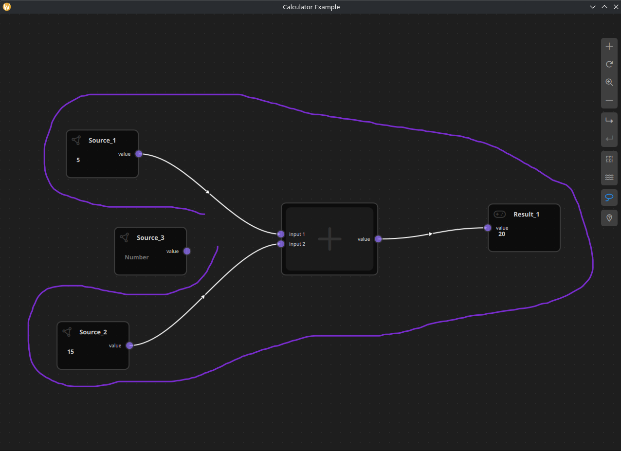
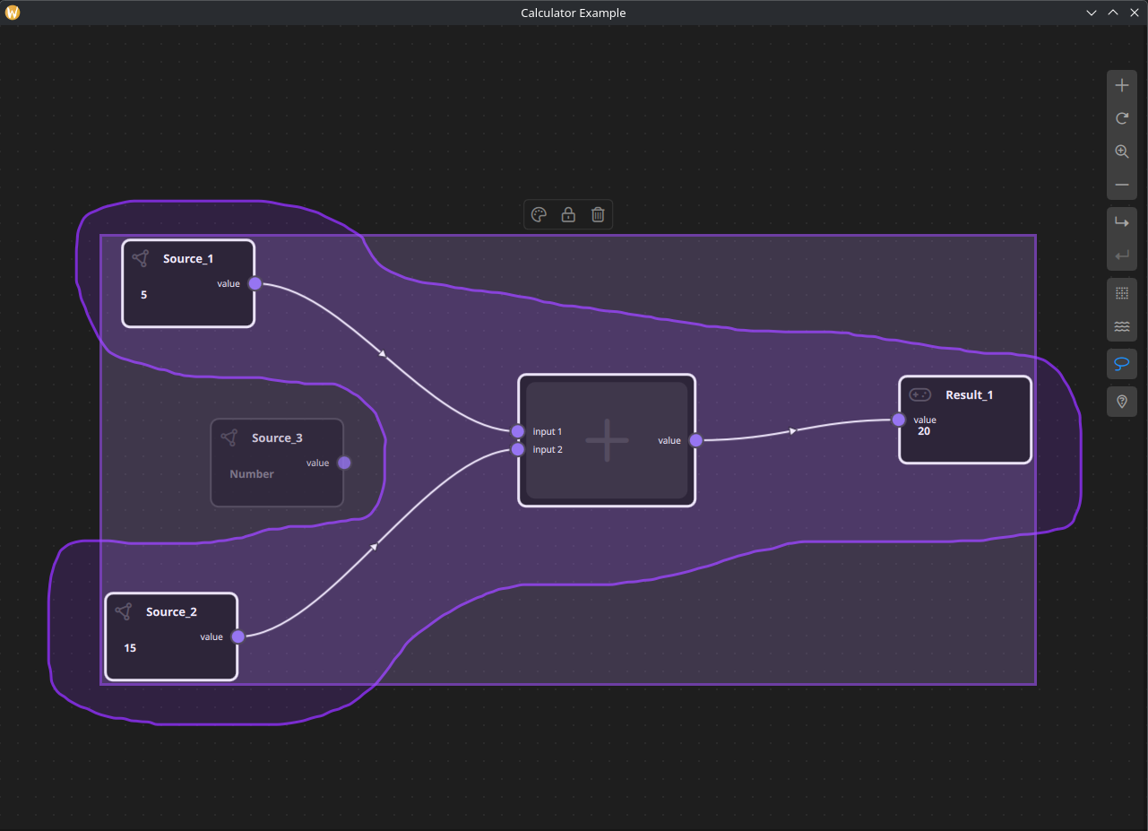
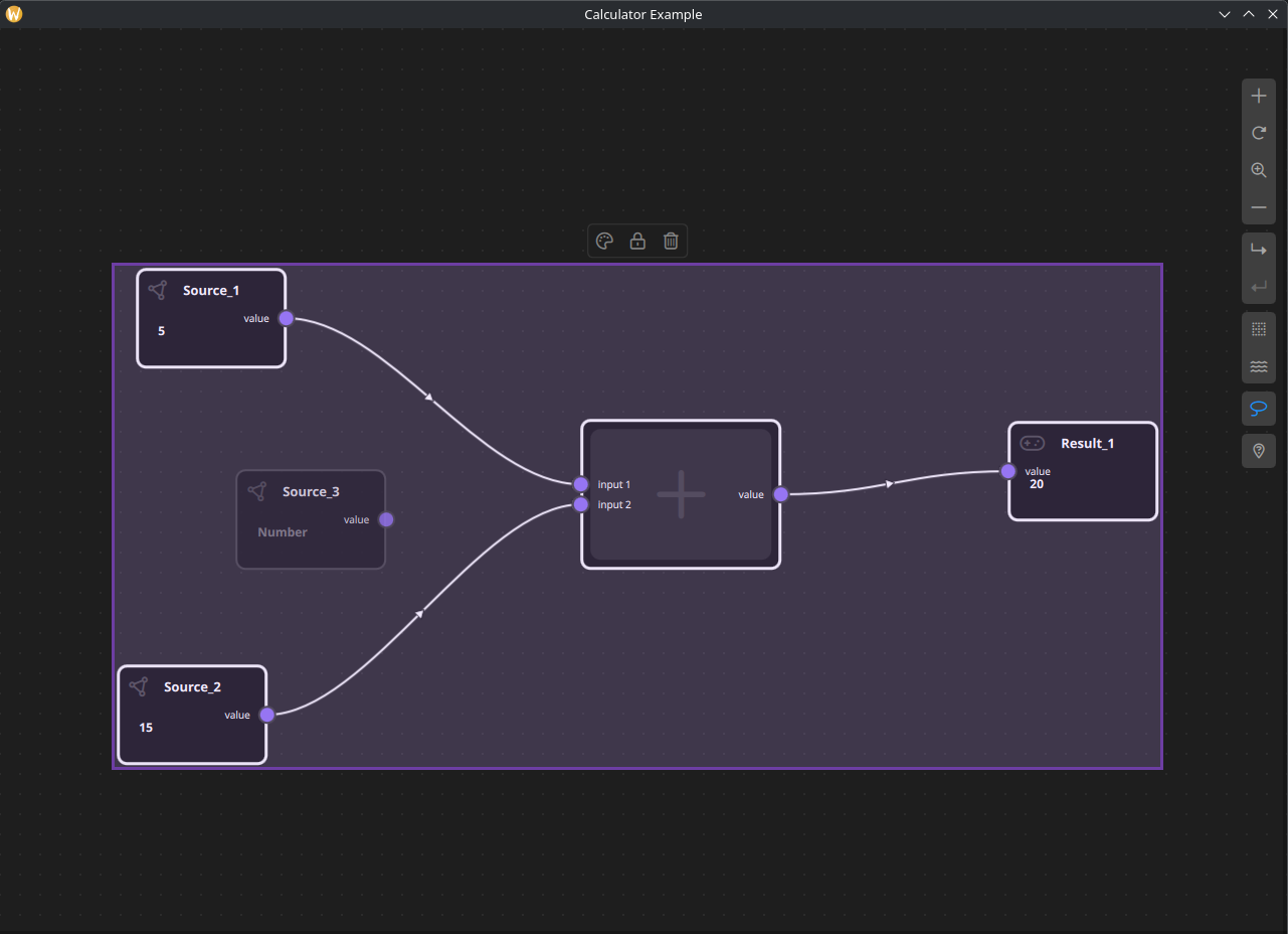
Motivation
Rectangular (marquee) selection is not always ideal when:
- Nodes are arranged in non-rectangular patterns
- The scene is dense and overlapping
- Users need fine-grained control over which objects are selected`
Lasso Selection solves these problems by allowing users to draw an arbitrary shape around objects, selecting only those fully or partially enclosed by the lasso path.
Selection Modes
NodeLink supports multiple selection modes managed by SceneSession:
- Rectangle Selection (default)
- Lasso Selection
The active selection mode determines how pointer drag interactions are interpreted during selection.
High-Level Flow
- User activates Lasso Selection mode
- Pointer drag creates a freehand path
- Path points are collected in real time
- Path is optionally auto-closed when endpoints are close
- Objects inside the lasso polygon are detected
- Selection model is updated
- Selection tools and rubber band visuals are refreshed
Lasso Selection Algorithm
The lasso selection feature is implemented using a free-form polygon selection algorithm combined with a point-in-polygon containment test to accurately determine which scene items fall inside the user-defined lasso area.
Lasso Path Construction
While the user is drawing the lasso, mouse positions are sampled continuously and stored as an ordered list of 2D points. To improve visual smoothness and reduce noise caused by high-frequency mouse movement, the raw input points are rendered using quadratic Bézier curve interpolation, resulting in a smooth and visually consistent lasso outline without altering the actual selection geometry.
Once the user completes the lasso gesture, the path is automatically closed, forming a valid polygon.
Selection Algorithm
After the lasso polygon is finalized, each selectable item in the scene is tested against the lasso area using a Point-in-Polygon (PIP) algorithm. For nodes and containers, the algorithm typically evaluates one or more representative points (such as the node’s center point or bounding box corners) to determine whether the item lies inside the lasso polygon.
The implementation relies on a well-known and robust approach such as the ray-casting algorithm, which determines containment by counting edge intersections between a horizontal ray and the polygon edges.
Accuracy and Performance Considerations
Accuracy:
The lasso selection provides pixel-level precision, allowing users to select complex and irregular groups of nodes that cannot be efficiently captured using rectangular (marquee) selection.
Performance:
The algorithm operates in linear time relative to the number of polygon edges and selectable items, which is suitable for real-time interaction. Selection evaluation is only performed after the lasso gesture is completed, ensuring that scene interaction remains responsive during drawing.
Design Rationale
The lasso-based approach was chosen to:
- Support non-rectangular, free-form selection shapes
- Improve usability in dense node layouts
- Provide predictable and visually intuitive selection behavior
This algorithm integrates seamlessly with the existing selection model and complements traditional rectangle-based selection without introducing breaking changes.
Lasso Path Handling
Path Construction
The lasso path is built incrementally from mouse/touch move events:
- Each movement adds a new point to
pathPoints - The path is rendered dynamically for visual feedback
- A minimum number of points is required to form a valid lasso
Shape Auto-Closing
To improve usability, the lasso automatically closes when the last point is close enough to the first point:
function closeShapeIfNeeded() {
lassoSelection.isShapeClosed = false;
if (lassoSelection.pathPoints.length < 3)
return;
var first = lassoSelection.pathPoints[0];
var last = lassoSelection.pathPoints[lassoSelection.pathPoints.length - 1];
var dx = first.x - last.x;
var dy = first.y - last.y;
var dist = Math.sqrt(dx * dx + dy * dy);
var threshold = 25;
if (dist < threshold) {
lassoSelection.pathPoints[lassoSelection.pathPoints.length - 1] =
Qt.point(first.x, first.y);
lassoSelection.isShapeClosed = true;
}
freehandCanvas.requestPaint();
}
This avoids forcing users to manually close the lasso precisely.
Object Detection
Once the lasso is closed (or selection ends):
- The lasso path is treated as a polygon
- Each selectable object is tested against this polygon
- Nodes and containers are tested using their bounding rectangles
- Links are tested using their input/output port positions
Only objects inside the lasso area are added to the SelectionModel.
Integration with SelectionModel
Lasso selection does not introduce a new selection system.
Instead, it reuses the existing SelectionModel:
- Supports multi-selection
- Works with Shift modifier
- Triggers the same signals as rectangle selection
- Automatically updates dependent views
This ensures full compatibility with:
- ObjectSelectionView
- SelectionToolsRect
- Rubber band visualization
- Drag & move behavior
Visual Feedback
Lasso Overlay
- Rendered using a Canvas
- Displays the freehand path while drawing
- Highlights closed shape when ready
Rubber Band Rectangle
After selection:
- The bounding rectangle of selected objects is calculated
Used for:
- Dragging multiple objects
- Displaying selection outline
- Anchoring SelectionToolsRect
Selection Tools Behavior
The SelectionToolsRect (delete, color, duplicate, etc.):
- Appears above selected objects
- Updates position dynamically via calculateDimensions()
Correctly follows:
- Single-node selection
- Multi-node selection
- Dragging operations
- Zoom changes
A fix was applied to ensure the tools update correctly for single selection, not only multi-selection, by reacting to selection changes consistently.
Performance Considerations
- Path points are stored in a simple array
- No expensive calculations during pointer movement
- Object intersection checks happen only when selection ends
- Bounding rectangle calculations are reused for visuals and movement
This keeps lasso selection responsive even in large scenes.
Best Practices
- Use lasso selection for dense or irregular layouts
- Combine with Shift for additive selection
- Avoid extremely long paths to keep interaction smooth
- Prefer rectangle selection for large, structured selections
Result
With Lasso Selection, NodeLink now provides:
- More flexible selection workflows
- Better control in complex scenes
- Seamless integration with existing tools
- A consistent user experience across selection modes
This feature significantly improves usability without adding complexity to the core selection architecture.